
Creating an young and dynamic, yet sophisticated and functional office space with a pinch of greens keeping in mind the budget constraint. While being low budget and highly practical, its projection had to have a sense of growth since Work Better had cracked the list of top startup firms in the country. The workspace, shared by over 90 staff members needed to be compartmentalized into various departments. The basic idea for design hence stemmed from the need for an energetic, young space that would allow more integration within the workspace.
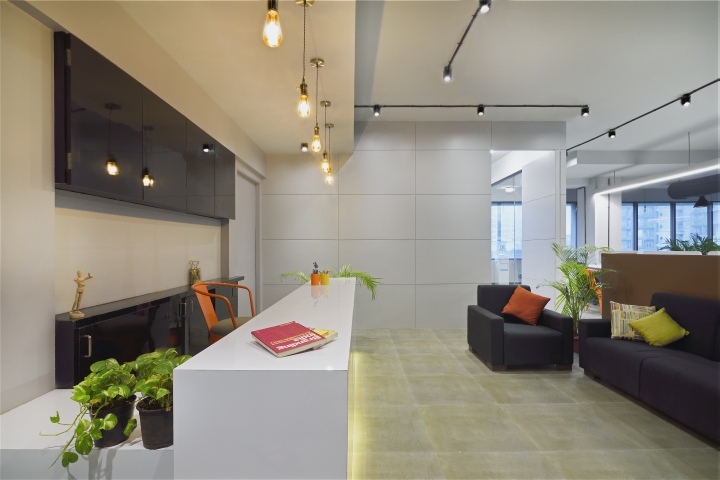
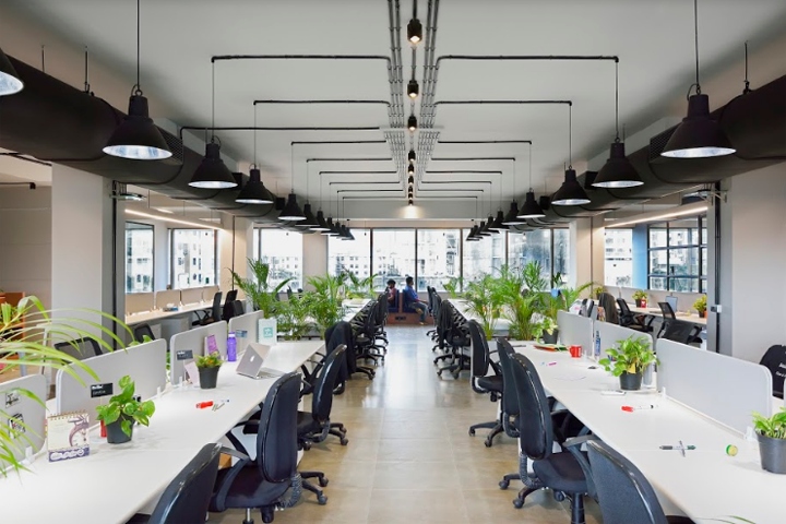
This 4500 sq.ft of office space was completed within a span of 45 days with extremely tight budget restrictions and costing as low as 900 Rs/sq.ft. The placement of cabins was done in order to maximize unobstructed views between teams and also to allow multiple uses of the desk areas by different divisions. The design was envisaged as the central spinal cord, from which various endings spring, representing the loud and high energy space for various creative minds to come together and work in unison.The PVC grid system is located centrally within the office on the naked slab from which light fixtures are suspended.
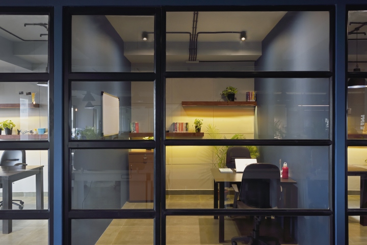
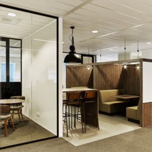
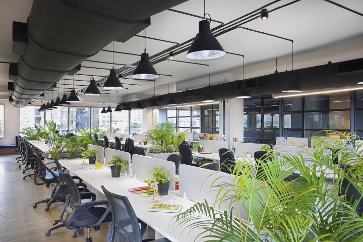
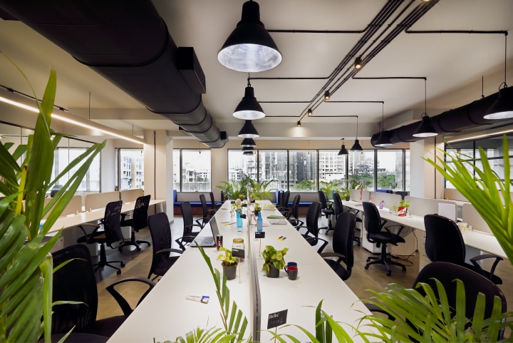
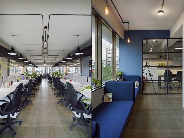
This centralized space is vibrant and inspirational segregating different teams functionally while opening up to pockets of relaxation towards the window. The horizontal aluminum sections play a major role in stretching the length of the space visually and adding to the concept of linarity. The exposed piping in the ceiling marks the grid play of the overall design of the office. The exposed pvc pipes are arranged in a manner that they illuminates the full space at a stretch. The industrial fixtures hang from both the sides over the worktables.
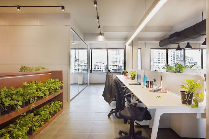
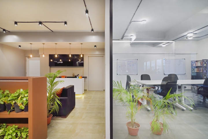
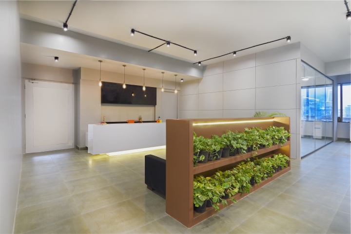
A linear suspended PVC lighting system has also been installed on both ends of the working space. Desking units are kept simple with white finish. The tiles are kept as simple as concrete finish vitrified tiles. Intermediate islands are filled with plants which makes the space appear greener and vibrant. The waiting area is backed with Botany where we have installed small young potted plants. Incandescent bulbs hang over the reception table in a series. The reception is kept very subtle and simple with black and white colors. The dark black couches with colorful cushions make the space look subtle and cozy.
The space consists of an exposed duct VRV System in the centralized working area and split units have been placed in all the cabins, meeting and training rooms. The ductable Vrv system has been laid in a linear manner adding to the overall length of the space. Concept of minimalist one-directional concept has been used for the overall space. The cabins are kept in a linear manner and has been partitioned and divided with dry wall partitions.
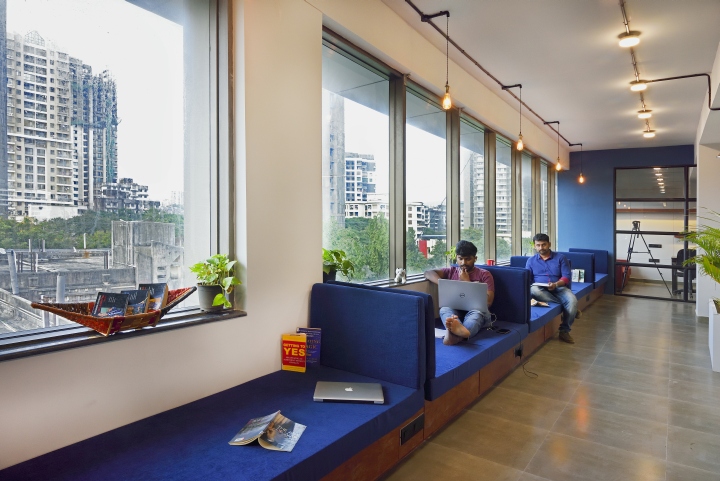
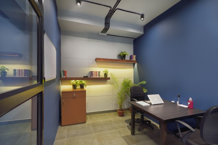
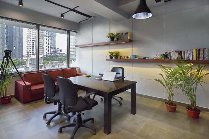
The exposed concrete wall paint has been applied on the rear wall of all the cabins where shelving units with lights below are placed to put in artifacts, books and botony. All the cabins have been accommodated with very basic loose furniture and has been kept open for alterations. Ash berry blue colored paint has been applied on the partitions dividing the cabins. The color scheme has been kept within the subtle shades of grey, white, berry blue, wood and pinch of greens.
Design: The Crossboundaries
Photography: Ashish Chakroborty


Add to collection
