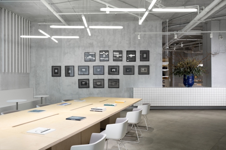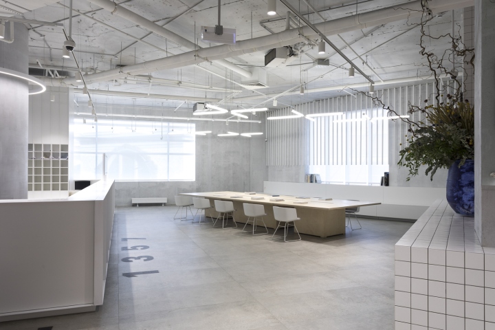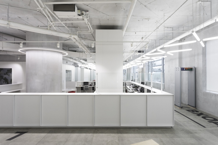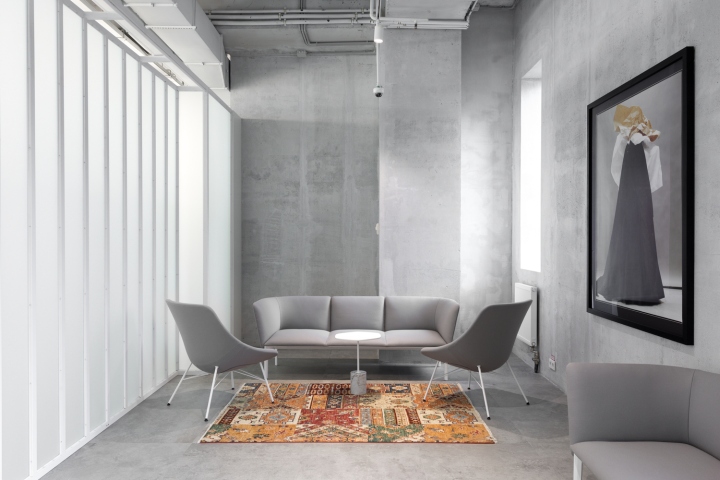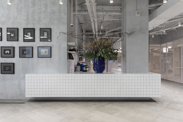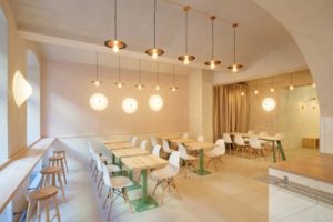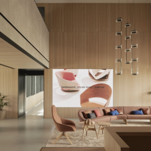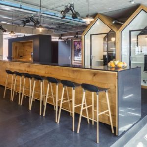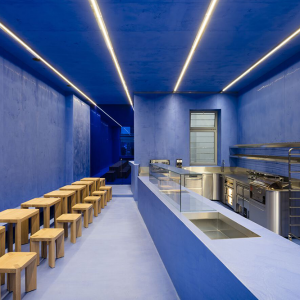
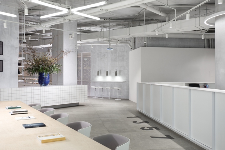

The plan was to create not only a modern and convenient visa center but also a multifunctional public space. The main slogan is “Italy starts here” and “here” stands for a small Italian cafe and an exhibition zone in the foyer wherein a waiting area one can also look through the magazines about art, design, and traveling.

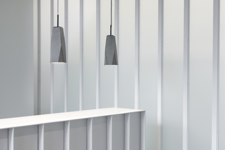
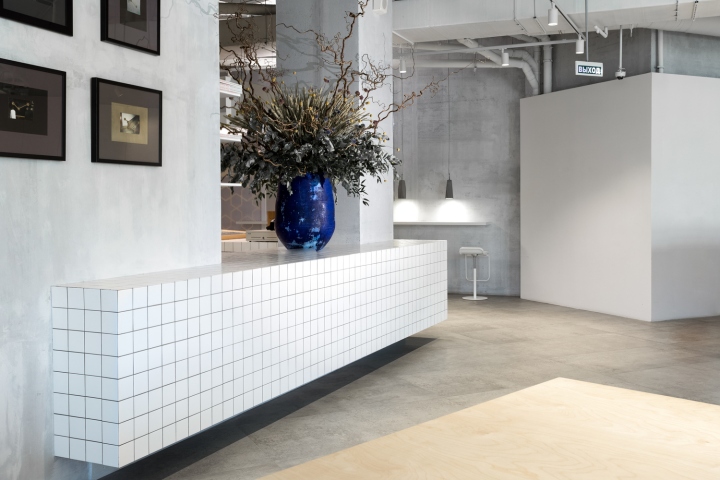
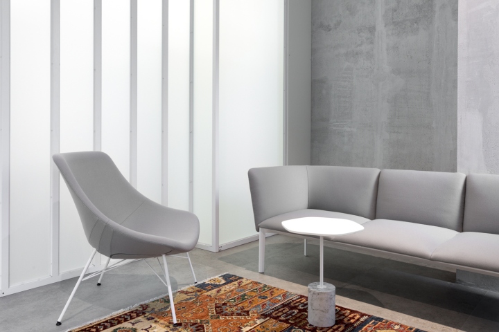
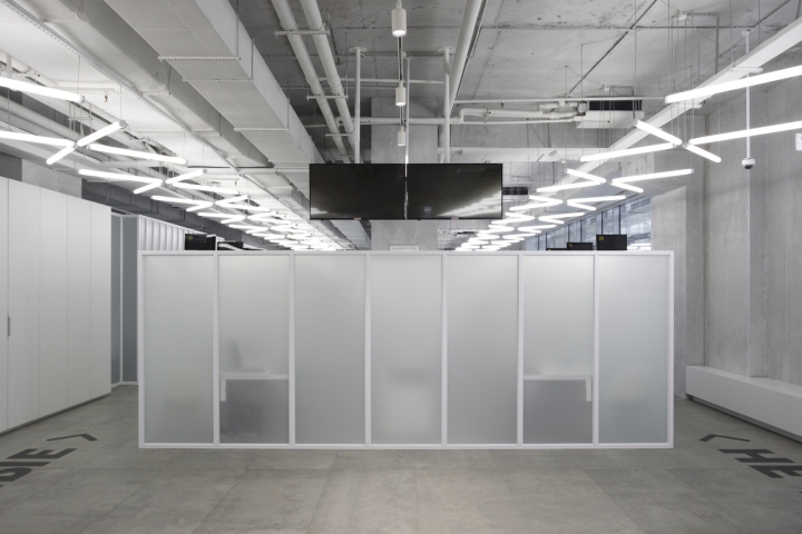
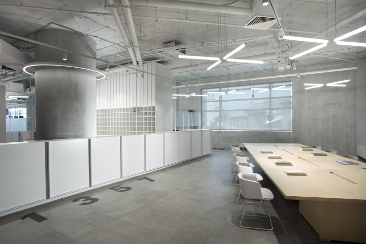
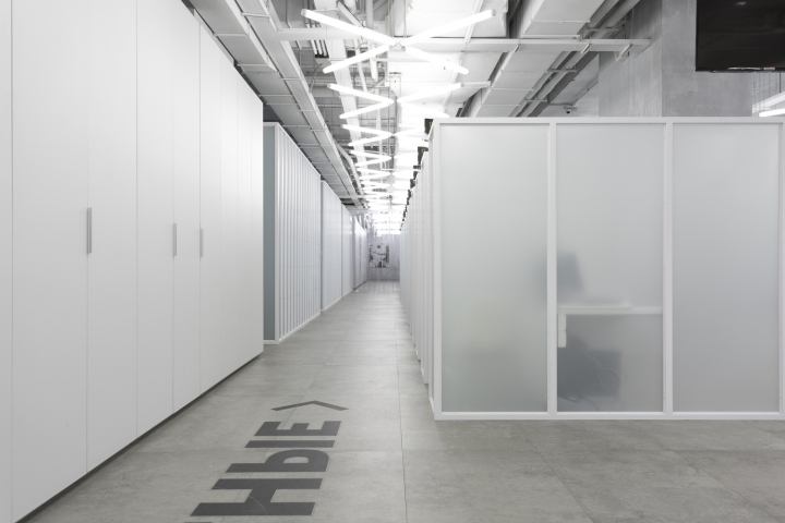
The reception desk is not only the “island” of information but the center of the whole interior which is designed in monochromatic colors. The textures of light-colored concrete which was used to finish the floor, walls and the ceiling are stylistically combined with the structural elements of furniture and other equipment made of a white metal profile, grid, and frosted glass.

The information stands and cash desks were made using painted thin steel sheet. The individual zones are separated by steel-framed semi-transparent partition walls and the whole space is penetrated with a lighting system consisted of thin LED tubes under the ceiling that gives us the impression of the light-filled and spacious room.
Design: MEL | Architecture and Design
Photography: Ivan Erofeev


https://www.archdaily.com/883723/italian-visa-center-in-moscow-mel-architecture-and-design
