
About
Zamora Homemade is all about enjoying homemade food. They use natural ingredients in traditional recipes and add a modern twist. Zamora shows its strongest side is character and commitment to the present, without ever losing sight of its traditions.

Concept
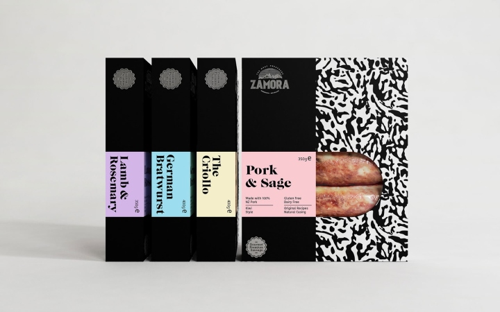
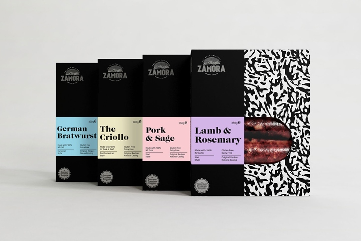
We worked with our client Zamora to develop a packaging family for their new line of sausages. The value of this product is its premium quality, as the sausages are made from original recipes created by themselves; using natural casing with the best NZ ingredients, whilst also being gluten and dairy-free. We’ve worked hard to achieve a pack that highlights those values and differentiate from the competition through strategic decisions that in turn do not alter the cost of the product.

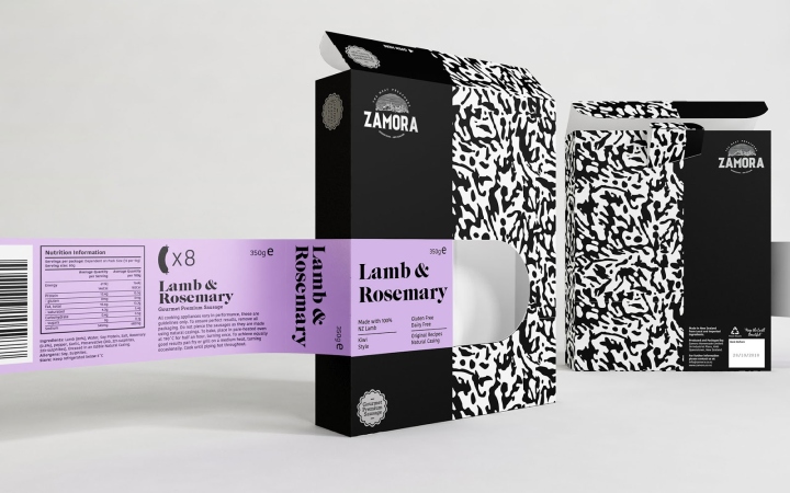
We’ve decided to work on the design of a ‘mother cardboard box’ instead of using the thermoforming usually seen in this category of products to give a personal and different approach. Through the design of the box we sought to create a system with a look and feel of a ‘collection’ as an analogy of a good collection of books. The principle idea is that when you taste one of these delicious sausages you will want to try the rest, just like the feeling you get when you are reading a good saga of books, you want to read the next one.

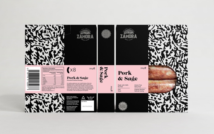
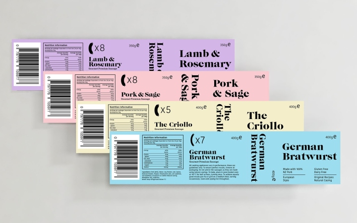
This explains the layout we’ve proposed. On the box we played with the typical elements of the brand: the pattern and the white and black colour palette with the silver foil touch on the stamps. On the labels we opened the visual identity of the brand, incorporating a palette of pastel colours that provides a fresh touch to the design, achieving a contrast with the mature palette. This creates a good balance between the traditional and modern characteristics of the brand ‘A brand that seeks to be young, but with a clear trend towards maturity’.

The last details of this packaging include a window that is shaped like half a sausage, inviting you to see the product. In addition, the matte finish both on the box and the labels provides the final touch on a product that emanates high quality from every perspective. We’ve achieved an extremely interesting and certainly distinctive pack in this category, and we are proud of it.
Design: Makebardo


http://www.packagingoftheworld.com/2018/02/zamora-sausages.html


