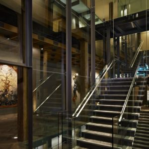


A transformation like this doesn’t come around often, and for an 82 year old company, transforming the 21st floor lobby of Leo Burnett’s Chicago headquarters is a task not taken lightly. Leadership set out to modernize the agency, shifting the culture within the walls of 35 W. Wacker to one of conscious collaboration and creative problem solving. The 21st floor of the Leo Burnett building has historically been the first impression for guests and employees alike, with Leo’s iconic glasses suspended behind an immensely long reception desk serving as the gateway to the agency. Employees habitually stormed through the space passing through with haste to switch elevator banks, and executives sat comfortable behind the frosted glass wall in private offices.
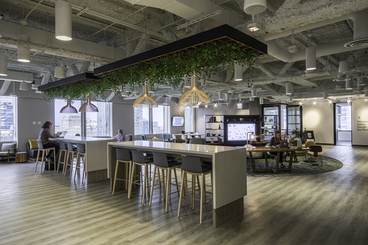
So when the plans were announced to reinvent the space, it was big news. A team of experts came together to help bring the vision to life, including innovation leads, key media and technology partners, and Arc’s Retail Design Group. The challenge was to create a space that fosters conscious collaboration, fuels creativity across disciplines and drives innovative solutions for our clients.
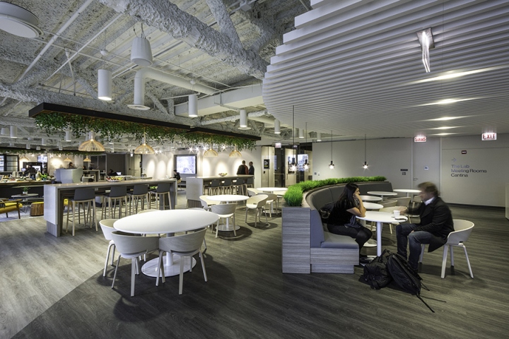
The space works to achieve 3 things: showcase the power of creativity and technology working in harmony, 2. provide open areas for idea making, and 3. convey the voice of our brand: progressive modern and smart. The agency employs 1200 people occupying 10 floors. Physical interaction was a challenge, as most people aren’t driven to leave their desks to travel 10 floors to meet. By creating engagement opportunities for people to meet, the space fosters collaboration and inspires connections.

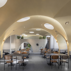
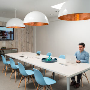
The design features a series of “living rooms” offering a variety of comfortable seating from communal tables to sofas and oversized chairs, semi-private booths and closed door conference rooms. There is something for everyone. The main area is outfitted with ample places to plug in and digital screens for projection.

Anchoring the space is a stage. It is used often for company presentation or the monthly concert series “Artist in Residence.” Reception sits at an inviting wood desk flanked by plush seats and stools to put your feet up. A café with coffee and vending was incorporated, as an obvious and easy way to get people to come to the space over and over again. The top of the line digitally powered coffee stations, serve up custom creations to entice folks to get out of the Starbucks line and head to 21.

The space has a warm, neutral palette, but is peppered with brightly colored upholstery and accessories. The lighting is dim, but not too dark, inviting people to come relax and get work done. Soft music plays throughout the day, adding energy to the space. Since opening, employees have been thrilled. Employees of all ranks can be seen using the space daily. Whether its mingling or mind melding, it’s a space where people are engaged and collaboration is fostered.
Designed by Arc Worldwide’s Retail Design Group
Photography by Kevin Meyer




Add to collection

