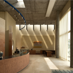
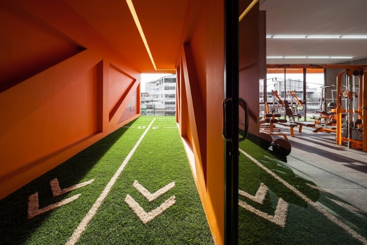

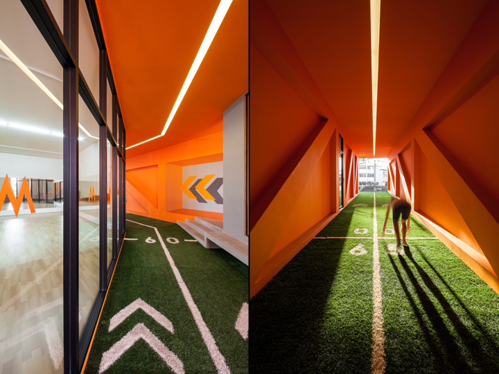
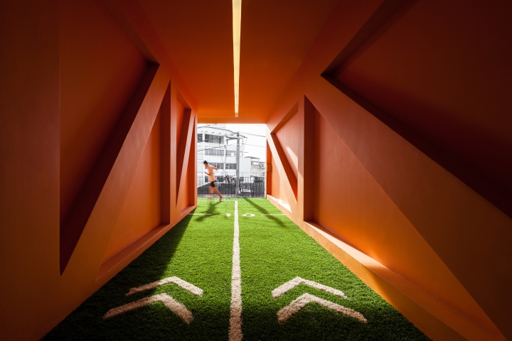
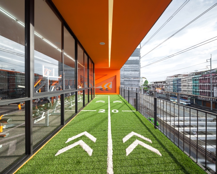
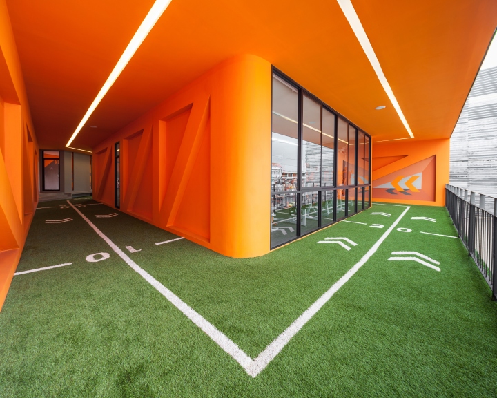
To create the space for proper cycle of an exercise loop that consisting of warming up > working out > cooling down > warm down > relaxing, IF proposed the idea to merge an exercise space with the circulation that continues throughout this whole project – from the main entrance to the jogging track on the 3rd floor.
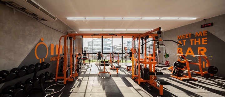
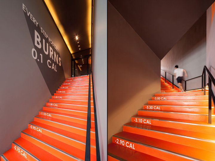
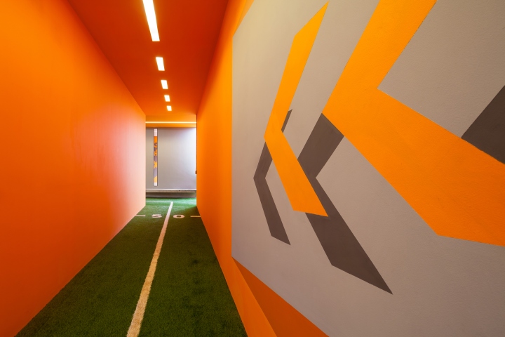
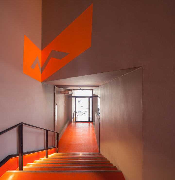
The main feature to help customers understand this idea is to use color, environmental graphic and lighting to define this specific space. A selection of orange gives the energetic feeling and the continuity from steps at the main entrance to the stairs that leads to the main reception and cardio space on the 2nd floor, and to the orange floor-wall-ceiling main jogging track on the 3rd floor respectively.

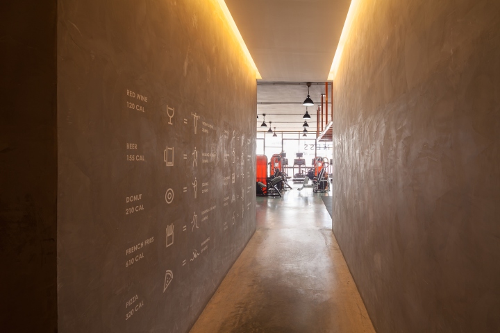
Informative environmental graphic such as how many calories will be burnt in each step or the direction and distance in this loop helps customer understand that apart from equipment, this loop is the part of their exercise already. The directional lighting strip or wall lamps on stairs helps accenting this loop as well. Moreover, bold phrases painted in each space give an inspiring environment to customers.
In the street scale, with all shop houses that is seamlessly attached to the footpath throughout the road, we proposed the urban void to give the city a break by creating a set back the b the open space on the 1st and 2nd floor. This provides breath taking space for the city and the distinction between M FITNESS and other existing building around there that people who pass by will promptly recognize.
Designed by IF (Integrated Field)
Photography by Ketsiree Wongwan




Add to collection
