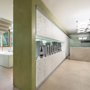

The design focuses on the renovation of the contemporary featureless industrial building, located in one of the most industrialized and polluted areas of Italy: the Sassuolo ceramic district. The design mission is to transform this building in the new headquarter of a ceramic company with office spaces and showrooms.
Goals
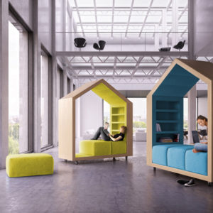
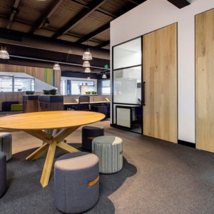
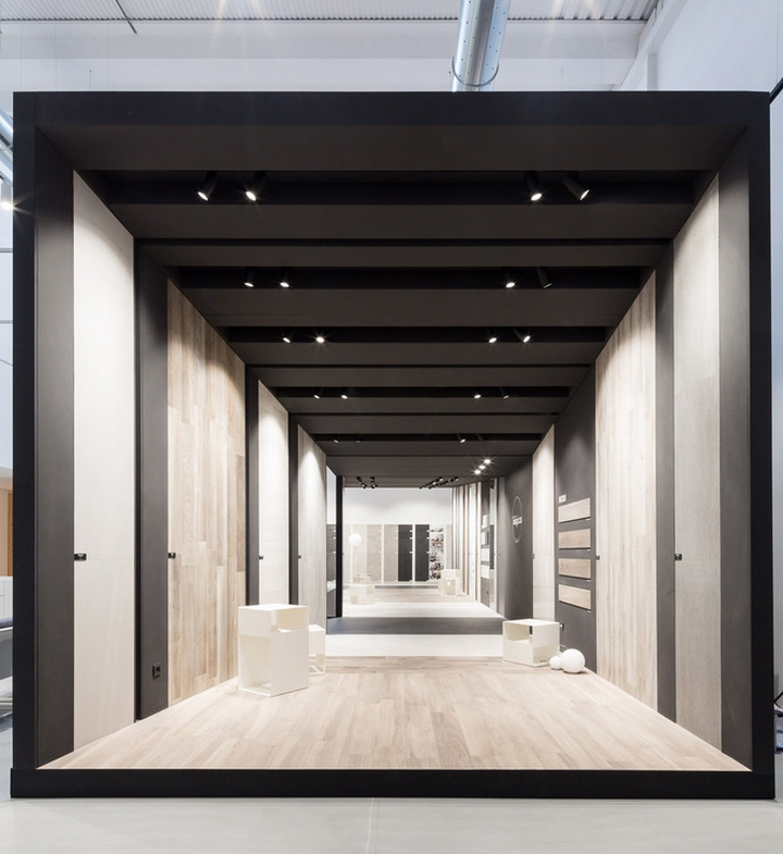
The architectural design main goal was to create a brand-new space for the offices, transforming the building in a comfortable shell able to protect and to give well-being to the daily users and supporting social connections among every employee. The design of the showroom areas was based on the creation of exhibit units that are at the same time the products container and an independent architectural object.
Design
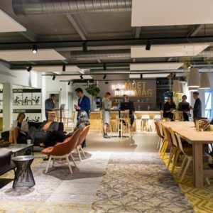
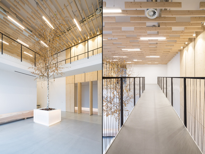
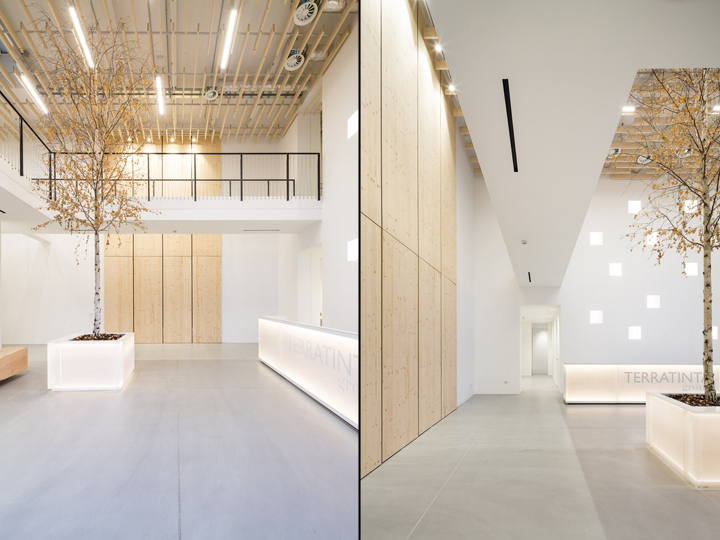
The main idea was to bring the nature inside the building, choosing natural finishing and amplifying the view on the sporadic green areas close to the building. The office spaces distribution is fluid, it respects the pre-existence and it involves few changes and discrete additions. The interiors design puts first the open workspaces that connect each other through convivial areas: spaces where users can relax, cook, eat, a fitness room and a corporate nursery. This spatial fluency is achieved by technological solutions and uniformity of finishing.
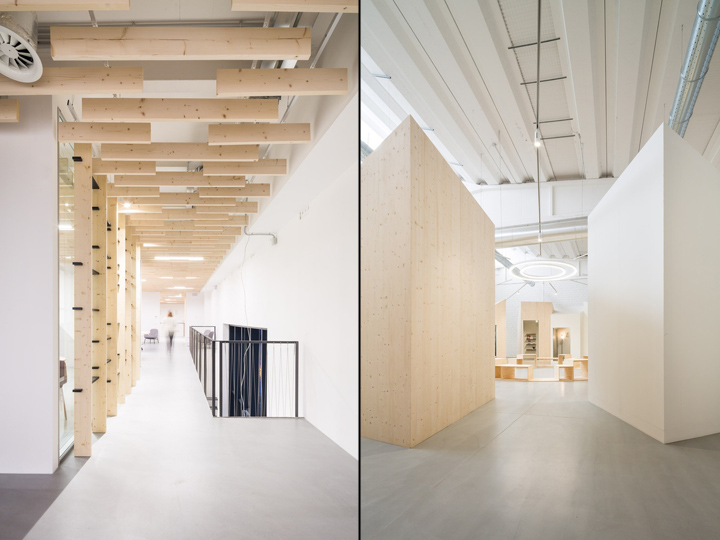
The ceilings are characterized by a wooden system that is light and stylish. It seems like a flying carpet made of floating elements that adapts itself to the different functions and shapes of the spaces where is installed. The wooden elements improve the ambient acoustic performances. They are easily removable, making the workspaces and the shared areas more adaptable in time. The furnishings are an essential part of the entire design. They are custom elements designed to improve the relations among users. The big desks in the open spaces, for example, allow the users to work together keeping the independence of every workstation.
Showroom
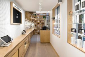
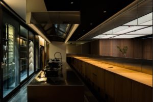
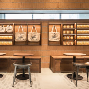
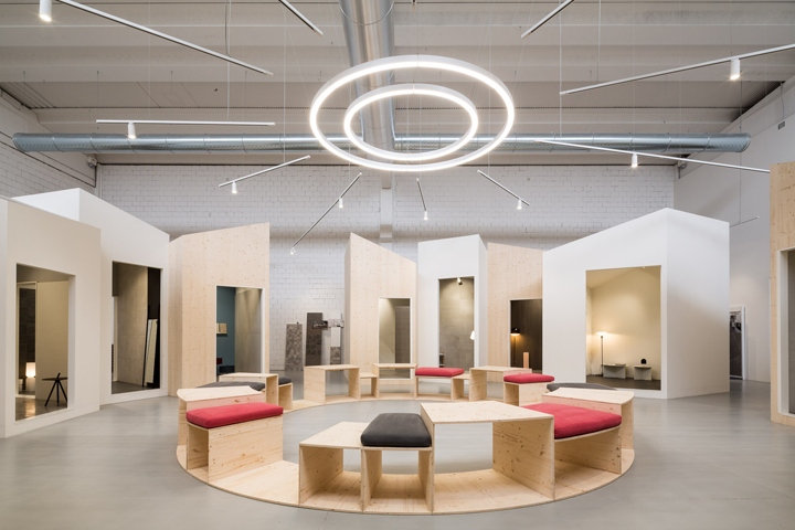
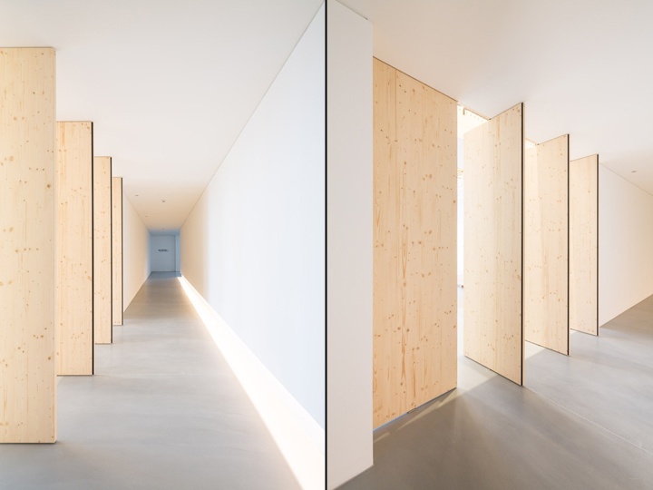
The new showrooms are located on the ground floor, back to the offices, and they tell the different personalities of the two main brands of the Group. The biggest one is a little town built surrounding a “square”, the place of trade meetings and events. It takes shape from the Italian historical urban centers, where the square was the most important place for trade and meeting. According to the brand style, the “buildings” of this little town are inspired by Scandinavia: pointed pitched roofs, narrow and high facades, wooden cladding and Nordic style furniture. The smallest showroom is completely different: an introvert space similar to a museum gallery. This area is simple and elegant, according to the brand style.
Architects: Enrico Bergamini
Design Team: Arch. Valentina Guerzoni
Photographs: Filippo Poli

https://www.archdaily.com/892607/terratinta-ceramiche-enrico-bergamini


Add to collection
