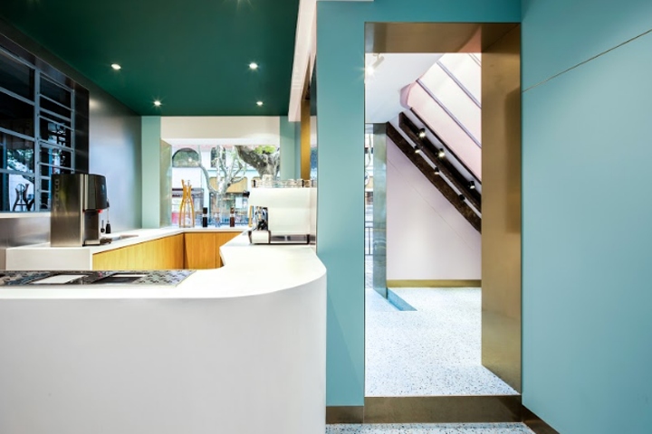

The Paloma Cafe renovated by dongqi Architects is located in an old building with a history of almost one hundred years. The project includes the renovation of the first floor entrance, the second and third floors, as well as part of the facade. The building was changed and renovated a lot of times during the last few decades. There was no document left as references, which makes the project more fun and challenging.
During the process of designing, the architects opened up most of the complicated and compact spaces to expose the original structure of this old building. The contrast of old and new materials creates an unique atmosphere for Paloma Cafe and the historical elements are traces of past.
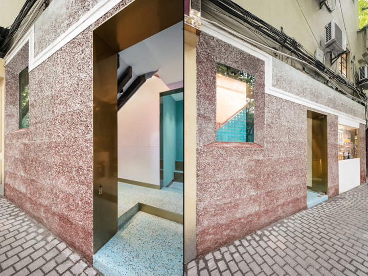
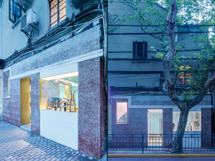
For the new facade, the designers aim to keep the traditional style of local architecture. The entry of the first floor is deconstructed and the architect uses a traditional treatment that is always found on regional architecture in Shanghai. Crushed red bricks and shattered glass are mixed with white cement, and by controlling the proportion carefully, the facade has a gradience from red to translucent from bottom to top.
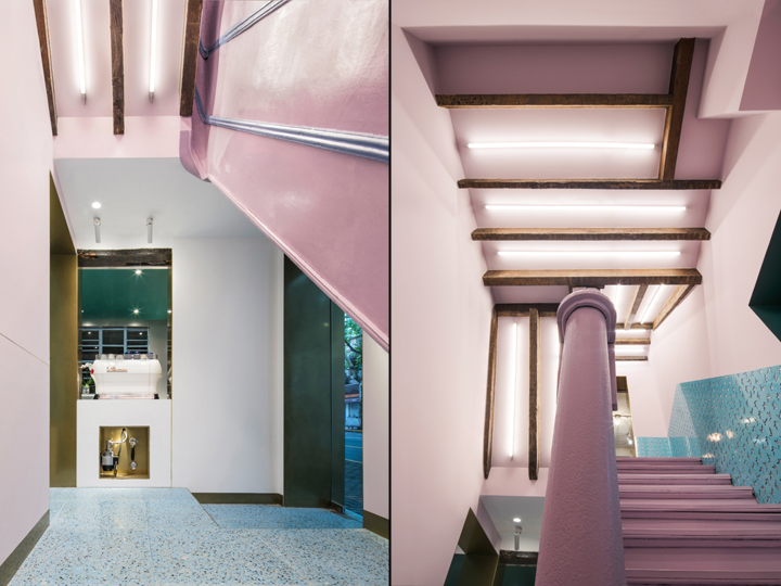
The white coffee machine is placed in a doorway as the spirit of the cafe and designed as a separate display area. It is right across the staircase. The pump and mechanical details are intentionally exposed within a metal casework. An old wood beam of the original building is exposed as well to give a contrast between old and new. To mimic the texture of the coffee machine, the designers choose to use the white stone as the material of the counter from the facade all the way into interior space.
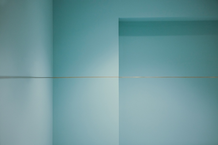
By discussing with the barista, the architects after all decide to have the counter this way as the most efficient method for the complicated and compact space on the first floor. The design of the counter could lead the customers into the inner space as well as displaying the whole process of coffee making. To integrate all the complicated small spaces within the original building, a brass line is designed throughout the building from the entrance and extends to the second and third floor as a subtle clue.
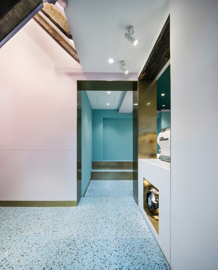
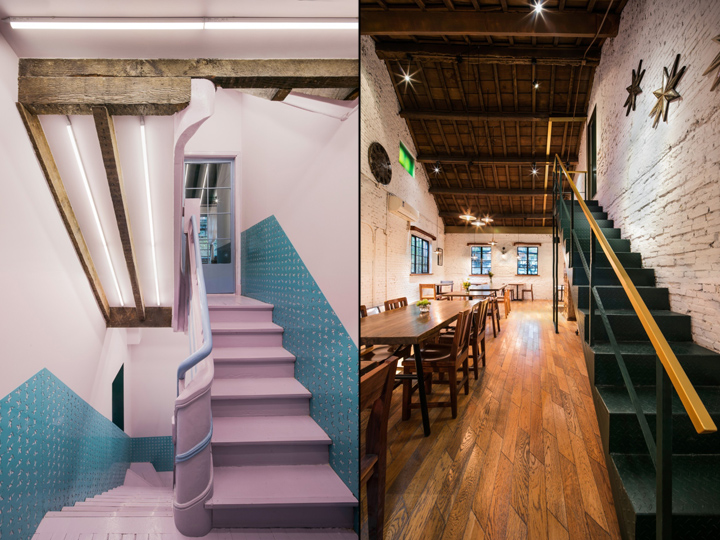
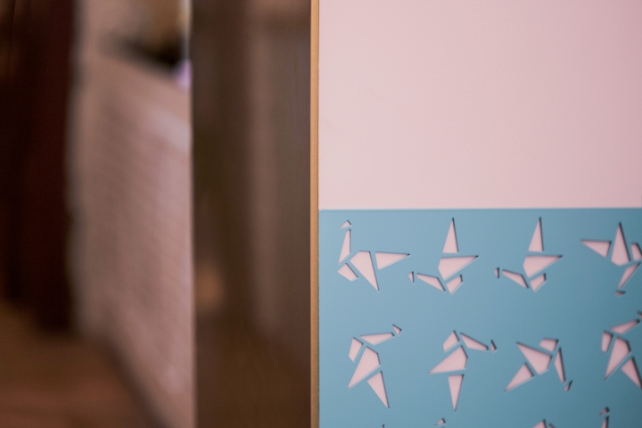
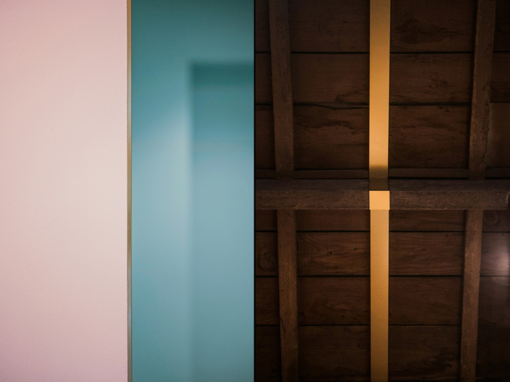
The compact staircase is one of the main focuses in the project. The original ceiling and decoration are removed to re-expose the original woodwork of the old building. The beautiful wood beams and framework are waxed and reinforced to give a feeling of rich history. Teal blue and light pink are used for the whole staircase and it creates a dreamlike atmosphere for the space. The logo of Paloma Cafe, which is a little bird, are cut on steel panels attaching on the walls of the stairway.
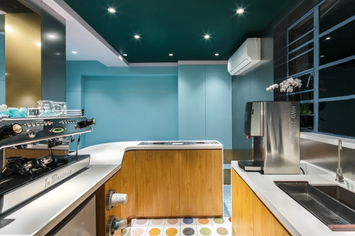
The color palette of the space is decided after a lot of discussion between the designers and the clients. Pink, teal blue, and dark green are chosen for the final and they are coordinated with the brass and original color of woods. The terrazzo floor is also customized according to the color of the wall.
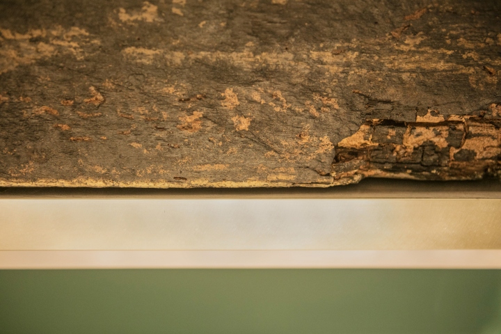
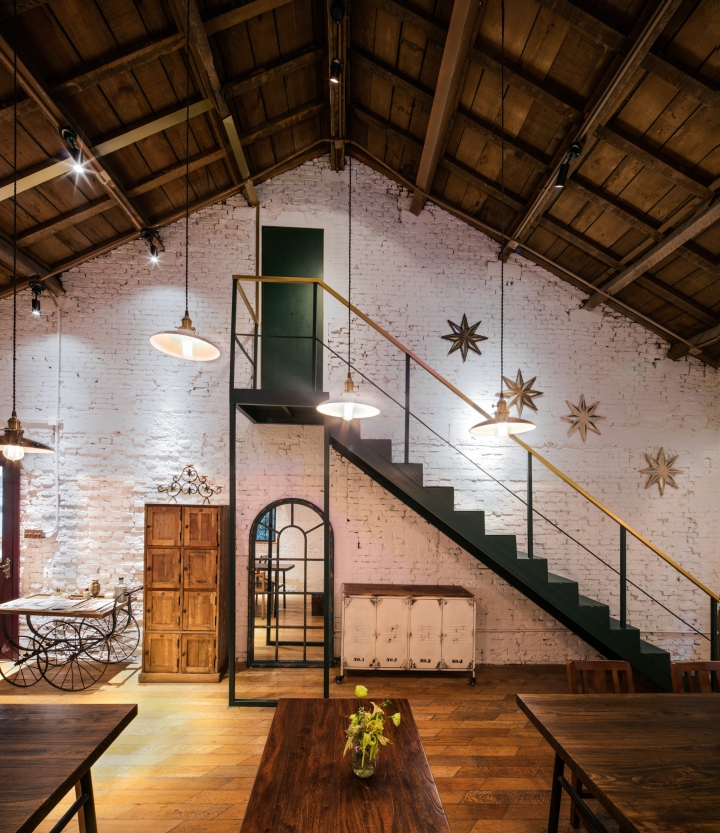
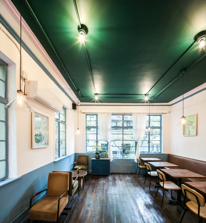
There is a wood-structured room on the second floor with a tilted roof. During the renovation, designers tried to keep the wood structure the same as before. The brass wraps part of the ceiling structure as the extension of the linear clue from the first floor and becomes part of the rail to the bathroom. For the third floor, the structural elements are reserved, three colors of paints are used to redefine the room and they together create an atmosphere of reminiscence.
Designed by dongqi Architects
Photography by Raitt Liu


Add to collection
