
Task
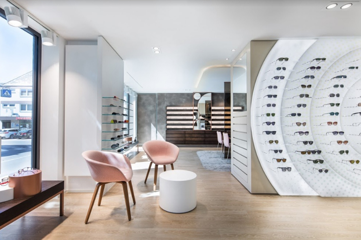
In the scope of redesign of the present store area, the client was thinking big and the planned re-design of the optician’s and hearing acoustics area led to the complete conversion of and development of the building in Burgstrasse in Wittlich. The construction measure was to move the competence area for acoustics from the basement to the ground floor and combine it on one level with the optician’s area to form a “competence centre for the senses”. Two building sections led to an attractive and modern overall retail concept. Brillen Müller represents the best service and greatest competence in the region. The specialist store offers its customers state-of-the-art examination and diagnosis techniques in the areas of optics and acoustics. The new design concept for interior design, examination and work rooms accordingly had to be integrated in a tasteful and functional manner. The specialist vendor’s wish and goal was a more modern and fresh presentation – to reflect topicality, lifestyle and technical competence once again.

Challenge
The complexity of the building project due to comprehensive demolition, conversion and expansion measures of the building and the measures arising for the new interior design required close cooperation between HEIKAUS and the local architect. Due to the comprehensive construction measures in the outdoor area, and in order to avoid an interruption of consulting and sales in both competence areas, the project was divided into two steps. The HEIKAUS interior design team completed the hearing acoustics area by August 2017. This store housed both the areas for acoustics and optics for 6 months, which was a true spatial challenge. In early April 2018, the second building part was handed over to HEIKAUS to implement the new room and design concept. In April 2018, the new competence centre for acoustics and optics could be festively handed over to the Müller family and opened.

Solution
This was a comprehensive project with requirements that motivated HEIKAUS to come up with special ideas. The design team was able to decisively influence the new façade design: The new outer plaster and its colour, the colour and placement of the windows, as well as the design and placement of the outdoor advertisements. This led to a perfect design fusion of interior and exterior – structural architecture and interior design – that is reflected in the overall appearance of the new specialist store.

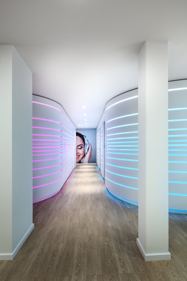
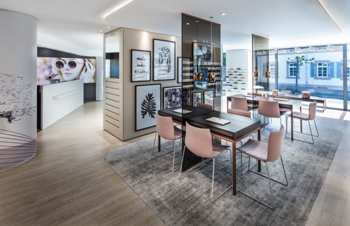
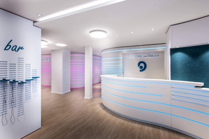
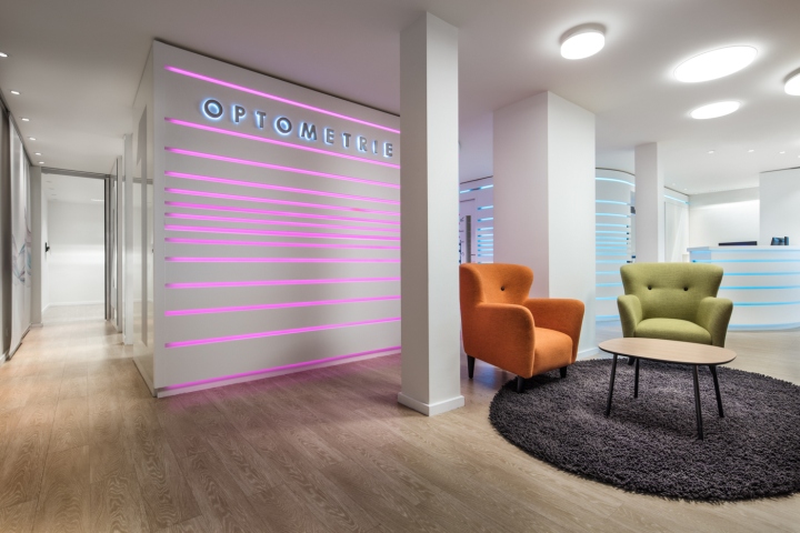
Indoors, the HEIKAUS team uses the available overall area of 260 sqm in order to provide each specialist and competence area with a platform of its own. The floor in a wooden look was used in both areas alike to combine them and create a clear unity. The areas are clearly divided for the customers with a tasteful colour [guidance] system. The optician’s area uses the colour magenta, while hearing acoustics is kept in teal – taken from the colours of the Müller logo. Teal and magenta recessed LED strips interrupt up the curved walls of the examination areas in the rear of the store while offering optimal orientation for customers. The left part of this hallway, coloured magenta, houses the optician’s examination area (optometrics) while the right part, including the generous counter, belongs to acoustics. The two areas were deliberately designed in different colours as well as materials. The acoustic area in the rear part of the store was designed in a clear and rather technical manner. High-pile grey carpet and wall coverings of teal felt provide a warm atmosphere while ensuring optimal room acoustics.
Design/planning: Heikaus Concept GmbH
Project management/design: Heikaus Interior GmbH
Photographer: Martin Baitinger, Böblingen
