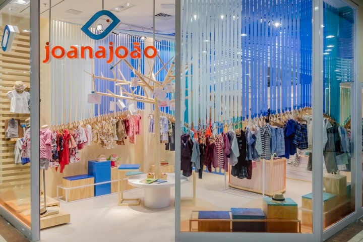

Under new management since 1989, Joana João store intends to create, develop and produce children’s clothing that differs from other competing brands by exclusivity, quality and comfort. All this without losing its primary focus: children.
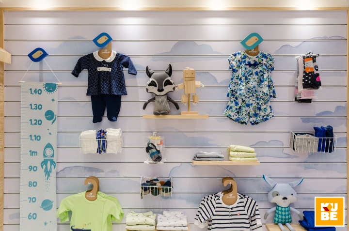
The concept created by Kube Arquitetura tries to rescue the history of the brand, established in the late 1980’s, through the outdoor games typical of that time. The furniture, inspired by a home yard, aims to create a playful, interactive ambience. The wall lining also gives the store an outside area effect and the flooring received a naturally finished porcelain tile to keep a neutral color palette.
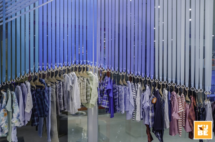
Being a corner store, two front windows were created with a door between them to guarantee that people would have a better flow and visibility. Kube brings back old children’s plays and takes the idea of the cat’s cradle game to make the ceiling look “braided” while the ribbons sway. The toddler’s clothes are exposed in ribbons of five colors – three shades of blue and two of green – scattered around the walls in different heights to allow children to see all pieces.
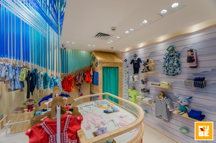
A pine wood table in the shape of a bird, the one present in the brand’s logo, orange bands and a small macaw make up the middle of the store. To support the exhibition, a panel was designed at the back of the store. Near these exhibitors, a table with a pine wood tree upon it and a circular bench around it was designed to make children sit and distract themselves drawing and painting. Then, if they want, they can hang their drawings in the branches of the tree to be displayed in the store. Thus, as children put their artworks there, they form the “leaves” of the tree and participate in the construction of the space.
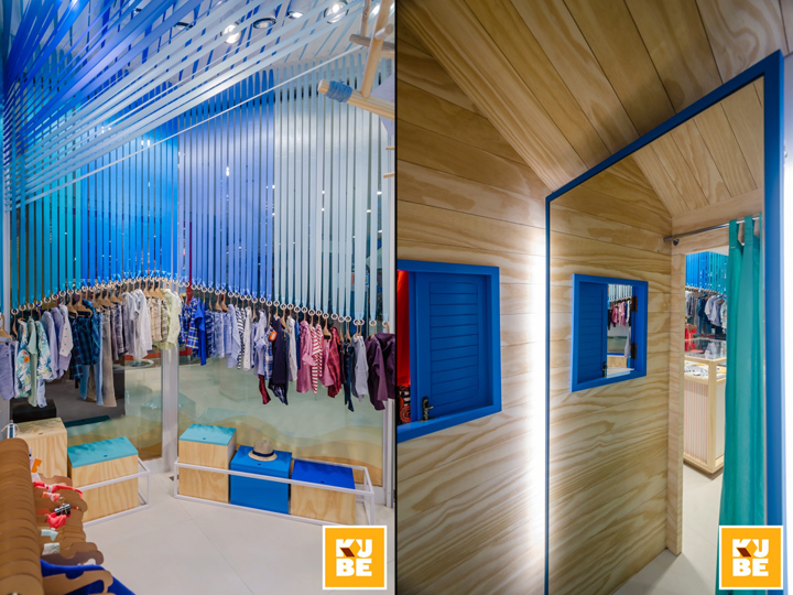
Playing with the brand’s concept, the wooden fitting room simulates a treehouse with a blue window and bird contours inserting the children in the brand’s environment e letting them have fun while trying their new clothes.
Designed by Kube Arquitetura
Photography by João Magnus


Add to collection
