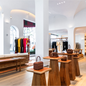
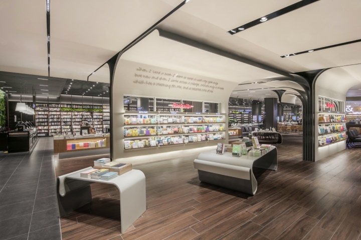

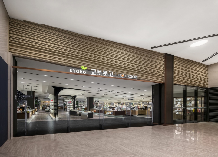
Kyobo book center is a bookstore which is a representative of Korea. Before we had designed a bookstore, we had thought about the essence of bookstore. The essence function of bookstore that we regulate is to read various books, earn information from diverse fields, and broaden horizons toward other books which are related with other fields. Therefore, we tried to concentrate on a book itself. Books are filled with writings on snowy papers and these papers are made a book. Our design had started from a thought that how it was, if the book itself had been interpreted spatially.
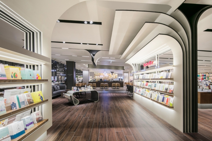
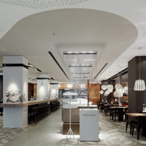
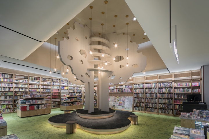
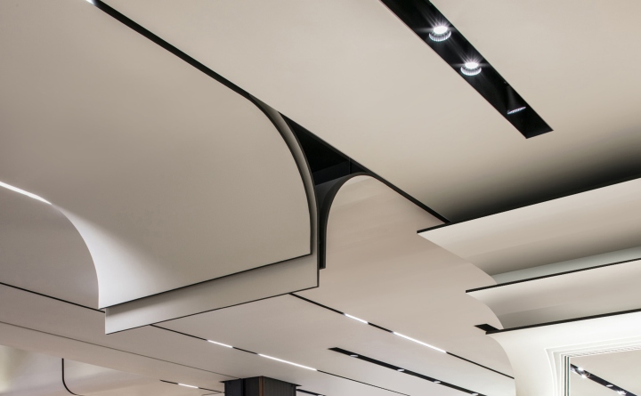
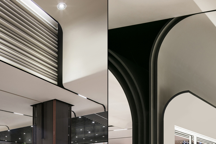
Sheets of paper are piled stratum super stratum on the ceiling of space, and each piece of paper makes leaves of a book by flowing down. Thus, sheets of paper create an object in space. Some papers create a flatbed by falling from the ceiling, other papers escaped from the ceiling partition into other space. Gathering each piece of paper composes territoriality of space by attracting people’s attention and being in charge of a functional role.
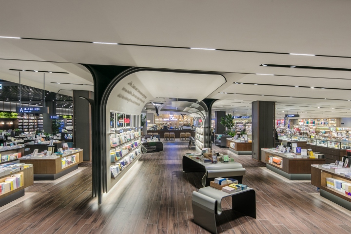
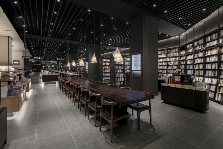
We had agonized about overall structure that how the “intuitive custom system” of books could be realized in the bookstore through space. First of all, what is the method to find information easily what the customer wants to in the bookstore as a broad treasure house of knowledge? We planned a central circulation moving line in the space as the answer. We wanted to make customer to take a round to bookstore with the moving line as the center for understanding of book location what the customer is looking for, and to find detailed data in book searching stand located in each pillar.
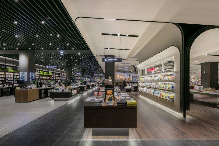
In addition, the bestsellers as a role of lighthouse are located in the center of space at the entrance of bookstore. The bookshelf of bestsellers was created by leaves of books which is falling down from piled papers on the ceiling and piling up the fallen papers. We had been convinced that it could be the best attention-getting factor well in the space as a design that if the piled pieces of paper on the ceiling could compose the bookshelf of bestsellers.
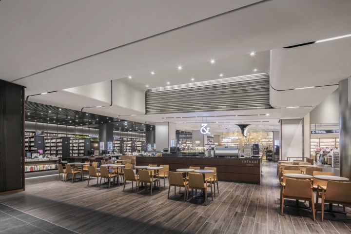
Finally, one of the biggest problems in this site is that one third of ceiling is tilted about 7 degrees due to a parking lot slope. Therefore, we designed the space to display high quality stationery and fancy products because when small size products are displayed in the area with the lowest floor height as the start point of slope, its disadvantage could become an advantage if the space is displayed snugly.
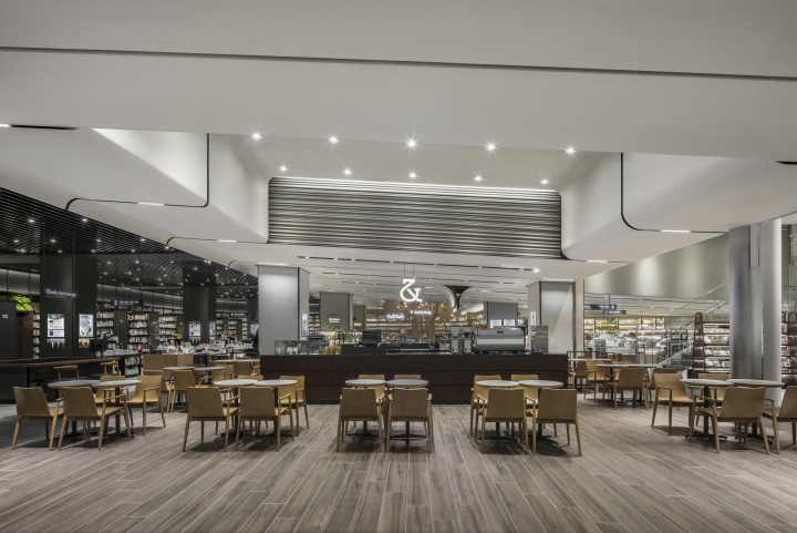
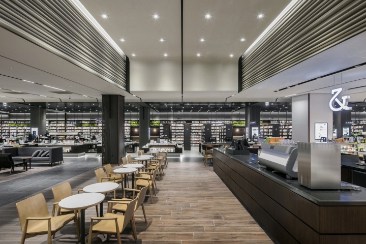
Moreover, cafe zal had been arranged below the ceiling where some part of higher floor height is possible to use for a space design that customers could read books and drink tea as well as staying comfortably.
Designed by Design Studio U.LAB
Photography by Yongjoon Choi


Add to collection


