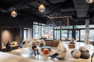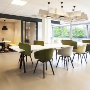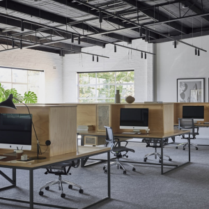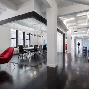

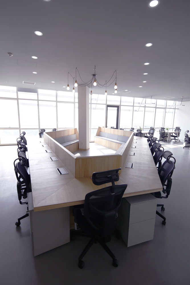
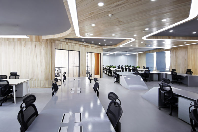
The client of the project is a young Internet finance company. The main idea of the company is derived from “let finance have temperature”. The company CEO emphasizes that making a simple, transparent and equal office space is the precondition given at the beginning of the design. Therefore, the concept of the design emphasizes the status of equality and freedom, to remove traditional cubicles and the sense of containment.
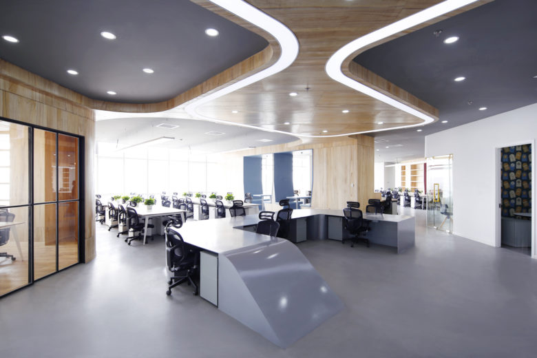
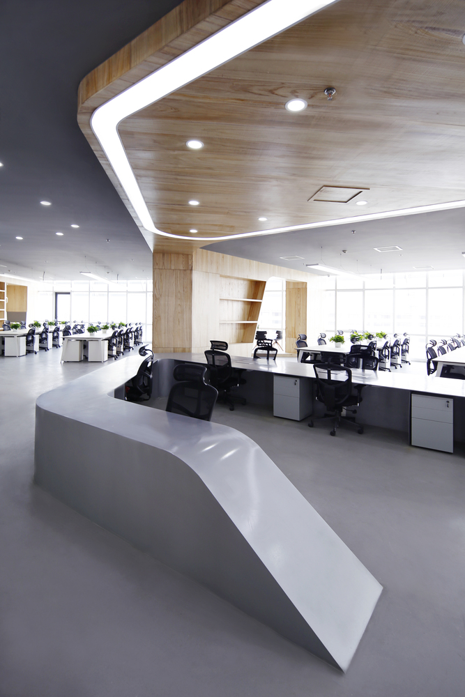
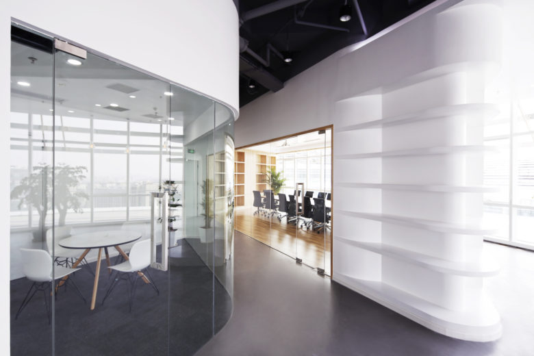
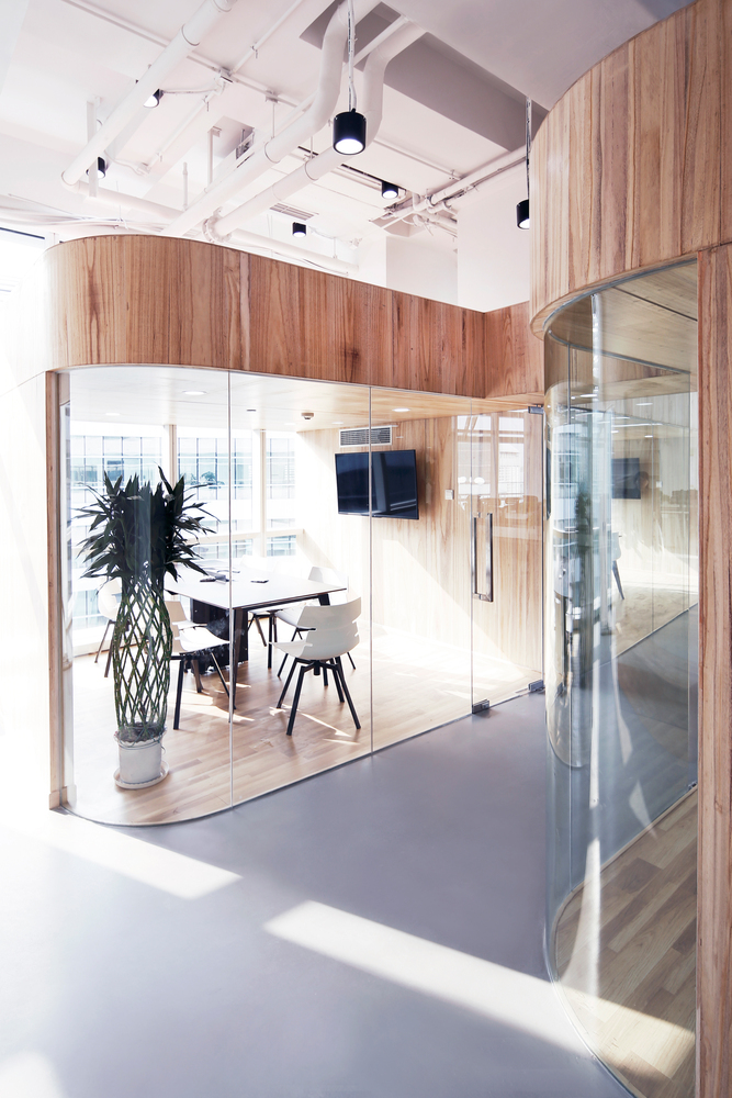
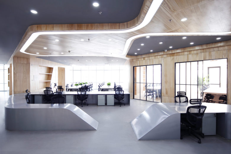
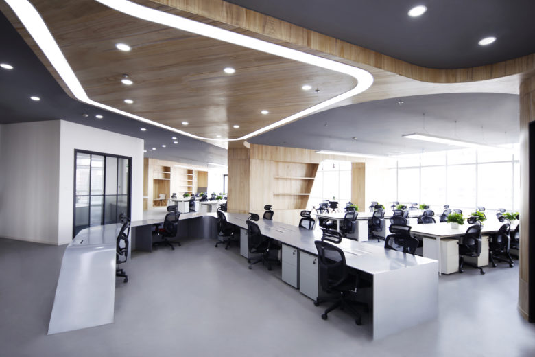
As a experimental work to pursue a relaxed, local, and resource workplace in the post-industrial era, the whole office is personalized curvy pattern following the concept of Galaxy Soho designed by Zaha Hadid. Instead of being confine to a traditional introversion and isolation mode of working division, it is a desire to create a happy mood like a park and a fairground.
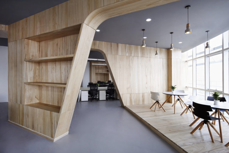
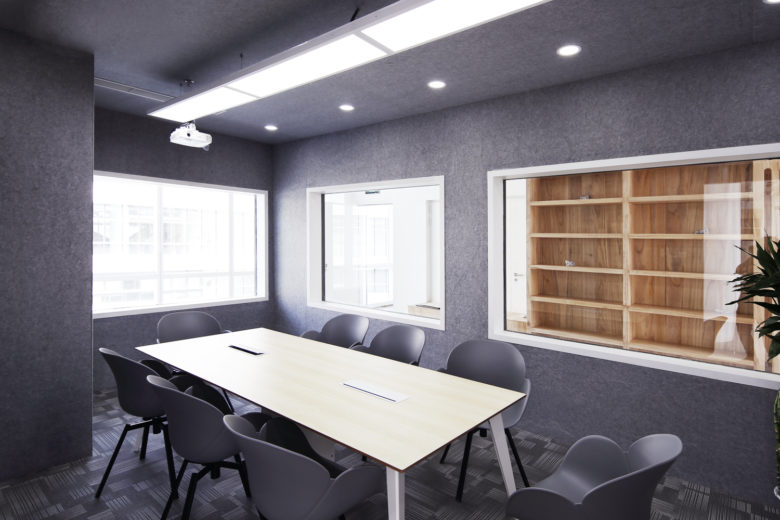
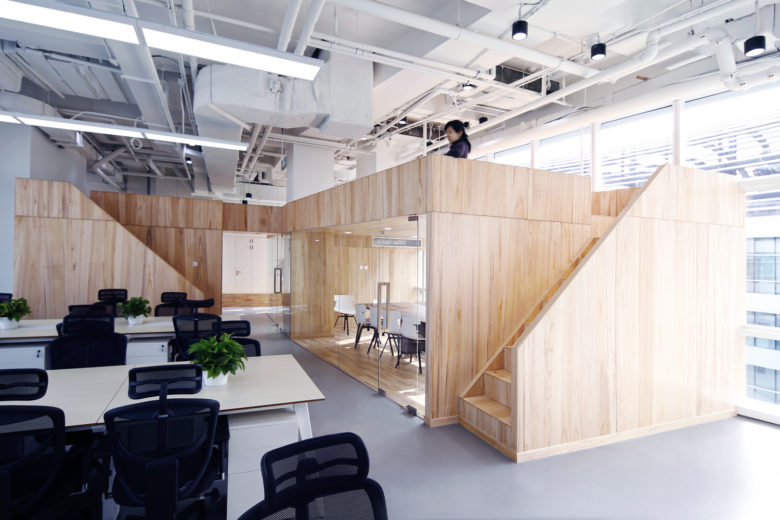
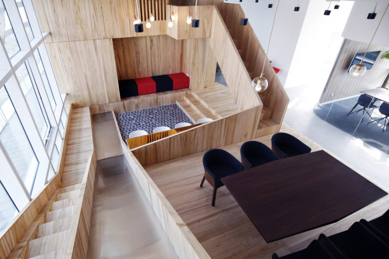
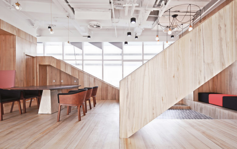
The layout of the office is a circular form, with a lot of diagonal columns in the original structure. Firstly, the architect quantified different functional space into three-dimensional box, such as the working area, meeting room, incubator, exhibition hall and VIP room, etc. The traffic space allows people arriving any place efficiently. Secondly, lots of irregular corner spaces were shaped by creating resting area to hide the original partition wall.
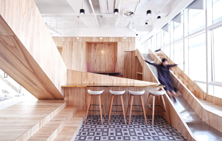
The design inserts vertical levels locally for the production of multi-activities. For example, in some public discussion areas in lower levels, a high platform is formed in the upper levels. Park elements such as a slide board are added to bring a richer experience.
The integrated functional space containers has weaken the limitations of site conditions, and highlight the original architectural features, to reasonably solve the problems of low spatial efficiency. Hereby, there are cooperative, compact and private corners, to create the area of emotional interaction, and achieve the state of multi-level scenes overlapping.
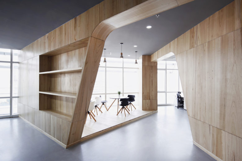
The office interior design makes the coordination and dialogue with the physical quantity of the Galaxy Soho of Zaha’s architectural language. In terms of material selection, most of the space is paved with wooden finish and customized with metal. The partial translucent and transparent glass partition increases transparency, and eventually the work scene is fluid and interpenetrating.
Architects: hyperSity
Lead Architects: Yang Shi, Shaojun Li
Design Team: Yang Shi, Shaojun Li, Mofei Li, Ou Dong


Add to collection
