450 square meters
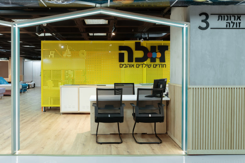
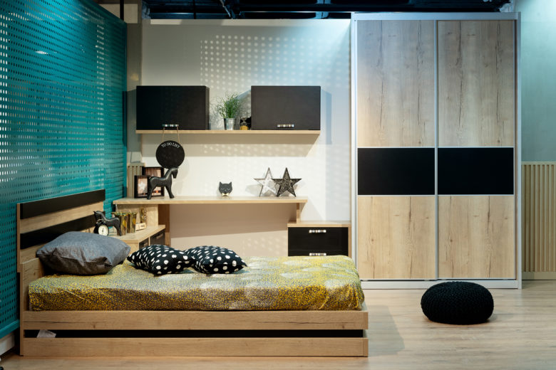
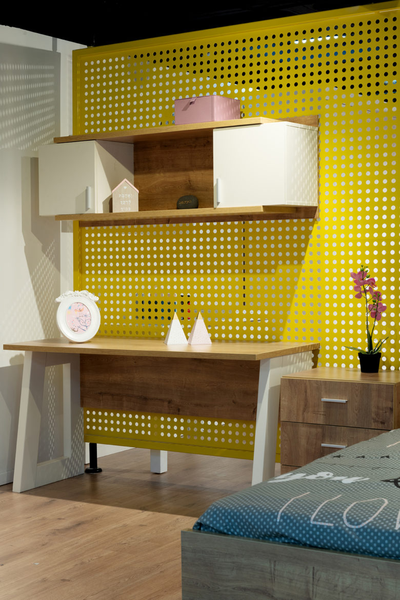
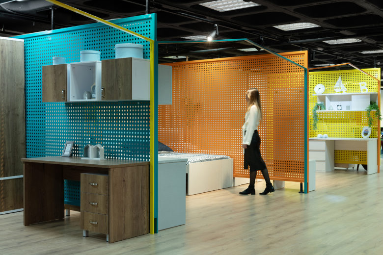
The concept was to create an interior for children’s rooms that would be interesting and different. It can be used to promote the product itself and also to serve as decoration in place of the bare walls you usually see in furniture stores
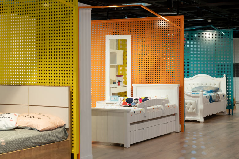
We took down the walls in the space and partitioned it into clearly defined areas, while maintaining a path for customers
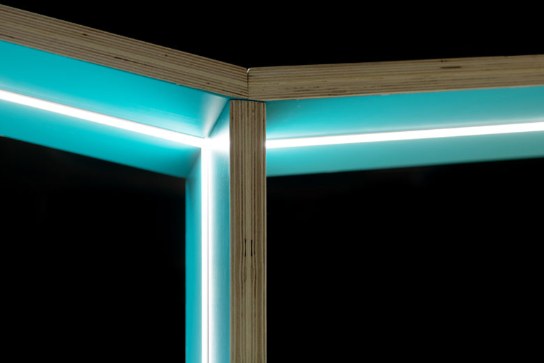
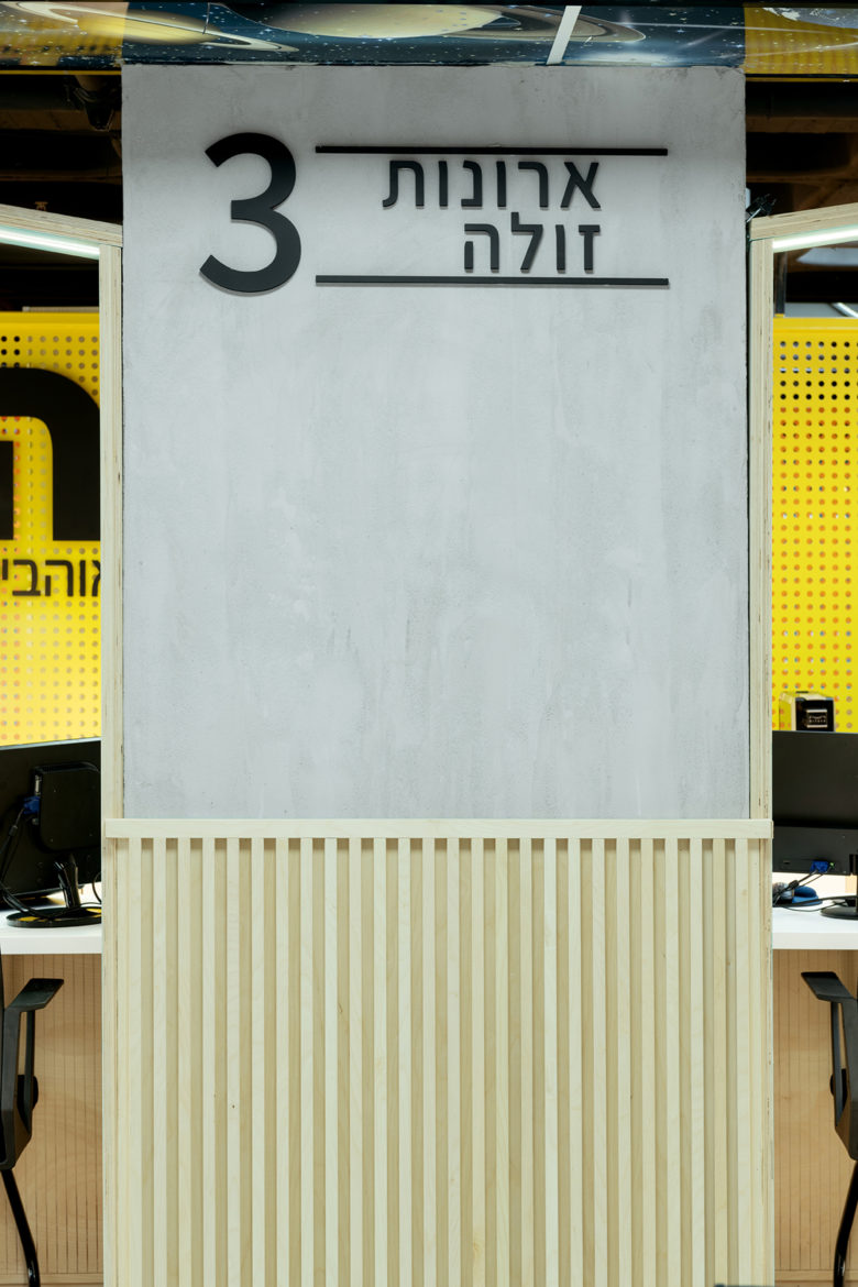
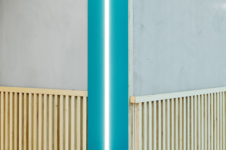
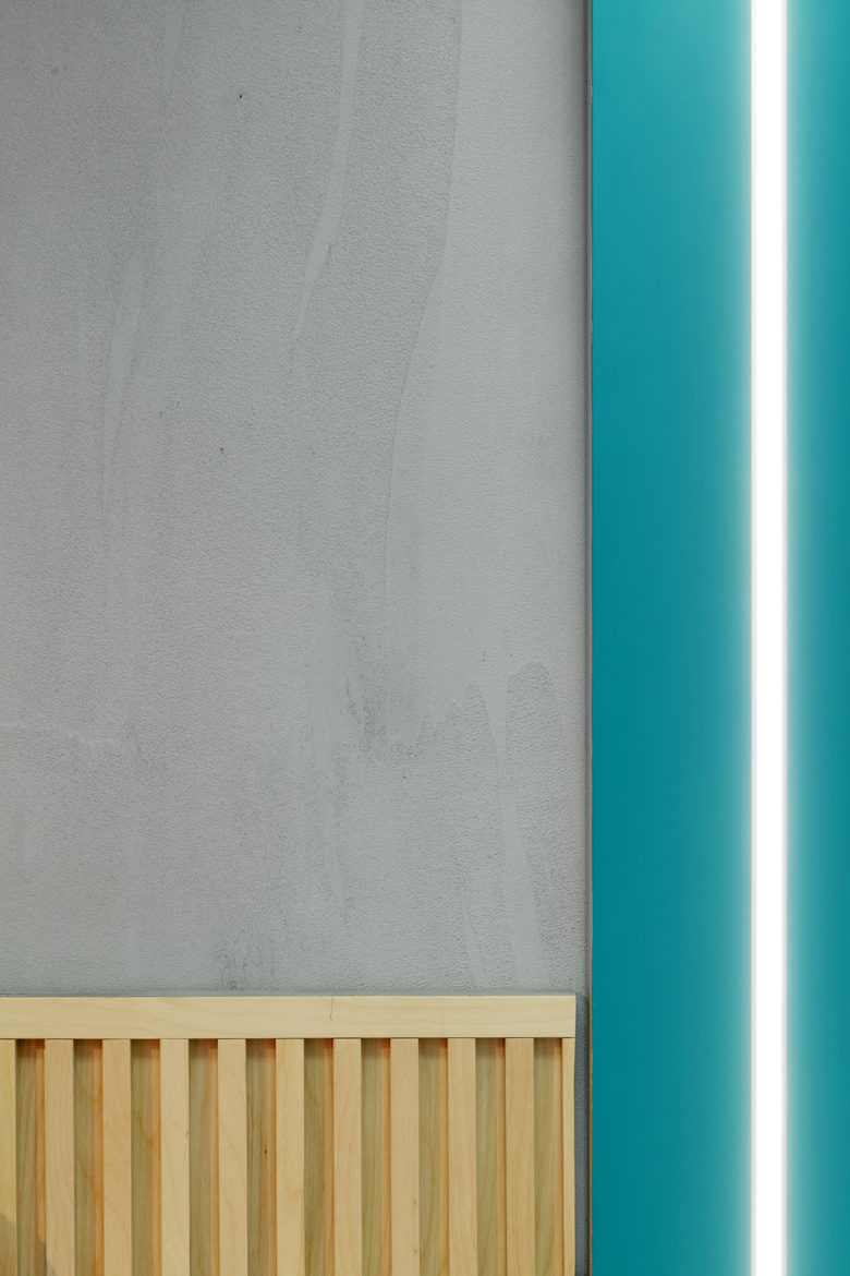
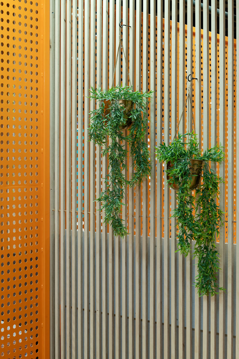
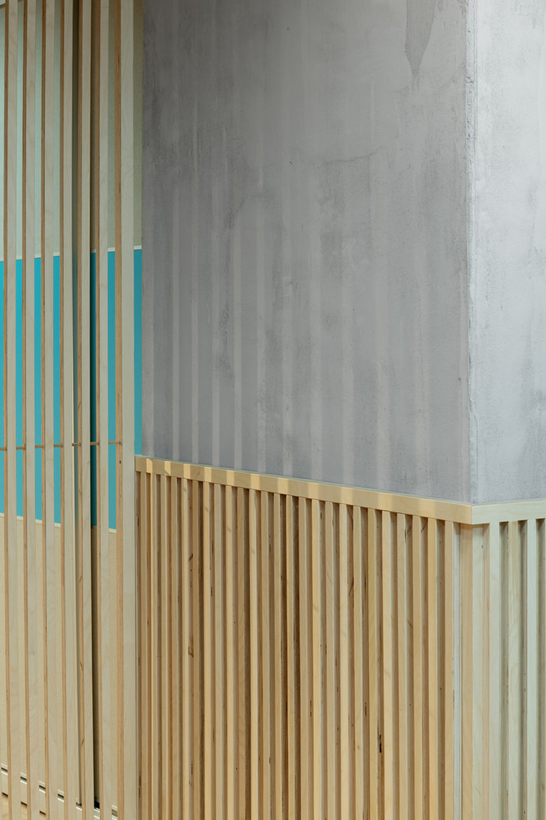
I decided to use perforated metal partitions in three colors, across the width of store. This made it possible to separate the space into separate “rooms”. Along the length of the store we created partitions made of thin wooden strips, and at the entrance to each “room” we installed one of the house-shaped frames.
Interior Design – Orin Silver BUXA Studio
photo by 181 maalot gidon levin
framework by yose zger
