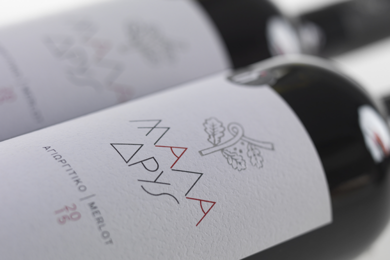
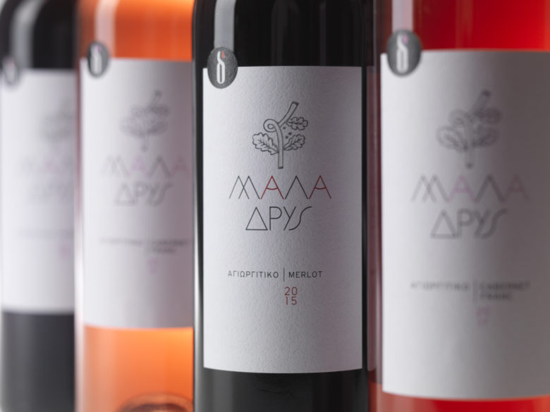
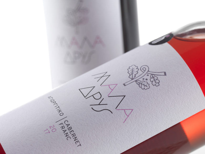
Μala Drys is a quirky name, combining two ancient greek words: much and oak. This is why the wine comes from a small mountainous Peloponnese village, which took its name from the abundance of oak trees in the area, where the Dasaklis family has been cultivating their private vineyards for five generations. Hence the drawing of a hybrid branch, with vine and oak elements, became the perfect central symbol for the label design.
What’s Unique?
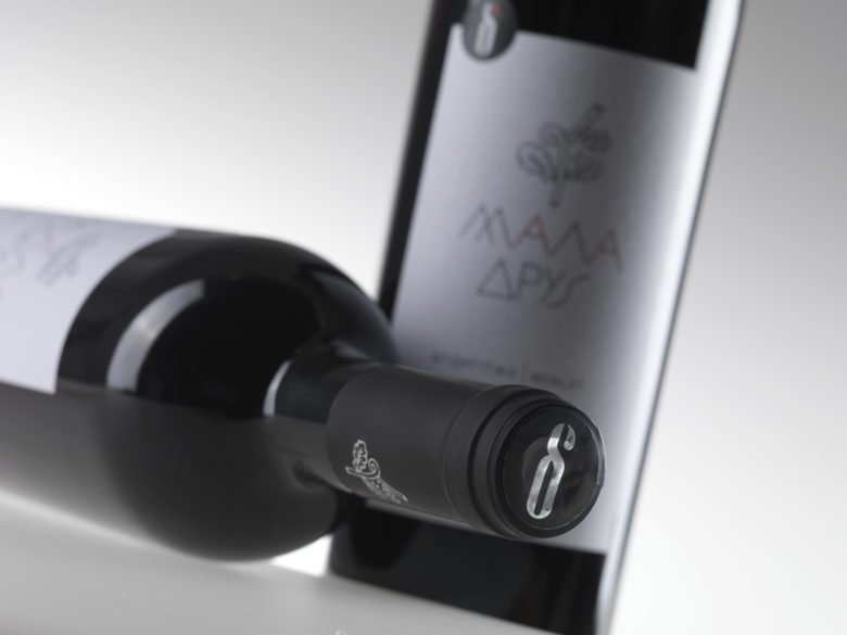
Minimalism, a distinctive font and an icon as quirky as the name itself makes up a memorable, contemporary, original wine label design. The diecut of the greek initial d – part of the winery’s logo – on the label, silver foil printing for the icon and rough texture paper complete the impression of a wine brand of today, which seems both simple and interesting. Just like the winemaker intended it to be.
Designed by Out To Lunch
Add to collection


