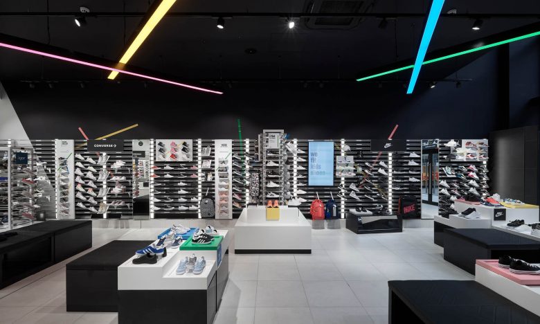
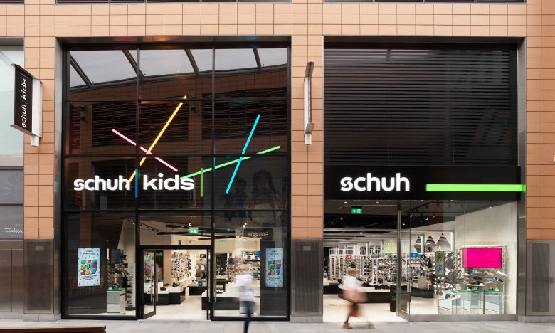
Briggs Hillier have created a new store concept for schuh kids.
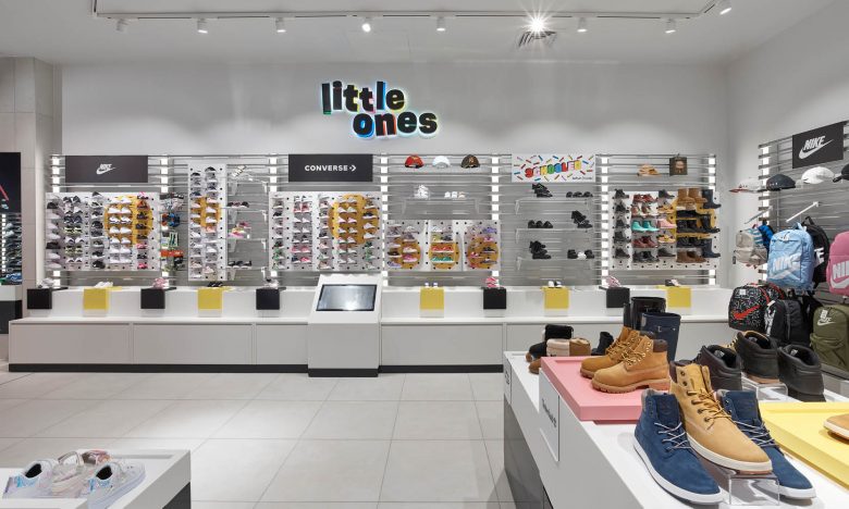
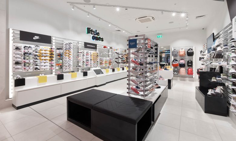
The concept creates a store of two integrated halves. The front section of the store features black walls, a high ceiling again in black and vibrant juxtaposition multi-coloured lighting bands that appeals to older kids. In contrast the rear of the store transforms into ‘white’, with white finishes and a lower ceiling. This changes the mood and creates a more intimate and calmer space for ‘little ones’.
The space is fully flexible to enable dynamic merchandising and fast reaction to trends. Digital screens and flexible components are easily moved around the space, allowing the creation of different brand stories throughout and providing infinite flexibility moving forward.
https://bit.ly/3jZyDo7


Add to collection
