As the outside world continues to induce unease, brands like Chimi are turning to the meditative architecture of temples for retail inspiration. Shopping has become a largely soulless, stressful outing lately – something we discussed in our recent FrameLive discussion on post-pandemic retail design. Our senses (and our dried-out ever-sanitized hands) are suffering, leaving us craving more calming – and even meditative – experiences. A series of recent projects to cross the Frame editorial desk provide just that, a movement we’ve unpacked and labelled Monastic Modern in Frame 136’s Look Book. Just as stepping inside a medieval church can take the edge off a scorching day, this typology can offer a sanctuary from the heated distortions of the world outside.
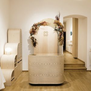
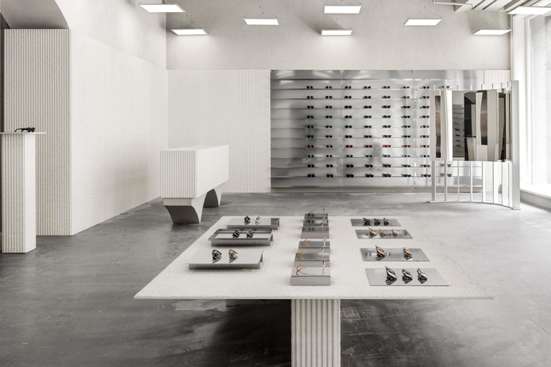
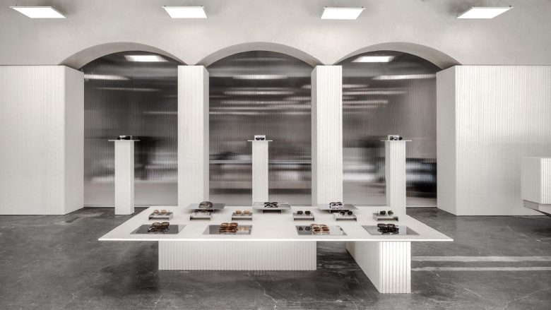
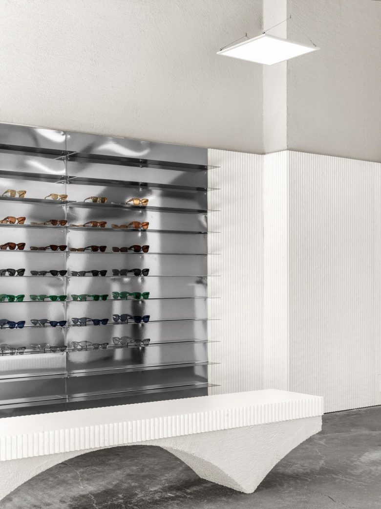
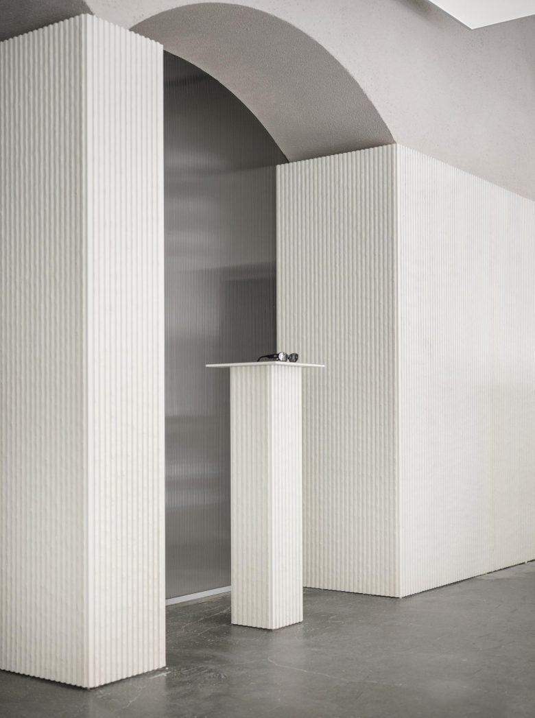
One such space is for Stockholm-based eyewear brand Chimi and comes from Campus (formerly Guise and 42 Architects), with creative direction from Nineties. The designers were inspired by ancient architecture, reimagining pillars and arches into a modern structure. Arches, indeed, are prevalent in the Monastic Modern movement. As Rosamund Picton and Kourosh Newman-Zand of semiotics agency Axis Mundi noted when analyzing the design codes of the tendency in Frame 136: ‘Arches dominate, either gently structuring vaulted ceilings or as smoothly rendered archways peeling off of long corridors. The repetition of archways or of spotlights and small windows elicits a meditative perspective. Table surfaces are proffered as slab-like altars or empty plinths, clearing territories for ritual ablutions or quasi-religious offerings.’
Nineties says that ‘as the mere existence of retail is being questioned, we wanted to create just as strong an offline experience as Chimi has online’. To do so, the design team translated textures and materials associated with temple architecture to ‘take the brand to a new level of tactility’. The interior relies heavily on contrasts: massive volumes meet thin lamina and broken arches. Walls shift from coarse-grained plaster to ribbed panels to sheet metal.
As summed up by Picton and Newman-Zand: ‘In an age of acute anxiety, spaces [such as this] affirm the truth and simple ‘there-ness’ of substances, both solid and vaporous or nearly imperceptible. It’s hoped that the obfuscation of purpose and the clearing of physical space
can prompt the clearing of cognitive space.’

Add to collection
