To rebrand a traditional Chinese restaurant
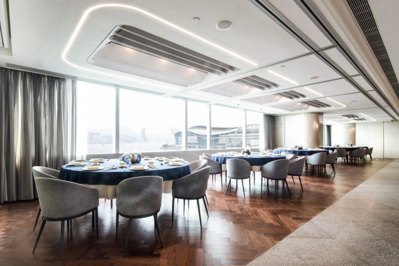
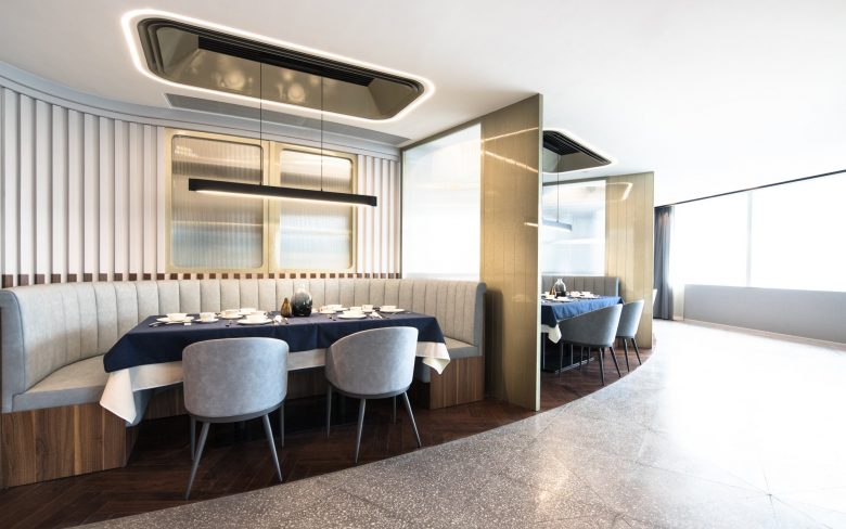
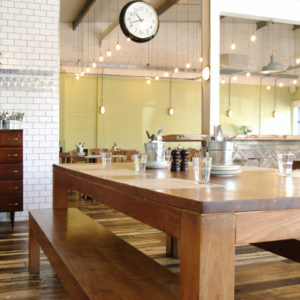
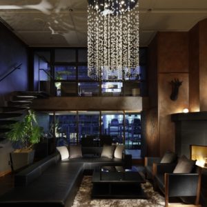
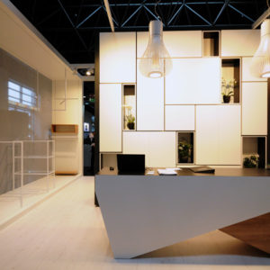
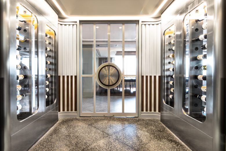
In this project, we would like to give a new image to the brand that reflects the its continuous evolution. The elegance of traditional Chinese style is reinterpreted into today’s modernity and to fit into the overall space with a touch of French style.
Usage of desaturated color tone
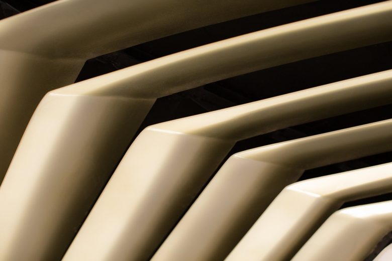
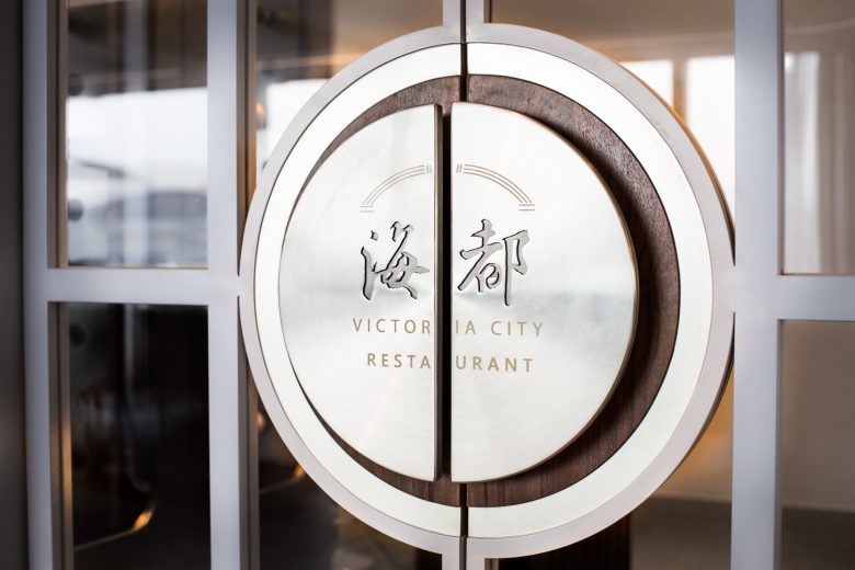
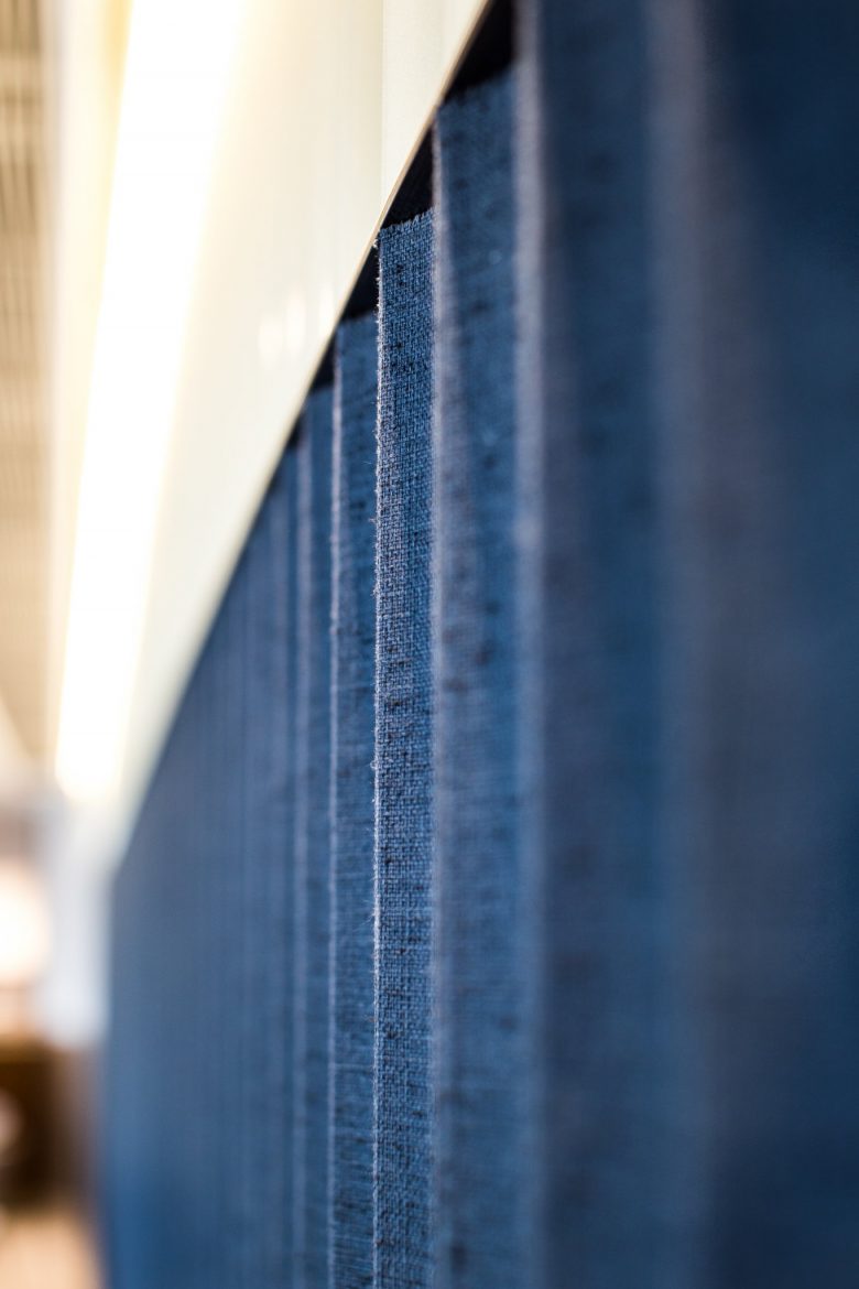
Instead of massive use of red color in traditional Chinese restaurant, we have applied navy blue, grey and white as the main color palette to feature the elegance in a desaturated state. The touch of matte gold color offers a grand atmosphere with a modern sense. Marble stone corresponding to wooden linings symbolizes the fusion of new elements to Chinese culture.
