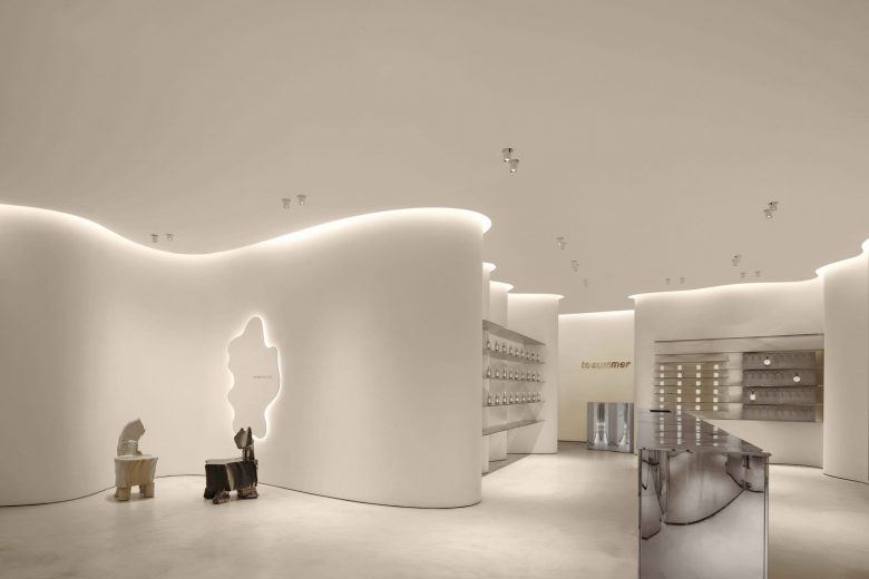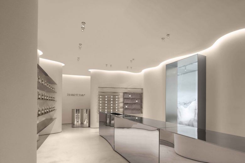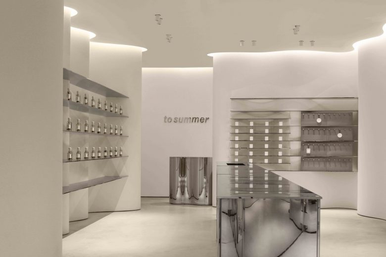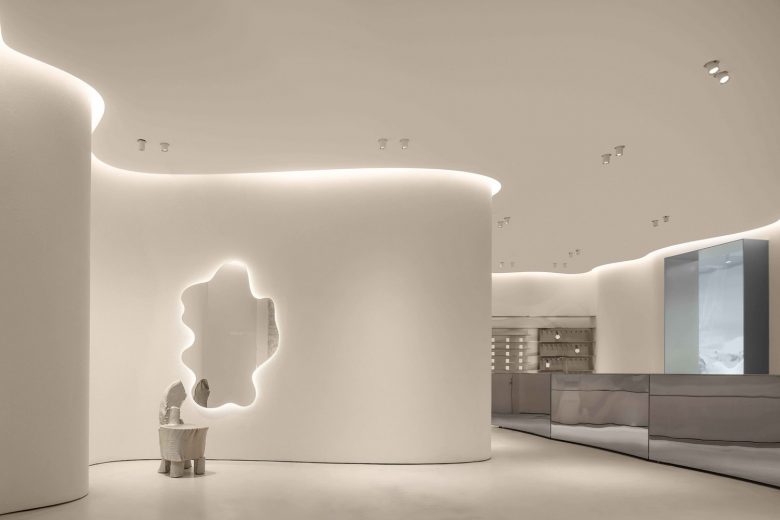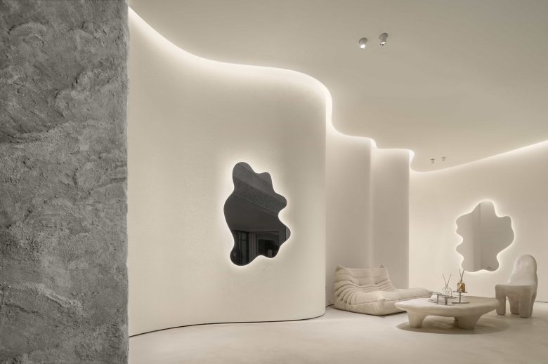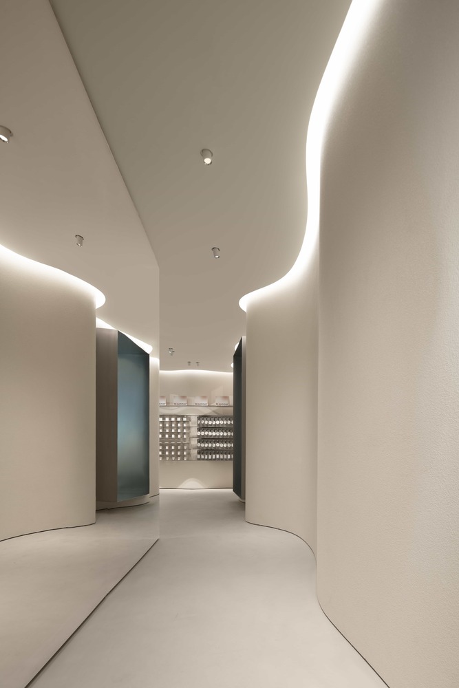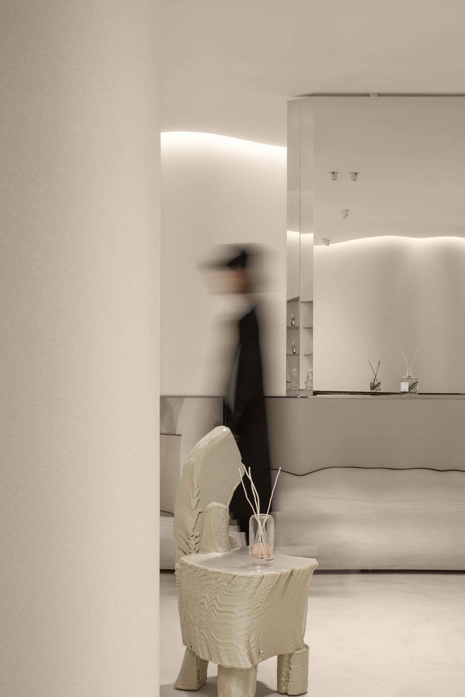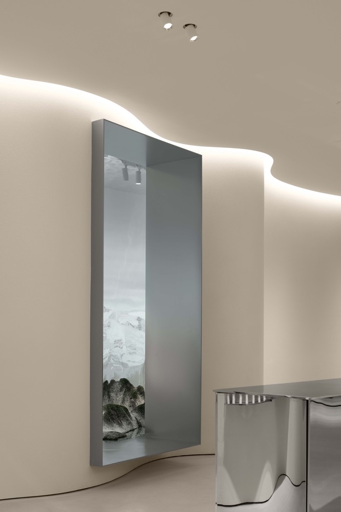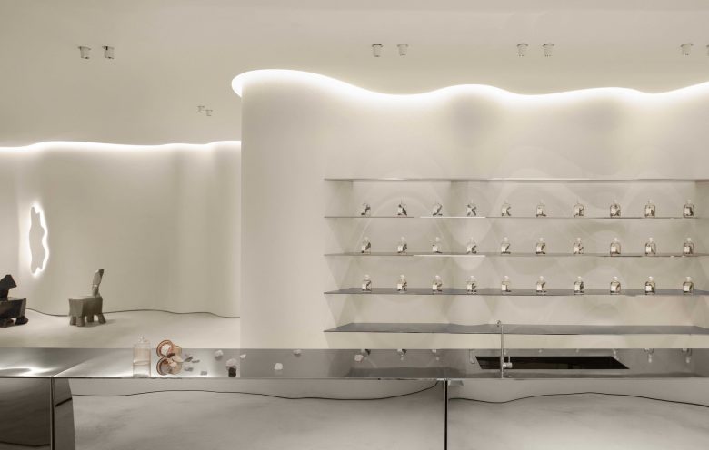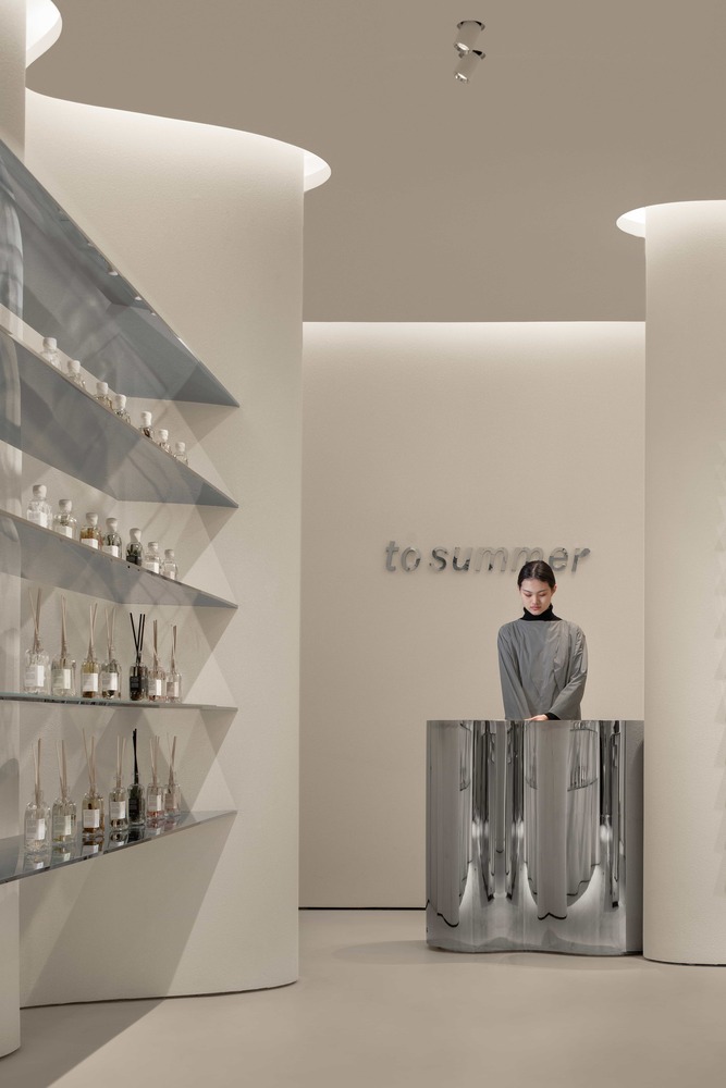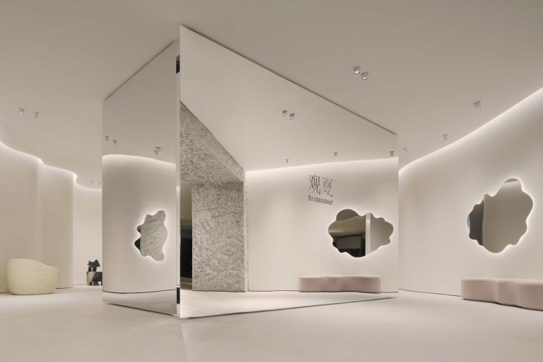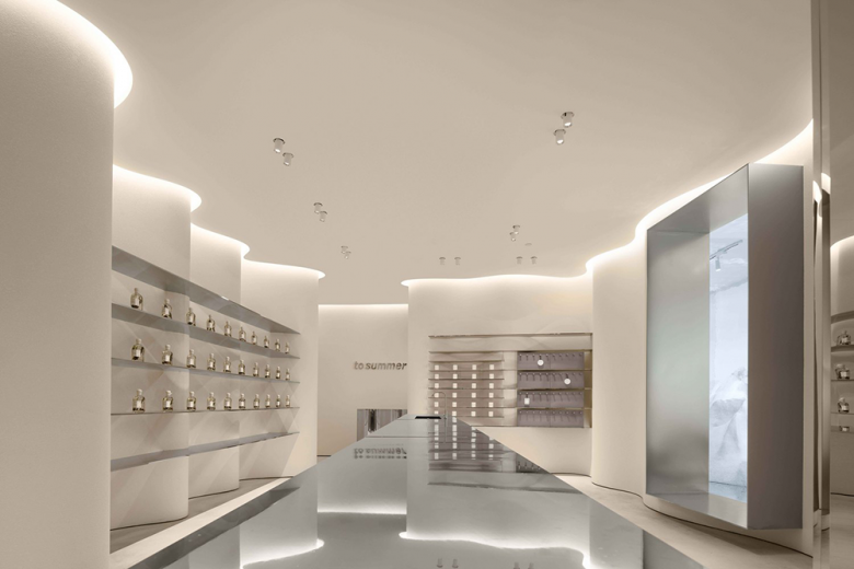
The new oriental original aromatherapy brand “ToSummer” announces its first off-line flagship store, the “ToSummer living room”, located on the ground floor of Taikoo Li North District, Sanlitun, Beijing. With its inviting combination of streamline and curved surfaces, the design transforms the 170m² space while leading visitors to naturally follow a circular flow. With the extensive use of mirror effects combined with continued light, naturalistic materials, and colors to enhance the ambiance of the space, visitors stop and linger to savor the experience. This is exactly the “living room” atmosphere that the owners sought to create – to inspire an emotional feeling between domestic and social, communication and comfort.
The brand’s concrete requirement for this space design was a “Modern Cave”. The designer chose not to directly create the natural appearance of caves but, instead, presents the characteristic elements of material textures to inspire the sensory experience. It transforms the original cave concept into spatial language, integrating it into this realistic space full of modern Oriental feeling to present a delicate balance between commercial and art, domestic and public realm, natural and artificial.
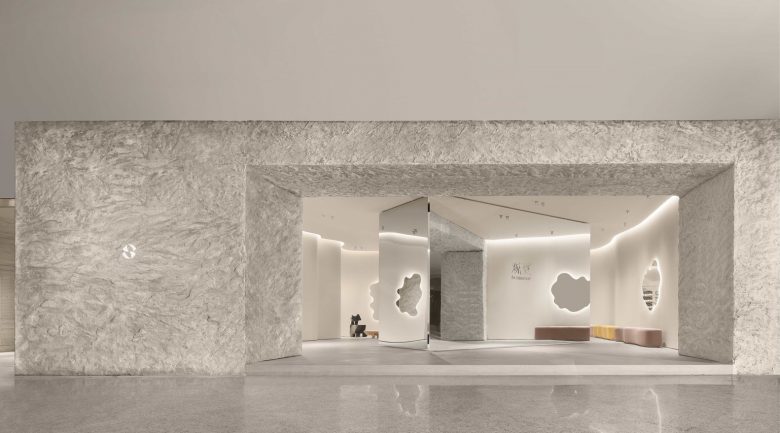
In contrast to the straightforward window and entryway of standard commercial storefronts, this experience space offers a facade of coarse gray-toned imitation-stone. The floor at the entrance is raised and retreats while the lighting within is soft and subdued, forming a significant alternative to the noisy, fast and bright shopping mall spatial experience.
The irregular-appearing interior space has been intricately designed and adjusted. It is naturally divided by a “metal screen” at the entrance and along a central island into the “living room” experience area in the front, the exhibition and retail area in the middle, an independent art installation space, and the cashier area at the back.
In their midst, the mirrored metal screen at the entrance echoes the curved wall and streamlined mirror so that the “living room” is naturally divided into several small interconnected blocks which perform their own functions. The designer incorporated flexibility to spaces, enlarging the adaptability to different exhibition forms.
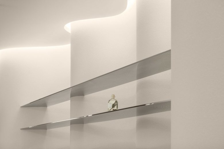
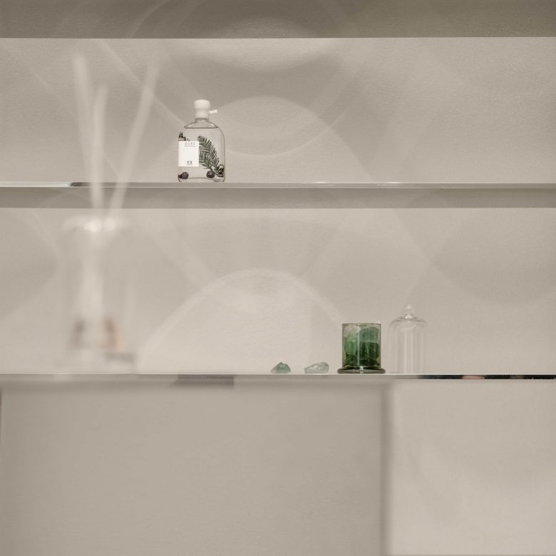
While the exhibition area is composed of shelves and a central island platform comprising a mere 25 m², it reflects the efficiency with which space was designed. The direct “intertextuality” of the metal island platform, shelves, and the curved wall presents the products like works of art, achieving a powerful imprint of the brand.
The whole indoor traffic line is connected through a U-shaped channel. When entering, the visitors!” flow is naturally streamlined through the spatial design, decoration and mirror reflected scenery, forming a positive and negative effect like a camera lens, however, space offers viewers a sense of security.
Architects: F.O.G. Architecture
Design Principal: Yu Zheng, Di Zhan
Design Team: Shaokai Hou, Chuyang Zhou, Aijie Xiong, Vince Choi, Shidi Fu
Photographs: INSPACE
