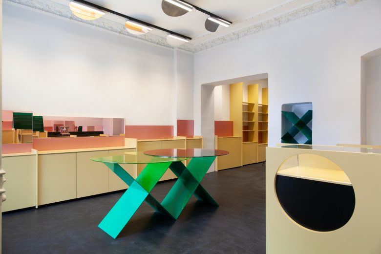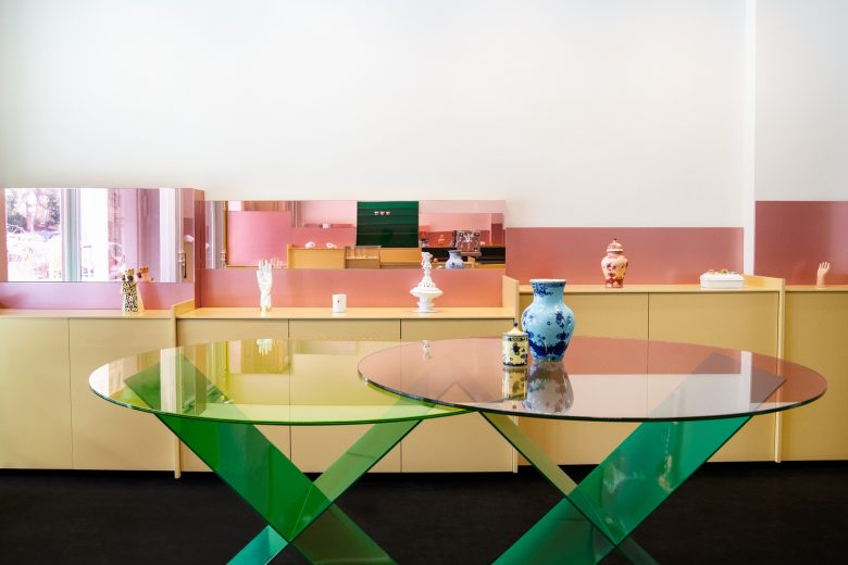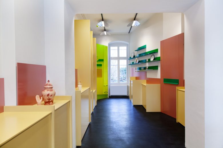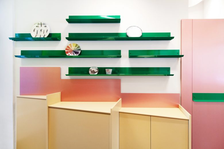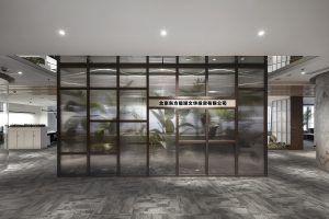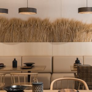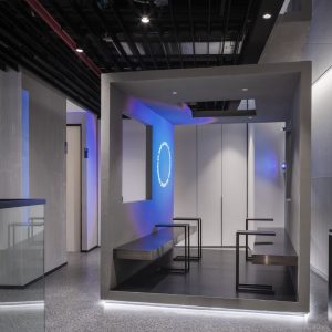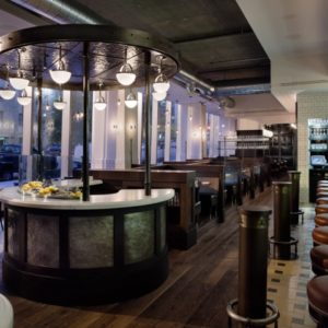
After opening the MDC cosmetic and institute for cosmetic treatments MDC cure, Melanie Dal Canton has commissioned Gonzalez Haase AAS to continue their cooperation and design the third venture, MDC next door in the neighbourhood surrounding the Wasserturm in Berlin’s Prenzlauer Berg. The MDC next door beauty and concept store is designed as a cabinet of curiosities for everyday objects, boasting a cheerful display of thoughtfully curated items and in-house collaborations.
For the new venue, the need for beauty and lightness in domestic objects became abundantly clear. This same lightness is what was sought by the architects, responsible for the design of all three of Dal Canton’s businesses, in approaching the complete renovation of the next-door store.
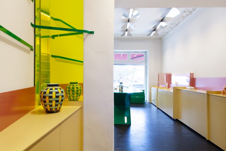
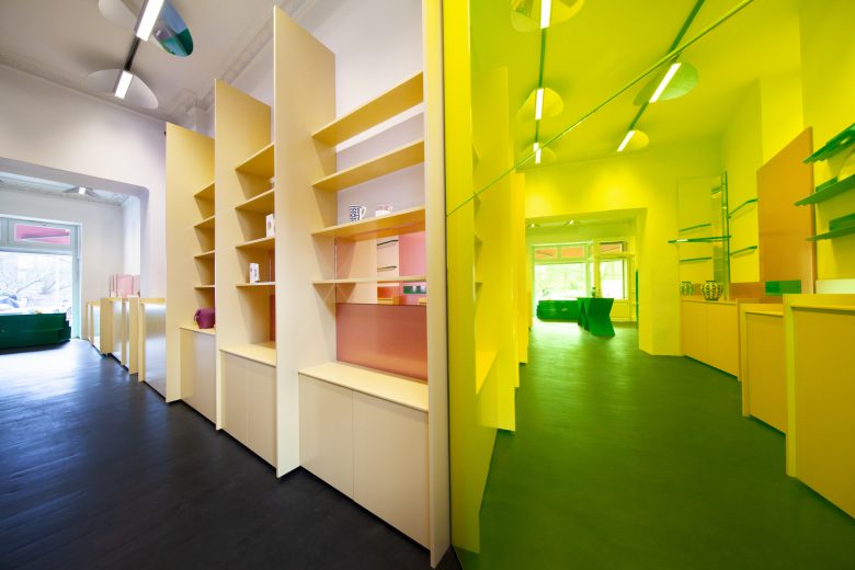
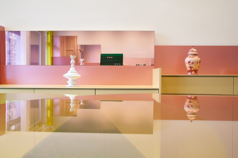
“Sunlight was the key for our design. Using mirrors and transparent overlays, we wanted to enhance the natural light and mimic its radiance wherever possible. When it comes to the overall structure, it all starts with the state of the premise at the start of the project. At MDC cosmetic, at MDC cure and now also at MDC next door, it was the existing rooms that significantly influenced our design – the ceiling height, the layout of the stairs and entryway, the naturally available light, all of this ultimately has a significant impact on our idea for their design. Then we tear down everything that exists to expose the structures. We go to work like sculptors.”- Judith Haase
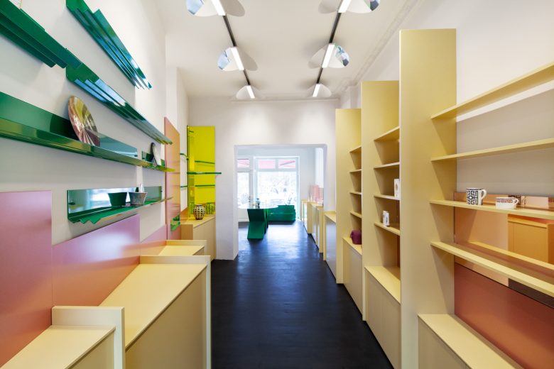
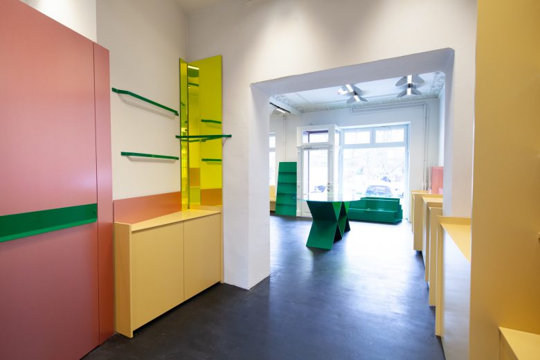
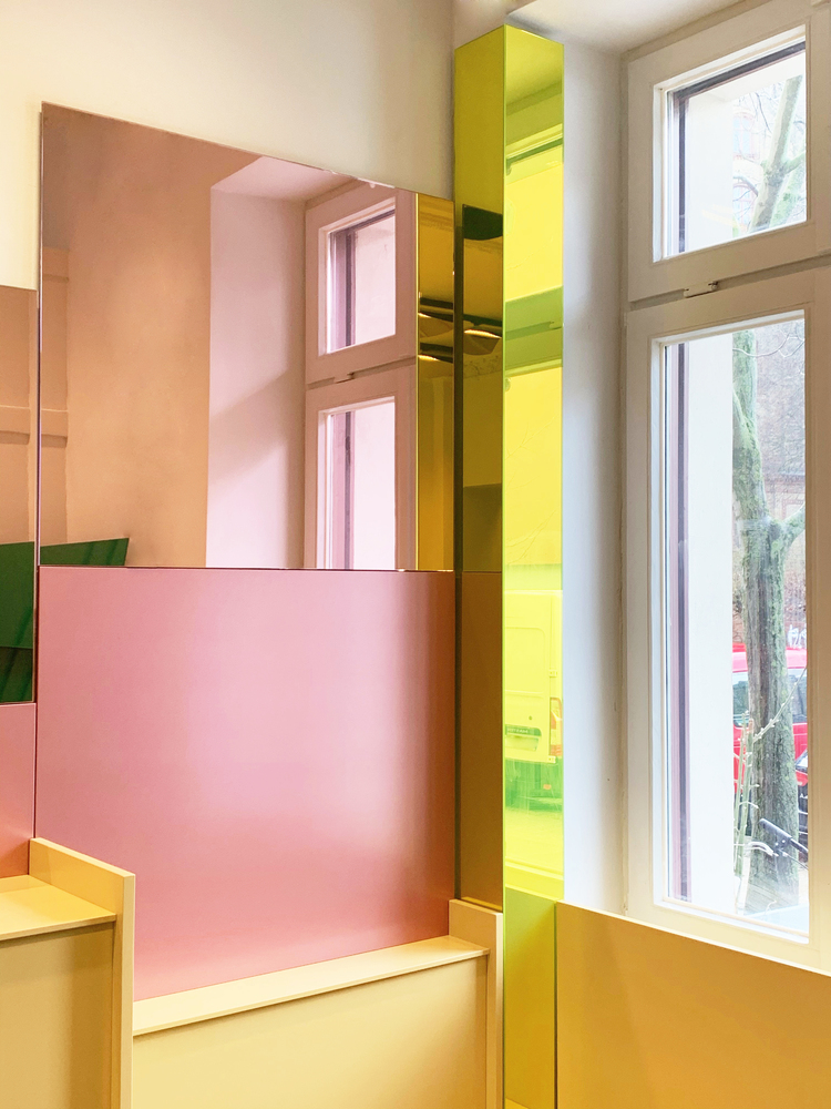
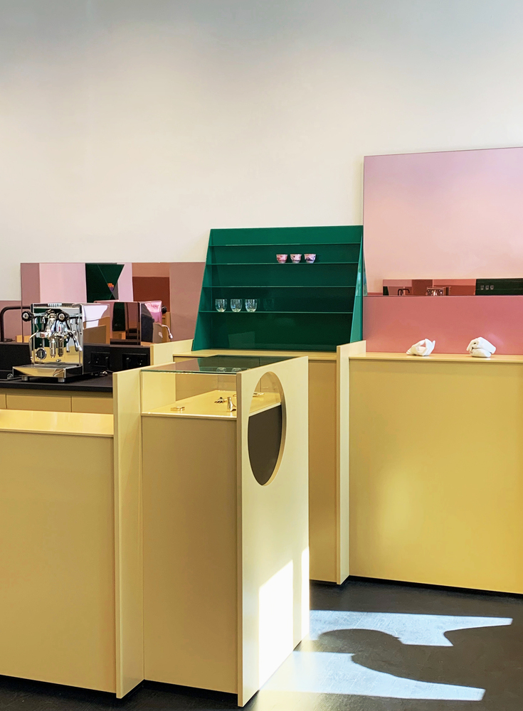
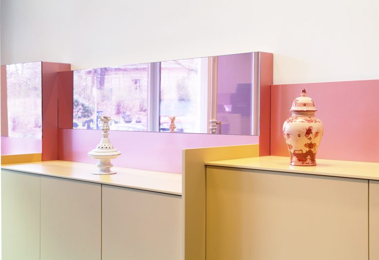
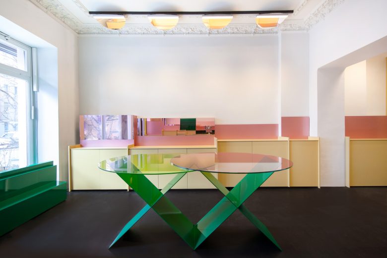
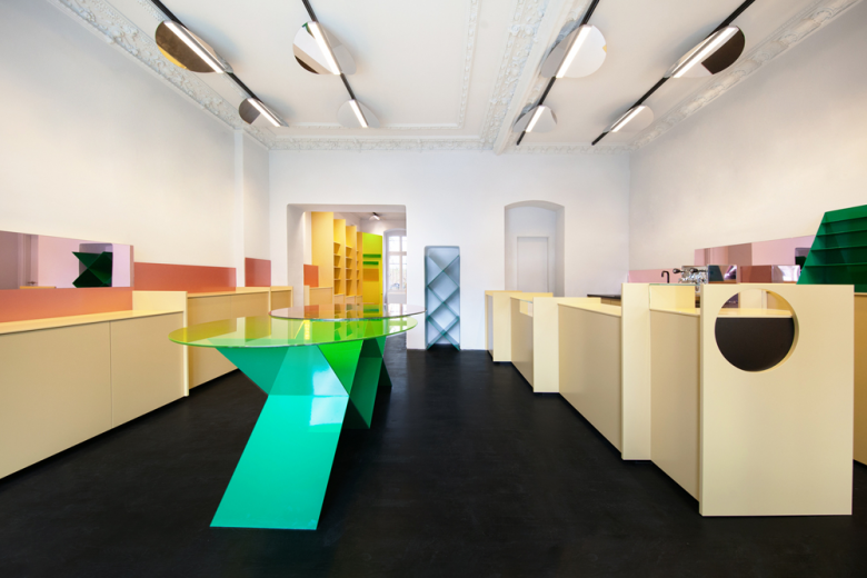
At MDC next door, a natural light axis is created by a diagonal wall that connects the front and back windows, underscoring the deep length of the space. Yellow vertical mirrors and rose-coloured mirror sequences, set at eye level, extend the space through the reflection of sunlight, in emblematic tones for natural connection. Each freestanding furniture element in the space is lacquered in a poppy green, set against the black monochrome flooring to enhance the store’s playful colour code.
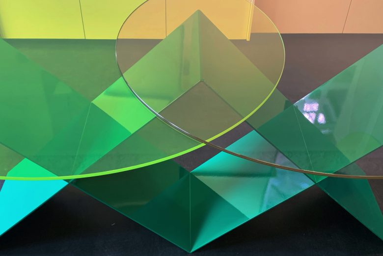
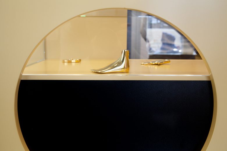
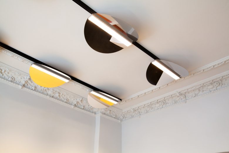
Drawing inspiration from Gordon Matta-Clark’s sculptural “building cuts”, the architects explore the limits of architecture with circular elements throughout the space in various scales and materials. A black cut-out at the register, round overlapping mirrors but most apparent in the twenty-four stainless steel polished light shades installed in a lively progression on the store’s ceiling.
Architects: Gonzalez Haase Architects
Photographs: Mirko Zander
