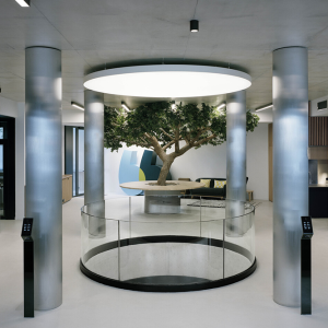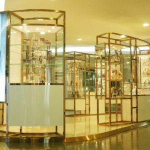
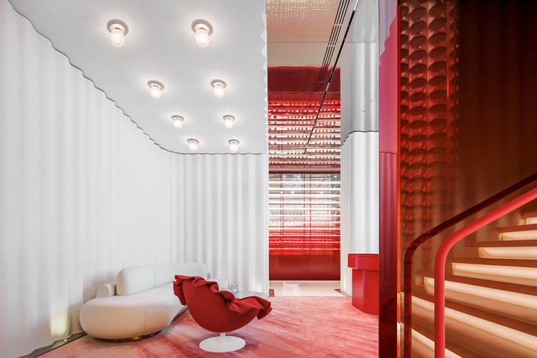
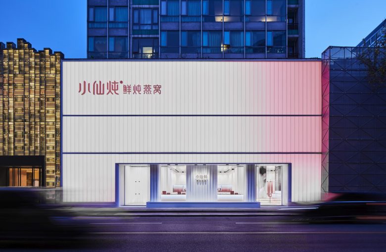
XFSEBN promotes a brand-new Chinese style nourishing product, which is growing fast in the Chinese market. As the first offline store, and experience center, XFSEBN has entrusted its design to Leaping Creative, reputed for its competence in retail brand experience design. The project, neighboring the luxury shopping center SKP, Beijing, China.
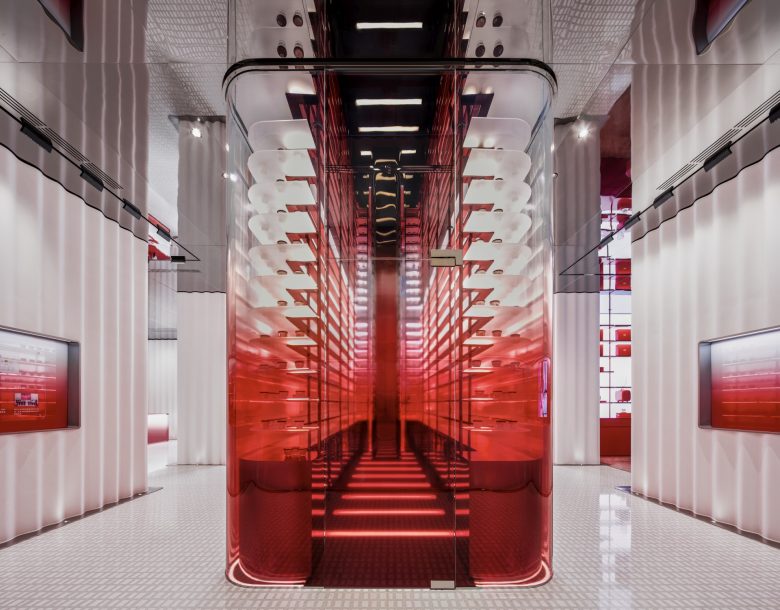
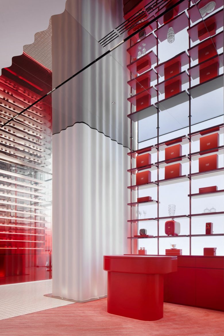
For its enclosing surface, the designers apply U-type glass to create a continuous vertical profile. In the channels of the U-type glass sheets, a dynamic lighting system is installed to produce a peaches-and-cream luster, achieving a visible brand-promotion effect. Inspired by the mild smooth and soothing taste of bird’s nest soup and its nourishing effects in producing a peaches-and-cream complexion, the designers adopt “translucent” and “flowing” to express their design ideals, aiming to endow various building materials with new spatial representations.
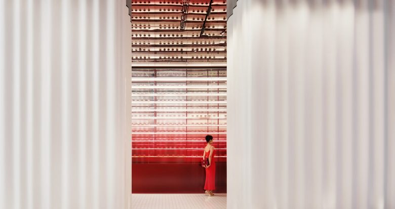
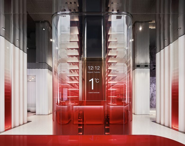
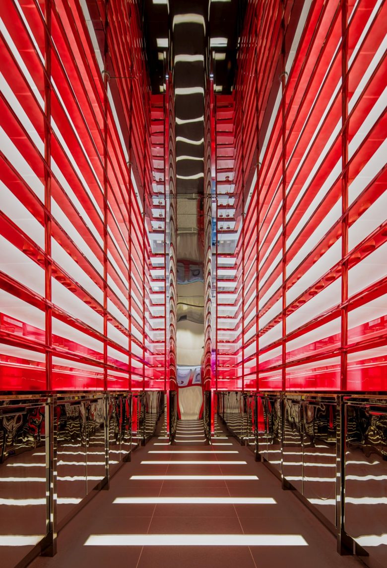
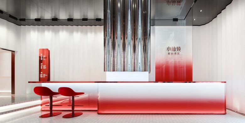
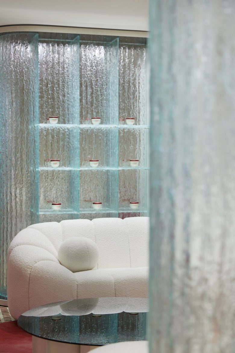
In order to create a sense of bird-nest like feeling, after many testing, designers from Leaping Creative choose the translucent white dupont corain, which are largely used to shape the seamless curvy and continuous wall throughout the 1th floor. As the heart of the interior space, the refrigerant area made of glass has incorporated the brand concept “freshness”in its designs to ensure the best nourishing effects. Since there is only one product category, the design team has included a module for scientific knowledge and culture in addition to product display area, boosting an immersion experience for customers.
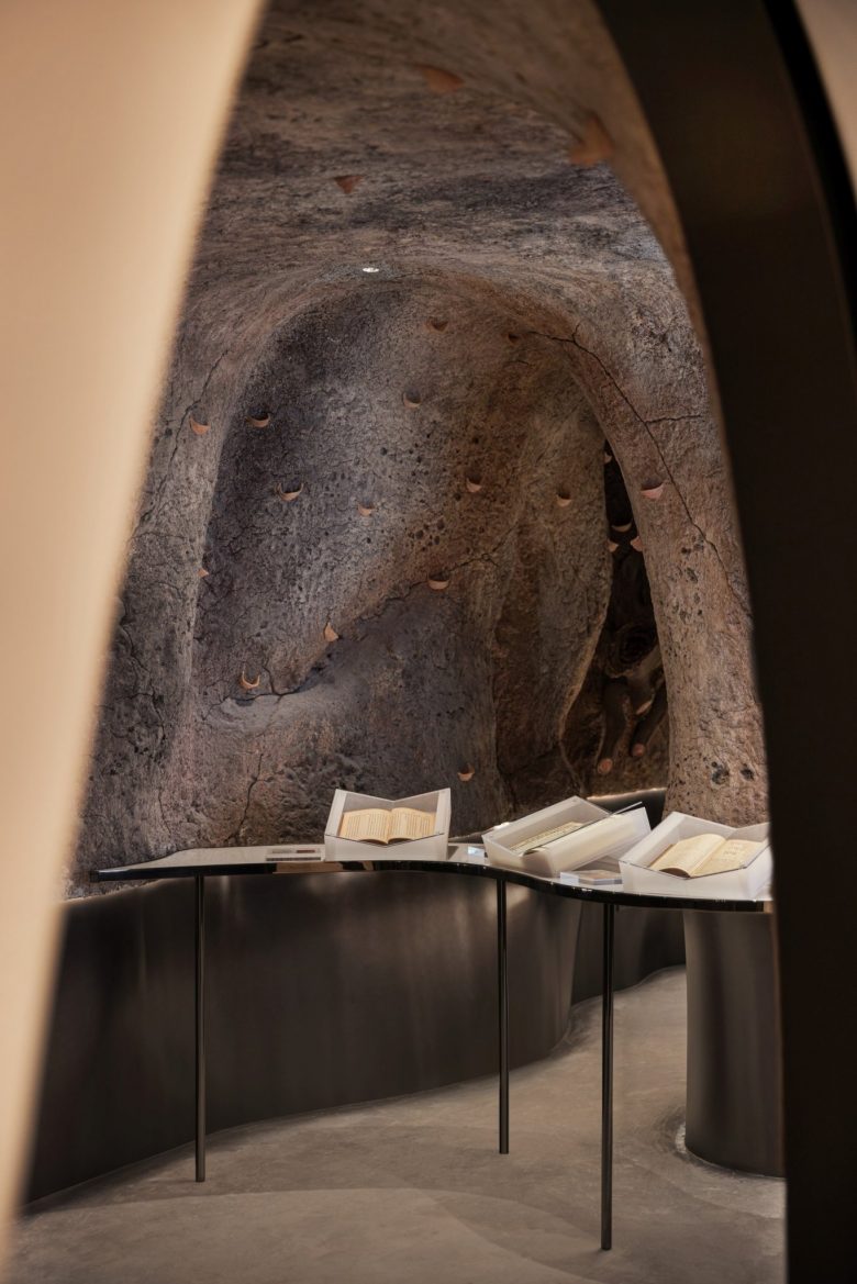
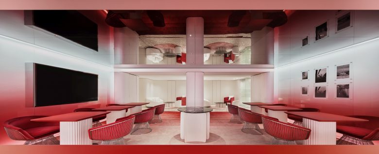
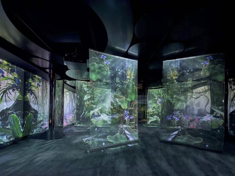
The first floor is founded as a retail store for the touchscreen interaction, product display and after-sales service areas, which composes a space for a holistic offline image. In order to arouse customers’ curiosity,on the second floor, Leaping Creative implanted a cultural scenario to simulate the living conditions of swiftlets, including their caves, rainforest and modern swiftlet houses. The third floor functions as an appreciation and partying area.
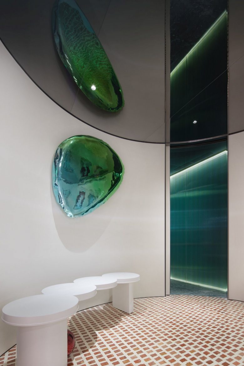
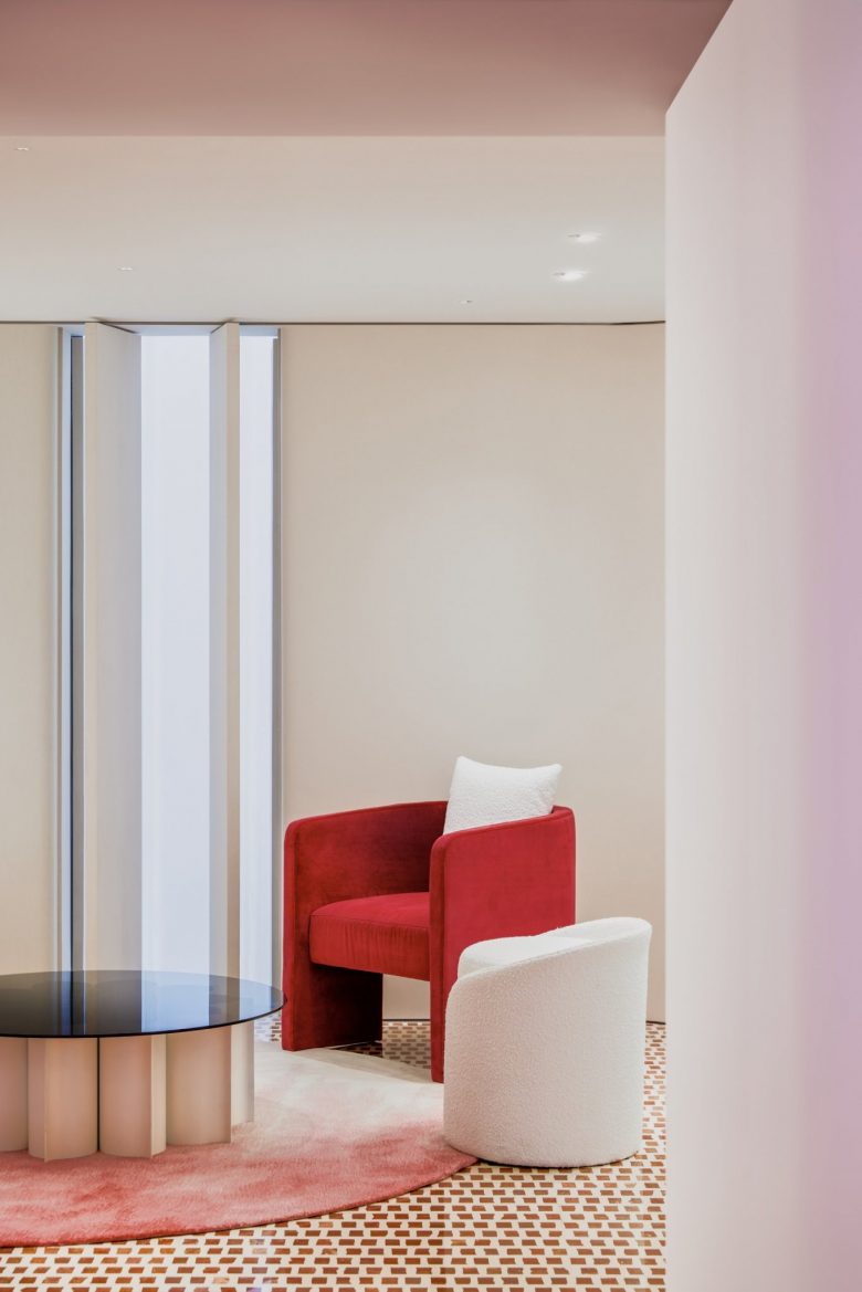
Upon the peaches-and-cream basic tone, the designers introduce a brisk dark green for a change and for a distinct spatial impression. Leaping Creative has studied different materials on luster and translucency, aiming to represent the direct visual impact of the product–soft, smooth and moist. Such contrasting is still performed on site, to find the most nicety cream-to-peaches color in a real scenario. Leaping Creative, as always, employs a contemporary language to express tradition culture. We design the space by using different textures and stressing distinctive colors.
Through shifts of light and shades, multimedia interaction and contrasts of different materials, showing a delicate and immersive experience space. Meanwhile, the key concepts of the brand are conveyed in our unique spatial expressions.
Designed by Leaping Creative
Add to collection

