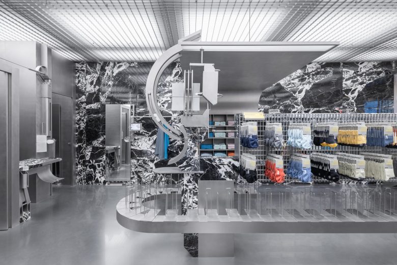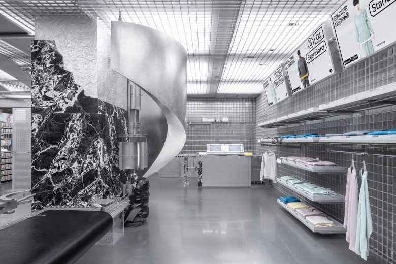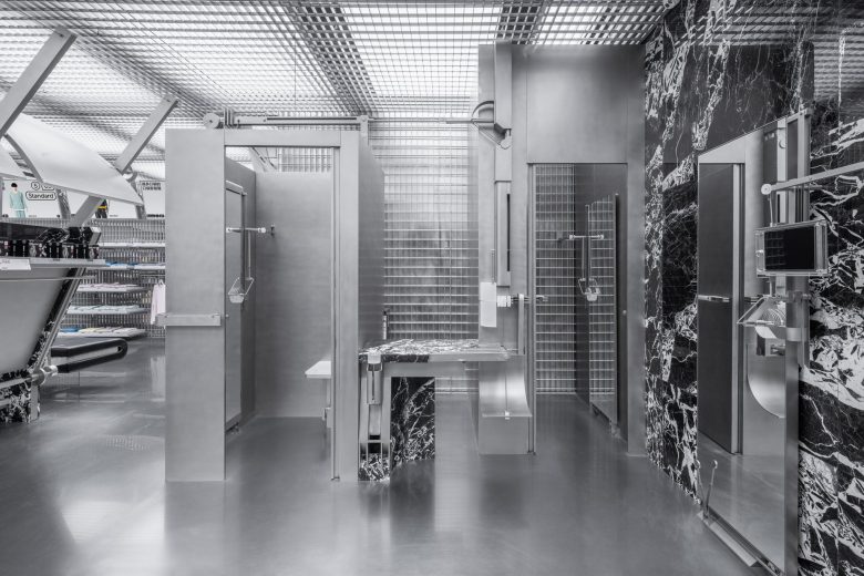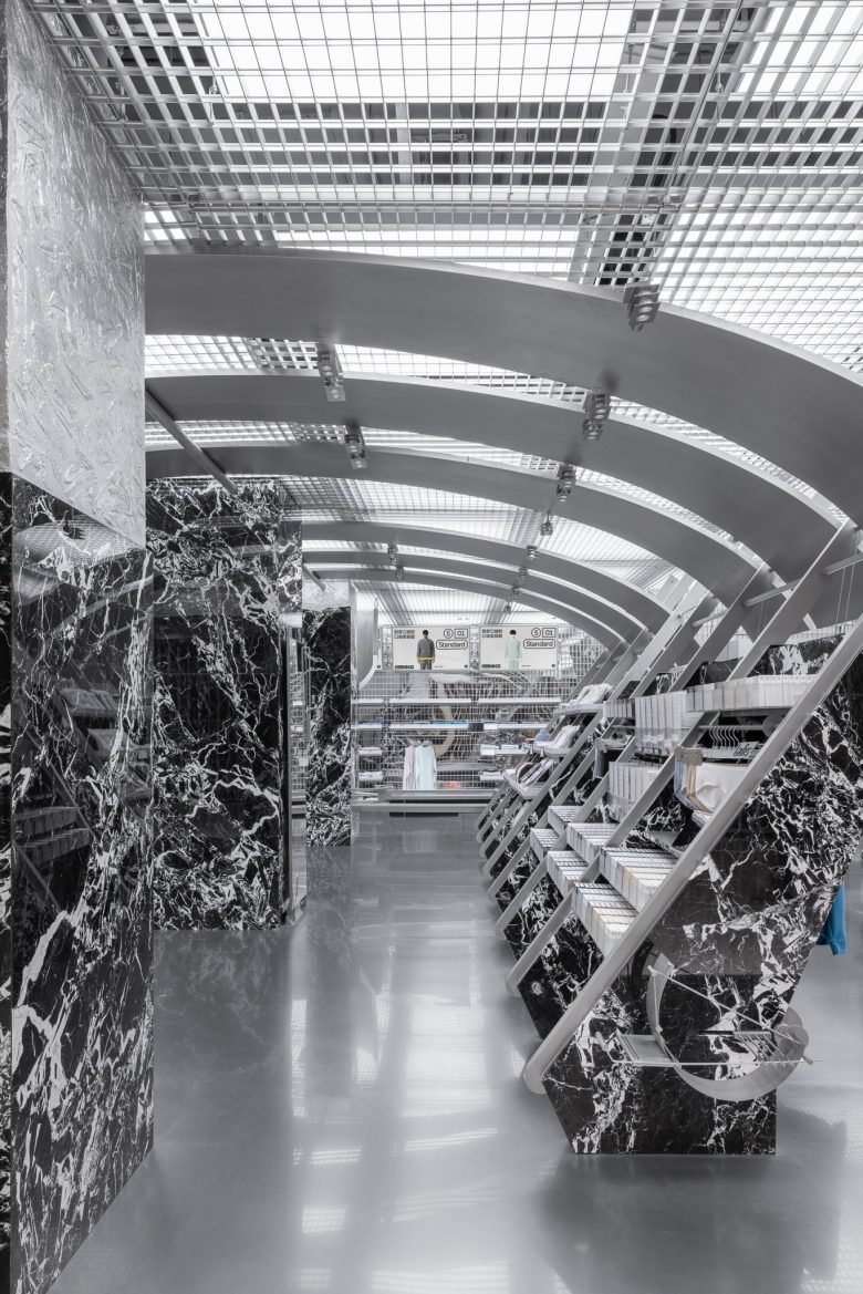
The Bananain Concept Store Hangzhou’s grey-scale interior offers its own rendition of immersion, evading the traditional experiential retail space.
Key features
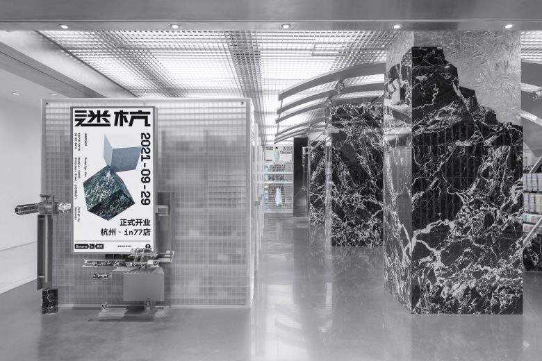
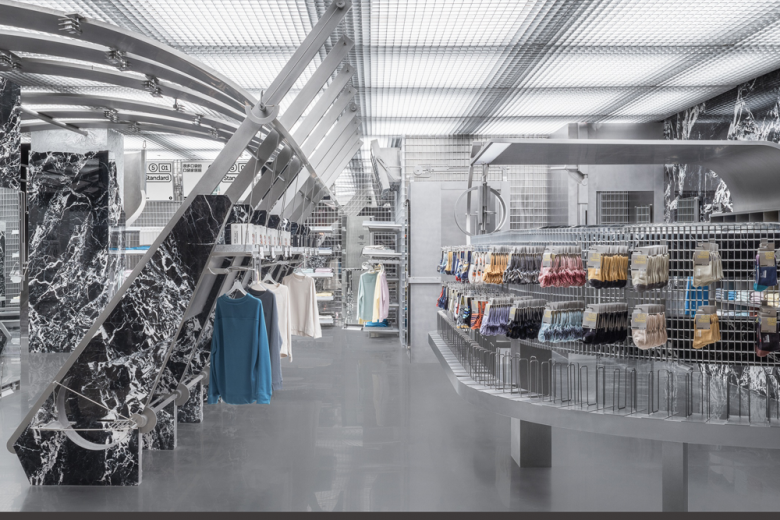
Chinese retailer Bananain offers wardrobe basics like undergarments, but for its concept store in Hangzhou, Some Thoughts Spatial Design and Research Office certainly did not take an understated approach. Some Thoughts drew inspiration from an abstract portrayal of our surrounding environment to inform the space; ‘The structure and constraints of the real world are like a grid without coordinates, representing the uncertainty in a certain order, which guided our approach to the retail space,’ the design firm describes.
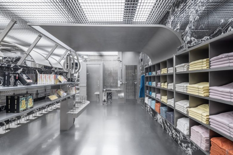
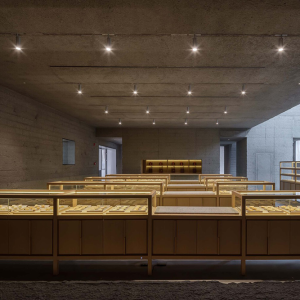
The space is fashioned with a greyscale palette of black, white and metallic grey, and materials including marble, metal and opaque glass. Stone masses form columns and shelves, partially lining the store’s walls. Aluminium grids span the store’s ceilings, serving as continuous as modular display shelving. Meanwhile, cambered ceiling panels intersect with the vertical marble columns and angled metal beams on either side. Below, metal-grid display shelves hold a selection of products.
Frame’s take
In Frame 145, semiotics agency Axis Mundi investigated the design phenomena of ‘dark retail’ in which ‘disruptive retailers are challenging the prevailing orthodoxy, designing spaces that renew the status of the retailer as creative instigator and that affirm the phenomenological stability of the product.’ As one of the spaces featured in the look book, the Bananain Concept Store Hangzhou embodies the essence of the undercurrent aesthetic movement.
By depicting the spatial concept abstractly, the retail space and those like it ‘resist consumer immersion or participation’, as described in Frame 145. Through this, the studio evades the typical, plot-forward structure of a spatial narrative and rejects the immersive, story-driven experiential retail space typical of the moment. In doing this, the space – ironically – creates its own experience. This frees customers from the burden of traditionally immersive retail: as Axis Mundi wrote, ‘released from the prevailing moral imperative of participation and self-becoming, the consumer is free to unspool and unwind in moody, oppressive reverberations.’
Designed by Some Thoughts Spatial Design and Research Office
Photography by SFAP
