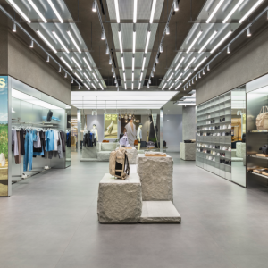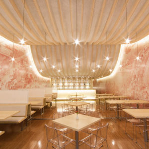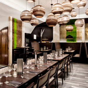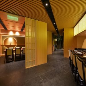
Zendesk‘s internal branding team was tasked to redesign their offices without the assistance of external architect involvement in London, England. The Zendesk London office firstly opened its doors in 2015. A few years and a rebrand later, it was in need of a refresh, to align both with current Zendesk brand guidelines and mostly, with a new post-Covid reality. The in-house Zendesk Brand Team took on the challenge to re-design the whole floor without external architects involved, assisted on the operational side by other Zendesk teams as Workplace Experience, Real Estate and IT.
In 2020, the process of reimagining a Zendesk post-covid office started by a companywide survey which made apparent that people found it easier to do focused work from home but that collaboration, interaction and problem-solving practices were far better achieved in person. From this starting point, the new London office design was developed keeping in mind the 3 main principles Zendesk has been applying to his new workplaces: Building a sense of togetherness, embracing the digital first approach without sacrificing opportunities to connect with each other in person; keeping collaboration at the core as a key element to attract top talent and promoting the employee experiences that have long defined Zendesk culture.
Zendesk offices are spaces that enable people to meet, work, and host the Zendesk way. To put a very fine point on it, they are the living embodiment of the Zendesk brand. An office is a multi-sensory experience for the customers, employees and guests, it reflects Zendesk messaging and the brand aesthetic in that they’re built to foster better relationships. Any office concept needs to be based on the design ingredients set by the Brand team to standardize all physical brand expressions. They are the baseline for any Zendesk space. In addition, a bespoke approach is taken for each office project as recently done for the new Zendesk Montreal and Krakow offices. Local unique features are introduced on top of the base layer of Zendesk standard design ingredients to turn each office unique and connected to the city and community it will live in.
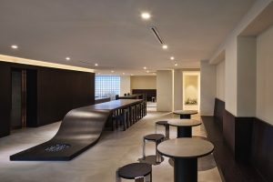
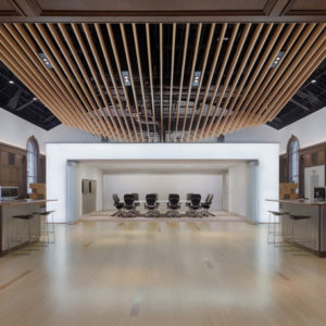
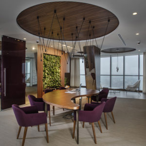
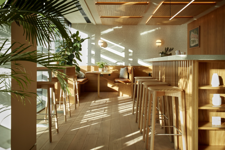
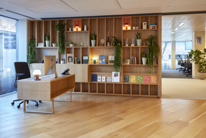
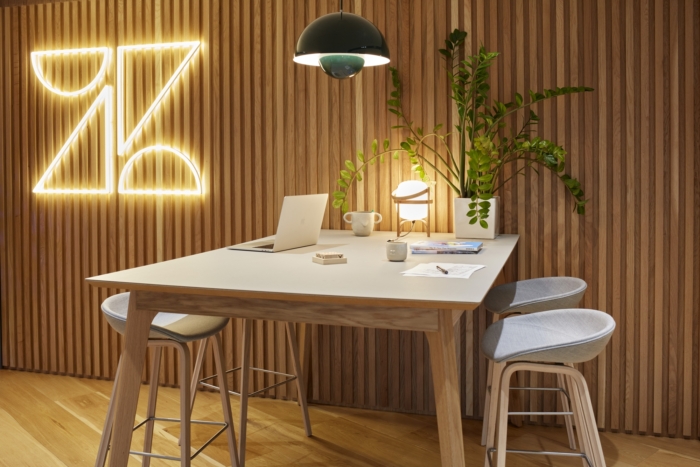
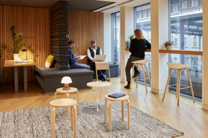
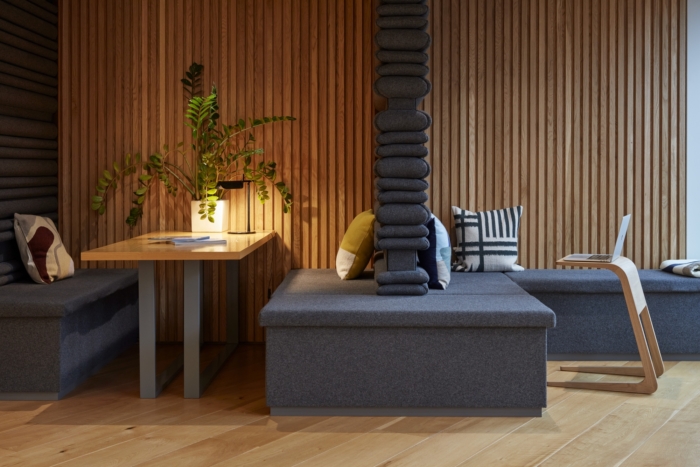
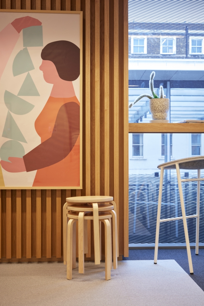
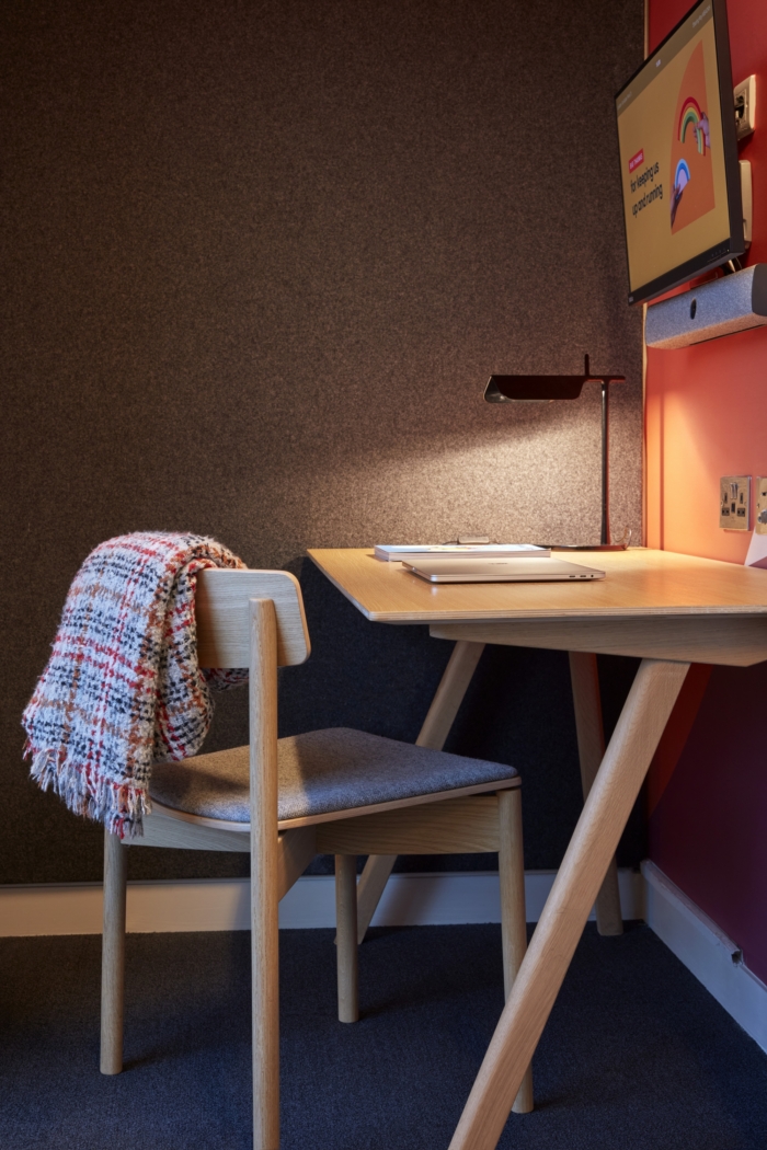
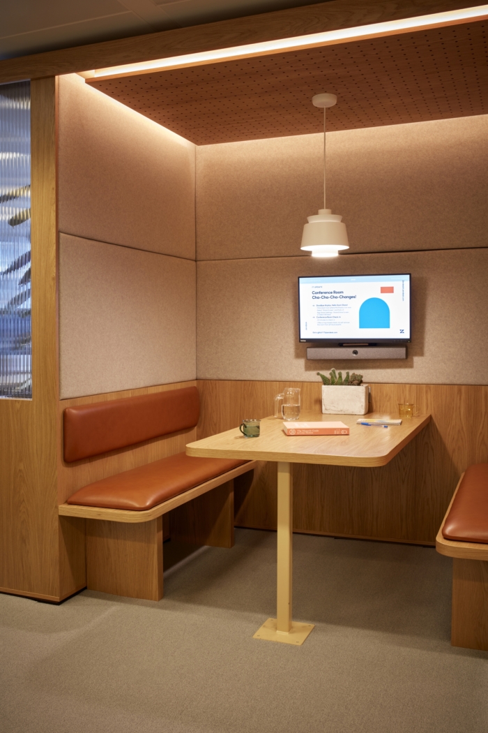
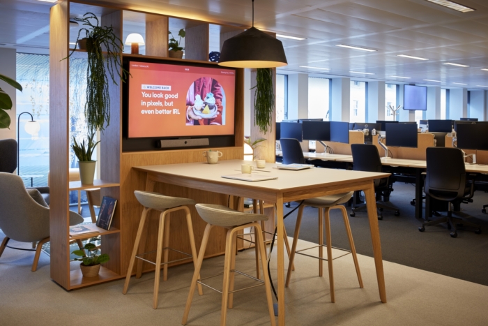
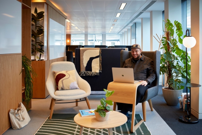
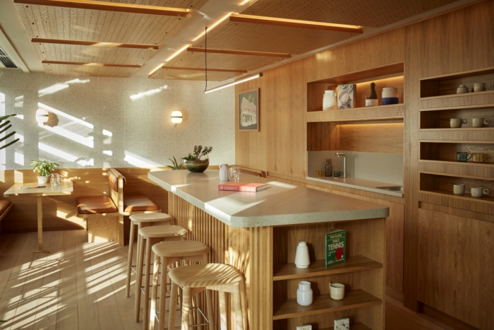
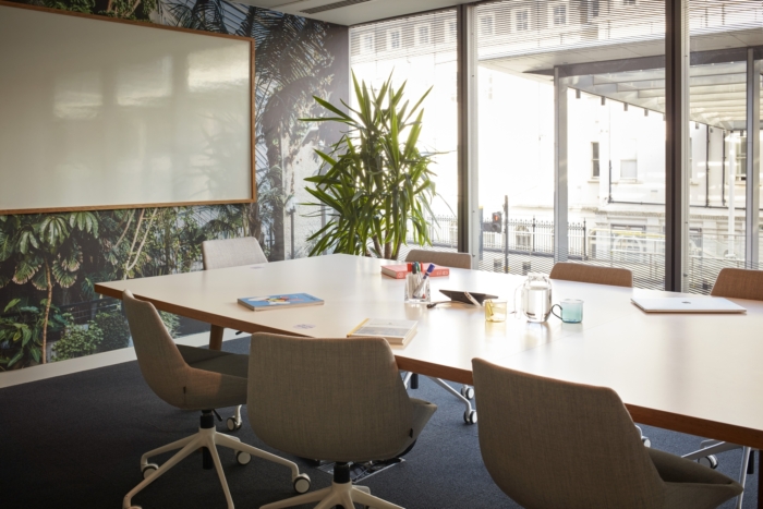
Thanks to the removal of several workstations and the introduction of collaborative spaces, the floor now presents a clear journey from public to private, with a reception space fully equipped both for hosting visitors and for collaboration, with a mix of lounge furniture, high tables and booths. From the reception area it’s possible to access both a more public and more private area. The public space is aimed to spark employee connections and it is equipped with a kitchen, an event space and a new signature cafe. The latter has been designed taking inspiration from East London historic cafes, adding an extra layer of Scandi flavor, to homage the Danish heritage of the company. The private area is aimed for all sorts of collaboration and focus work. A first section is made of a mix of welcoming informal collaborative corners and workstations. These spaces have been designed keeping employees’ wellbeing at the core, introducing human and warm materials, plenty of greenery to breathe life into the space and many pockets of light to shape an inviting environment. This same path will then lead to the focus area, with several workstations for head down work. Meeting rooms of different sizes are spread around the whole floor to ensure that in person and remote collaboration spaces can be available everywhere.
Design: Zendesk Brand Team
Design Team: Giuseppe Cariello, Chris Taylor, Sarah Johnson
Project Management: CBRE
Contractor: Apex Design
Furniture Dealer: MJ Flood
Photography: Heiko Prigge





Add to collection
