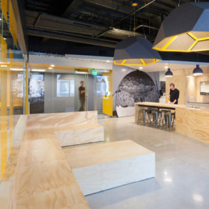
Crone had been in its Kent Street premises for 25 years where the staff was spread over three levels with little connection between the practice and visiting clients. So, they began to search for a new location. Crone recognized the potential for this space that was originally earmarked to accommodate an indoor lap pool and fitness center. Level 18 (just above podium height, but with grand views north down George Street) had been used by Ernst & Young as their mail and storage room for over ten years. It was dusty and dirty with giant compactors dotted around the floorplate.
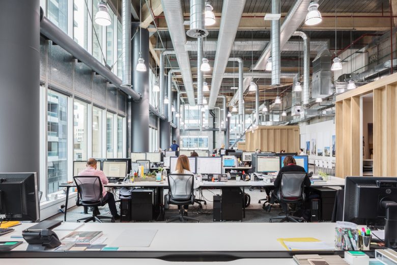
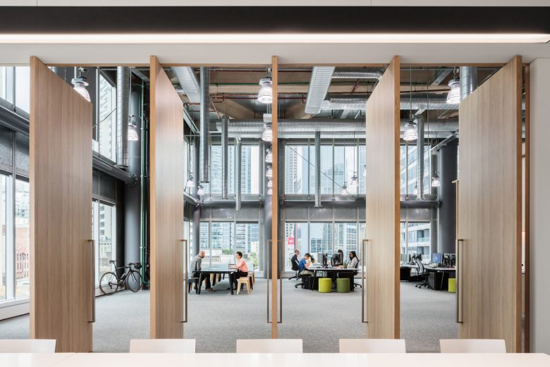
Although at 850 square meters with a 7.2-meter floor-to-ceiling height it is anything but small-scale, Crone’s new studio at Sydney’s World Square is a stunning metaphor for an architectural practice renewing itself. Its huge space and fully glazed north-facing façade make it unique among architectural offices and it acts as the physical analog to Crone’s cultural shift.
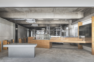
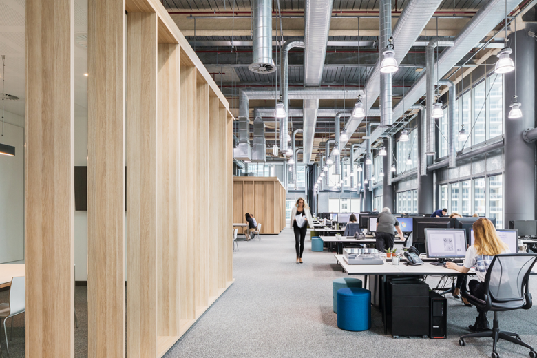
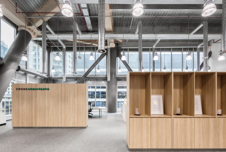
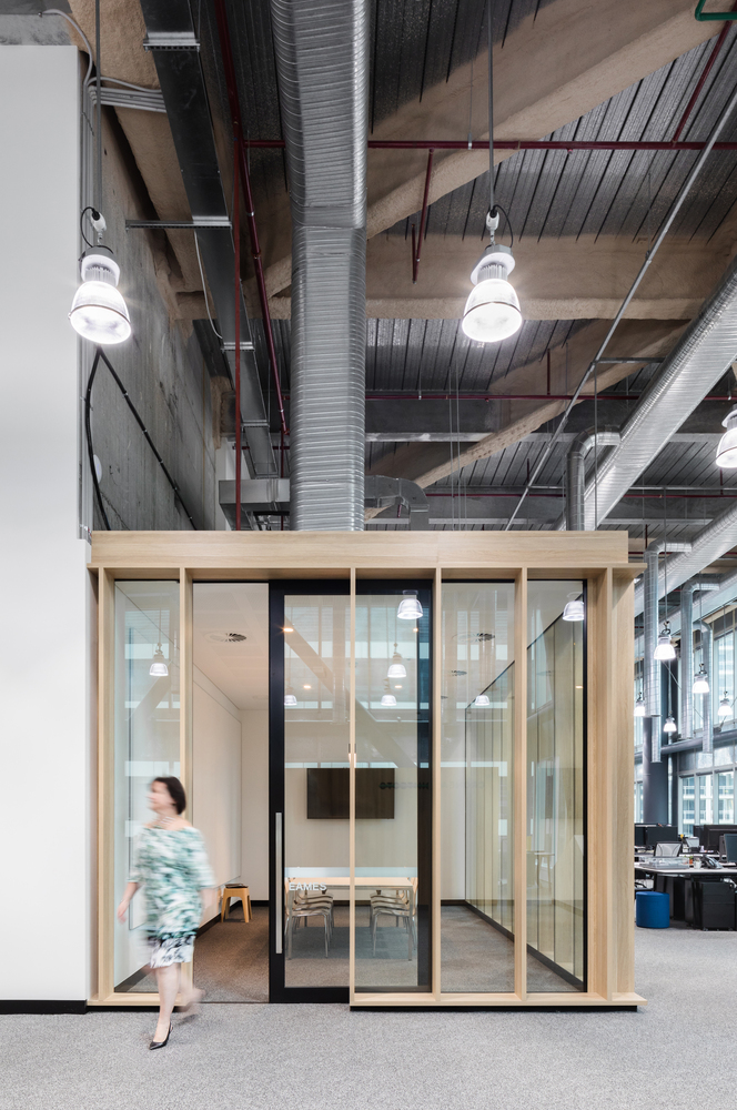
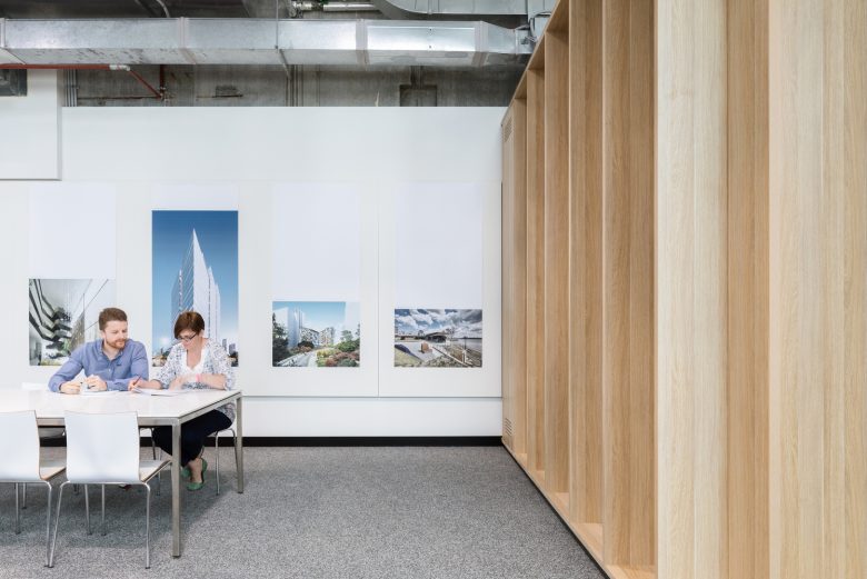
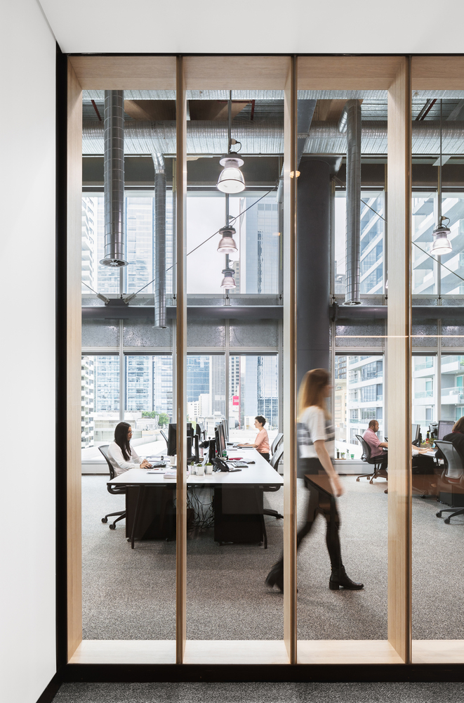
A limited fit-out budget led to a very simple design solution, allowing the space to do most of the talking. From the lifts, there is no foyer as such and the visitor turns the corner to have the exhilarating double-height, light-filled space reveals itself. A monochrome grey carpet complements otherwise industrial elements, along with the beautifully understated oak detailing as the visitor walks past glazed meeting rooms and the working architects to an expansive end space with a large communal lunch table and the boardroom off to one side. Often referred to as a “warehouse in the sky,” it gives you a sense of being in a creative, collaborative space, like an industrial space. The office has been designed to be agile and design-focused. The fit-out looks almost temporary. It’s a light touch within the space with everybody getting equal light and the space is flexible to allow for a constantly changing practice.
Architects: Crone Architects
Lead Architects: Greg Crone, Sandra Furtado, Niall Durney
Photographs: Katherine Lu


Add to collection
