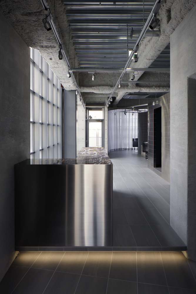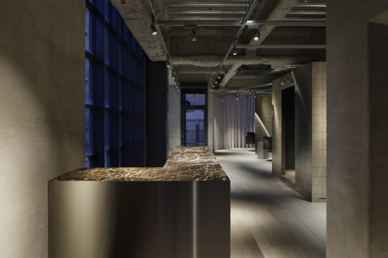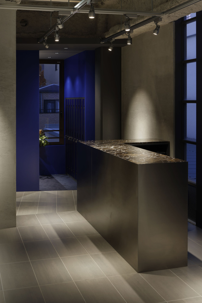
STAKK The beauty salon by Osaka’s orange street, STAKK, headed by Mr.MASAKI YOSHIDA, is now open. The origin of the name is the word stack, meaning “to pile up”. Before it underwent planning, prebuilt windows in a lattice-like layout would enter the field of view when looking around the bare shop. In that instance, we linked it with something we saw in a sketch from the shop owner, Mr. Yoshida. A sketch that logically analyses a hairstyle from the shape of the head made into a grid. A lattice that was iconic of his own logical way of thinking. From there the design concept turned into a “Grid.” (Grid = a mesh of lines used as a foundation).
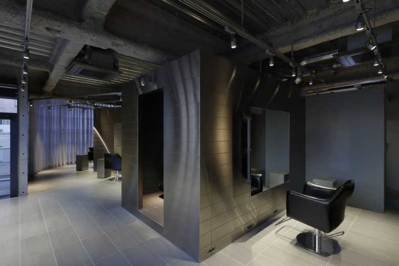
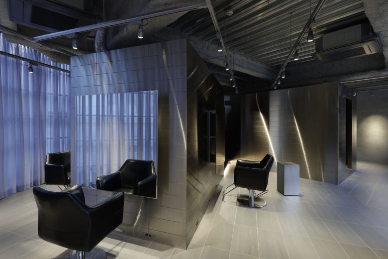
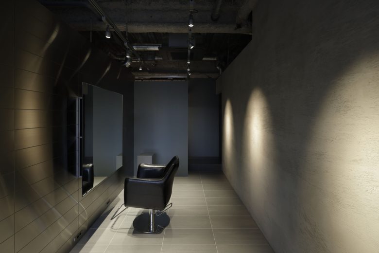
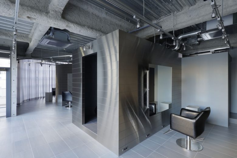
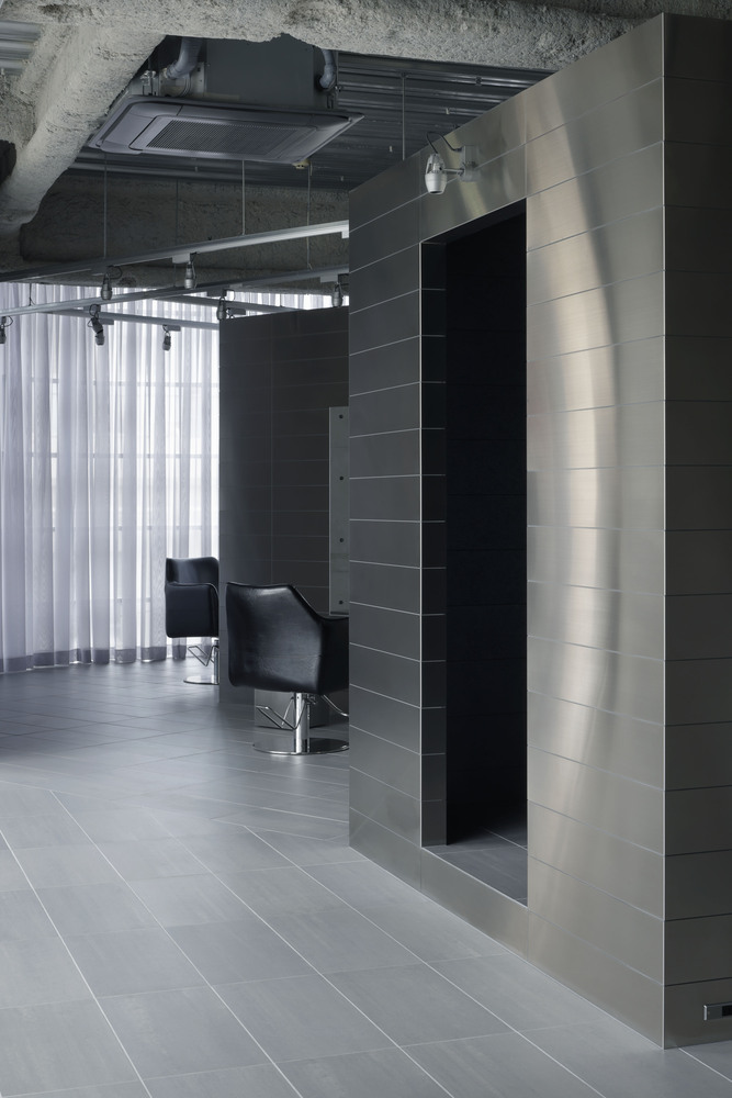
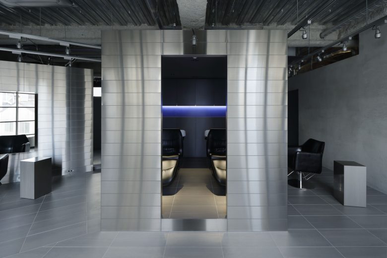
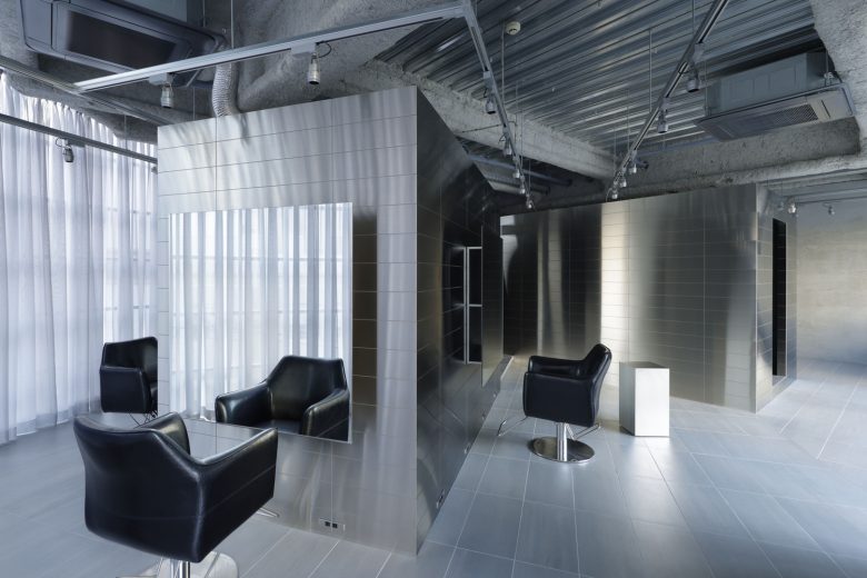
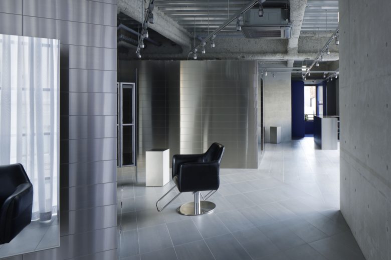
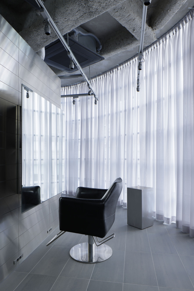
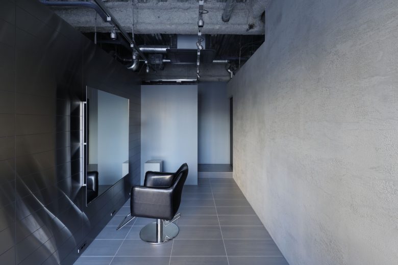
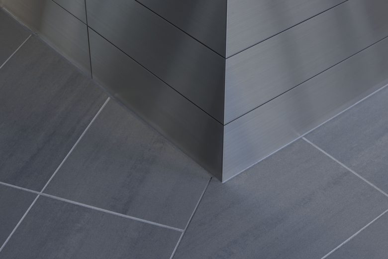
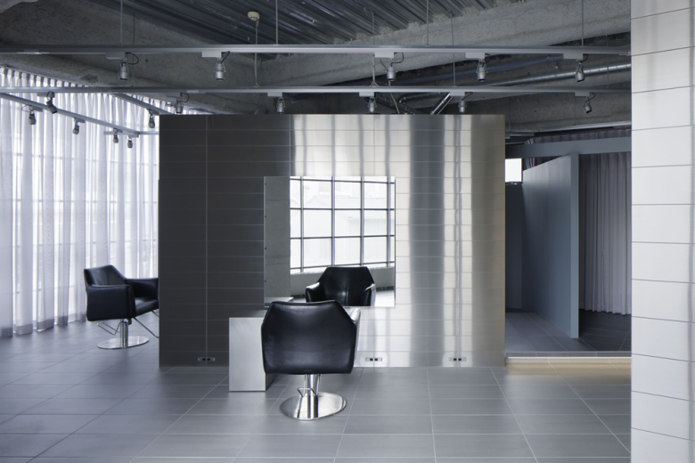
Firstly, the floor and walls were made into a grid. (The floor tiles convey the grid). There its functions are introduced, and the size of interfering objects (size of mirrors and spacing of seats) is also established. The stainless-steel booths in the center of the shop contain shampoo sinks. Outside, rows of seats are placed. On the exterior, existing products on a stainless-steel board were finely segmented into a tile layout and stacked on top of each other. On the inner wall surface tiles of wood wool cement, cut into periodic segments from the provided size, were placed. (Also, as a way to block out the noise of conversation or water) This lines up with the name of the shop of course, but it is meant to convey the owner’s logical concept of “periodic subdivision” (gridification) in the construction.
The intention and subject here was “distance”. As the owner has a strong sense of balance and object spacing, even slight disorder is very distressing. Working with that, objects and people are placed at set distances, and sizes were distributed such that the walls and floor were parallel to the seating area. Also, so that none of the objects in view drew too much attention, we wanted to create “blind spots” in the shop.
However, we felt it was not wise to build walls just for that purpose, so two shampoo booths were placed in the center of the shop (angled according to movement lines) and spaced apart. Regarding the haircut area, there are currently four seats in place but may be expanded to a maximum of nine in the future.
Because the stainless steel comes in tiles, mirrors can be attached at the corners, making expansion easy. In addition, the merit of having materials come in tiles is that there is no need to replace everything if a portion is damaged. You can restore it by replacing just those parts. Considering how things could change from here on, it was designed not with the intention to fix or redo anything but to make the same materials last as long as possible, creating a functional design that’s considerate to the environment.
Architects: kfuna
Lead Architect: Fumitaka Kawanishi
Photographs: Daisuke Shima
