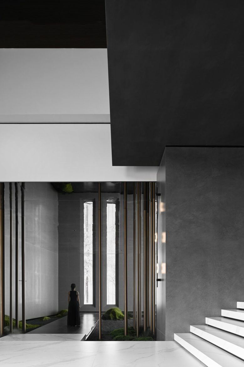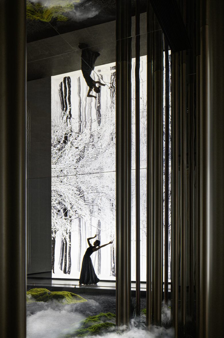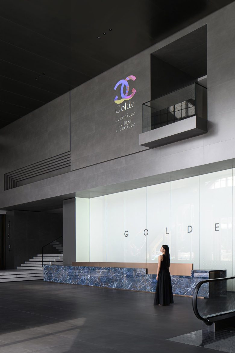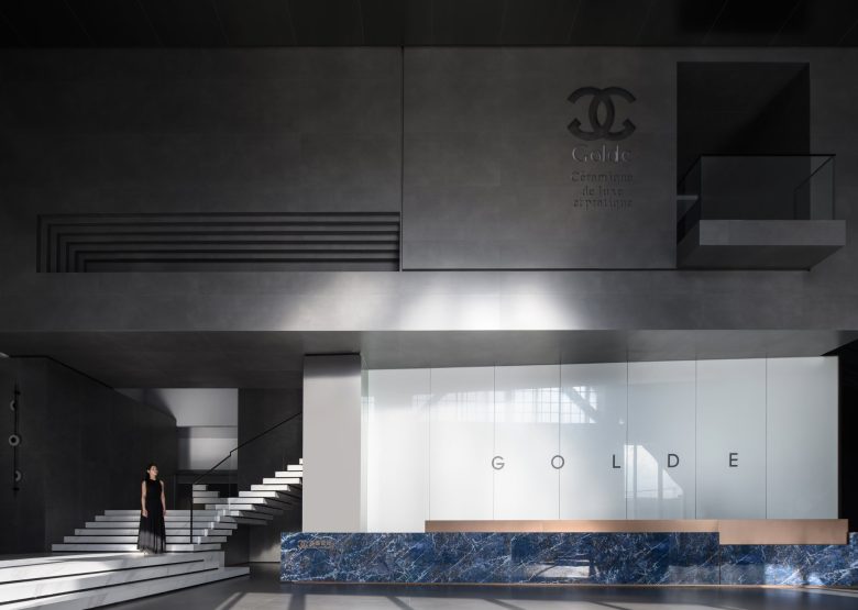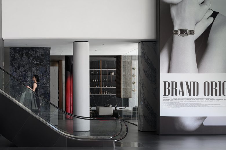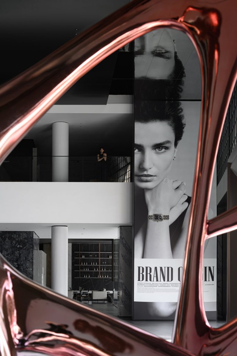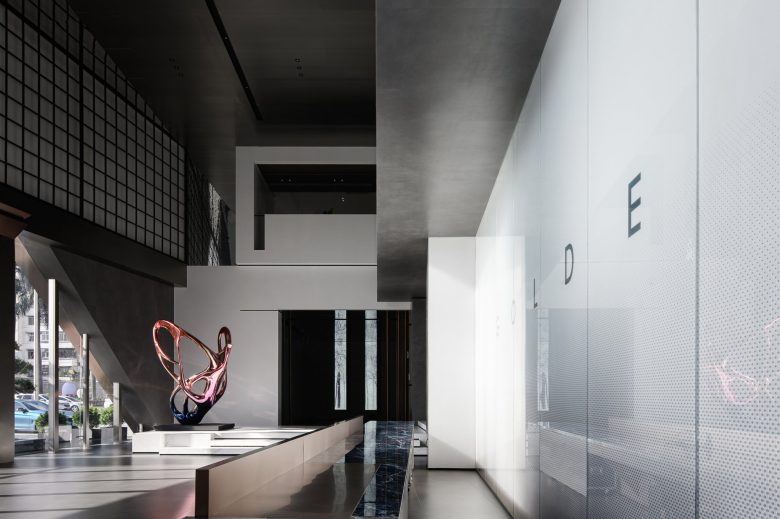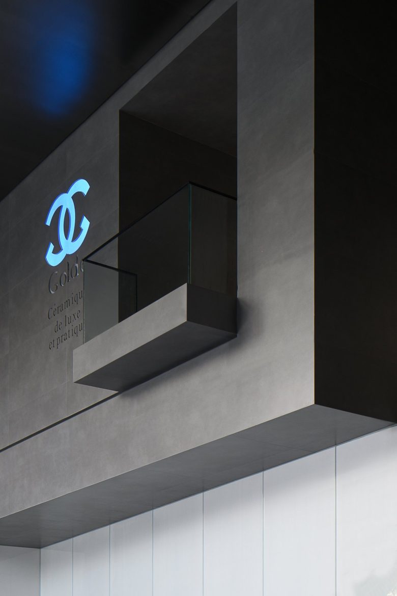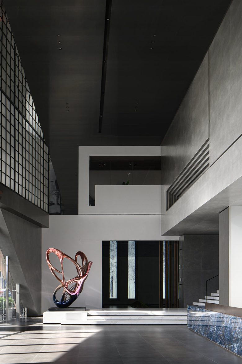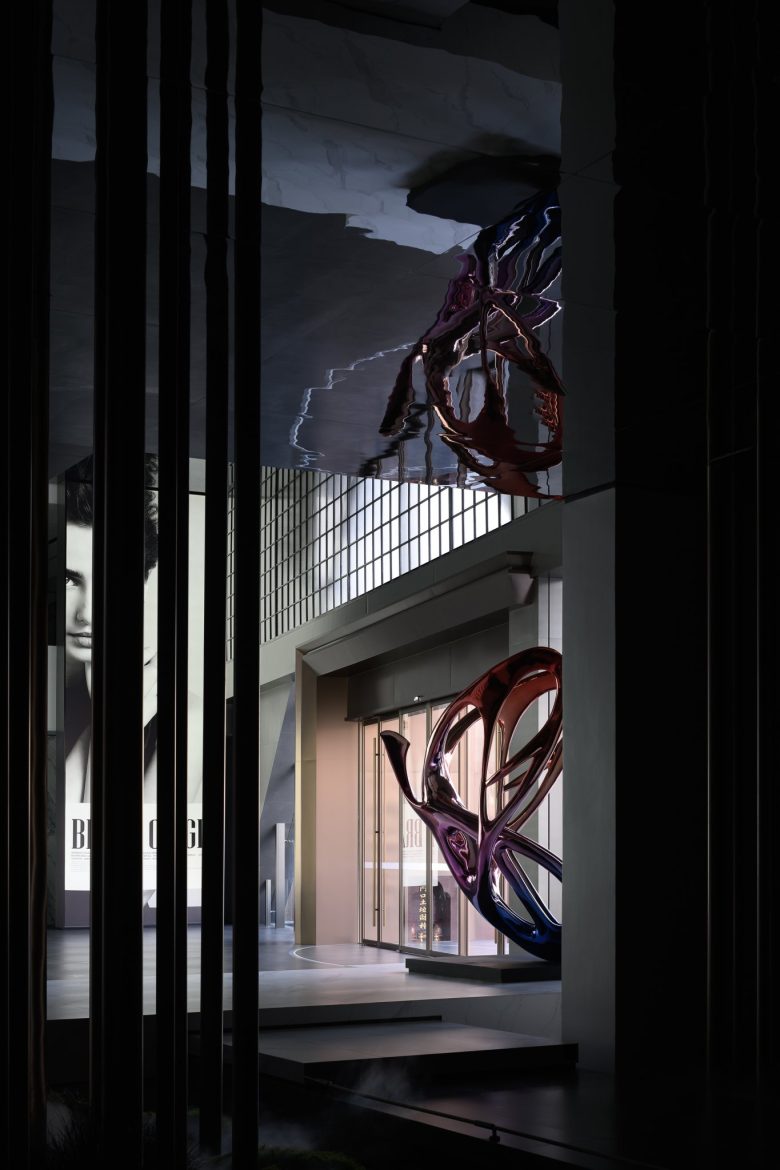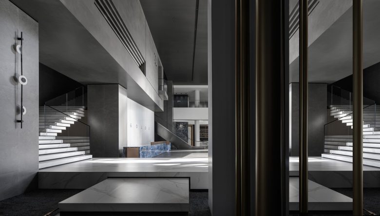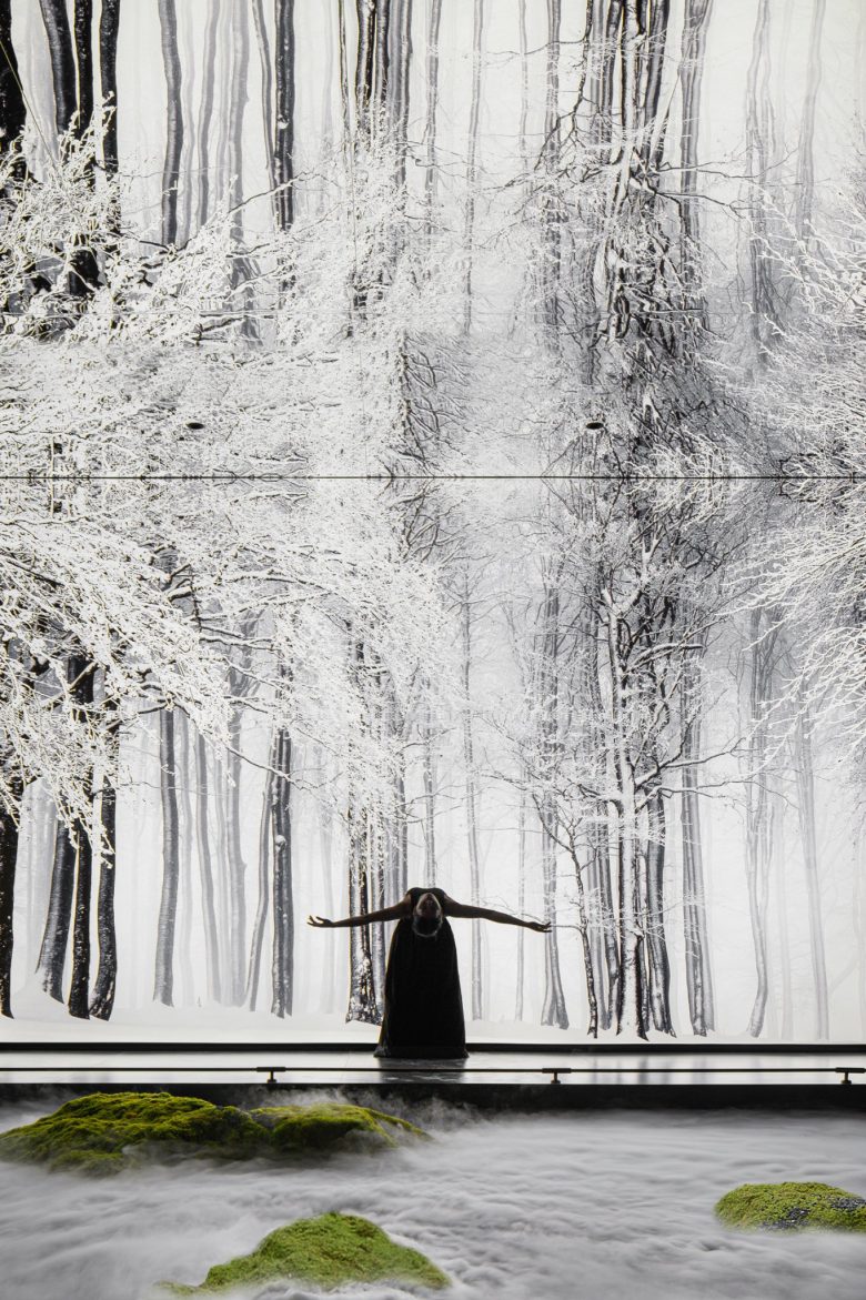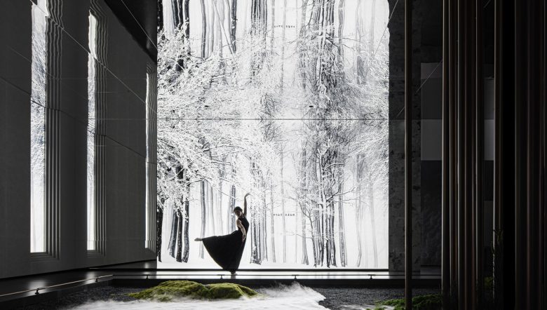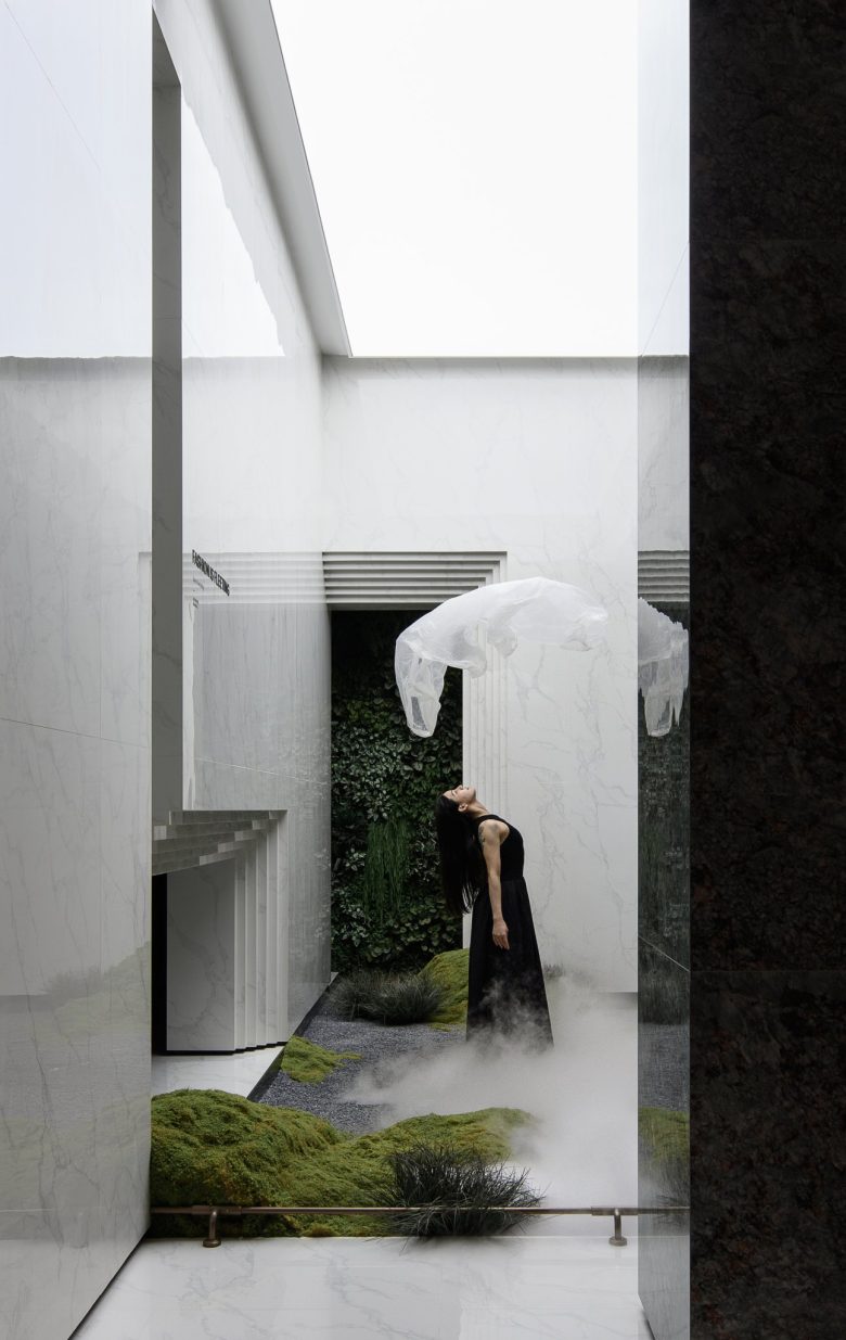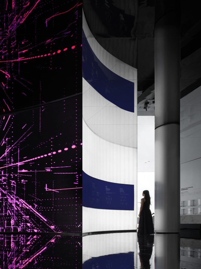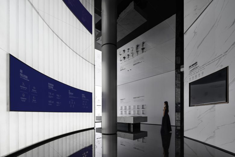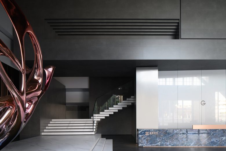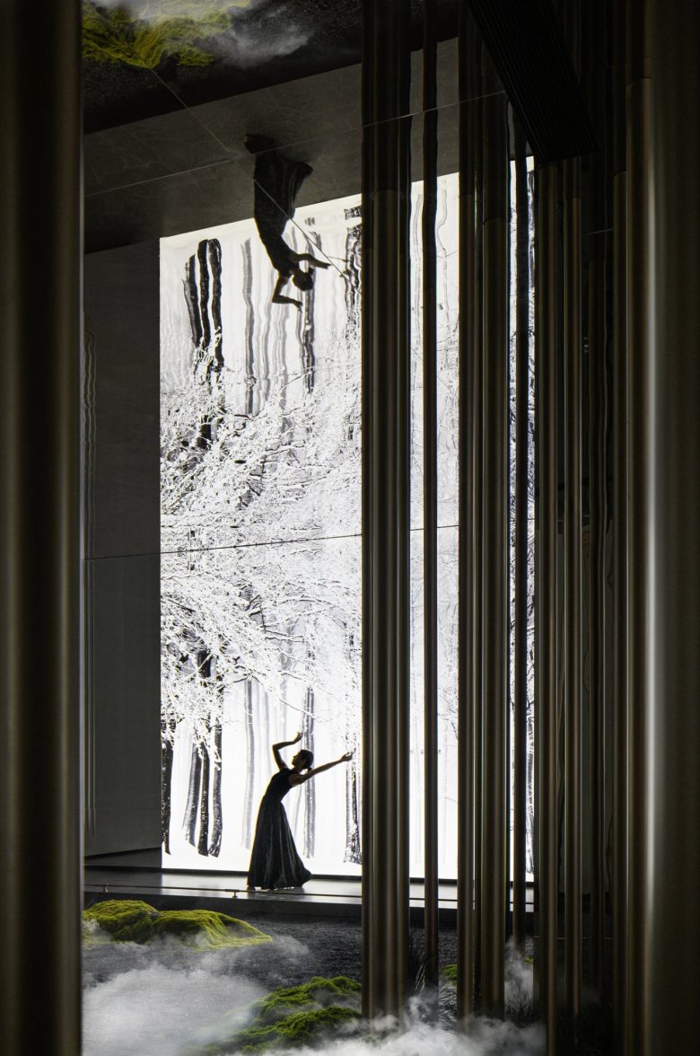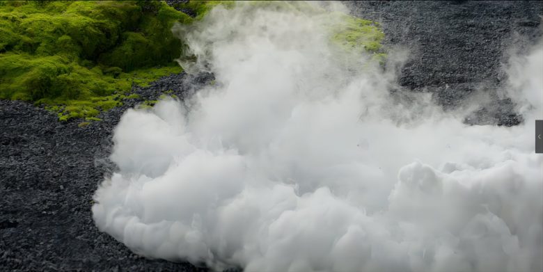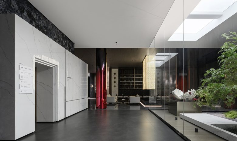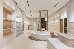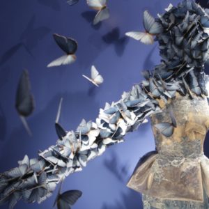

The designer draws inspiration from the process of butterfly emerging from its chrysalis. This marvelous transformation process showcases the brand’s rebirth and rejuvenation. The exhibition is characterized by an extremely black, white, and grey color palette. We are able to sense the brand’s commitment to Italian minimal style in the exhibition decorated by the deep grey cement-textured walls, statuary white marble staircase and pure white silk-screened painted glass backdrop. The stainless steel butterfly in the corner highlights the brand’s consistent taste of fashion. On the other hand, the front desk, made of indigo luxury stone, reflects the discreet luxury of the brand. For observers who are immersing themselves in this unique space, they can feel all-round exquisite taste of the brand. When the sun shining through the grid glass window in the morning, every corner of the lobby is illuminated. It outlined a sense of mystery and sacred beauty, with the interplay of light and shadows filling the space and emanating a unique and elegant atmosphere. The double-layered structure in hollow design, with incorporation of geometric elements and interlock square blocks, enhances both the exquisite quality of the products and artistic atmosphere of the space. That’s how a unique brand symbol formed.
Design Firm: Topway Space Design http://www.topwayspace.com/
Chief Designers: Wang Zhike&Li Xiaoshui
Design Team: Lu Zhongwen, Lai Yuqin, Qiu Wenfeng
Soft Decoration Design: Yang Shiwei/IRIS HOUSE
Project Owner: Guangdong Hongyuan Ceramics Group
Main Materials: Golde Ceramic Tiles, Sintered Stone, LANSEN
Photographer: Xu Yiwen
