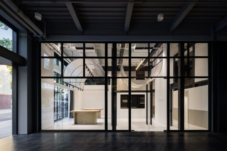
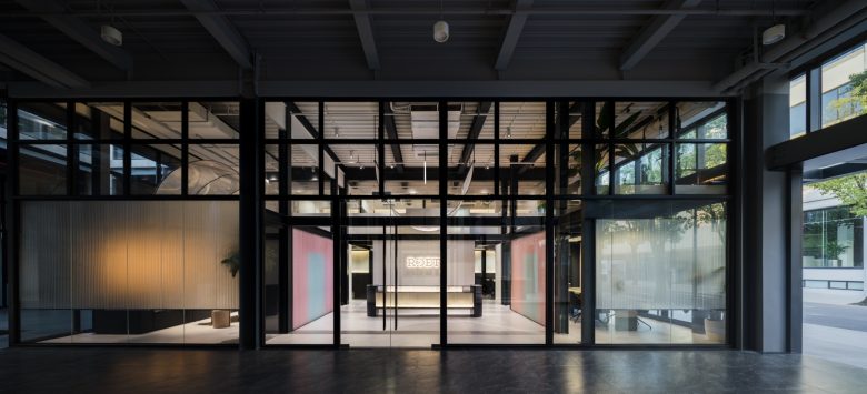
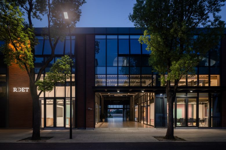
Shanghai RIDET Technology is a pioneering company specializing in developing life sciences instruments. RIDET’s office space on the first floor is composed of two square shaped area divided by a public corridor.
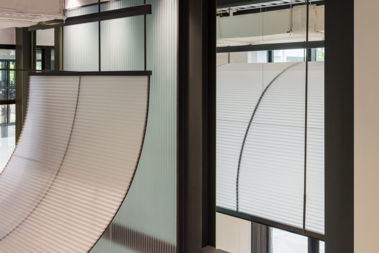
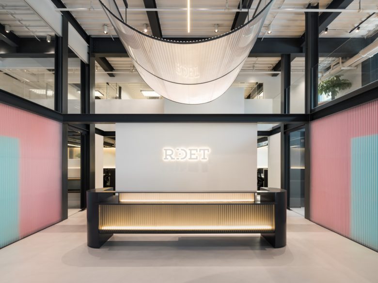
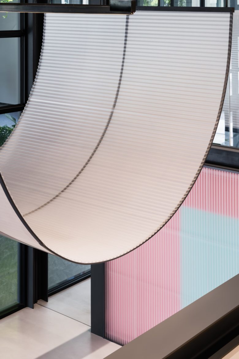
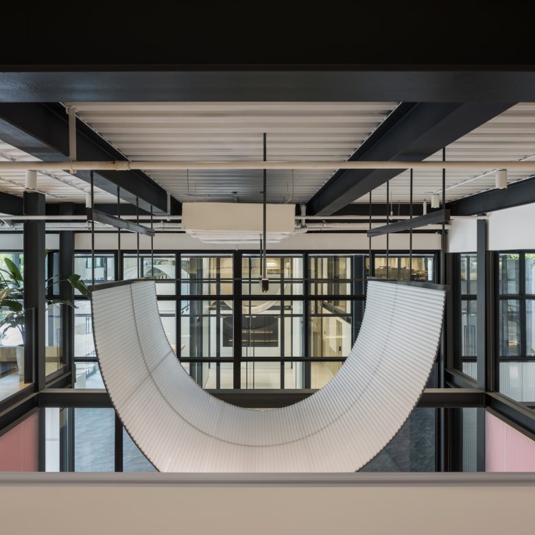
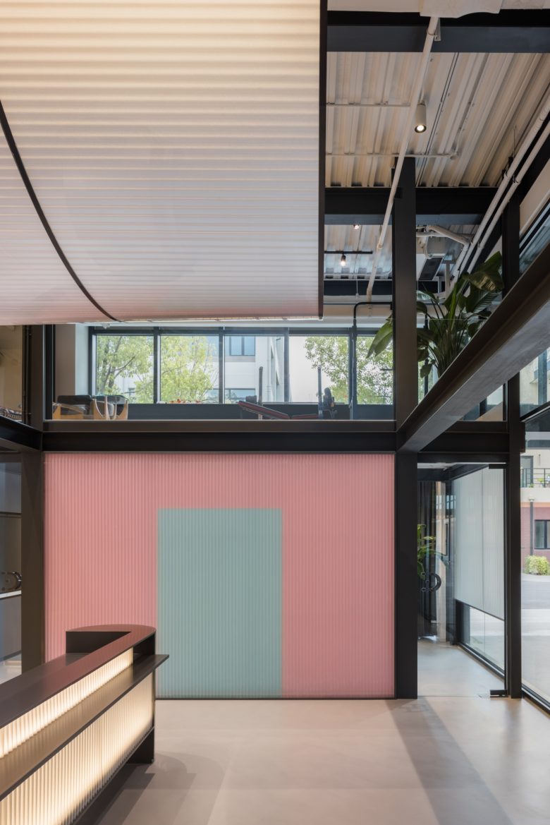
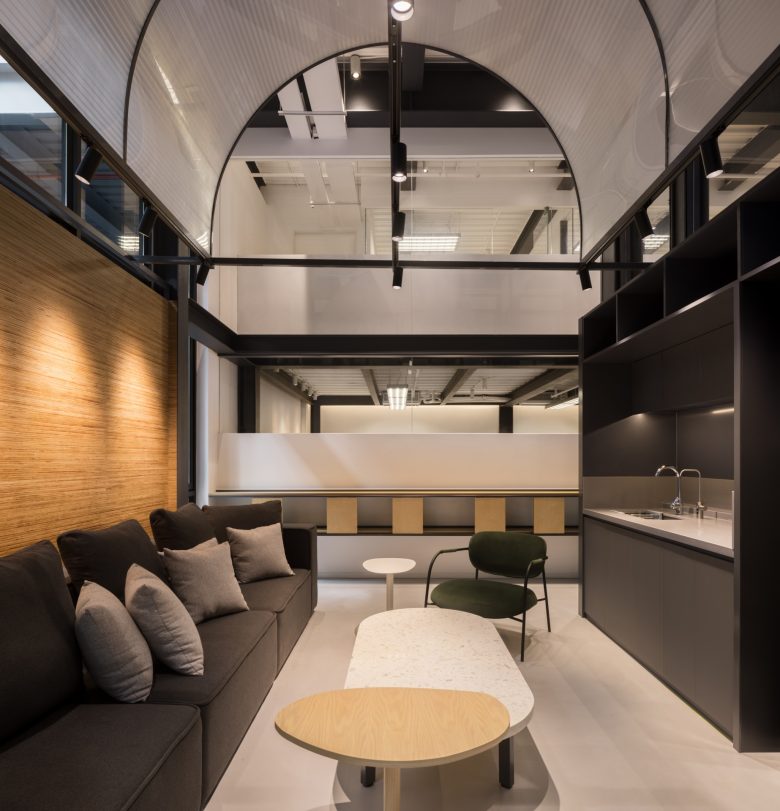
Ridet’s name derives from the Latin word “He laughs,” which is reflected in the Ridet Logo (I+D= smiling). The overall design creates a feeling of happiness in the aesthetic to reflect the brand’s identity. For this, RooMoo Design Studio designed suspended elements in the shape of a “smile” using semi-transparent curved panels. It is reinforced by the use of colors, pink and light green, conveying a blend of softness, happiness and a sense of technology in the visual approach.
Structure and volume are the logic of organic space
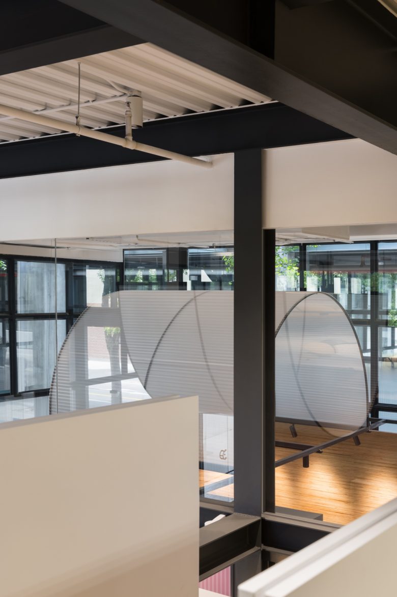
Dutch structuralist architect Herman Hertzberger emphasizes space’s malleability, simplicity in structure, and user-centric design. In RIDET, we’ve integrated structuralism by adding new structures to the existing framework. Each space now includes a half-level L-shaped mezzanine with stairs at the center. This forms versatile block relationships, allowing seamless integration of different functional zones and allowing users to explore spatial connections flexibly.
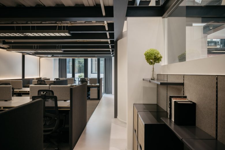
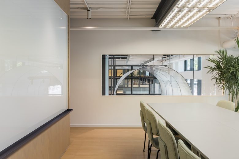
The arrangement of the entire spatial sequence emphasizes balancing openness and enclosure. As a large space, RIDET consists of distinct semi-private smaller spaces, allowing everyone to experience others’ activities during work while preserving private work areas. The printing and cleaning rooms are strategically positioned under two separate staircases for optimal space utilization.
Flexible assembly is a demonstration of practicality
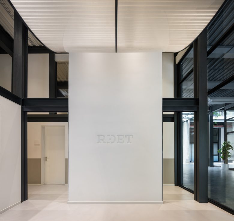
The “smile” elements can be found suspended from the ceiling above the reception desk structure, and as well as door handles, creating a lovely atmosphere.
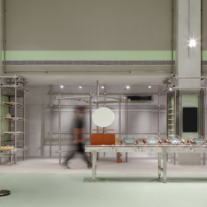
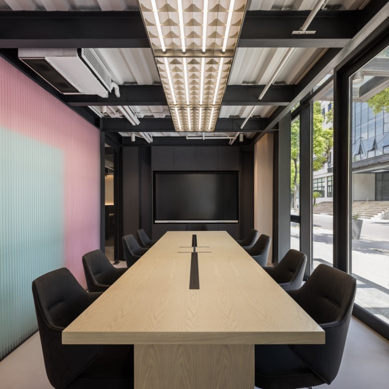
Simultaneously, RooMoo extended the concept of “assembly” by adopting an industrial style and assembly approach for RIDET’s overall space design. Building upon the relationship between structure and considering potential future adjustments, RooMoo utilized existing elements such as brick walls, ceiling metal beams, and metal supports to incorporate the building’s inherent industrial structure into a minimalist and practical style.
For the main wall, RooMoo employed an “I-beam” shaped steel structure, light green and pink gypsum boards, and semi-transparent curved corrugated panels as compositional elements. The gypsum boards directly match the brand colors, eliminating the need for additional coloring and reducing painting processes. In contrast, the corrugated panels are easily assembled and disassembled, echoing the concept of “assembly “.
A space that gathers a sense of belonging
Architectural structuralism advocates for spaces that foster interactive communication and experiences. It emphasizes human needs, comfort, and the creation of environments suitable for living and working. It underscores personalized spaces, light, ventilation, and people’s spatial perception. Industrial-style spaces feature open floor plans, fluidity, and transparency, emphasizing simple and functional design.
Combining these concepts, RIDET’s office space aims for symmetry, utilizing stairs to connect the upper and lower floors. Transparent glass and semi-transparent dividers enhance fluidity, providing each employee with a focused and comfortable work area. The design fosters a sense of belonging, promoting interaction in a shared ample space for all users and cultivating a connection to the work environment.
Design Team: RooMoo Design Studio
Lighting Consultant: Shanghai DINGZHE Lighting
Photography: Wen Studio




Add to collection
