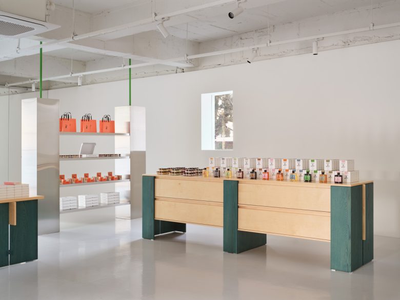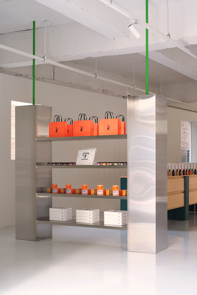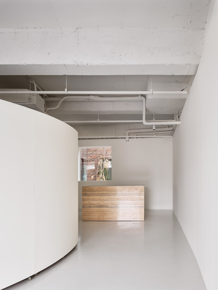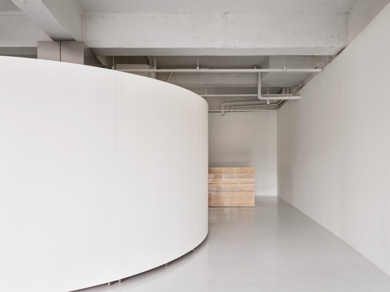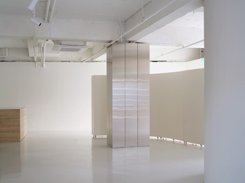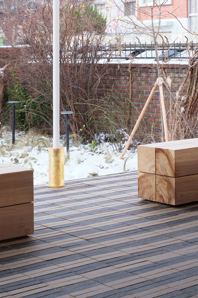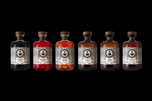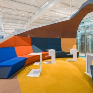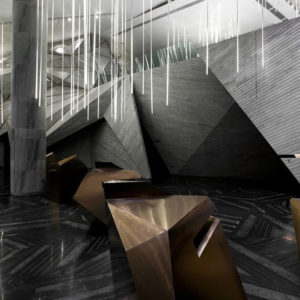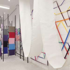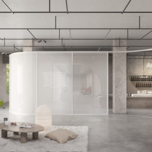

We believe a brand’s core identity is created through the values of brand founders. We worked to expand and deepen the meaning of the brand by actualizing the identity that was formerly presented on a product and service level. The brand ‘Workerbee’ communicates with consumers through its product, which is regionally produced honey. And. with their mascot ‘Kerbee,’ the main messages of ‘Save the Bees.’ and ‘Honey makes it better.’ are given life. Kerber, who takes a step into this world with the wings of honeybees, doesn’t exist physically, but as a mascot of the brand, adds vitality to the brand.
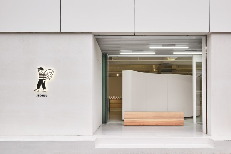
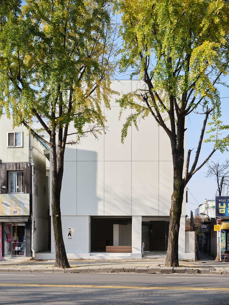
Our Goal was to enhance and refine the character of the brand by deepening the existing color and further expanding the concept to show wider possibilities. The two buildings which were formerly used as a hospital and house are reinvented as ‘House of B’, and each building is designated the concept of ‘MANSION’ and ‘VILLA’. By manifesting this concept, the story of the brand can be shared with the public through a physical space.
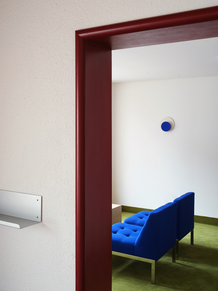
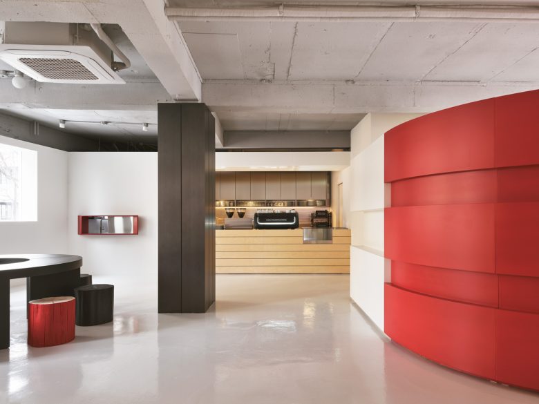
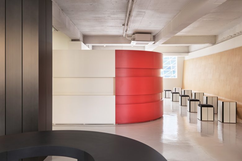
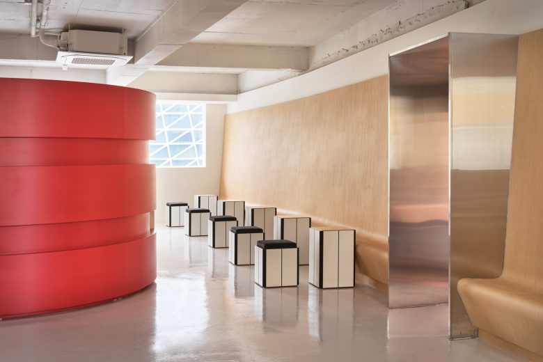
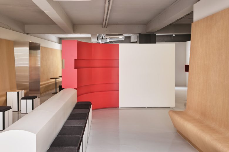
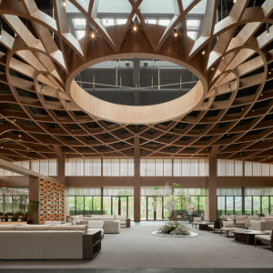
MANSION_Expanding the brand image – The three-story building, which was once used as a hospital, shows the possibility of expanding the brand of Workerbee through a modern sense of space. The red and natural wood structure makes a statement in a clean and void-like space. This expresses the existing brand color through a more elegant but powerful appearance. MANSION is like a blank canvas where endless possibilities of directions can be drawn.
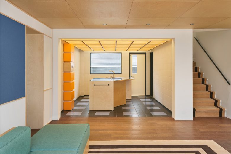
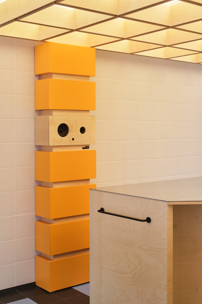
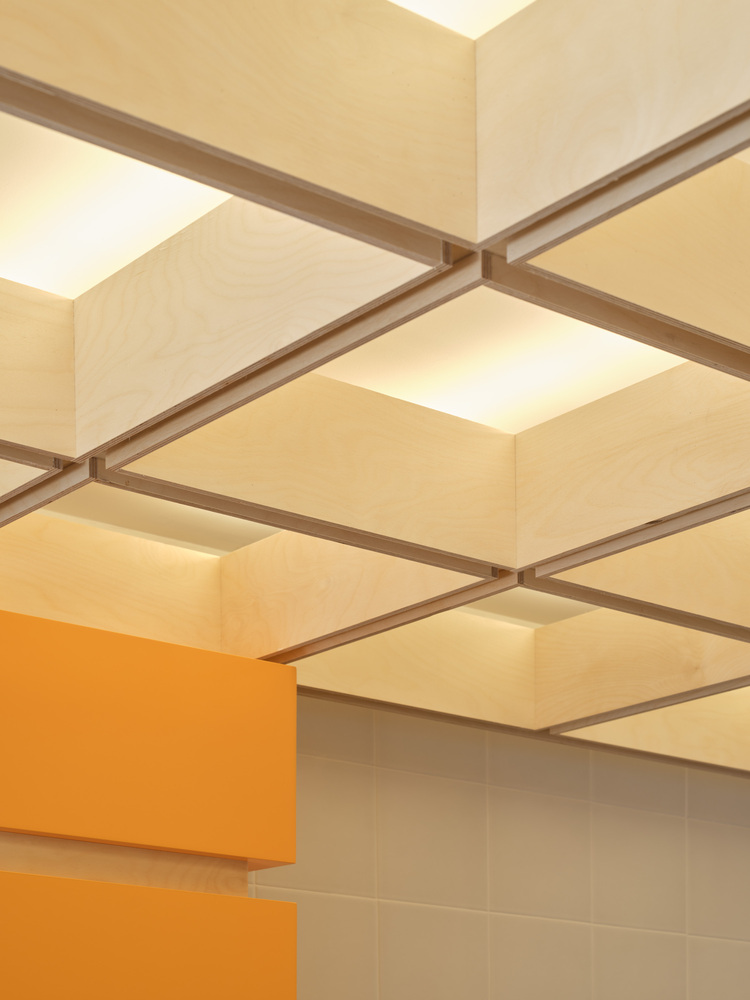
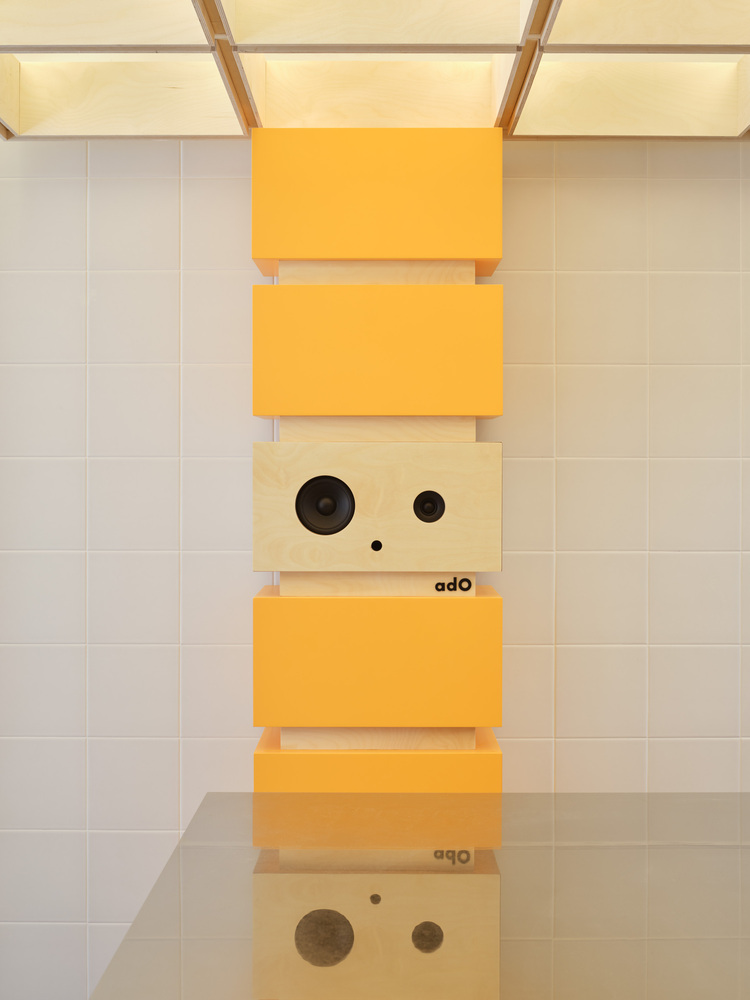
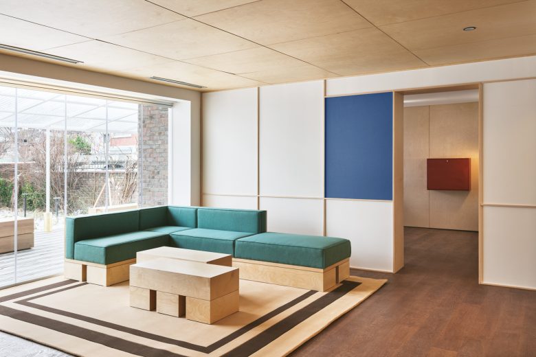
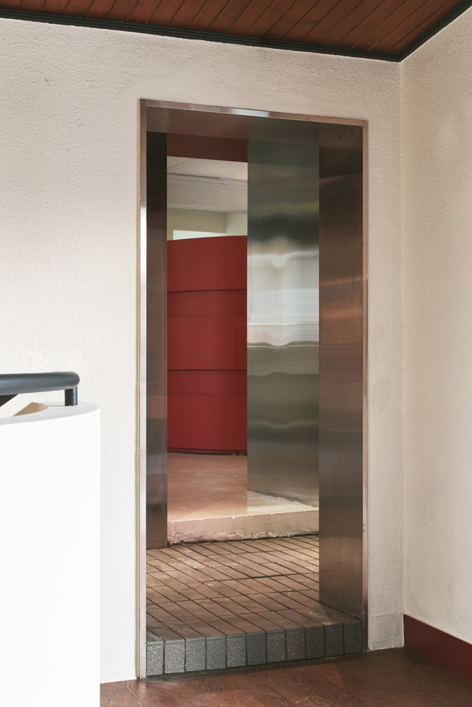
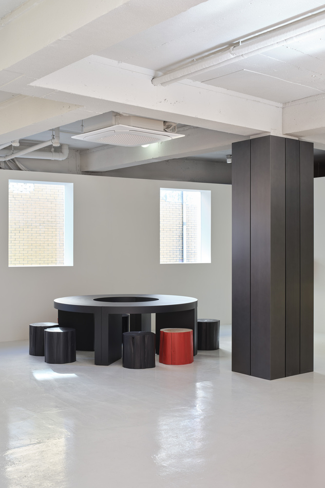
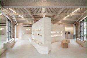
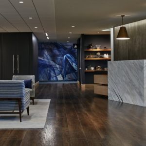
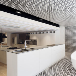
Villa_Giving life – The old house behind the hospital building was reinvented as the home of Kerbee. All elements were created through the persona-like introduction. “What would Kerby do?” was the question asked at every step of our design process. The moment you enter VILLA, you will feel a warm welcome from Kirbee. Elements such as dark wood flooring, patterned tiles, and brick flooring make you feel the presence of Kirbee and their taste. Kerbee’s garden is where the visitor can feel a sense of rest in the countryside, even if it’s for a short time.
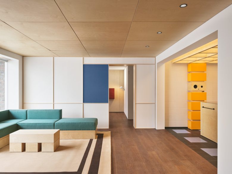
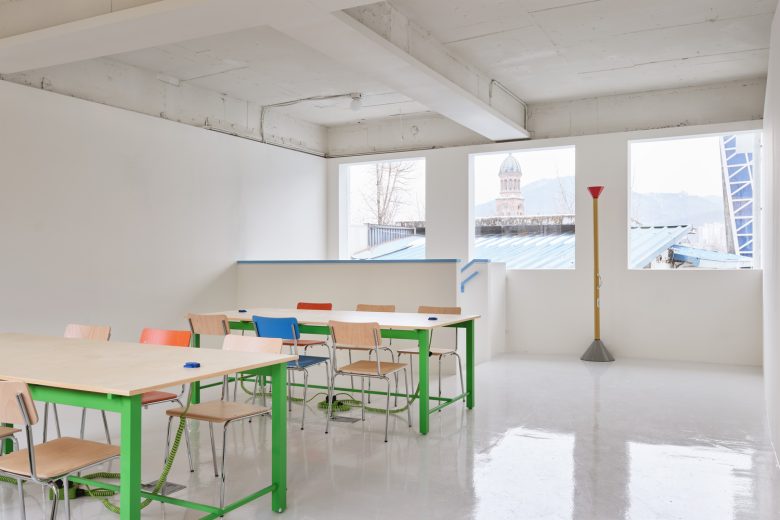
Separated – but one_separated space]A connected passage between the front MANSION and the rear VILLA building was established, and the backyard, which was intricately intertwined with other buildings, was opened. The space was divided vertically and horizontally but was reborn as a space that can be circulated through a singular movement line. As a result, the two buildings are one, and the colors of the brand Workerbee are organized and deepened as a space to tell the story of Workerbee.
Architects: Another D Studio
Design: Kyungmin Kim, Seyoung Jung
Design Team: Jaehee Chung, Hyunsung Lim
Photographs: Donggyu Kim
