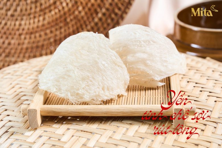
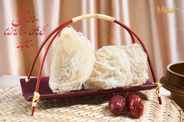
Bird nests are among the most precious and luxurious dishes because they are rich in nutrients and beneficial for skin health and overall vitality. Not only is it highly nutritious, but it is also rare and hard to harvest, making bird nests a precious gift for special occasions.
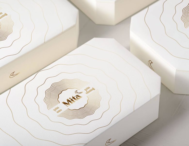
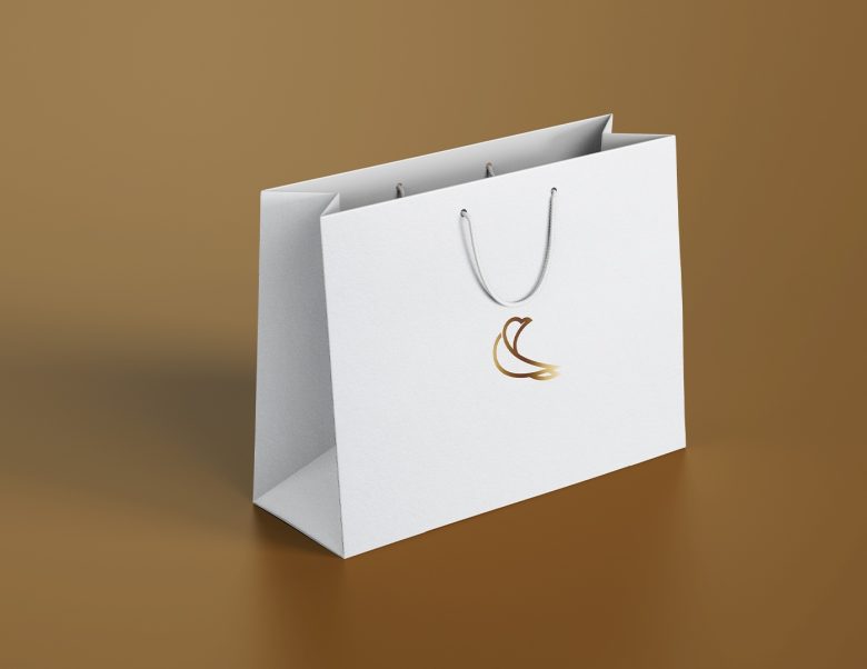
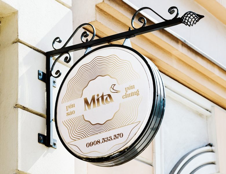
The Mita logo has two parts: logotype and logomark. The typeface is straight and solid, creating a premium brand feel. Customized with sharpened strokes to depict a bird, it embodies both elegance and strength. The logomark features an illustration of a bird nest, directly showcasing the brand’s product and its luxurious essence.
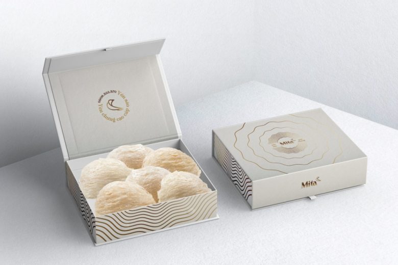
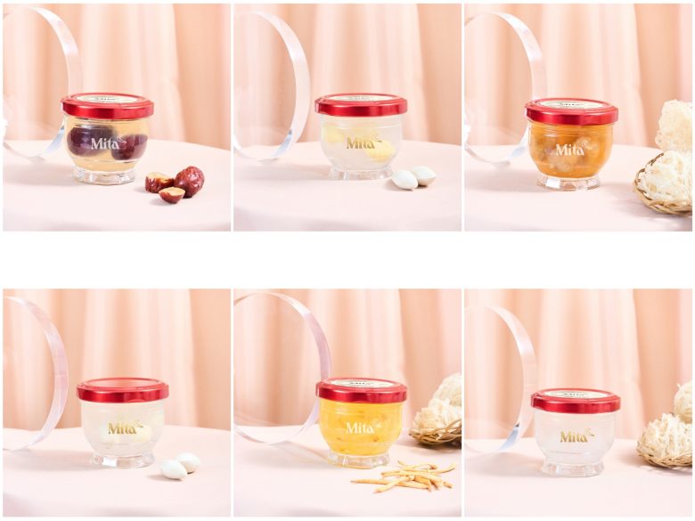
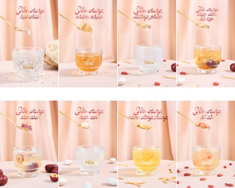
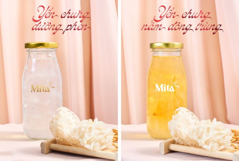
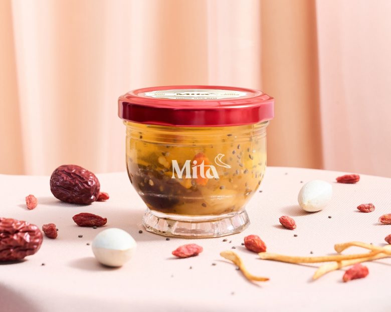
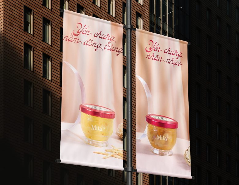
Mita packaging includes a glass jar for the bird nest and a rectangular paper box for nests. The jars are designed only with the logo on one side. However, consumers easily distinguish types of bird nests by realizing the ingredients contained in the glass jars.
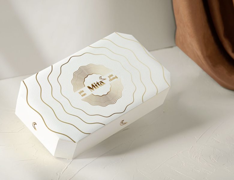
On the other hand, the paper box is white with golden yellow text and the logo, exuding simplicity and elegance. The big flowing sound wave graphic on the packaging represents the sound of a bird, adding a dynamic element to the design.
Overall, our design aims not only to leave a lasting impression on customers but also to enhance the luxurious appeal of Mita’s products. This creates a feeling of appreciation and special attention when they give the bird nest to someone.
Designed by RYMEE Creative
Add to collection
