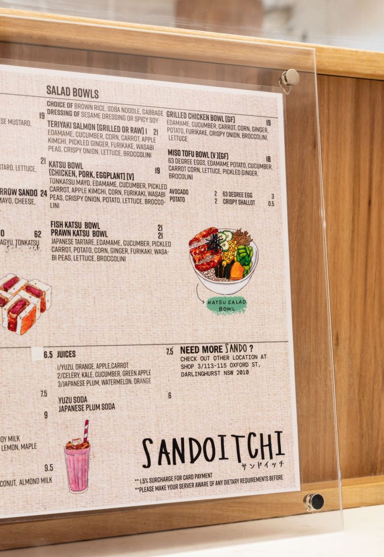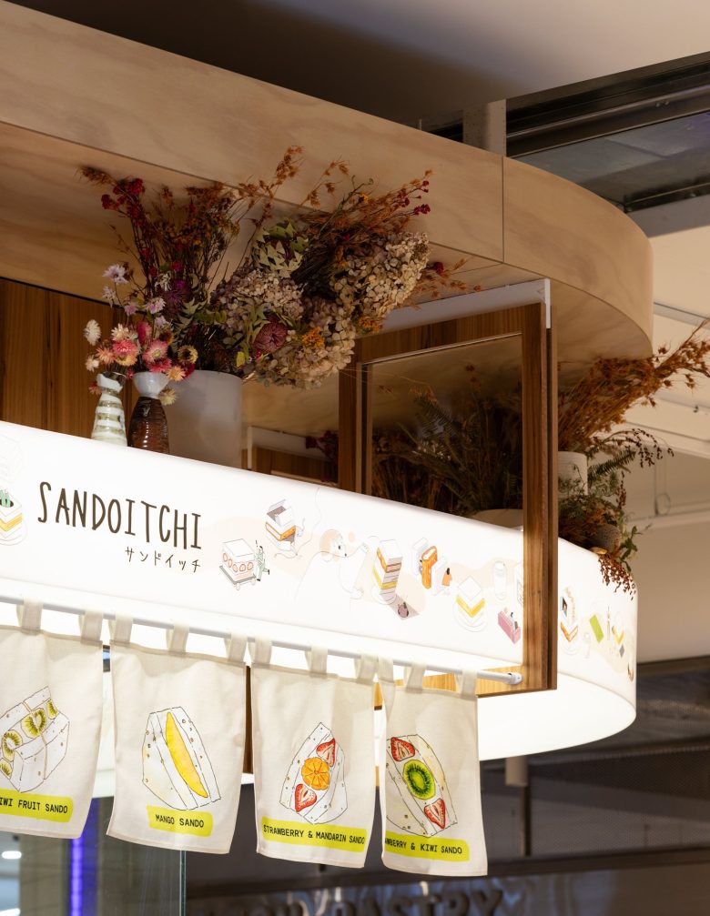

Sandoitchi, a renowned brand specializing in flavorful Japanese sandwiches, prides itself on its simplicity and delicious ingredients. The store’s concept, “Unbox the Flavour of Happiness,” draws inspiration from the unique sandwich box used to package and deliver these delectable creations.
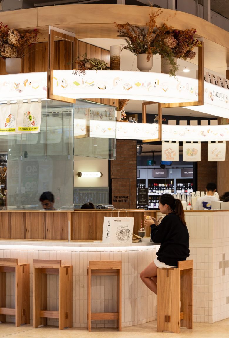
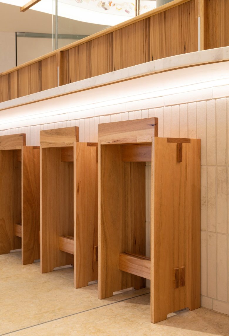
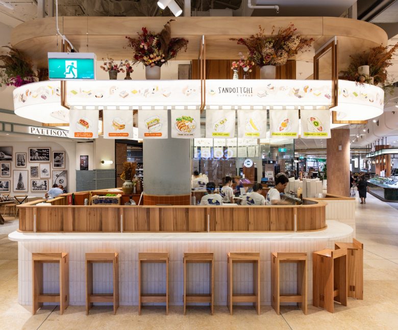
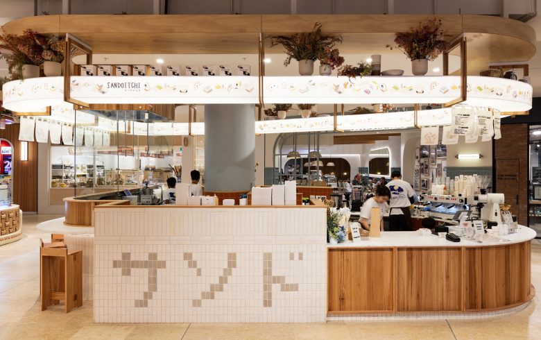
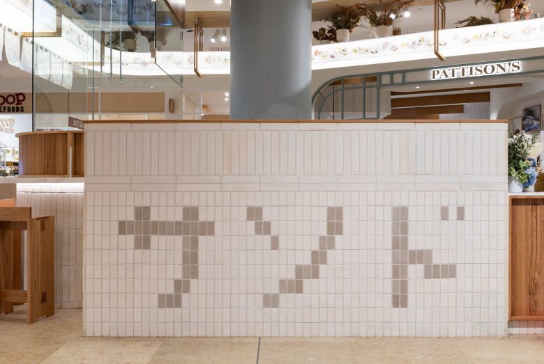
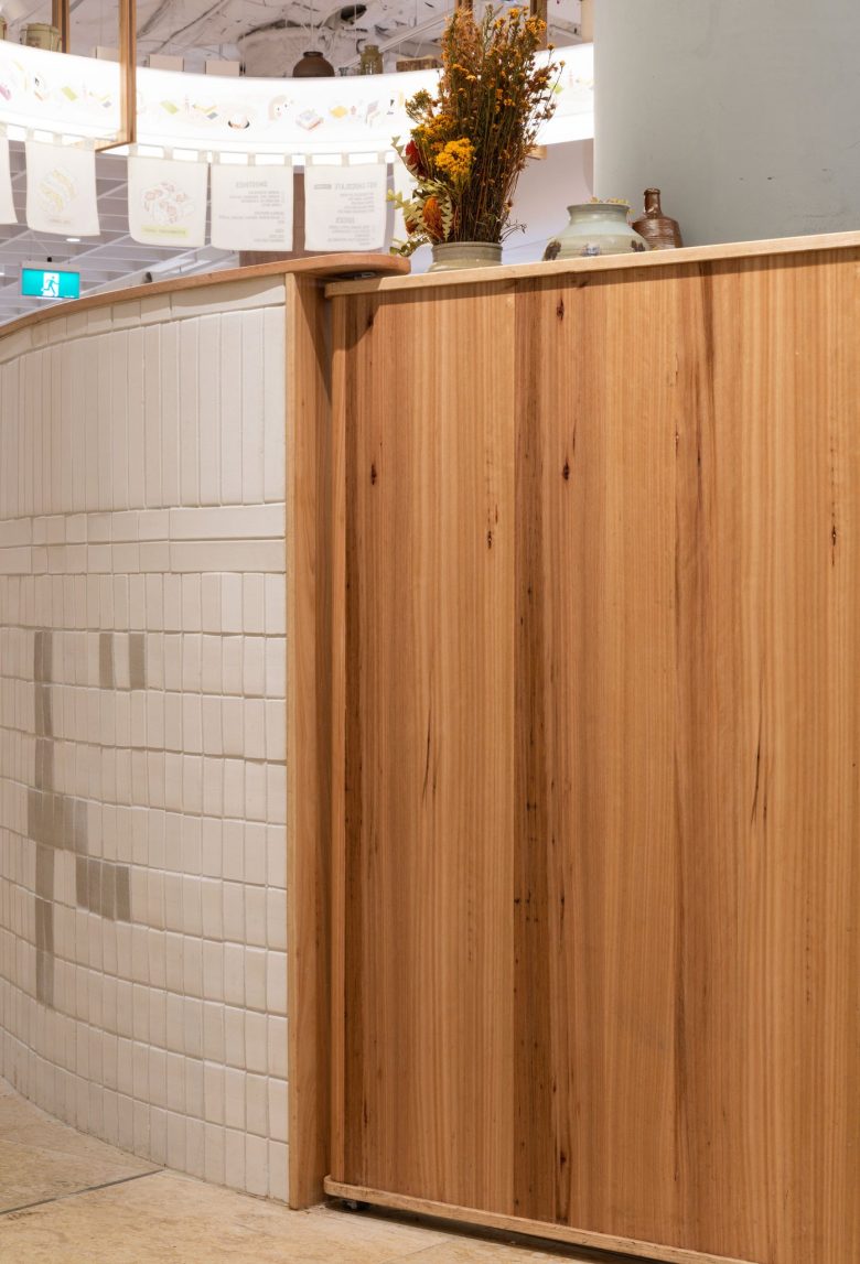
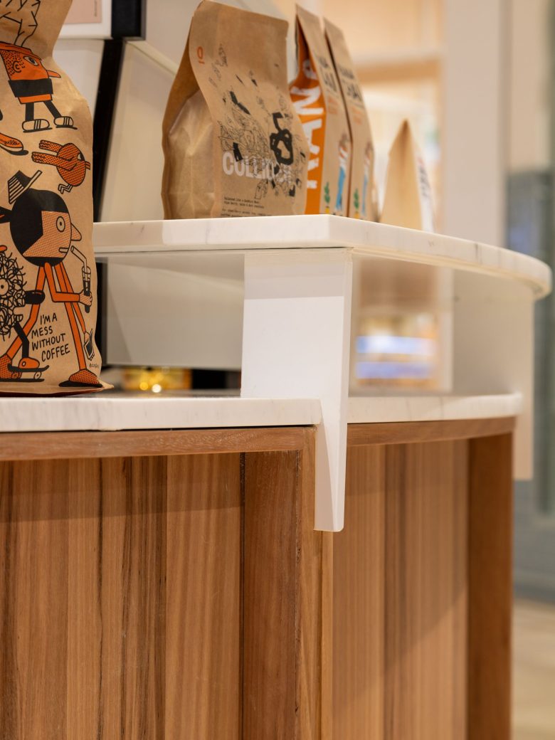
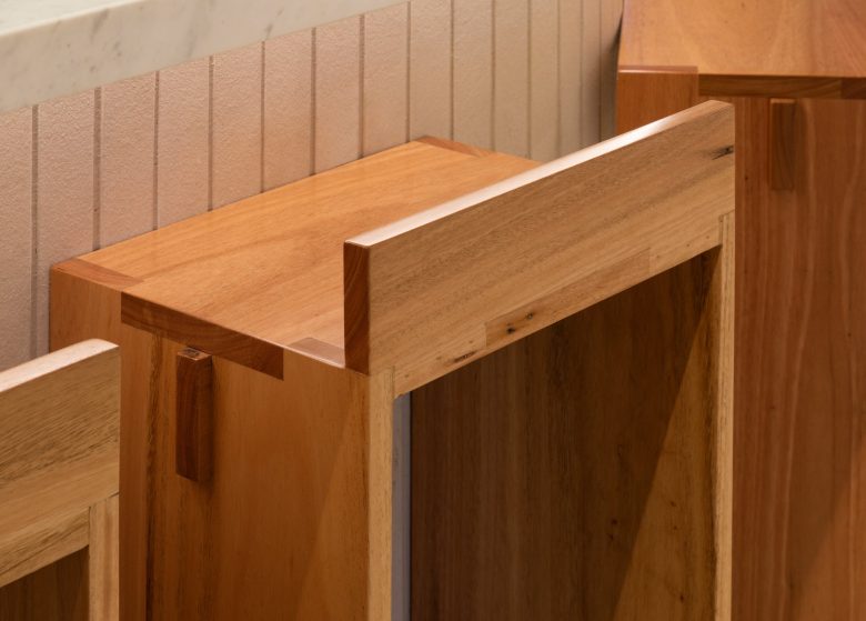
Japanese influences are delicately integrated throughout the kiosk, adding an authentic touch. The counter is designed to emulate the structured layers of a sandwich, utilizing horizontal and vertical stack bond white bricks, reminiscent of neatly stacked takeaway boxes.
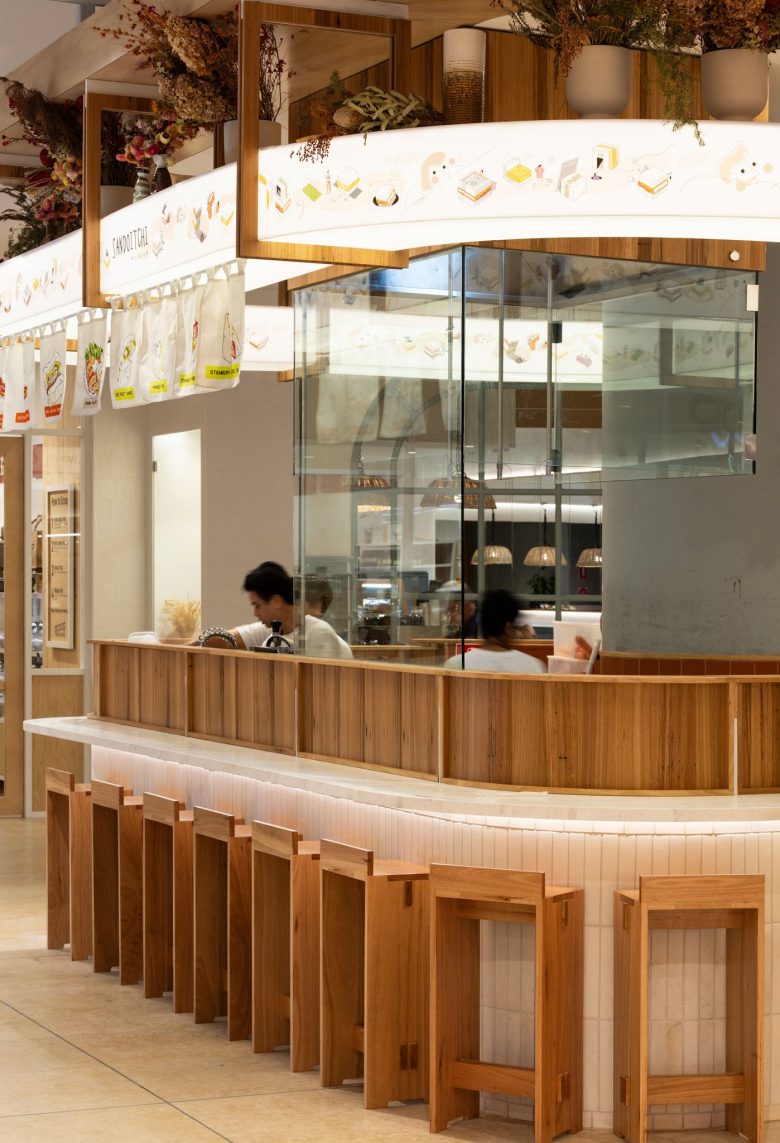
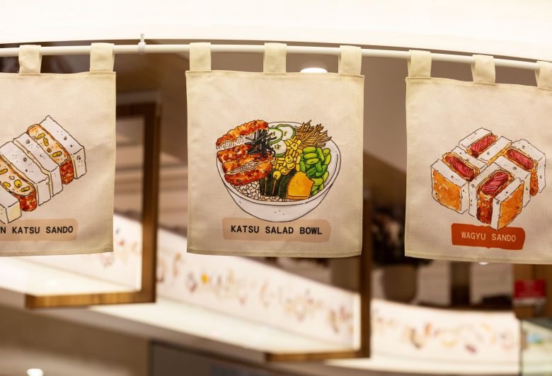
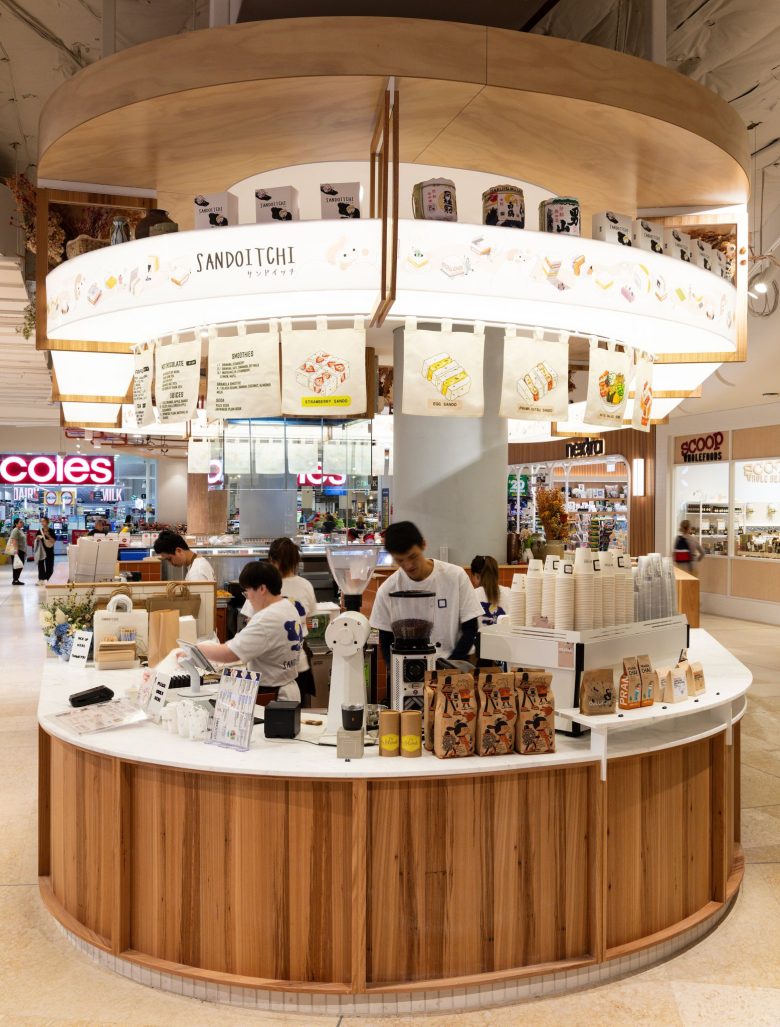
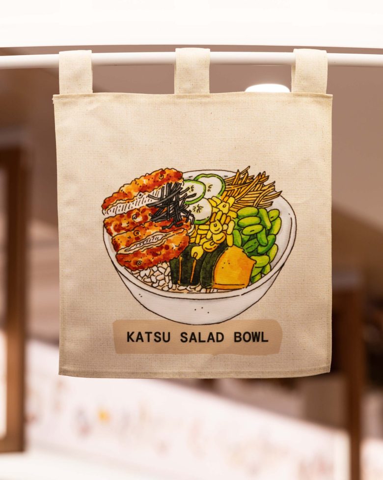
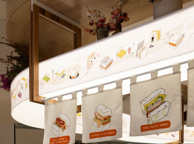
Beautifully illustrated woven curtains, a signature element of Sandoitchi’s brand, add a touch of authenticity. Japanese Katakana characters are subtly expressed through the white bricks. An overhead lightweight structure captures the brand’s tagline, “It’s more than just a sandwich,” featuring a detailed illustration that showcases a landscape of sandwiches in various forms. This clever storyline entices customers to take a closer look at the captivating artwork that wraps around the entire kiosk.
The carefully chosen lighting and color palette within the store creates a cozy and welcoming atmosphere, evoking a sense of being in a comforting home environment. With an open plan layout, customers can witness their sandwiches being made in front of their eyes, thanks to a theatrical open kitchen. A small seating area is also available for diners to savor the tantalizing flavors of their sandwiches within the space.
Photographer: Andrew Worssam
Certifier: Kudos Building Certification
Shopfitter: PRE Shopfitting
Illustration: Felix Saw
Interior Designer: Vie Studio
