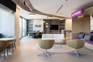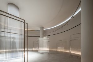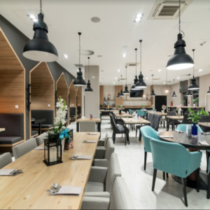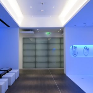
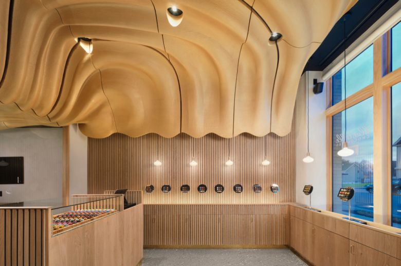
Tasked to imagine a ~900 square foot space for an artisan chocolatier, Arch&Type asked how built space can enhance the crafting & consumption of chocolate. Rather than focusing on the superficial image (how chocolate appears) and painting cocoa beans on the walls, designers Seth Amman & Adam McCullough explored chocolate’s emotional & physiological impacts, and how to evoke such feelings through material and space. The impetus for this exploration came from client Ben Johnson, who presented an image of untempered crystallized chocolate: melted, silky, and flowing. Design began by extracting the feelings from both the image and Ben’s product—comfort, mystery, warmth, decadence—then transposing these into the realm of building craft.
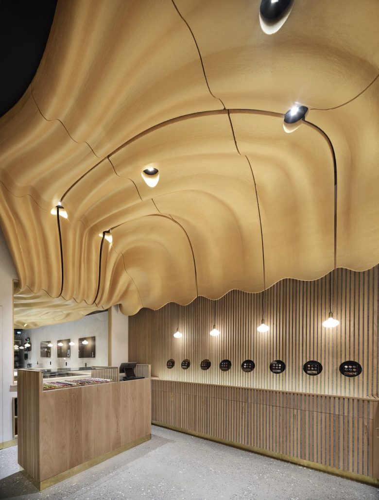
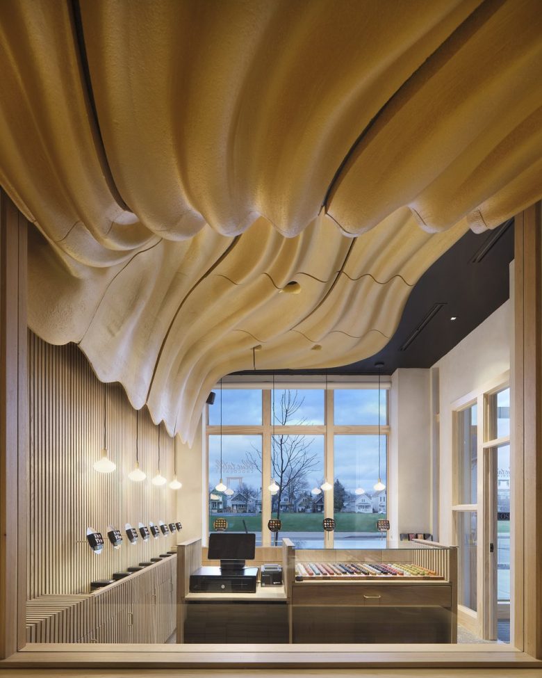
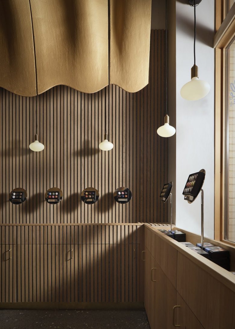
A warm, textural atmosphere emerges through a palette of soft matte white oak balanced by subtle lime-wash paint, large aggregate concrete, mirrored metal, and gold. Brass accents along the casework and wall bases tie into the parametric river ceiling. Together, these elements coalesce into a sort of surplus-quality, augmenting one another as an experienced whole—punctuated, of course, by the sensuous act of biting into a truffle that slowly melts to reveal an equally “surplus” flavor profile.
Many may remember the task of writing a sonnet in high school or college. A rigid structure of rhythm and rhyme causes a struggle for the novice. To a poet, however, form is a tool in itself by which to experiment and surprise. In the practice of building, limitations and roadblocks may open new creative avenues. Rather than bemoan the expense of fabricated casework and custom-milled ceiling tiles, the designers had an opportunity to celebrate local resources: namely their own “in-house” craftspeople (Amman’s father, Mark, and McCullough himself), University at Buffalo’s SMART fabrication factory (Sustainable Manufacturing and Advanced Robotic Technologies), and a local metal-worker.
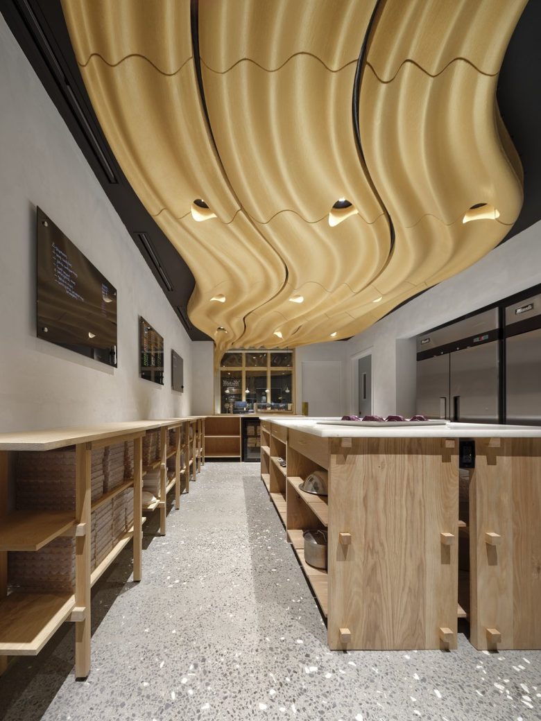
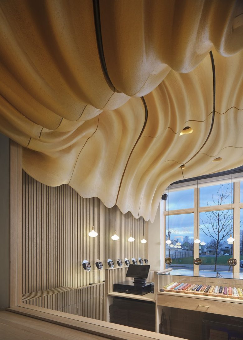
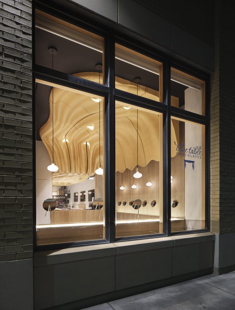
Furthermore, cost cuts, through a careful approach to value engineering, rather than diminishing the project, led to reimagining aspects of the design that became iconic. Notably, the ceiling, originally intended as a near-seamless mirrored plane, became a sculptural piece better resonating with the project’s initial provocation (the aforementioned photo of molten chocolate, which happened to be golden from the light refraction on the chocolate crystallization). Additionally, the wall separating the retail zone from the kitchen, meant to be glass, became a stud wall with a large window and a frameless door painted to match the lime-wash, while casework, originally intended for the west wall in the chocolate workshop, transformed into four custom tables.
Being that Johnson was a return-client for Arch&Type, his prior success with Amman allowed for some openness in construction, which involved both typical and atypical methods and personnel. The general contractor handled the detailed coordination of walls, electrical, lighting, and the installation of custom items. McCullough and Mark Amman crafted rough oak planks into custom millwork in two separate WNY workshops. Buffalo Niagara Weldworks fabricated the display mirrored dishes and brass kick-plates that accent the chocolate shop. Amman worked with his University at Buffalo School of Architecture peers and students to model the parametrically designed ceiling. Even here, robotic and hand-crafted techniques were merged to gain efficiency and detail using a CNC (computer numerical control) robotized router. Amman’s student interns worked to assemble, fireproof, and finish the ceiling tiles at the University’s SMART fabrication factory, which became proof-of-concept for municipal code review with regard to fire safety. Further emboldening the required multidisciplinary approach to design creation, and manufacture of spaces.
The comforting, handcrafted white-oak furniture elements, precision-honed mirror dishes, and dramatic flowing ceiling synergized in a space that literally and emotively underscores the artisanal chocolatier within the urban storefront.
Adjusting design and building practices toward the limits of locality resulted in a space greater than the sum of its parts. By leaning into the resources available, Blue Table Chocolates’ new shop is distinctly Buffalo, despite lacking elements typical of Buffalo architecture. Yet, the project came together thanks to a large team of hands, using a variety of methods—digital and physical, typical and atypical—to turn a shared mental image into a space that celebrates chocolate and architectural craft.
Add to collection
