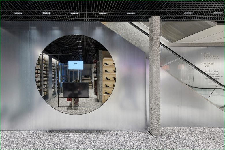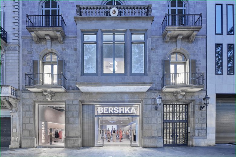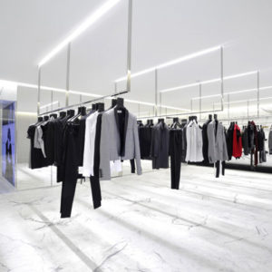
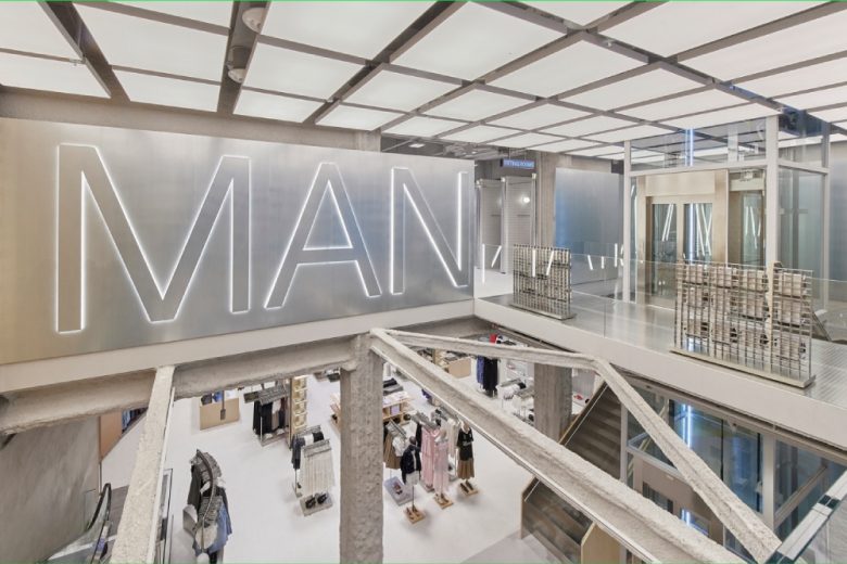
Part of the Inditex empire, fast-fashion brand Bershka specifically targets a young demographic with on-trend streetwear styles. In Spain, its home country, the brand has started to open design-led retail spaces which not only elevate the shopping experience, but also lend a distinctive edge to Bershka‘s overall brand image. Bershka‘s new flagship store in Barcelona is no exception. Occupying no less than 1,700 sqm. (18,299 sq.ft.) spread across three floors of Casa Puig Colom, it’s situated in a former residential building erected in the early 20th century by Catalan architect Josep Font i Gumà (1859-1922). The interior design, created by Castel Estudio, a Barcelona-based architecture practice specialised in retail design, meticulously pairs the listed building’s architectural splendour with modern interventions. A series of simple product display modules organise the various Bershka collections, varying in materiality and contrasting with the existing historic architecture through their sleek design and lightness.
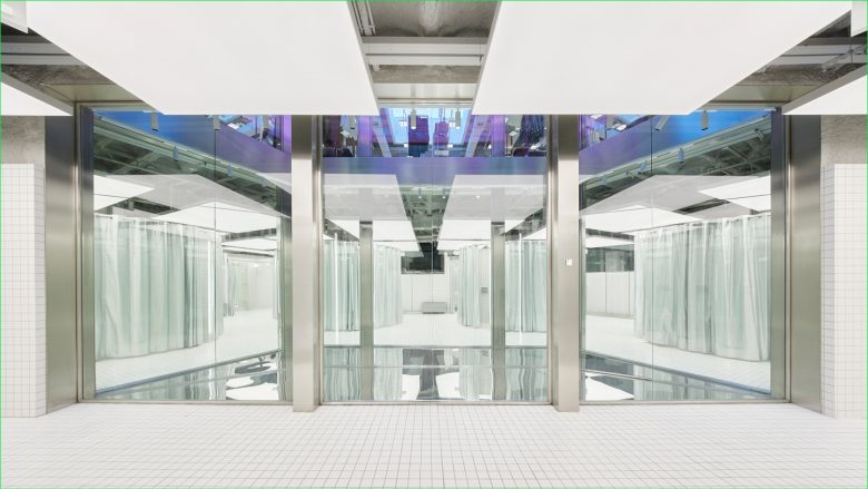
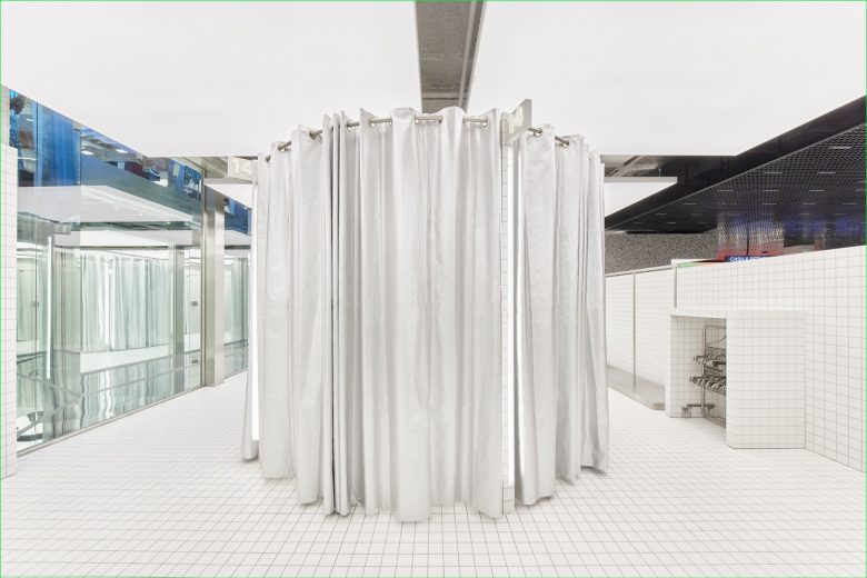
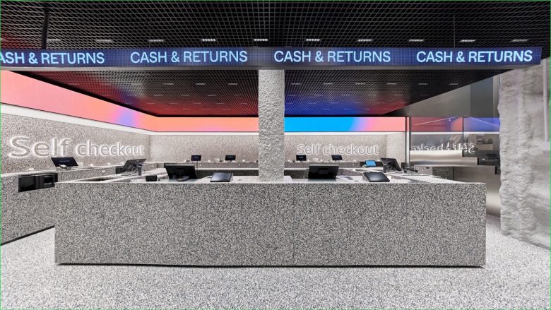
Another striking key element of the interior design is the creation of a visual connection between the floors by way of ceiling cut-outs, patios and skylights, which at the same time boost the spatial dynamic when navigating the premises. Adding character to the settings are a series of striking elements, such as a large stone wall which structures the product display, while at the same time ushering in shoppers towards a light well that houses a kinetic screen with content generated by the American artist and actor Ezra Miller. Needless to say, special attention has been given to lighting, most notably a grid of LED light boxes which can be found across the store. The ground floor of the Bershka flagship store showcases the Bershka and BSK Teen collections, and one floor up, the men’s collection can be found. The basement section is home to a sizeable accessories collection and the check-out and fitting room areas.
Designed by Castel Estudio
Images © Bershka
