

BEEFEATER by Constantin Bolimond
posted by retail design blog on 2025-09-29
Add to collection

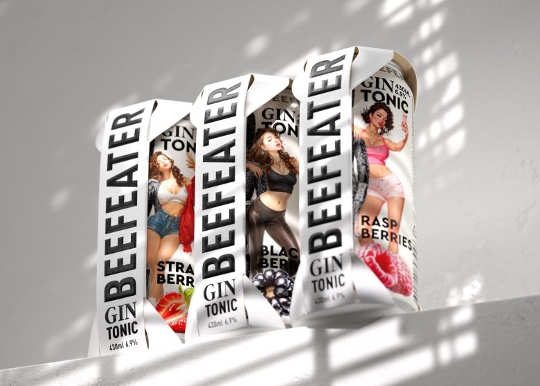
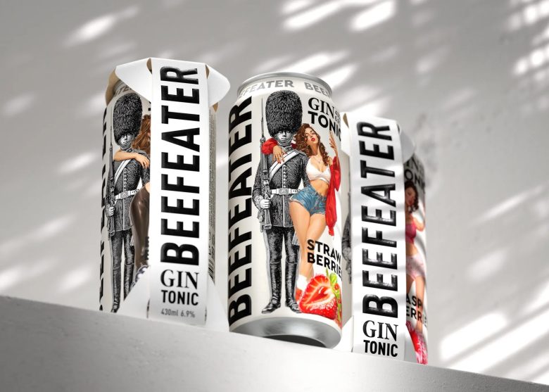
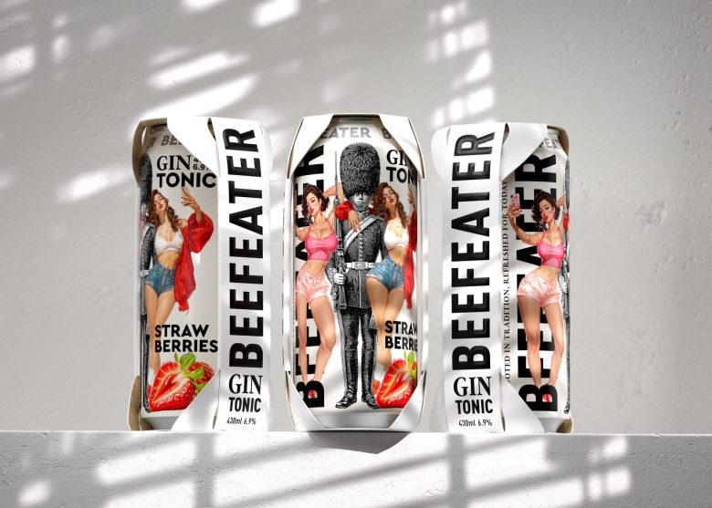
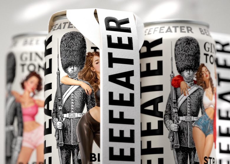
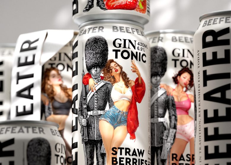
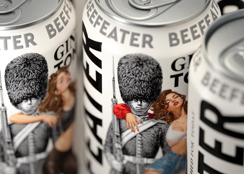
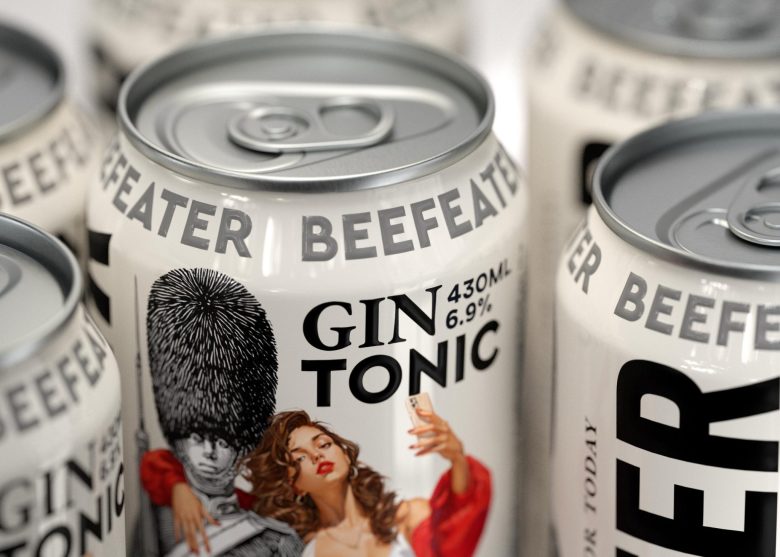
BEEFEATER GIN TONIC
Gin carries the weight of history — born in the traditions of London’s distilleries, refined through centuries. Tonic brings the spark of modern life — light, fresh, and effervescent. Together, they create a timeless union: a drink that honors the past while celebrating the present.
Curator’s Insight
Beefeater Gin & Tonic’s packaging strikes a bold balance between heritage and modern flair. The iconic London guard illustration anchors the design in tradition, while playful pin-up style characters and vibrant fruit graphics inject energy and contemporary appeal. Large, confident typography reinforces brand strength, creating a striking contrast against the clean white background.
Designed by Constantin Bolimond
Add to collection