
Ten years after the rebrand that profoundly reshaped its corporate image, Bazzara continues its path of growth and innovation by unveiling the restyling of its logo. An evolution that renews the roastery’s visual identity while preserving the values of elegance, craftsmanship, and Italian spirit that have
always defined the brand.
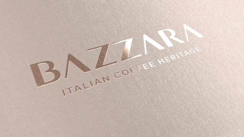
Typography takes center stage in this evolution: the new logotype adopts a custom sans-serif typeface, with more readable contrasts between filled and empty spaces and a separated double “Z” to enhance rhythm and flow.
The updated version appears more solid and modern: proportions have been harmonized, spaces balanced, and the double “Z” made clearer, improving the logo’s overall legibility. The payoff “Italian Coffee Heritage” remains unchanged — a clear homage to the roastery’s founding values: Italian coffee culture and artisanal excellence. A smooth transition that renews the form, but not the character, of the brand.
Designed by Blossom23


Add to collection

