

MN by Studio K95
posted by retail design blog on 2025-11-25
Add to collection
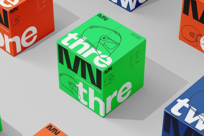
The MN Helmets packaging system was designed to give each helmet model a bold, unmistakable visual identity while maintaining a strong sense of cohesion across the entire product range. The solution combines oversized typography, essential line illustrations and high-impact color fields to create packaging that is both functional and visually iconic.
Each model is assigned a dedicated chromatic universe: ONE adopts the brand’s warm red–orange, TWO is defined by a deep technical blue, and THREE introduces a vivid acid green. This strategic use of color creates instant product differentiation while reinforcing a clear, modular system. The palette was intentionally reduced to ensure maximum contrast and recognizability in any retail or online environment.
Typography plays a central role in the design. The large-scale numerals and extended lettering wrap around the boxes, transforming each pack into a sculptural graphic object. Combined with minimal line drawings of the helmets, the packaging communicates technical precision without overwhelming the viewer. Every element, spacing, scale, rhythm, has been crafted to balance clarity with strong visual impact.
The structural layout supports easy readability of product information while allowing the graphic system to remain the protagonist. Darker tonal variations are used for secondary details, adding depth without disrupting the purity of the main color blocks.
The result is a packaging family that is bold, modern and unmistakably branded. Designed to stand out both in-store and in digital presentation, the MN Helmets packs express the brand’s core values: engineered simplicity, confident minimalism and a clearly defined visual language.
Designed by Studio K95
Creative Director & Graphic Designer: Danilo De Marco
Graphic Designer: Dario Leonardi


Add to collection