

Nazani Sweet by Atyan
posted by retail design blog on 2025-12-15
Add to collection
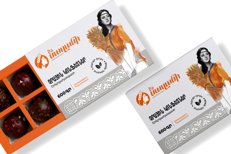
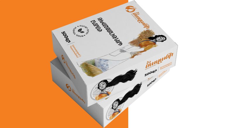
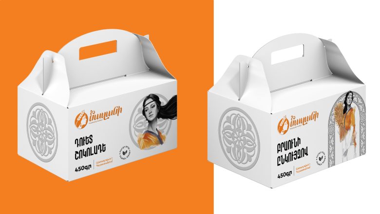
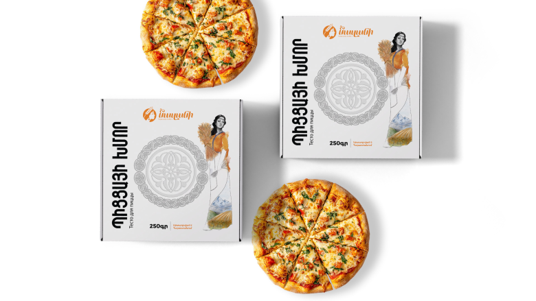
Nazani is a modern Armenian food brand built on the heritage of ancient craftsmanship, wheat culture and feminine strength. Our goal with this packaging series was to create a visual language that feels both authentically traditional and confidently contemporary. Each product—from chocolate truffles to pizza dough and cake slices—carries a unified brand identity anchored in an illustrated Armenian woman, symbolizing purity, dedication and the timeless connection to harvest.
The character illustration combines pencil-style portraiture with warm, expressive brushstrokes in orange tones, echoing the brand’s primary color and the richness of Armenian fields. This fusion of monochrome and color creates a dynamic focal point while preserving an artisanal feel.
To reinforce cultural depth, the layouts incorporate Armenian ornamental motifs, carved-stone patterns and textile-inspired borders, all redesigned in a clean, modern manner to maintain visual harmony across formats.
The packaging architecture emphasizes clarity, product visibility and shelf presence. Strong typographic hierarchy, white space, and the brand’s signature orange ensure an instantly recognizable look. Each box is crafted to balance tradition with simplicity, making the brand approachable, warm and premium.
Through this design system, Nazani becomes more than a food product—it becomes a celebration of Armenian identity, land and craftsmanship, brought into a fresh, contemporary visual world.
Graphic designer: Aram Atyan
Graphic Designer: Mos Atyan


Add to collection