ABOUT
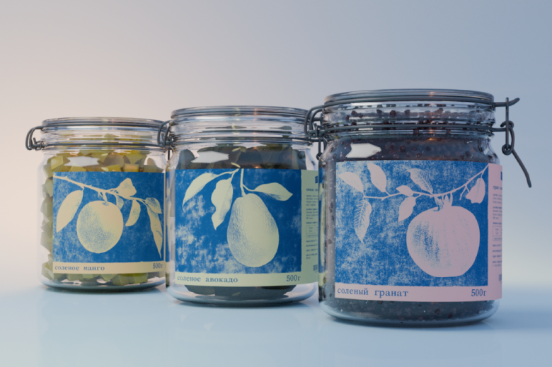
Poté is a brand that produces pickled products made from exotic Brazilian fruits. It exists on the boundary between the familiar and the unexpected: a traditional method of preservation combined with ingredients that are uncommon for pickling. The task was to create a visual language that would not simply describe the taste, but would work with the process itself — time, transformation, and anticipation.
SOLUTION
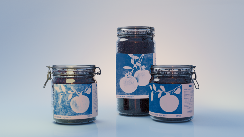
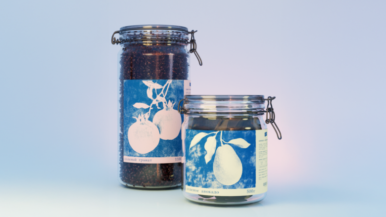
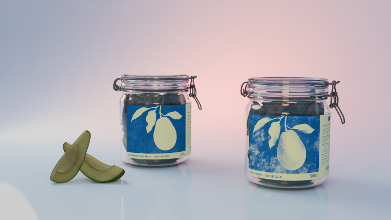
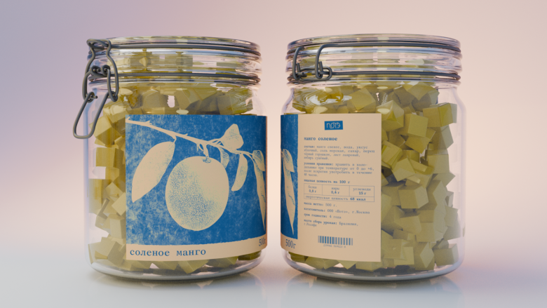
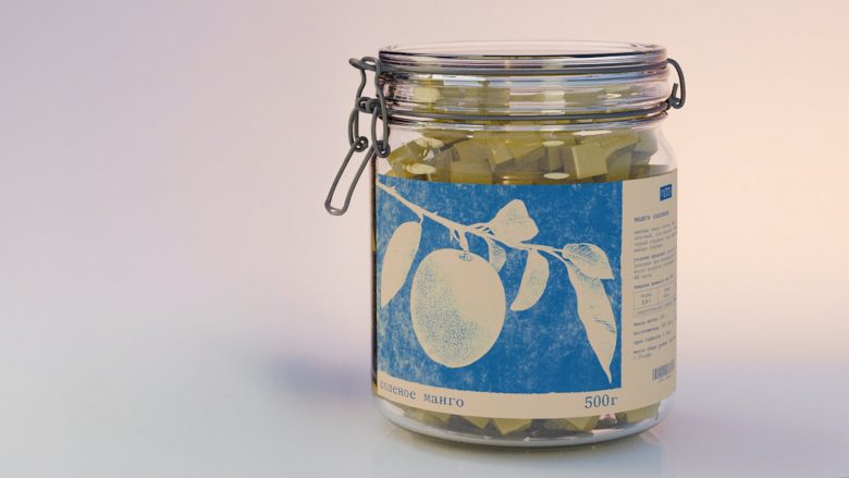
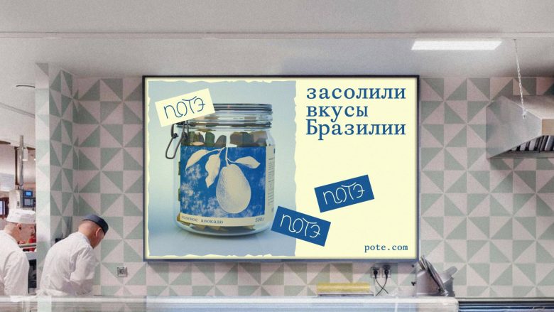
Cyanotype was chosen as the main visual metaphor — a photographic technique based on the reaction of salt and light. This approach is conceptually close to the product: both pickling and cyanotype do not reveal themselves instantly, their result emerges gradually. The packaging is divided into two series. The lightly salted line is designed as an image that is only beginning to appear, while the fully salted series resembles a completely developed cyanotype with deep blue tones and clear, defined forms. The blue color additionally enhances the sense of exoticism and refers to the unusual origin of the fruits. In this way, the level of salinity is directly communicated through the visual state.
RESULT
As a result, the packaging becomes more than just a carrier of information — it turns into a visual process that reflects the character of the product. The packaging emphasizes the ideas of time, anticipation, and transformation, creating a strong association between taste, technique, and image.
Designed by Lera Kharlan
