

Add to collection
vial is a multivitamin packaging and identity system by India-based design studio Presentable that explores how modular structure can redefine everyday wellness products in retail.
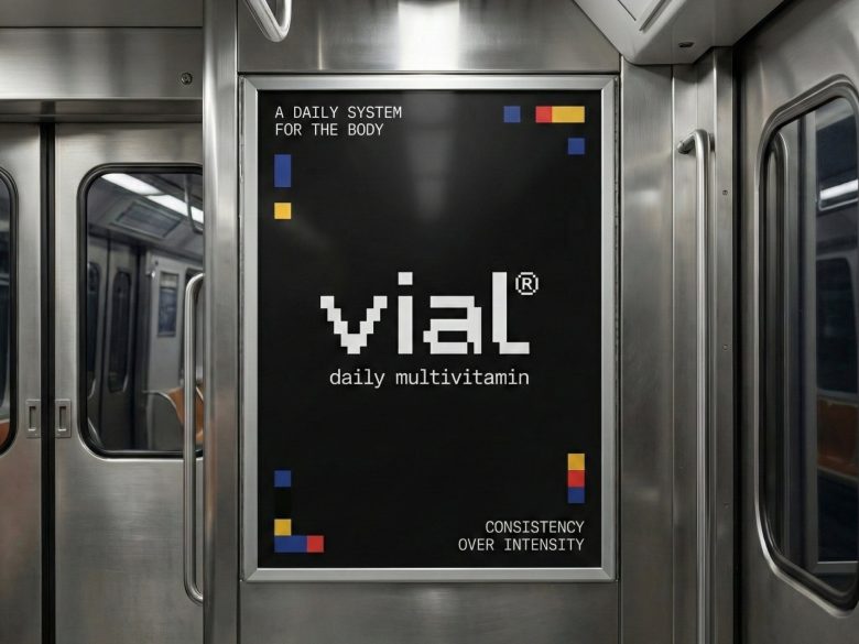
Supplement packaging often relies on urgency and visual noise. vial proposes a quieter alternative, framing daily nutrition as a steady, repeatable ritual expressed through consistency rather than exaggeration.
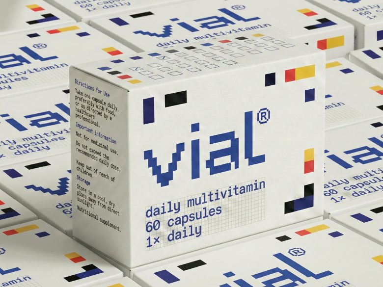
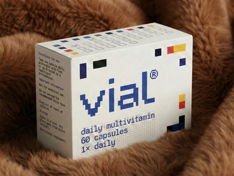
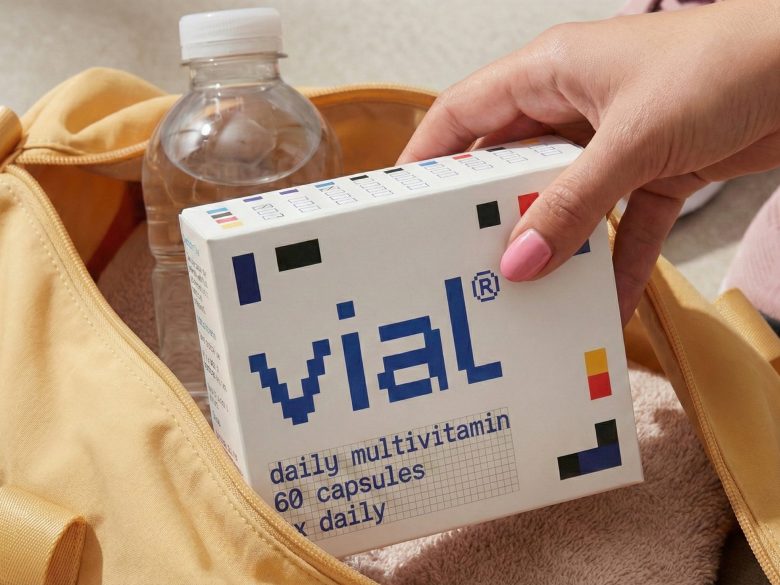
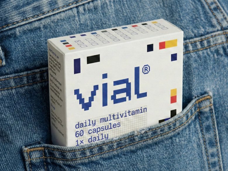
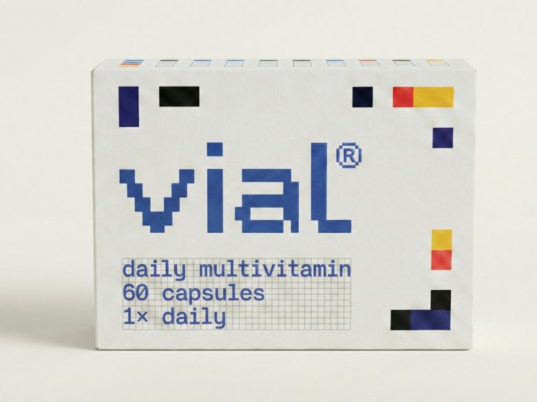
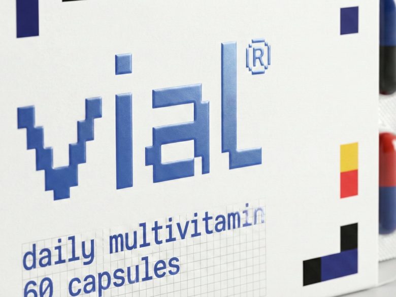
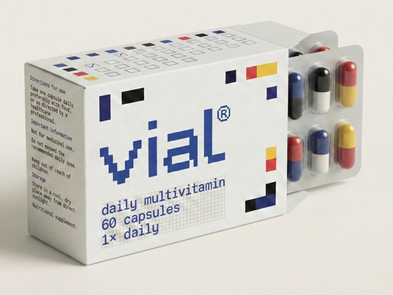
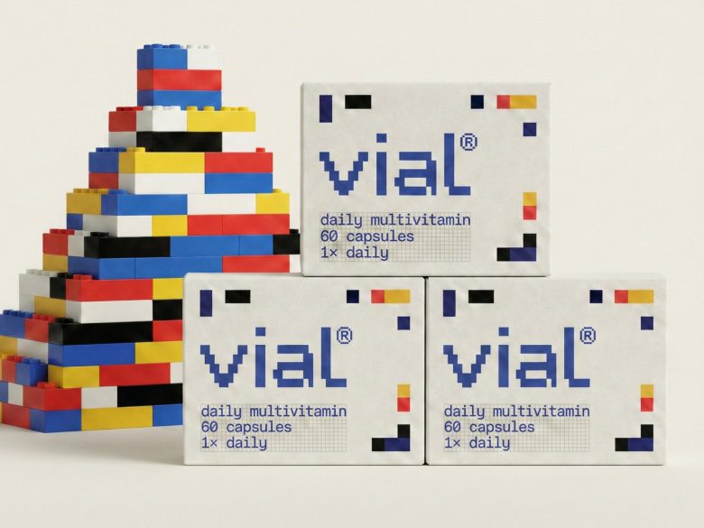
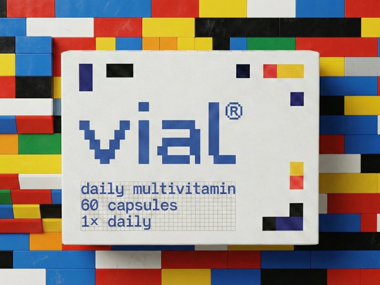
At the core of the identity is a rational grid where geometric units represent individual nutrients. These units align, stack, and shift across packaging, forming compositions that express balance and changing needs. The same structural logic shapes the logotype, ensuring the brand and packaging emerge from a unified system. Colour functions as an informational layer, differentiating SKUs while maintaining cohesion, and restrained typography supports clarity without competing with the geometry.
On shelf, repetition creates rhythm while controlled variation supports navigation. Integrated checkboxes extend the grid into interaction, turning packaging into a small ritual object. vial positions structure as an expression of care, where balance becomes a visual metaphor for health and consistency becomes the language of wellbeing.
Design & Art Direction — Presentable (India)
Add to collection