
The project in the Istanbul Metrocity Business Center was performed by mimaristudio, given that the boutique office in the Astoria Residence previously designed by mimaristudio for the same group was no longer able to satisfy the changing needs of the day, and it was necessary to adapt it to the developing international office standards.

The first step of the project was the search for a new location suitable for the new requirements. Mimaristudio participated in the selection of the most suitable place, in terms of technical infrastructure and requirements, from a few alternatives. The starting point of the planning was to ensure that the interior design would eliminate the hierarchical location of the employees and motivate the employees.

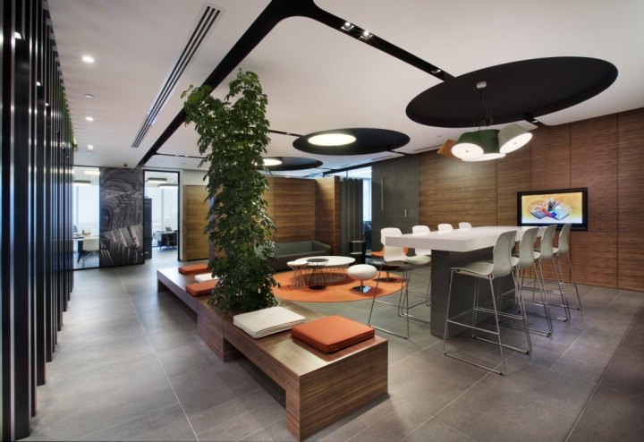
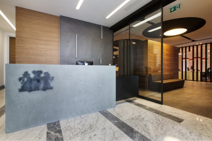
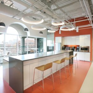
This approach focusing on the intra-company requirements, rather than the employees’ titles was reflected to this project that meets current and future requirements, emphasizes the company’s performance and dynamism and reflects a modern, but clear design. The project aimed at providing simple, but stylish office spaces, and the area was planned based on a foyer opening to the entrance hall, and connecting to two main circulation lines. The office welcomes you with a reception desk manufactured specially by using natural stones and furniture. The first space after the reception desk is the foyer. This space is designed as not only a waiting and recreation room, but also a meeting room, and serves as the artery of the office. The materials, colors, service facilities and lighting concept of this space were designed to make it user friendly to the employees and the visitors of the office.

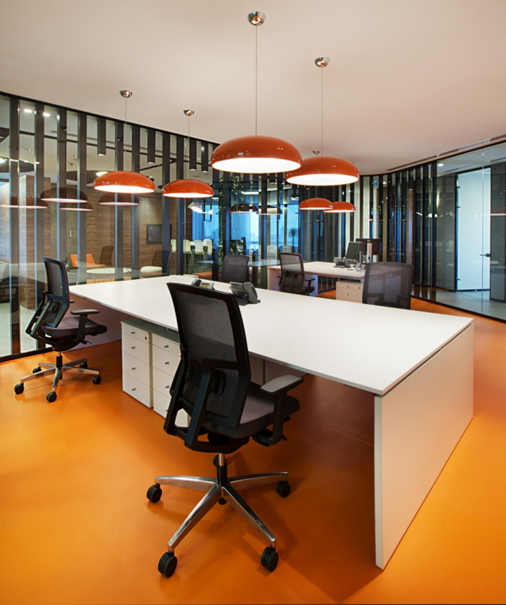
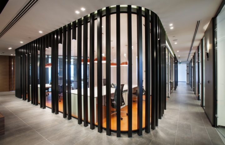
The triangular layout of the space starting from the foyer connects the two corridors at the service exit, and divides the office into three zones. Two sides are connected to the facades, and the space in the center is used as a working space. This space is the center of the office in terms of colors, materials and planning. A single color is emphasized in the work stations, and the area containing the team work spaces. The poles converted into lighting fixtures in certain points and surrounding the working capsule support the emphasis of the space.

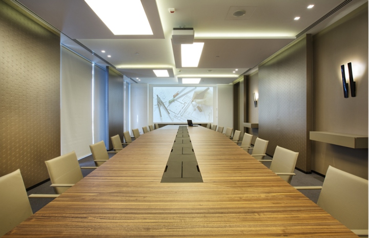
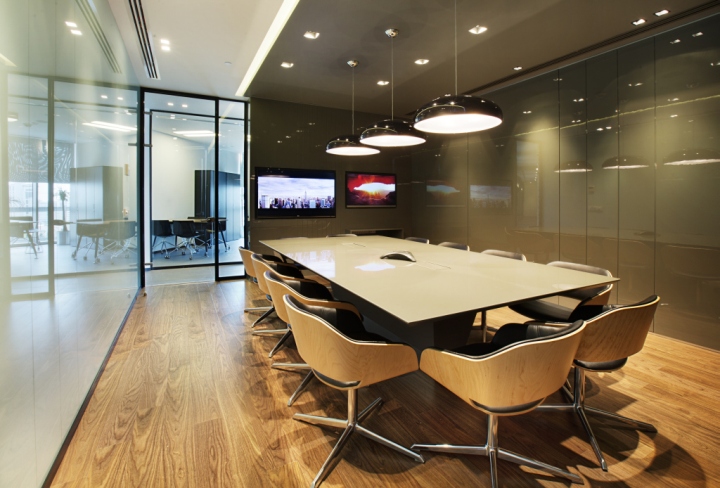
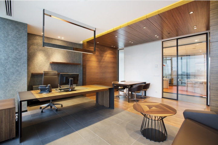
In the office, two separate meeting rooms were designed, each facing difference façades. One is a general meeting room with a capacity of 22 persons, while the other is a meeting space for 12 persons with video conference facilities. The materials and the textures used in the bigger meeting room have softer colors, while attractive colors and materials were selected for the other. All components of the walls and the concept of the meeting table were specially designed by mimaristudio. Certain design concepts were applied to independent work units and group work spaces, while a different concept was used in the office of the director. This office is divided into two sections, namely the working space and the meeting space, and the fine construction materials used inside this office particularly emphasizes this difference. Like in all other independent units, this room has an independent meeting corner, and all wooden applications other than the mobile furniture were specifically designed for the user.

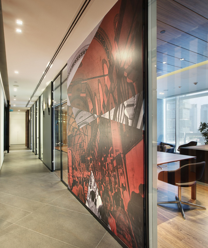
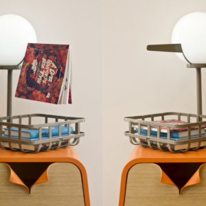
Upon the request of the user, carpet tiles applied to the floors of the office, except for the big meeting room. Specially cut granite tiles were applied to the main entrance and the circulation areas, laminated tiles were used in the small meeting room, and PVC floor tiling was used in the working spaces. All furniture in the office was designed specifically by mimaristudio, considering the office’s concept and requirements. The supplementary products, other than the workstations, were selected from different brands, such as Neotek, connection and Gotwob, for complementing the concept. While examining the façades of the working stations facing the two main corridors, the full/empty balance of these façades were taken into consideration. The visual works created by Future-ist and mimaristudio as an extraordinary interpretation of different photos of Istanbul stand out on the sides of the workstations facing the corridors.

The common problem of working areas, namely acoustic and noise isolation, was particularly taken into consideration during the project stage. Accordingly all separating walls were designed by using noise isolating multilayer wall panels, connected to the floors and the ceilings without leaving any space in between. The dark colors, preferred in every part of the office, and used generally in the works created by the design group in the recent years, were used in the wall coatings, the floor coverings, the glass segregation systems and the lighting fixtures to create coherence. Dark Aydinlatma provided professional support during the design of the lighting throughout the office. The plans were prepared specifically for the office in accordance with the design’s concept, and the utilization purpose of the office. The lighting level of each area was calculated independently and the critical areas were taken into consideration. As a result of these studies, the fixtures used as a part of the lighting design and providing general light to the office were supported by decorative products at certain areas. We cooperated with Lumina Aydinlatma while selecting and ordering these decorative products.

At the planning stage, we preferred working cabins, rather than an open office space; and designed the lighting by appropriately balancing the lighting levels, areas and utilization purposes recommended for working areas. Accordingly the control of the lights was integrated to the project, given that the lighting requirements vary throughout the day. The opacity between the rooms was designed in a manner resulting in the perception of the ceilings as a whole and the continuity of the lighting groups. Different fixtures were selected for different areas, and special lighting solutions were provided for the working stations. The project created a workspace that reflects the employer’s corporate sedateness and global vision together with its international identity.
Design: mimaristudio / Ayca AKKAYA KUL / Onder KUL
Photography: Gürkan Akay
