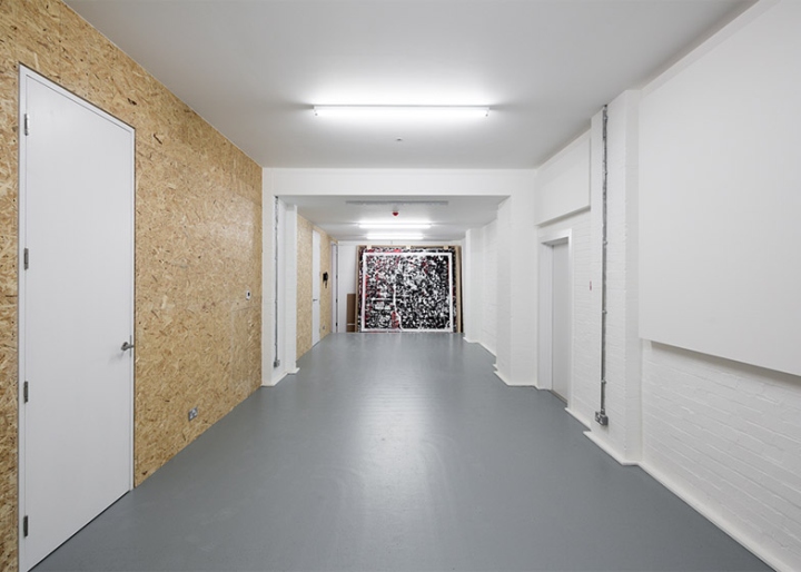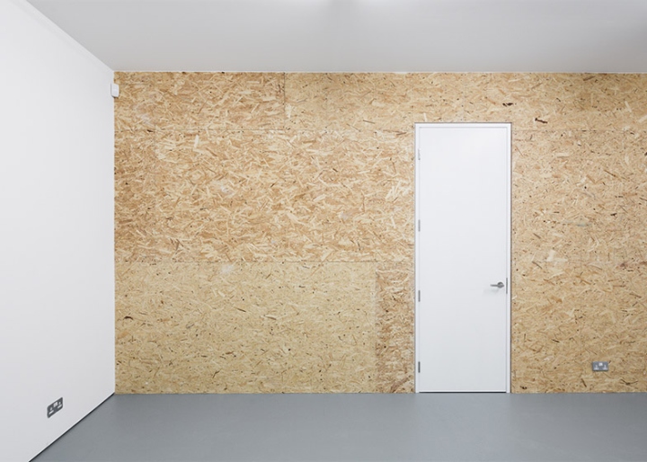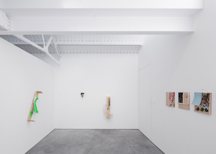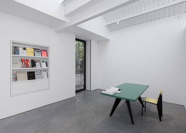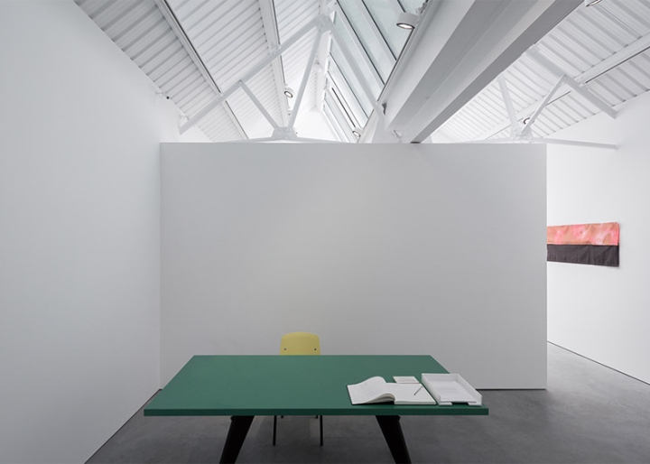

London studio Matheson Whiteley has revitalised a trio of dilapidated 1940s warehouses to create a new contemporary art gallery opposite one of the city’s historic churches.

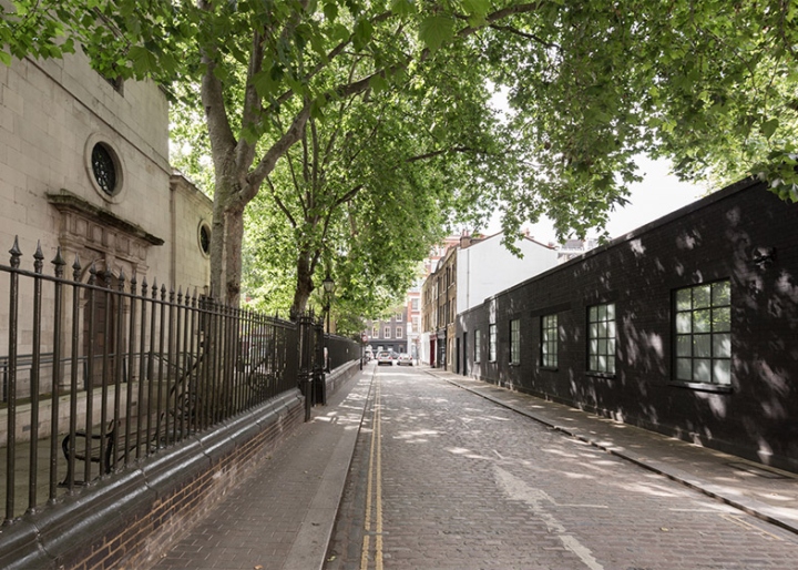
The site for Modern Art sits directly opposite St Luke’s, a church designed by British architects John James and Nicholas Hawksmoor dating back to the 18th century. The challenge was to create a structure that would be sensitive to its setting while also suiting the functions of a modern exhibition gallery. The three existing buildings on the site were in a bad state of repair, but after an initial assessment architects Donald Matheson and Jason Whiteley realised they featured many qualities suitable for a gallery, so decided to retain rather than demolish them. “We think re-use is a critical architectural topic because it relates so fundamentally to sustainability,” Whiteley told Dezeen. “We could tell immediately that the fundamental proportions of the interior space and the saw-tooth profile roof-lights would be important,” said the architect.

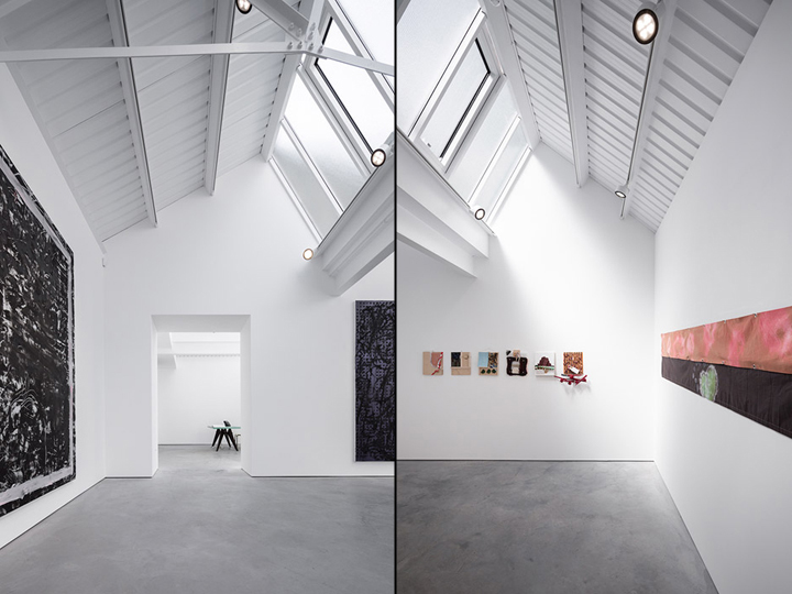
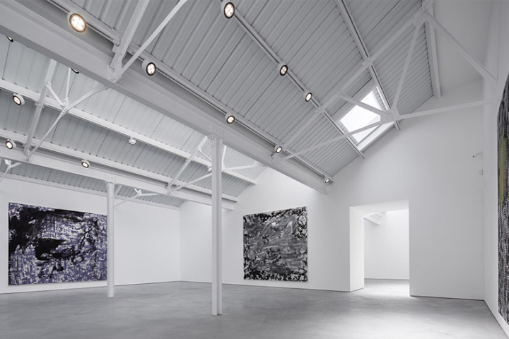
The first task was to repair the existing buildings and strip them back to their basic structures by removing ad-hoc extensions. The space was re-organised to create two galleries – one large and one small – and a series of ancillary rooms. A new polished concrete floor slab was also inserted to unify the three previously separate structures, creating a continuous surface that integrates underfloor heating. “In architectural terms it succeeds by drawing disparate elements together to form a new singular identity – neither explicitly modern, nor overly beholden to the past,” said Whiteley. “We were interested in coaxing unused and forgotten spaces back into public life while retaining a memory of previous functions,” he added. “As a position, this leaves room for invention and the architectural imagination.”

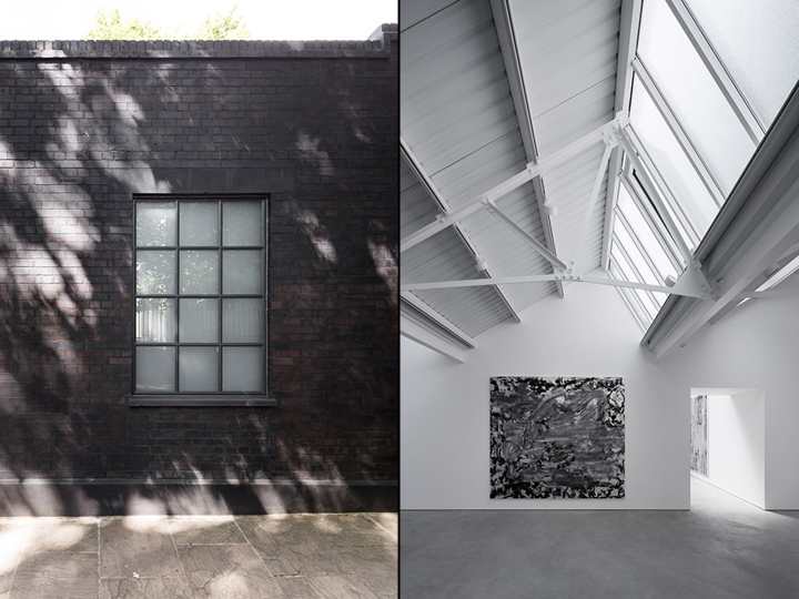
New windows were built into the six existing openings along Helmet Row and colour washes were added to the external brickwork to give the walls a dark purplish-grey colour. A three-metre-high entrance was also inserted, matching the height of the window lintels. Inside, the glazing of the skylights was repaired using wire glass, and opening panes were added to enable natural ventilation. “Replacing the roof-light glazing involved careful research to find a kind of Georgian wire glass reversed to provide a diffuse quality, but still quite textured,” said Whiteley. A new overhead track lighting system was also added to supplement daylight on darker days, and also to offer flexible directional lighting for highlighting particular artworks on display. The team also paid particular attention to the scale of openings between rooms to make them feel like spaces in their own right.

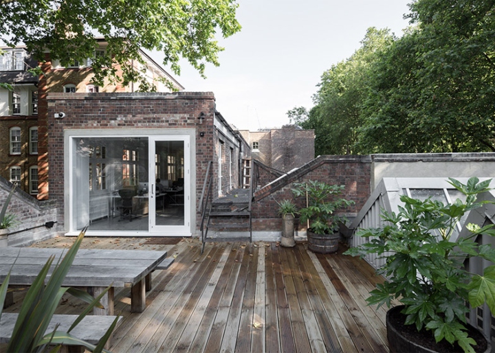
“It was important that the display spaces suit a range of scales – from intimate work to quite monumental pieces,” added Whiteley. A separate access on the outside of the building provides a route to offices on the upper level, as well as a decked roof terrace.
Design: Matheson Whiteley / Donald Matheson / Giles Reid / Jason Whiteley / Naohiro Mizushima / Paol Kemp-Roudot
Photography: Maris Mezulis


via Dezeen
