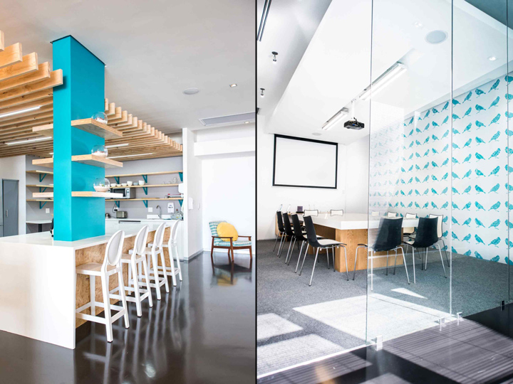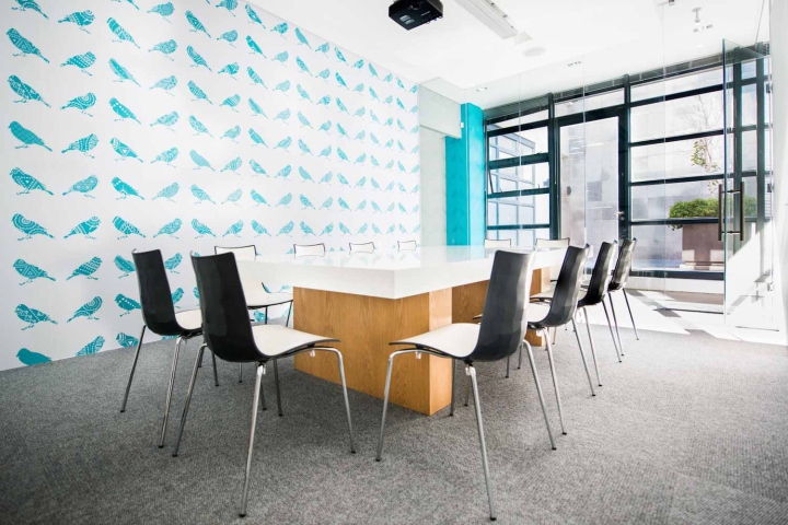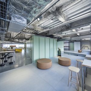

Led by Inhouse Brand Architects’ director, Aidan Hart, the re-design of John Brown Media’s premises aims to increase connectivity among staff members while aligning the physical environment with John Brown’s charged work ethic and creative output. The new space incorporates John Brown’s corporate colour, teal, which is uplifted by vibrant yellow, and expands on the company’s informal bird theme motifs that were in place in the previous offices. A stylish yet lighthearted Scandinavian aesthetic runs throughout.

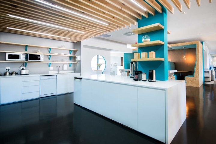
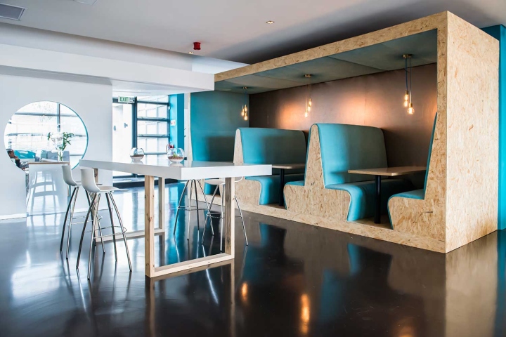
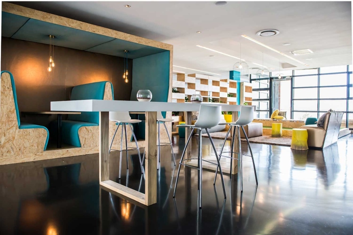
Once past the reception area, the offices open into a shared space that includes an open-plan kitchen with a breakaway dining table and seating. Directly opposite the kitchen and table is a series of three eating pods featuring high-back booth seating in the company’s signature teal. Because of its proximity to the kitchen, the booths have successfully enabled staff to socialise and engage with one another while grabbing a bite to eat.

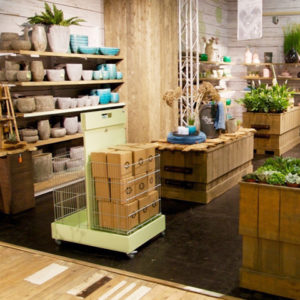
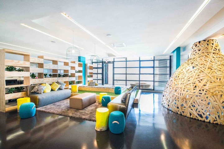
Beyond the kitchen and dining area lies a lounge area or indoor ‘campsite’. The ‘campsite’ is kitted out with faux grass, picnic-like seating, timber plant boxes and canary yellow wooden tree-trunks. Brightly hued lounge seating, a cartoon-covered ‘bed’ and birdcage light fixtures add delightful visual fodder. The nod to the outside world brings a natural balance to the interior. Multi-functional, the campsite serves as a versatile informal lounge, communal gathering space, and waiting area for guests. With internal communication increasingly being driven online, there has been a loss of intimacy and face-to-face conversation. Yet this ‘campsite’ area allows staff to revitalise, reconnect and refresh, and has catalyzed a creative, happy working environment.

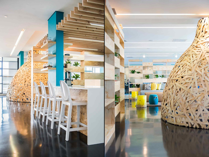
Adjoining the campsite is an unconventional meeting room that takes the form of an oversized weaver’s nest. The ‘nest’ is constructed from timber fins and is clad in strips of pine. It takes centre-stage in reference to John Brown’s fondness for birds.

According to Inhouse designer Jenine Bruce:
“The nest was influenced by the company’s incorporation of birds within their branding. So, we chose to use this in our design by taking it a step further and building a nest which creates a ‘safe’ and intimate meeting spot for employees.”

Daylight from the existing large glazing facade allows natural light to filter in through the slats of the nest giving the interior a dreamy ambience. The nest has great presence and can be seen, via the keyhole design in the reception wall, as one enters the offices. The nest and lounge were set back against floor-to-ceiling glass walls that lead out onto a balcony and were positioned in such a way so as to take full advantage of the impressive views of Devil’s Peak and Table Mountain.

Flanking these main feature areas on either side lie open-plan offices for staff, with the central campsite acting as a visual and physical connector. The staff workstations are partly screened off by the series of multi-functional wooden shelving that supports both planting and library space and provides some measure of privacy.

The level of communication within the company has changed dramatically due to the open plan layout. This is a considerable advantage and something the client particularly wanted to achieve considering that the previous offices occupied two separate premises. John Brown was originally on two floors in Black River Park and the different departments were very separated. The new layout encourages greater productivity as it provides various meeting and breakaway areas that allow staff to leave their desks and engage in a different environment for a quick meeting or brainstorm.

John Brown has commented favourably on the marked and positive effect this has had on staff morale and output. Inhouse has provided an interior design solution that not only is an antidote to formulaic corporate office design, but has also contributed to increased cohesion, creativity and productivity.


