
Interior:
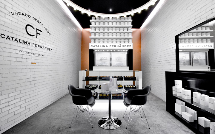
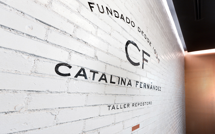
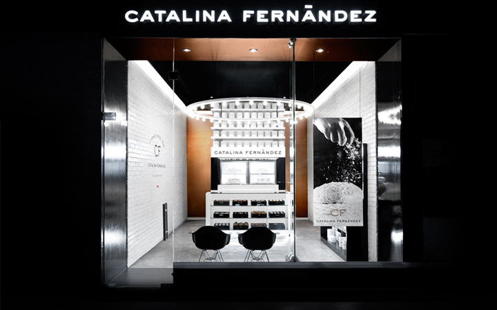
Catalina Fernandez is a high end pastry boutique established in San Pedro, Mexico. The concept in which the store’s interiors were based is the brand’s origin. It started in 1988 as a home based bakery and ended up as a successful pastry shop.
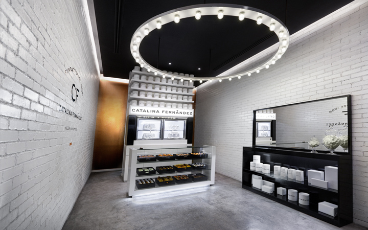
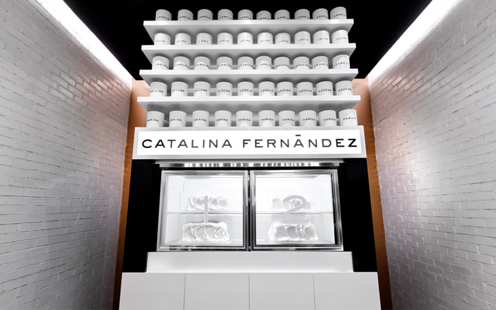
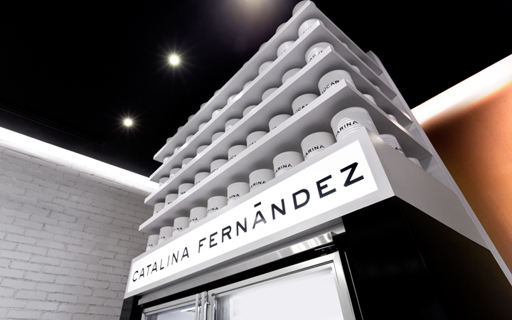
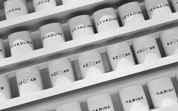
In order to give the store a look similar to a warehouse/kitchen, we used packages of sugar, flour, and yeast and placed them all over the store. To benefit from the stores tall ceilings we designed a vertical structure with shelves above the refrigerators.
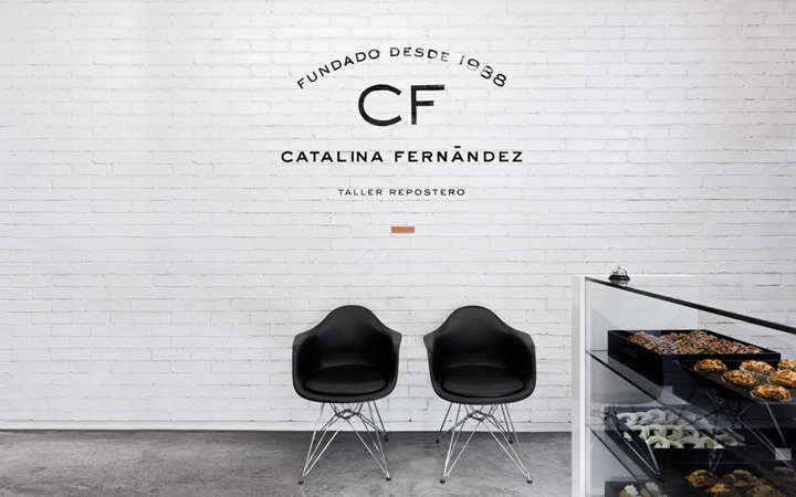
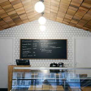
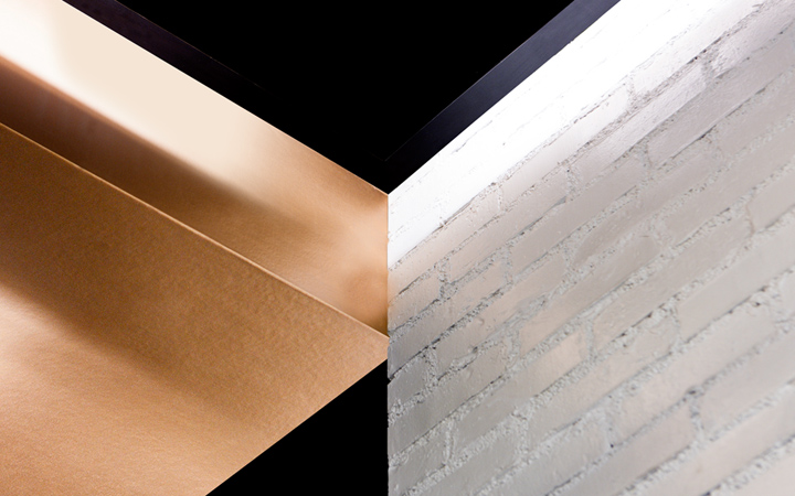
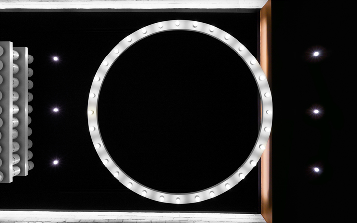
The brick wall with white enamel is meant to make the store look impeccable, as well as old fashioned, so there would be an interesting contrast between the worn out bricks and the modern furnishings, with all simple and geometrical shapes. The goal was to create a place that even 20 years later would still capture the eye of people walking by with its imposing lighting and simple props.
Branding:
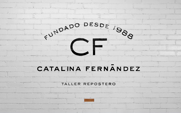
Catalina Fernandez is your typical home based bakery that started in 1988 and eventually became a successful pastry shop. Along with the shops growth, came the need to open more branches and to penetrate new generations of potential clients.
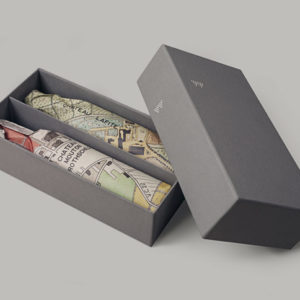
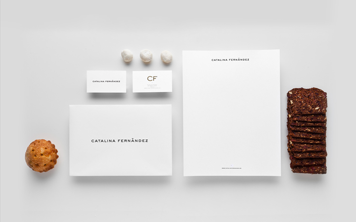
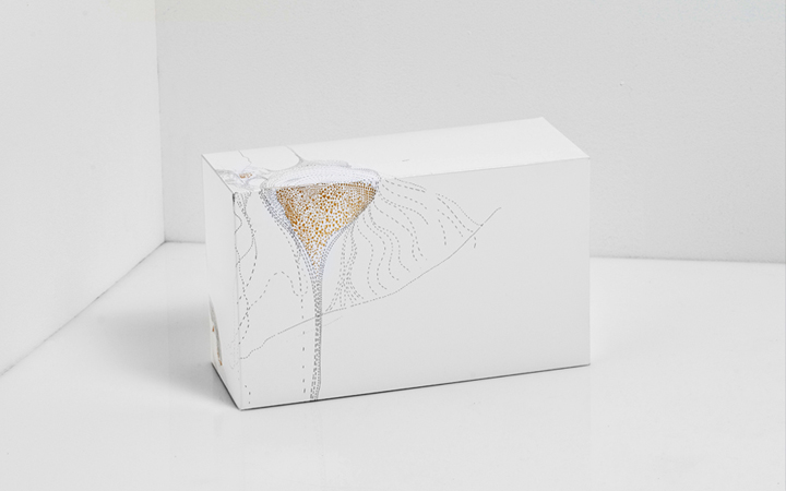
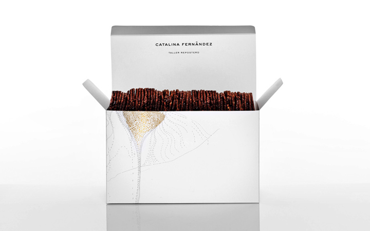
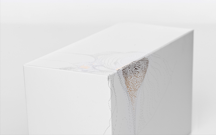
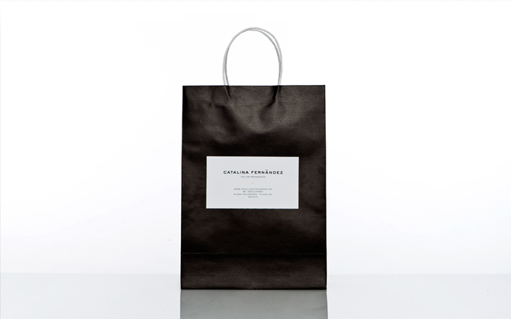
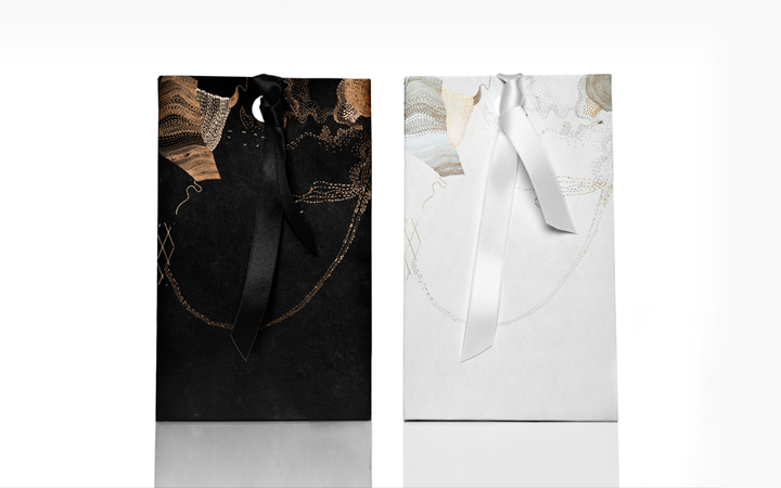
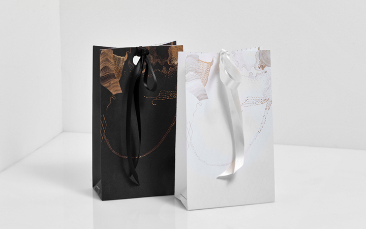
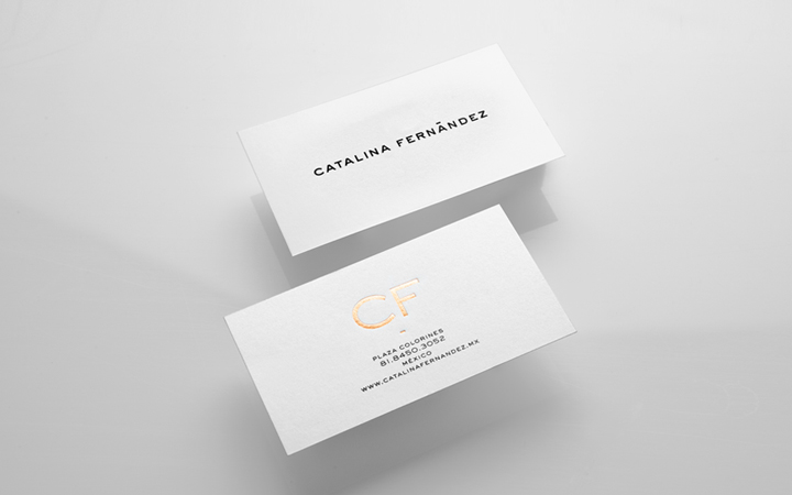
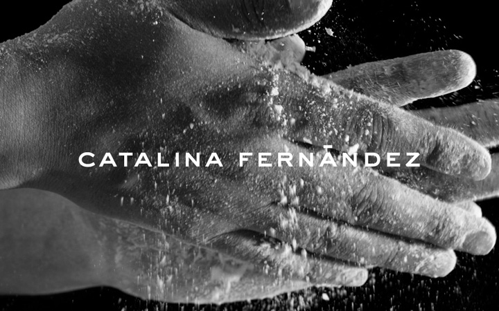
When the client approached us, she told us her desire of upgrading the brand to a much more sophisticated style. Based on these requirement we developed a very elegant identity, with a sans serif typeface to keep the brand neutral and give it a chance to evolve in the long run, with new designs for their packaging and other printed pieces. The various boxes and bags were decorated with details in golden foil that, not unlike Catalina’s pastries were, took many hours of attention to detail.
Designed by Anagrama


Add to collection
