
The Spanish company came to A+D with plans to open a chain of stores in Eastern Europe. Stores were carrying around 100 pairs of shoes completed with bags. All set of shoes and a bag have its own style and should be exposed in the way that allows comfort of watching, touching and trying without creating a mass or overloaded effect. The concept should be easy to implement on small size stores.

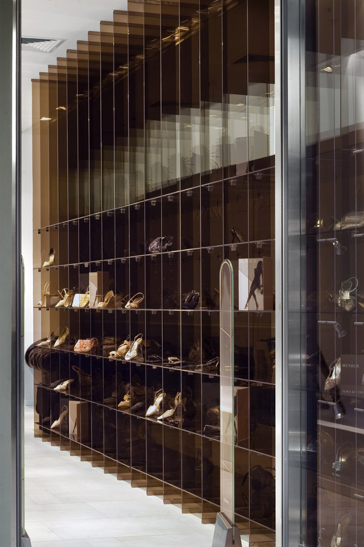
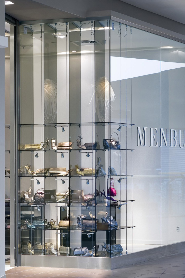
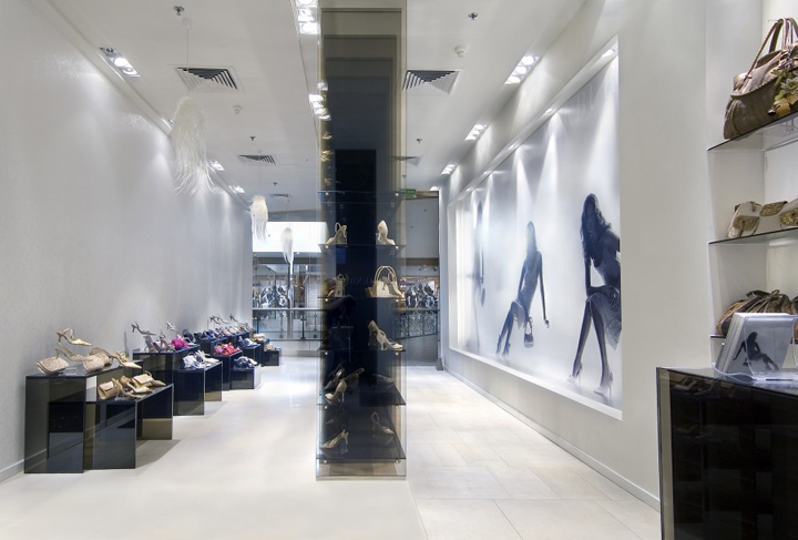
A+D Studio came up with an idea of opening the store window to allow consumers easy entering while seeing many attractive products at the same time. The shop window exposition has been turned 90 degrees to create an entrance with a feeling of a street. The feeling is created by a “city-size” billboard from one side and classic expo from the other side.

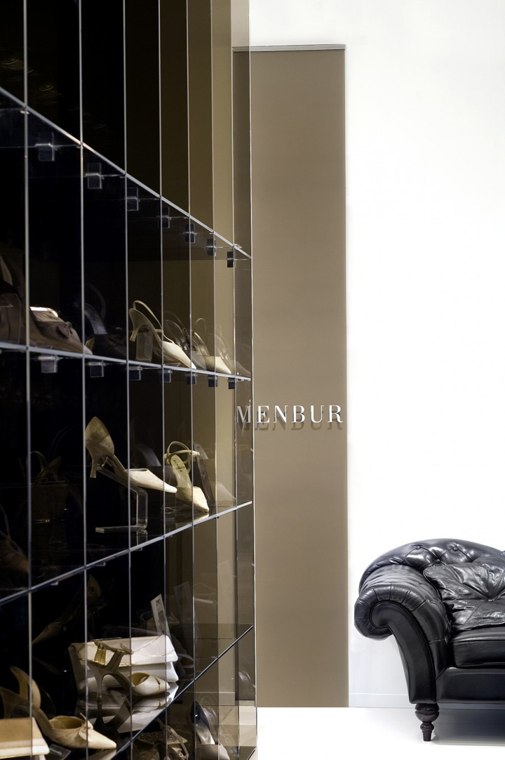
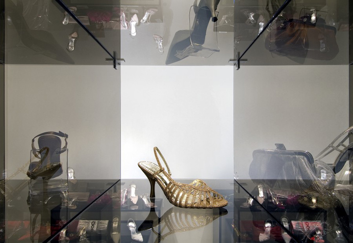
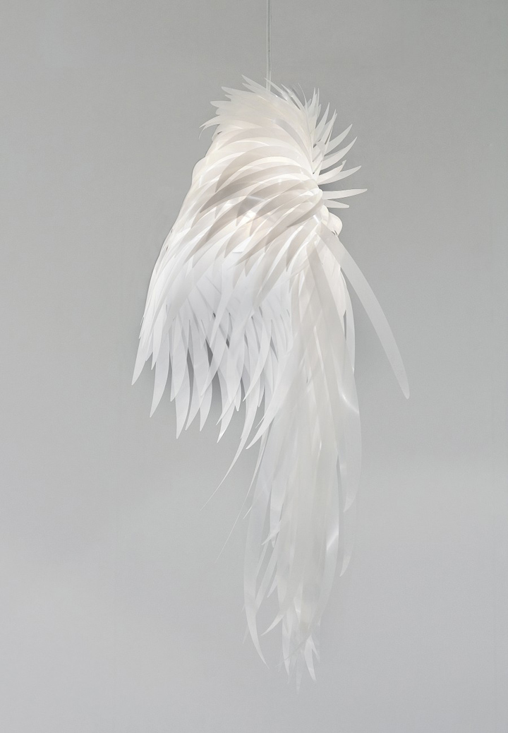
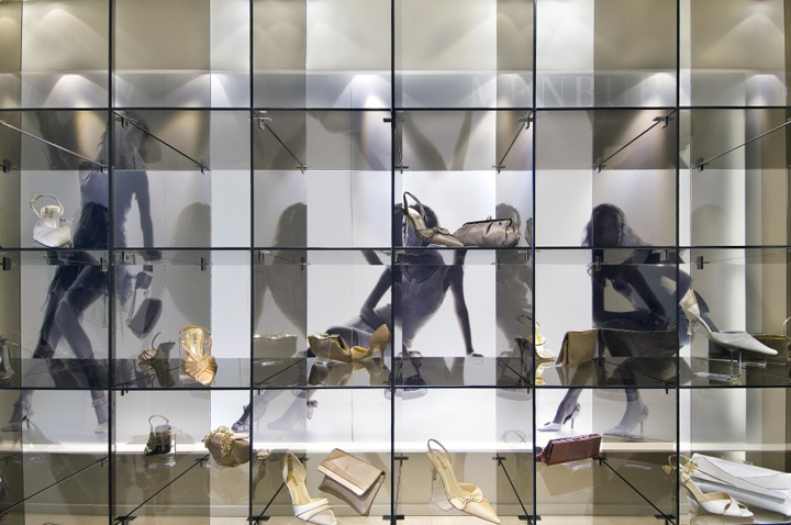
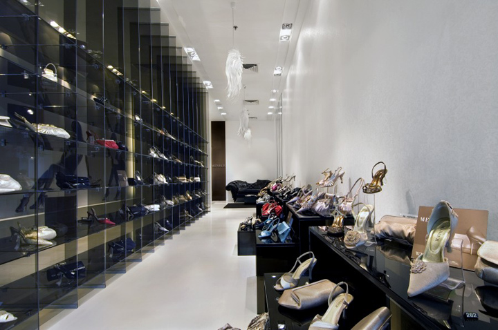
All sets are shown in separate boxes. The smoked glass allow easy understanding of the product line with perfect separation of interesting set from the rest. After entering the white, strong illuminated “corridor” we see a big sofa with black skin. The natural material breaks down the technical and cold perception of the shelving system. Natural materials are also used in chandeliers which are repeated few times. Those laps with shelves are icons of the concept.

Merchandising is also placed along walls in typical units. The uniqueness here is created by carefully designed lights (3 different lighting angels have been used here). All sizes between furniture and the VM planogram itself were planned keeping in mind close contact with the product, strong consumers independence (comfort zone) and very limited area of the store with great capacity’s expectations.

The aluminum logo placed in an unusual way and unique POS materials and VM accessories accent the store and symbolize modernity and usage of latest technology creating the presented offer. The concept was adopted for trade fairs, showrooms and boutiques across the whole Europe.
