
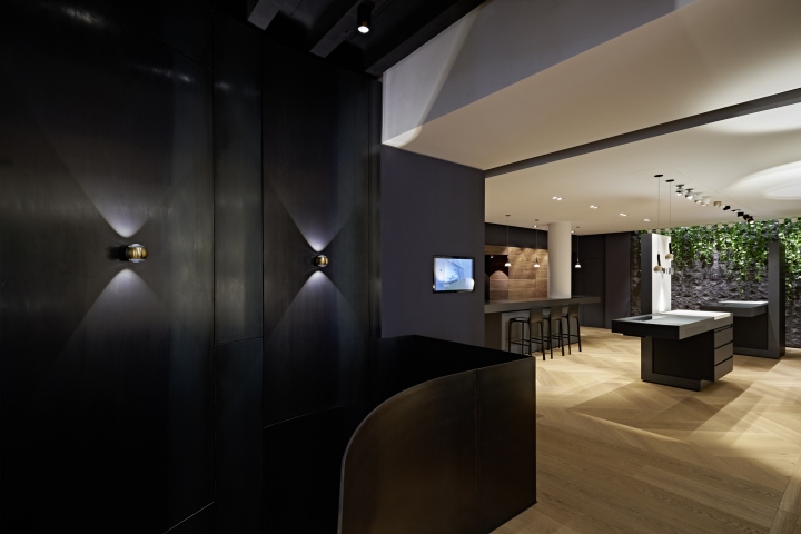
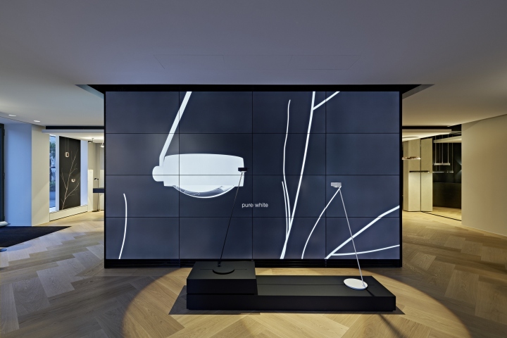
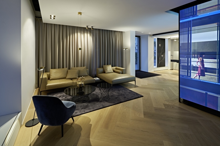
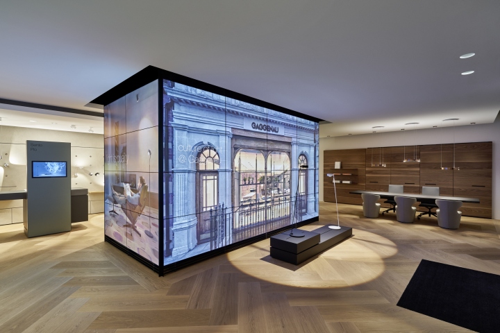
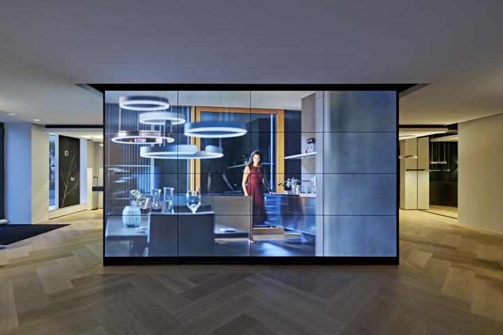
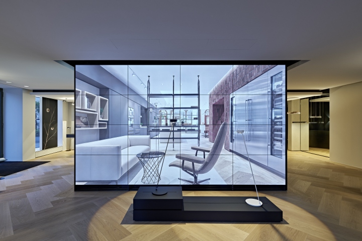
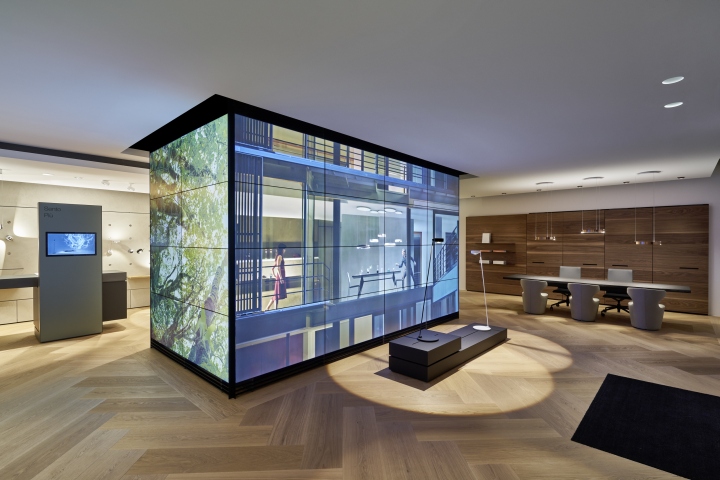
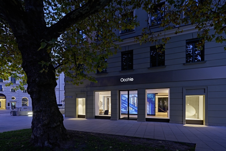
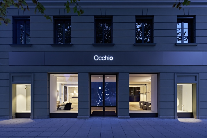
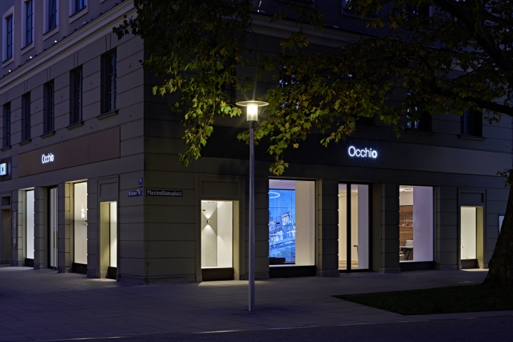
With its second flagship store in Germany, Occhio sets a new benchmark for the presentation of the premium lighting brand with its innovative range products and creates a retail experience matching design and quality of the product with the store design in every detail. The location at the heart of Munich within the historic Luitpoldblock, puts a spotlight on the brand which is surrounded by neighboring brands Acne Studios, Aesop, Aspesi and Schwittenberg. The 300 sqm space is arranged on two levels, visible from the distance due to its large sale video wall which can be seen across the square in front of the store.
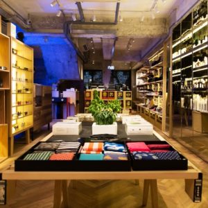
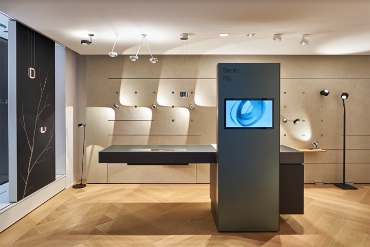
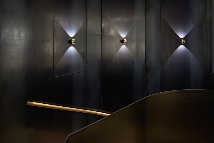
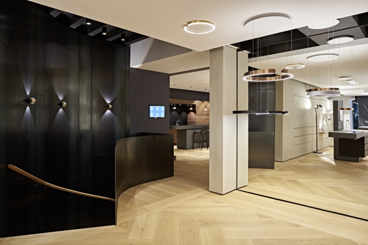
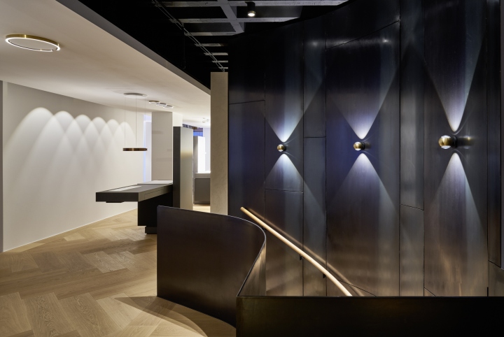
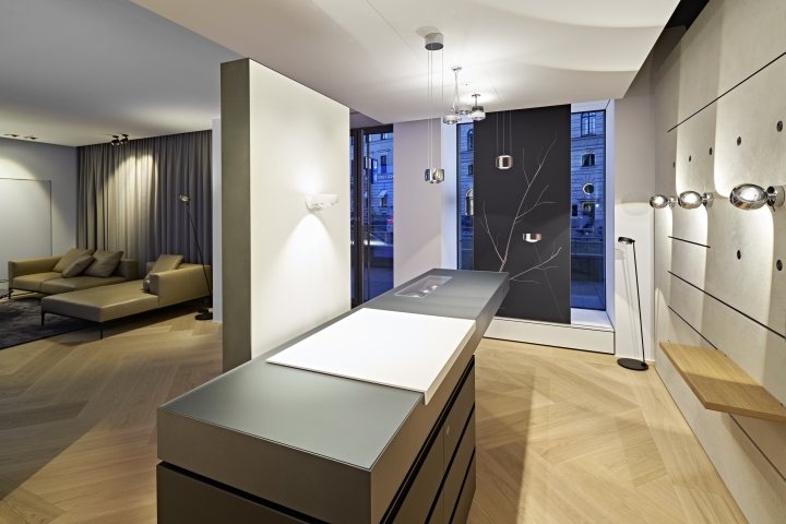
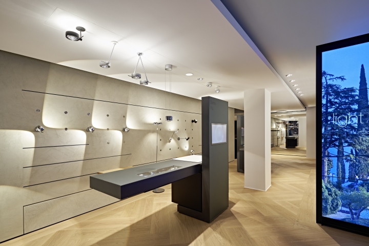
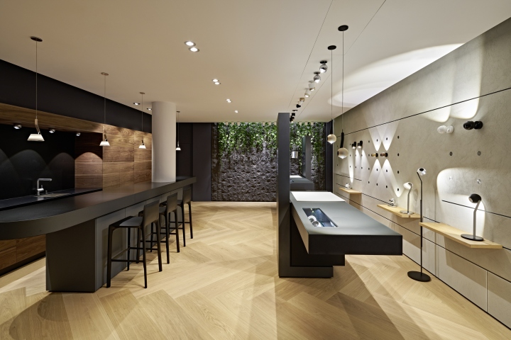
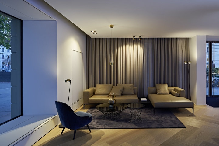
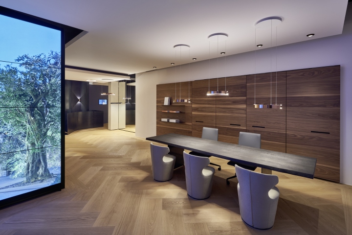
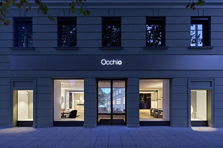
The minimal design of the historic store front sets a contemporary contrast to the listed building. Entering the space nothing reminds of a retail store at first sight. The general mood and impression reflects a contemporary and highly sophisticated home interior, defined by precious materials and a soft tonality. The lights are naturally arranged with the carefully selected furniture pieces and create an uplifting atmospheric experience.
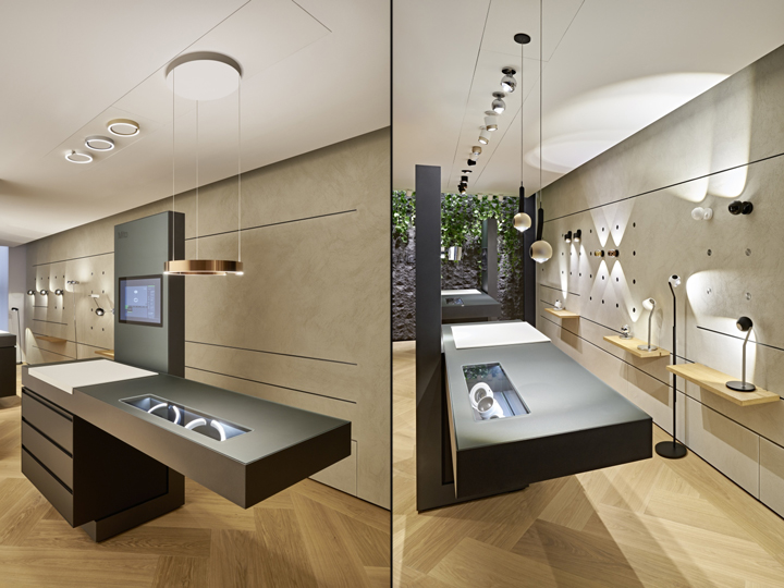
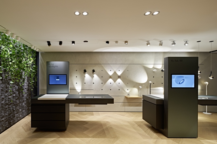
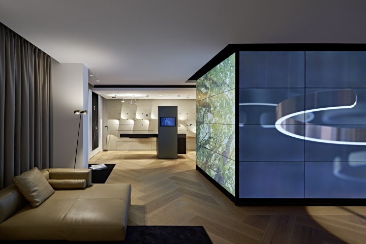
The presentation of Occhio’s lighting systems along walls and ceilings is fully integrated in the plastered walls, offering electrified plugs and rails, allowing for a flexible plug and play visual merchandising. Customers are visually guided through the product area by vertically arranged shafts which mark the product categories with an integrated screen and cantilevering table with an integrated showcase which displays the product in a most delicate manner.
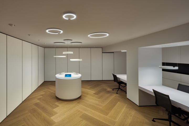
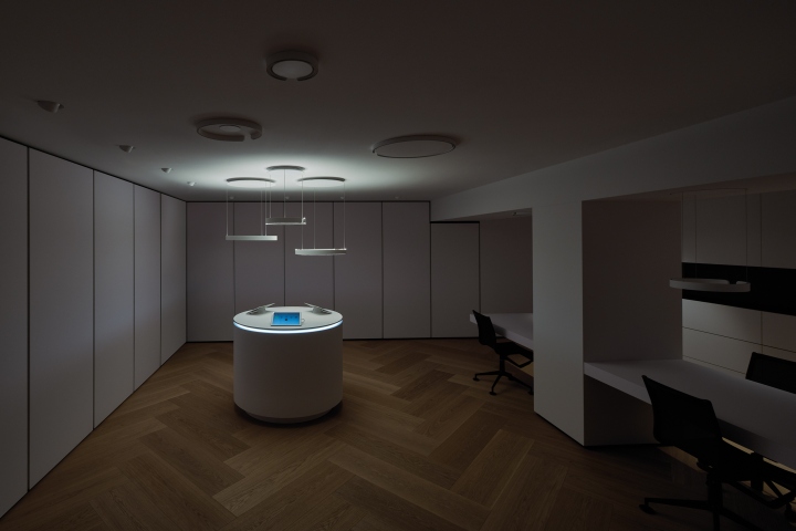
The visible surfaces are made from satinated glass, carrying a mirror on the backside and an inbetween colored layer of film. The second level in the basement is a walk-in storage space, focussed on the experience of light. The storage-shelves are hidden behind white large-format doors, making a white-cube which is used for demonstration of user interface, control and consequently how a whole space can be modulated by light.
Design: einszu33
Photography: Robert Sprang


Add to collection
