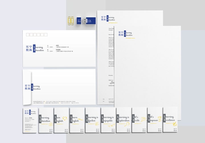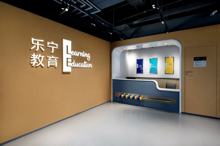

We were honored to work with Learning Education in 2017 for their comprehensive rebranding. It was a full scale integrated project that involved nor just graphic branding rework, but also generating new brand assets like brand video, key image photography, and extending the branding across spatial design, facade treatment, signage and wayfinding.

INSPIRATION:
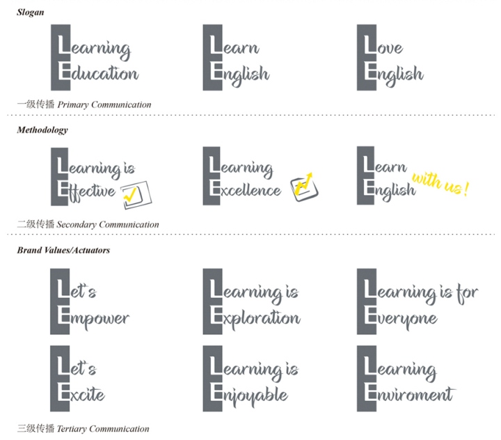
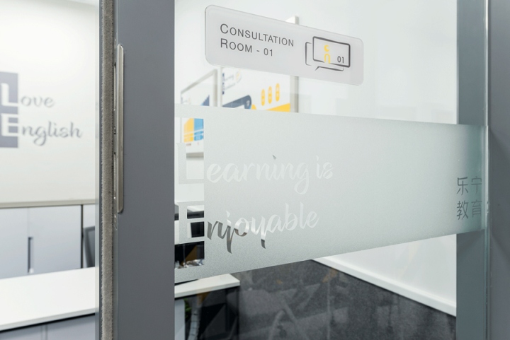
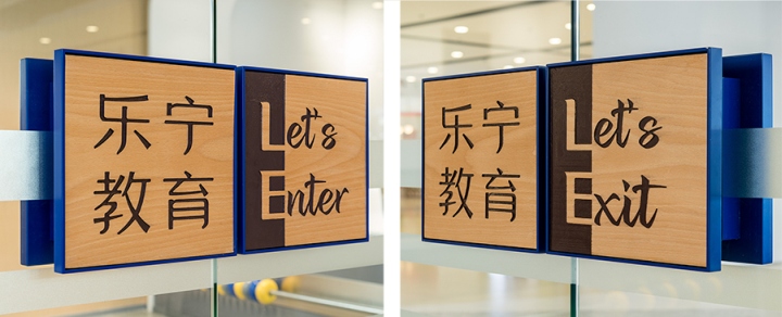
How do we integrate a brand logo (a fixed component) with marketing communications (a variable component) seamlessly? So that the brand DNA is encoded directly into the branding, facade, signage, graphics, video and even methodology wise. So that it is not a placeholder at one corner, but front and center in touchpoints visually. That is the starting point of this project. And where better to demonstrate the power of language in design than a project for a children’s English education client.

PROJECT DESCRIPTION:
A comprehensive integrated rebranding project that involved graphic branding rework, generating new brand assets like brand video, key image photography, and extending the branding across spatial design, facade treatment, signage and wayfinding. In response to a greater need for quality English education, the client decided to embark on a holistic rebranding project to reposition the company for the future.

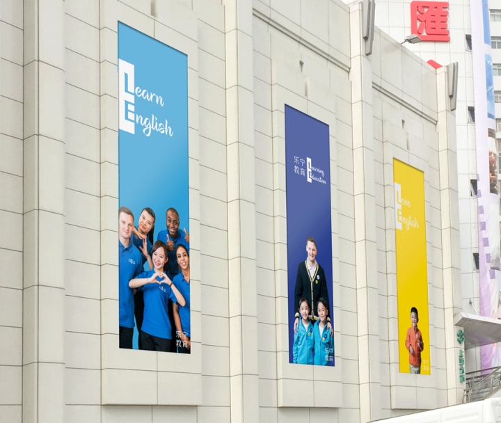
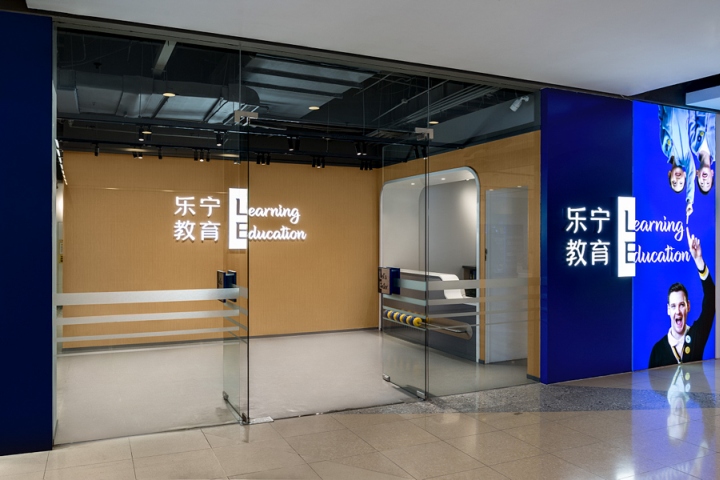
In visual communications, we used solid colors as background, with two purposes in mind. The first is so that the different combinations of L & E words can be understood quickly as that is the core essence of the brand. The other is so that we can focus on the expressions of the children and teachers. Honesty is such an important aspect of the branding that we used their in-house teachers and students, and not professional ones.

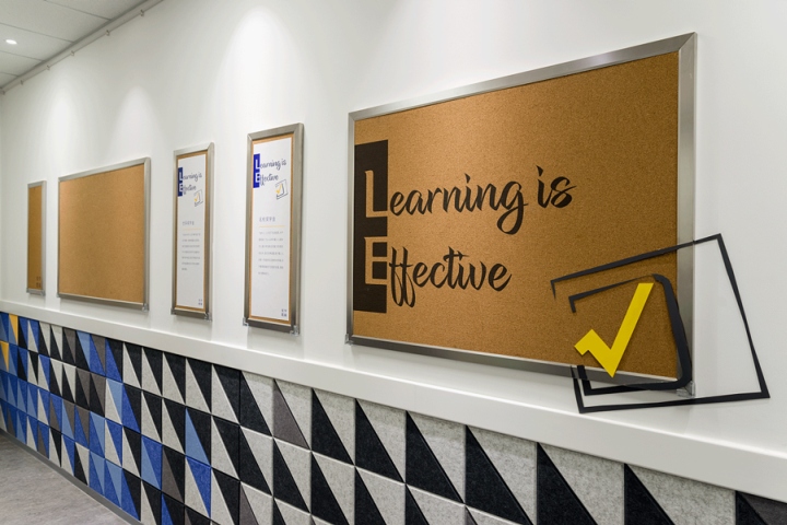
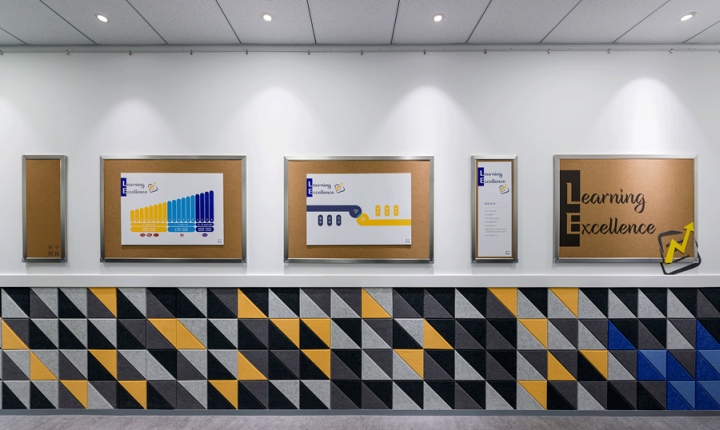
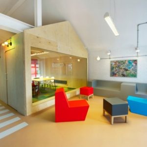
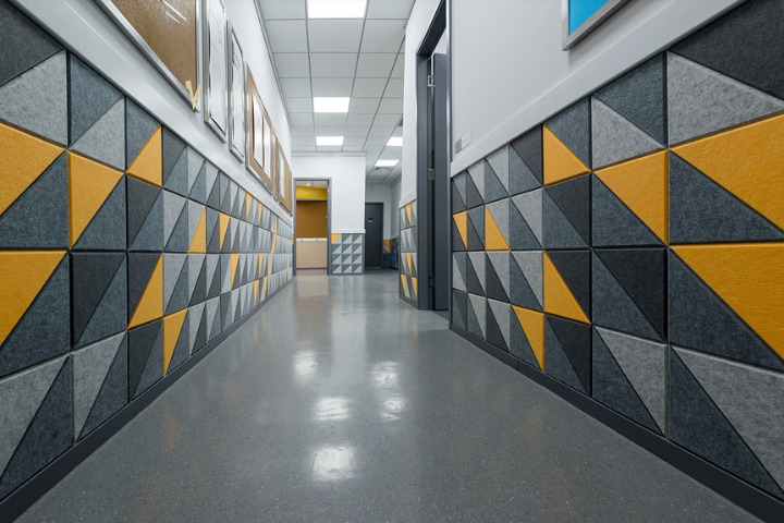
The different colored backgrounds are meant to correspond to different communication purposes. Yellow for students only, light blue for teachers only, and dark blue (primary corporate color) is used when both teachers and students appear. Spatially, we created a mosaic pattern made of sound proofing panels that resonated with core branding as well as providing a lively environment for children at their viewing height.

CHALLENGE:
Because of the way the logo is enlarged to be a primary communications and visual device, it was a challenge to make the design work across all touchpoints. From the facade, outdoor advertising of all dimensions and aspect ratio, to multi-media application and interior decoration.

We are only presenting a snapshot of this branding at this moment in time. Branding design should evolve organically with changing market needs, and it is with this belief that we created a Visual Identity system that has the ability to grow with the client and their consumers.
Designed by United Design Practice
Photography by Shawn Koh
