
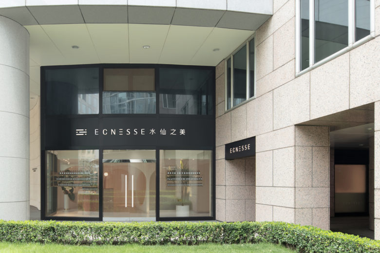
As a high-end chain store brand for precision personal skincare in Beijing, Ecnesse is positioned to provide customized beauty and body care solutions for high-end guests. In 2018 when Ecnesse planned to upgrade and renovate its 5 stores in Beijing, it commissioned Penda China to undertake the spatial design of the project.
Project origin
Women are very conscious of their appearance, but today they concern more about health, elegance and long-lasting charm than mere skin-deep beauty. So naturally, they would not hesitate to invest in the future, such as spending some time on professional skincare.
In a casual chat with several girls after dinner about business women and their expectations for life and future, chief architect Wan Shuyan strongly sensed the desire of the client, a gorgeous girl with ambitions, for a professional and aesthetic space to provide all-round beauty care for the guests. Fascinated by this idea, Shuyan decided to take the design project immediately.
Before renovation
Before renovation, the interiors of these stores varied greatly as they had been commercial spaces planned for different trade, with fancy designs and poor daylight. In this context, we decided to make the design simple, transparent, bright and cheerful. After renovation, both the client and guests were amazed that the result went far better than the previous expectation without even a trace of the original design left.
Caves of beauty
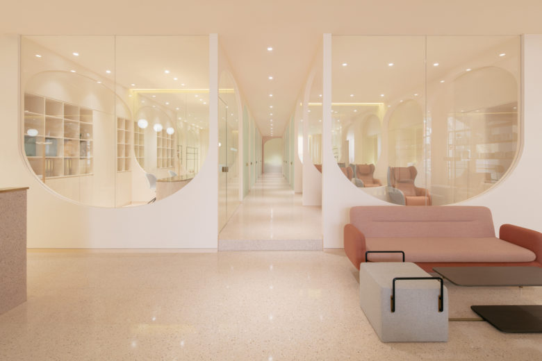
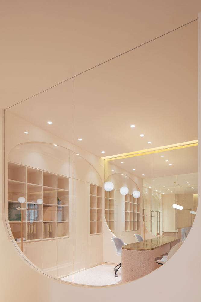
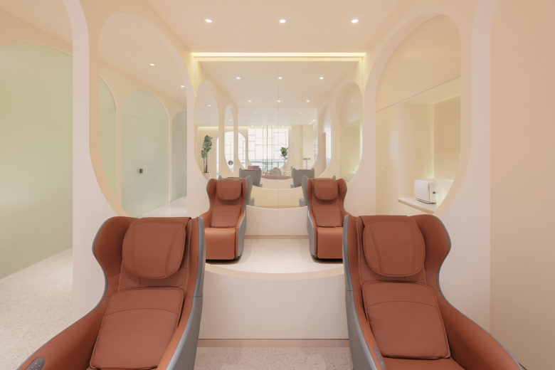
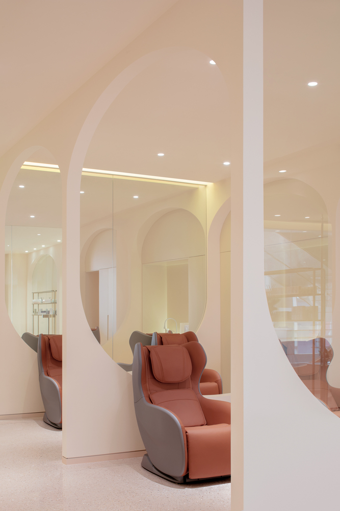
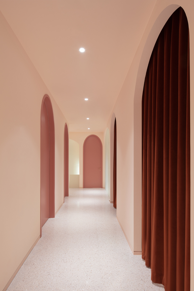
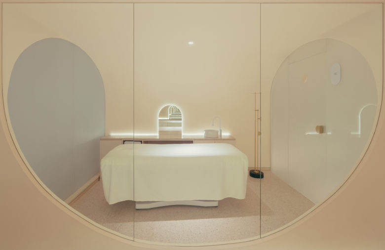
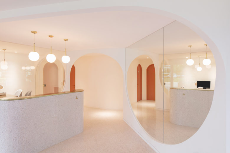
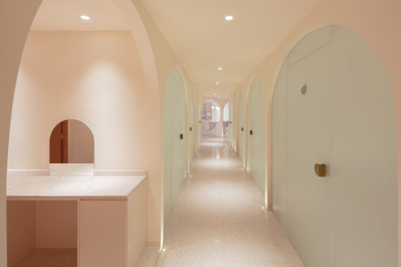
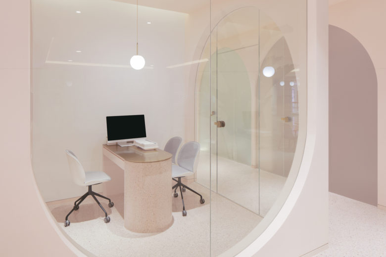
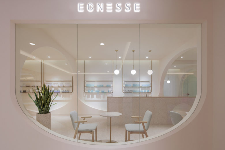
As a brand of its own tone, Ecnesse focuses on service quality and prefers individualized spaces. To create a sense of belonging and safety for the guests, our design concept was originated from caves, the earliest shelter for human beings. We hope the guests will not merely see the monotonous white square ceilings while lying, but be able to make a fewhead and neck movements when their sight lines follow the curvy lines in the ceiling. We prefer a continuous curve along the spaces, while each independent space can be deemed as an isolated cave where guests can immerse themselves in some unique spatial experience while enjoying beauty care.
“We create a sense of rhythm and a little bit mystery with curves, and this is exactly how people feel in the presence of a beauty,” said Wan Shuyan, the chief architect.
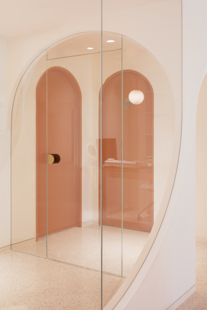
The previous spaces were much enclosed with limited daylight, while we needed large spaces to realize the cave concept. So we incorporated many mirrors into the design to form continuous and multi-layered caves.
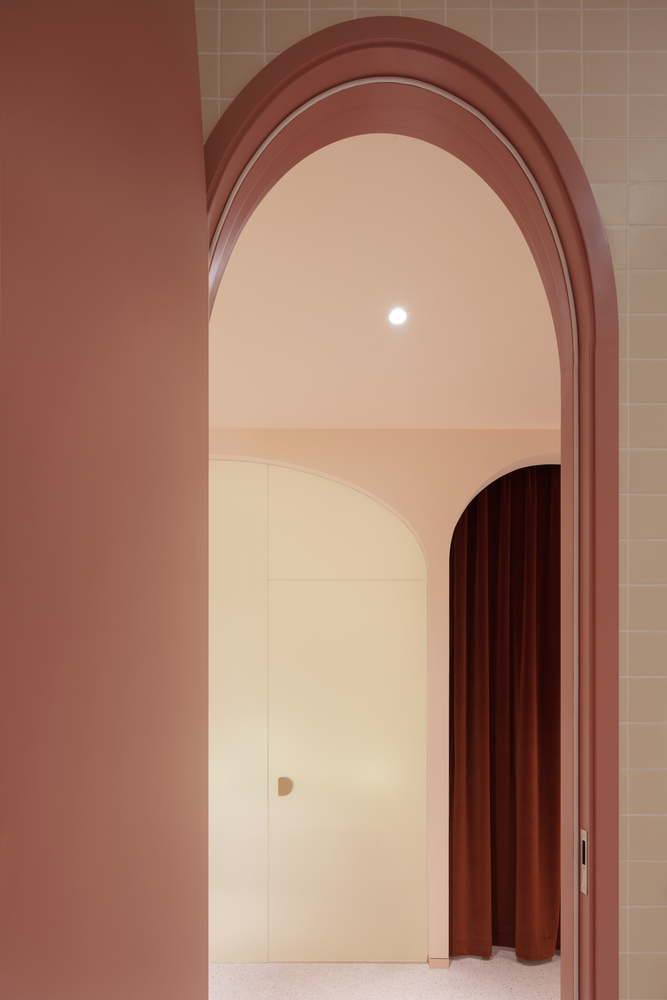
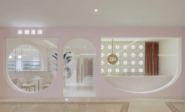
“It was five years ago when we first used arch elements in our design for Hongkun Museum of Fine Art. In recent years, arch design were used quite often, so we were thinking how to make our arch design more meaningful and recognizable among those many. Arch design comes in many forms but only one deserves the name Penda China. Of course, arch-shaped caves should also meet the spatial needs of the brand, and in no way would we ever force any redundant symbol in design,” said the chief architect Sun Dayong.
Gentle feminine color
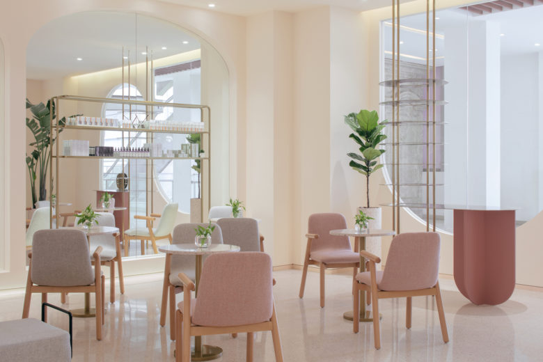
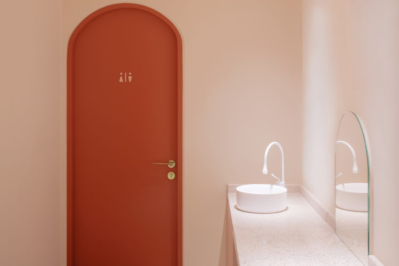
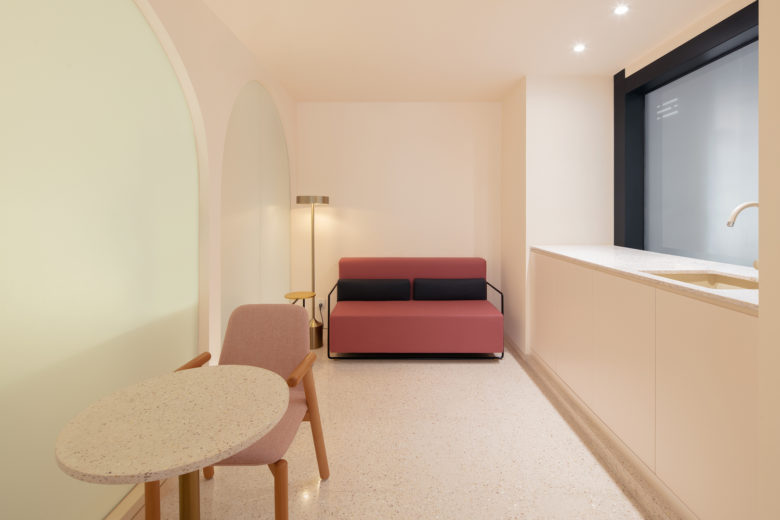
The beauty industry is, almost completely, oriented towards females, and Ecnesse, likewise, serves mostly female guests. For this reason, we choose pink color series for the design of spaces, hoping to break the traditional concept of the monotonous white spaces in beauty shops. With arch design in pink spaces, people would feel less distanced from the space, creating a unique sense of safety and belonging.
For such spaces, some guests stay quite a long time for skincare and a relaxing atmosphere is created via materials and colors in design. Beauty is a popular topic among women, so we referenced the future trend into consideration, and it so happened that our choice coincides with the fashion color trend of this year.
A dialogue between different materials
To strengthen continuity within limited spaces of the stores, some of which are inside the shopping mall, mirrors are installed on some walls to enrich the spaces through reflection and facilitate interactions between people and spaces, creating unpredictable spaces just like Escher’s.
Understanding and analysis of guests’ needs is essential for spatial upgrading. Based on successful brand positioning in the past and customer analysis, the architect developed some design principles. The first is to rationally organize spaces and functions, and integrate and interconnect the multi-purpose spaces. For example, the previous open lobby can be incorporated with bar, lounge and nail beauty etc., where guests can learn, rest and relax, and have some new experience more than beauty care services.
Branding
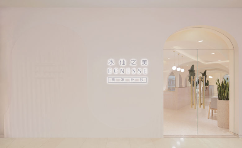
The last but not the least, consistency matters for branding. Despite of varied sizes and locations, Ecnesse stores maintain a consistent brand logo and design style. Meanwhile, the design of each store is customized to ensure rational daylight and comfortable spaces.
Repeated core elements serve as a formal language to strengthen people’s impression on the brand and enhance visual recognizability. This is also part of the branding strategy.
Thanks to the above analysis and considerations, spatial upgrading for Ecnesse was well received by both the client and guests. The upgraded spaces injected more vigor into the brand, offering refreshing experience to guests and enhancing the sense of pride among the staff. This is exactly what the design objective had aimed at, i.e. to influence and change people’s behavior through the spaces for a better life in future.
Take-aways
Beauty shops are places for relaxation, so the design should be conducted in a relaxed manner. They also represent the guests’ pursuit for beauty, especially female guests, so the spaces can be designed with some surreal and imaginative elements. For this project, lighting is a particularly important factor and gentle indirect lighting is preferred in this case. Level difference should be avoided as this may cause inconvenience for beauty technicians, mostly girls, to frequently move around the beauty equipment. Besides, the sight line of women should also be well designed in circulation design and planning.
Women’s desire for beauty can be interpreted in big picture terms or small details, just like how they select high heels. This means there is no such one-for-all design standard in terms of women’s aesthetic preferences. What matters most is to find out their needs and to provide warm, delicate and somewhat imaginative spaces for them.
Interiors Designers: penda
Lead Architects: Dayong Sun, Shuyan Wan
Design Team: Yi Zhang, Yue Zhu
Photographs: Zhi Xia











Add to collection

