To celebrate the beauty, diversity and creativity of Australia’s leading cultural icon, Sydney-based branding studio, Squad Ink, worked alongside the teams at Archie Rose and Sydney Opera House to create a two-act gin release set to launch 1 October, 2019.
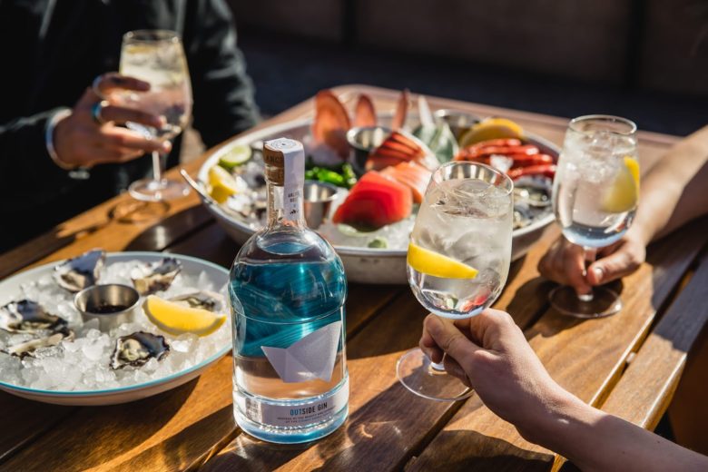
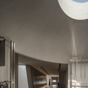
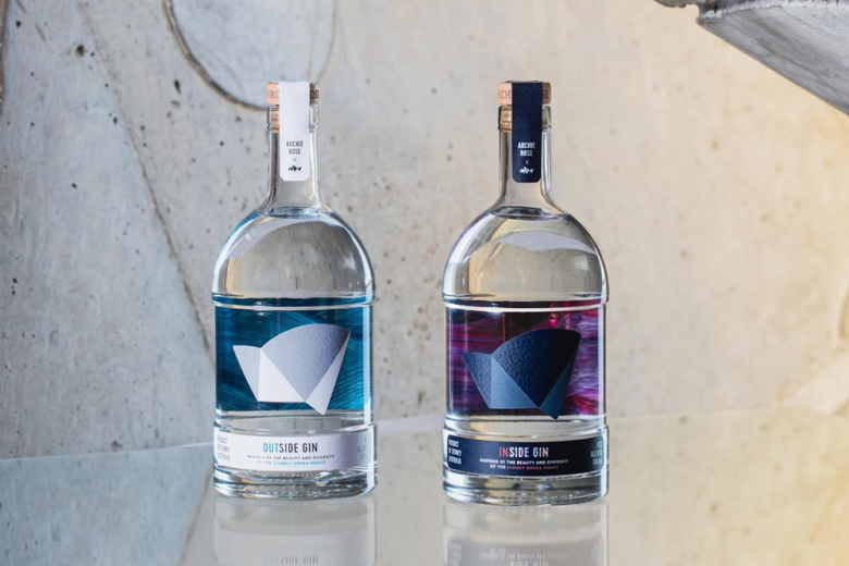
Named Outside and Inside Gin, this twin gin release celebrates the timeless architectural splendour and natural surrounds of the Sydney Opera House alongside the creative energy and artistic talent experienced on its stages.
“As Sydney-born designers, the brief to capture and respectively pay tribute to the Opera House through spirit packaging was both thrilling and daunting! It was a real creative meeting of the minds and we couldn’t be happier with the result.” says Matthew Squadrito, Creative Director of Squad Ink.
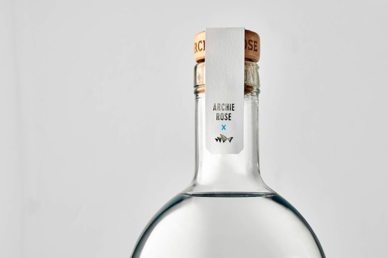
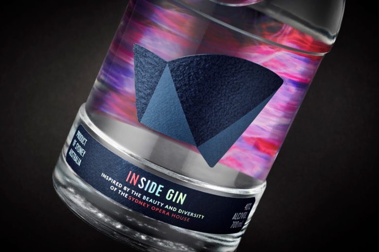
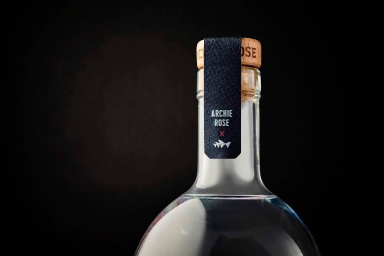
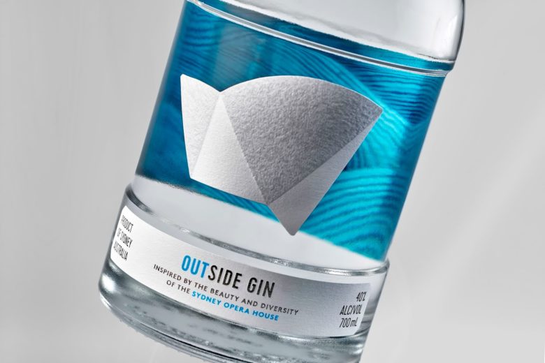
As a retail product there needed to be a clear visual connection to the iconic Australian landmark, whilst delivering a fresh interpretation of the iconic sails, designed by Jørn Utzon. Referencing his original plans and design principles for the building exterior we were able to create a new geometric form that would act a brand mark for this epic release.
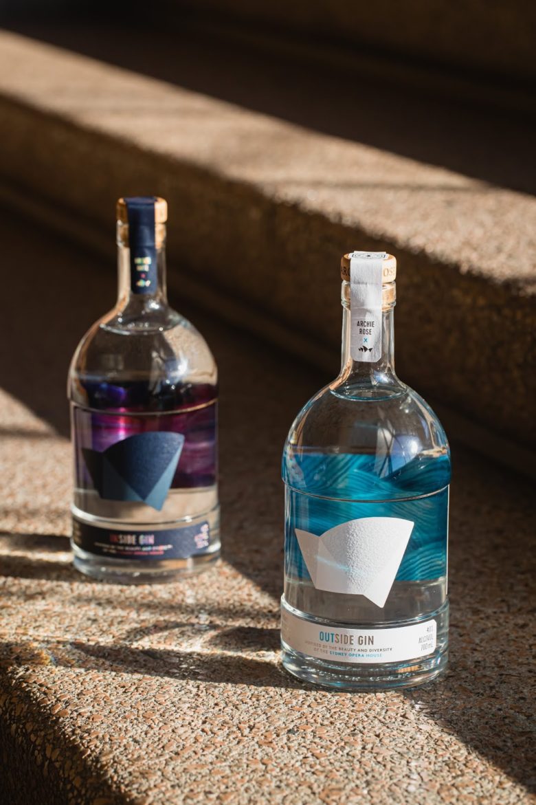
As a twin gin release, the bottles needed to not only perform as a striking pair but as stand alone products, delivering their own unique design moment.
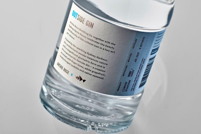
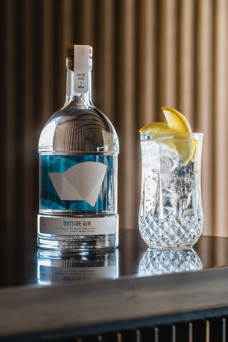
Act one: Outside Gin is inspired by the coastal setting surrounding the Sydney Opera House and Utzon’s design principles, juxtaposing nature against man-made elements. Framed by the sparkling Sydney Harbour, this architectural wonder balances nature with a magnificent geometric form serving as the inspiration for Outside Gin. Expect a juniper forward gin accented with lemon-scented gum, South Australian yuzu, finger limes, white grapefruit, locally foraged seablite and native seaweed.
“Upon reviewing the brief, I held up the naked Archie Rose bottle and imagined it taking the form of a looking glass that would reveal the splendour of the blue Sydney Harbour morphed with the arched sails of the Opera House,” Squadrito relates.
“We then underwent a series of trials and testing in production which brought us to the current solution; a full colour reverse print with a solid silver foil applied and laminated to the base stock, offered striking luminosity. The front label is a simplistic and timeless representation of the Sydney Opera house die-cut and grain texture-embossed.”
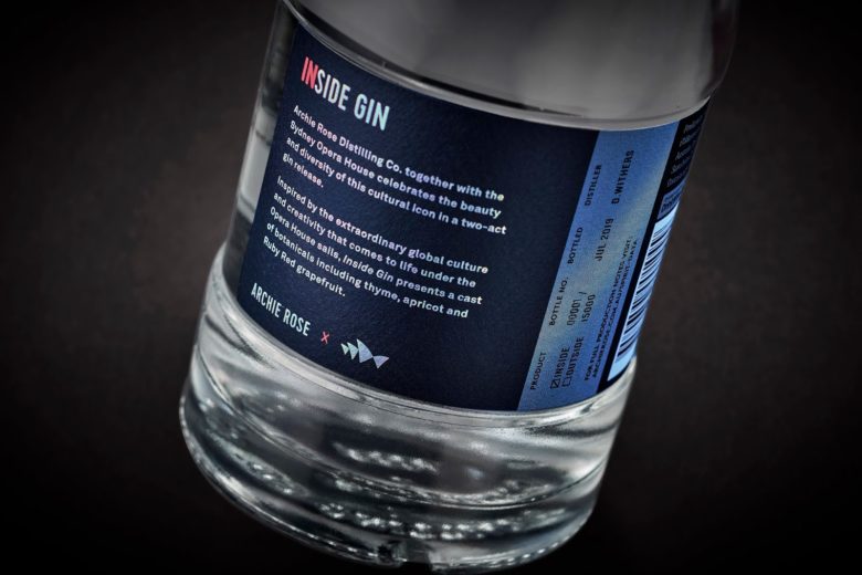
Act two: Inside Gin celebrates the extraordinary creativity that comes to life daily under the Opera House sails – a place where global cultures and art forms collide. The concept behind this spirit was to create the dynamism you would experience in a play, concert or celebration. This fruit-driven gin displays a bright positive summary character and presents a cast of botanicals including native thyme, Australian apricot, raspberry and strawberry gum.
Continuing the before-mentioned concept, this time in contrasting deep blue and purple hues – the reverse image dances on the bottle in different ways depending on where the light hits it. To add extra sparkle and encourage interaction, we applied a Kurz Light Line Laser foil.
