Design Philosophy: Playing is Healing. Key Concept: ‘Children Dimension’. A hospital is the kind of place most people would rather avoid as much as they can. We have witnessed more medical institutions’ attempt to create a more pleasant and friendlier environment, some with the architecture and interior decoration that are almost equivalent to a shopping mall or hi-end hotels. If such built environment can make the feeling of going to a hospital for us adults more tolerable somehow, what about the experience of the little ones?
For the kids, luxury isn’t something that can comfort them from the pain, fear for needles or even the bitterness of the medicine. We, therefore, look for the things that will bring them happiness throughout their experience at the hospital. With the children’s mindset, we discover that ‘fun’ is what every child instinctively looks for. Despite their different backgrounds, all kids want to live their lives looking for something fun to do.
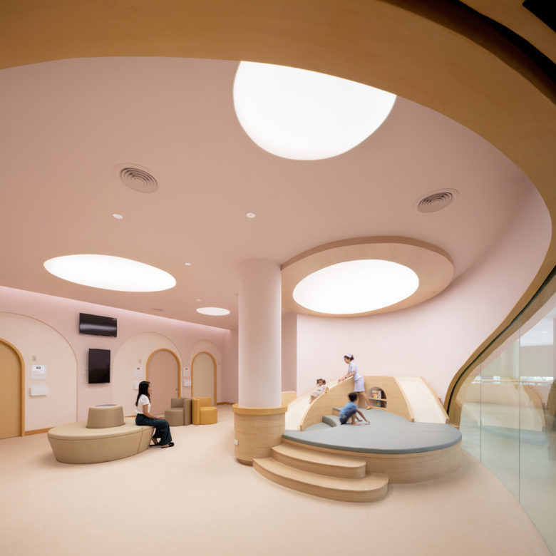
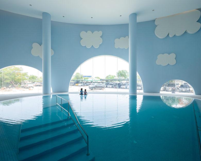
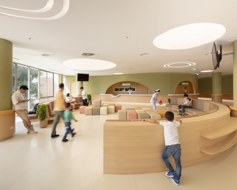
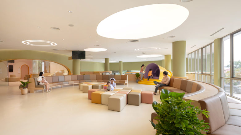
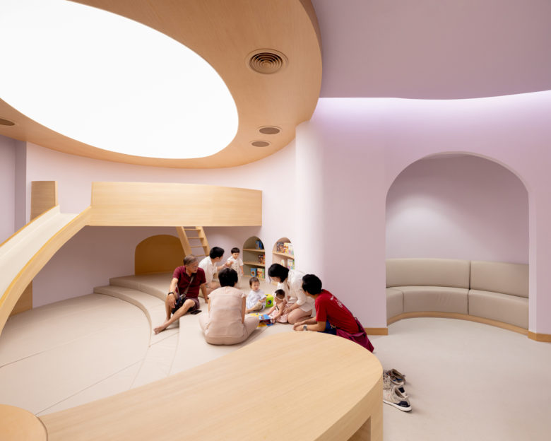
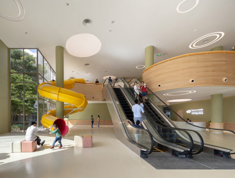
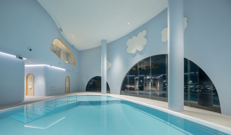
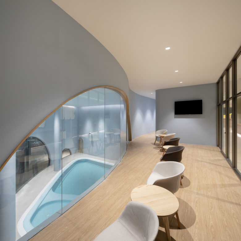
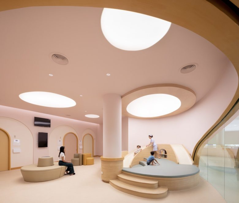
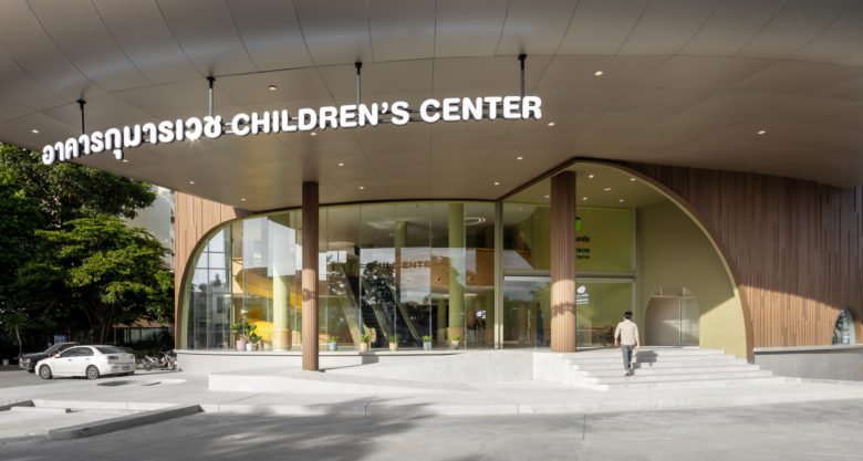
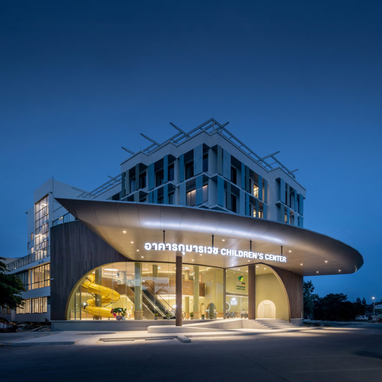
Using this element of ‘fun’ as the key becomes a great challenge considering how we have to approach the design from the perspective of a child (which we, unfortunately, don’t have that much left) while constantly reminding ourselves that we would actually have to make a hospital a ‘fun’ place. Such thought process leads to the design of a hospital with a giant slider situated right at the front of the entrance hall (imagine being a kid dreading going into the hospital, the slider will definitely make you stop crying). The waiting area of each clinic is designed into a playground, which becomes somewhat a burden for the parents of having to convince the kids to leave the hospital). The program also includes an indoor swimming pool that has a bunch of artificial clouds floating atop.
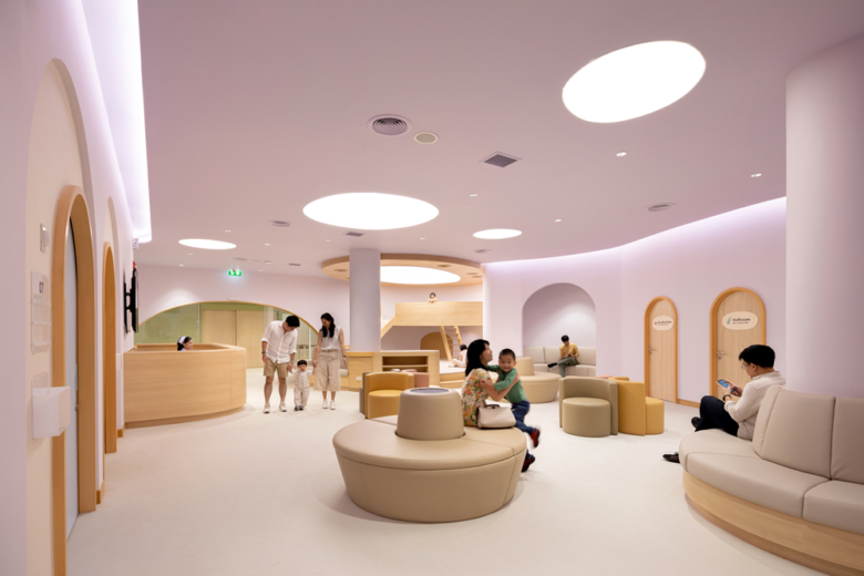
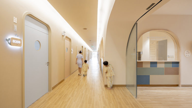
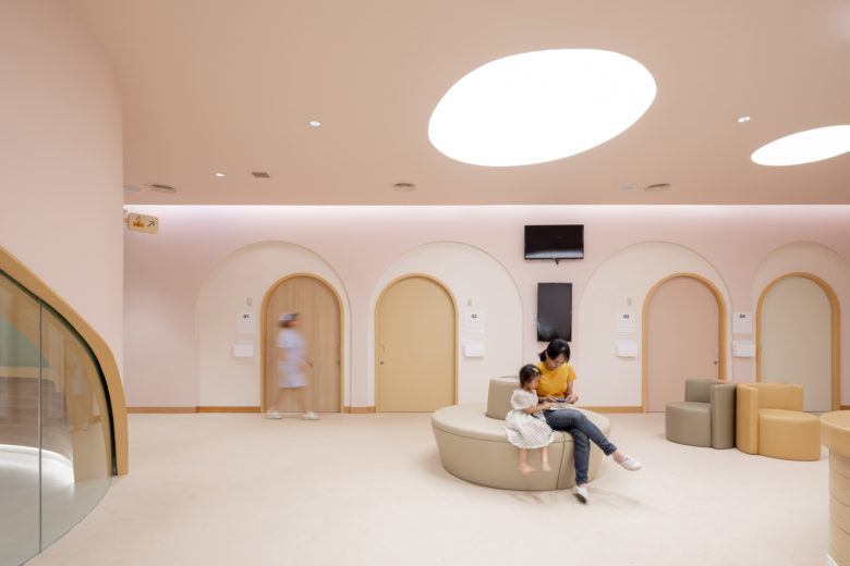
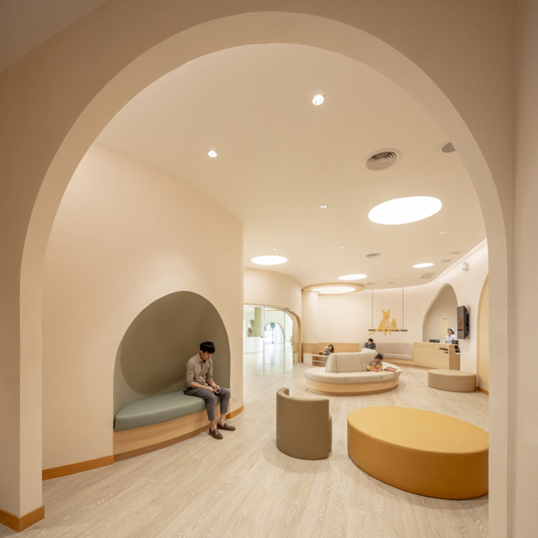
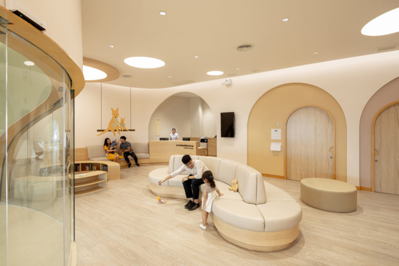
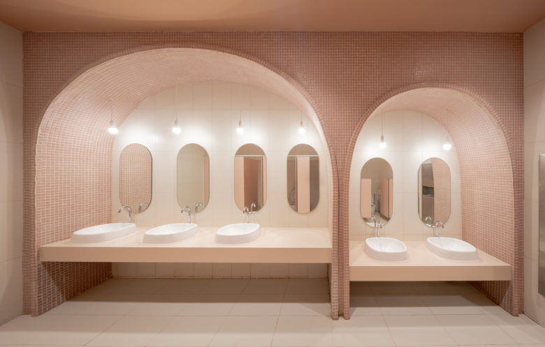
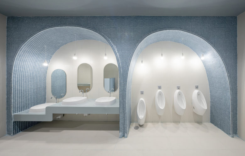
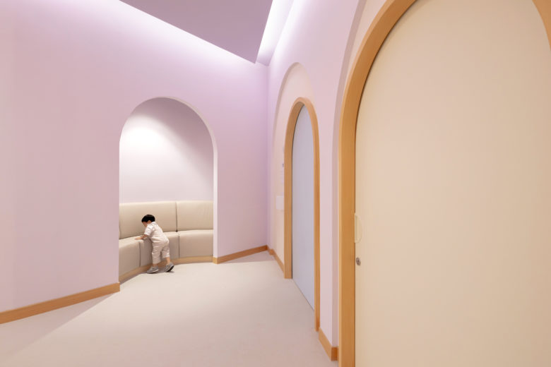
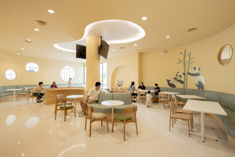
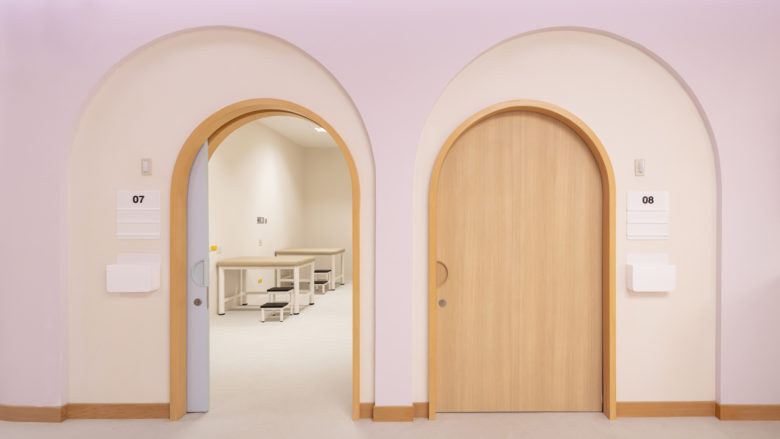
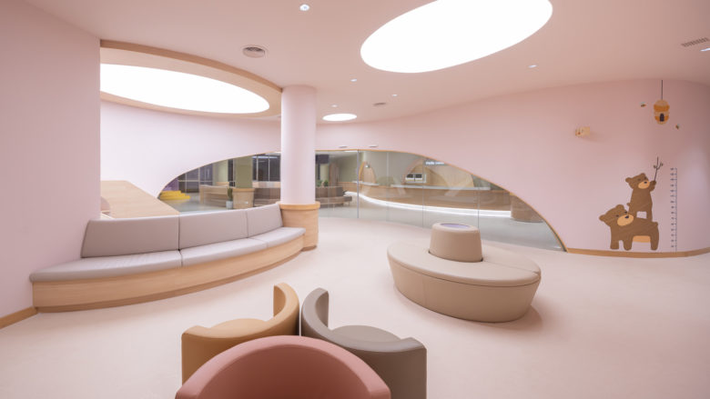
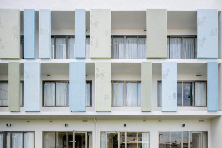
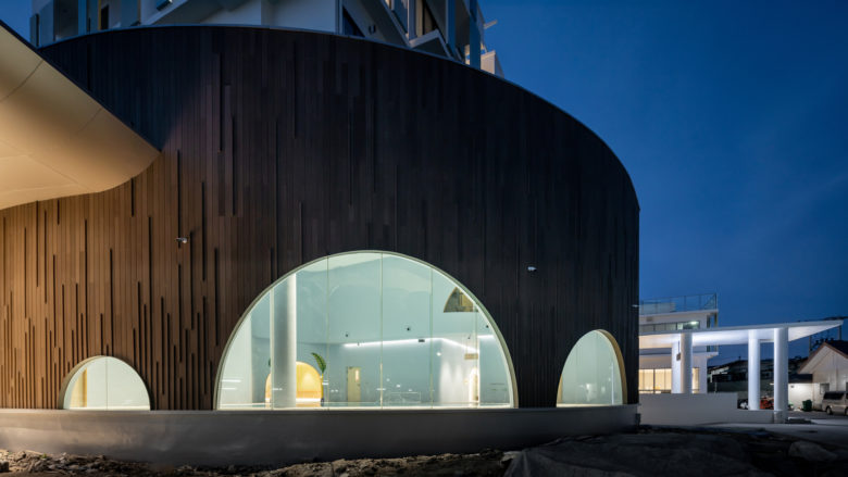
The children dimension is created using various physical shapes, colors and symbols materialized from the design language that is made up of delicately curved lines and deliberately avoids the perfect geometric forms. The design renders the aesthetics, which reminisces the way one continues drawing of a curved line without focusing on whether it will be able to form a perfect circle or not, and it ends up bringing a sense of freedom to the young users’ experience of the space. These lines are formed into the arches constructed above the doorways and seating areas with the sizes calculated to correspond with children’s body proportion, creating a built environment that truly accommodates children’s behaviors and preferences.
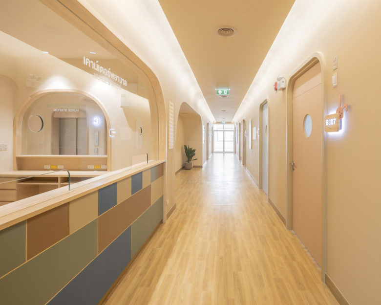
The pastel color tone encourages the children’s use of imagination (as a kid, we all create our own imaginary world when we are experiencing a space for the first time). We believe that children will be able to enjoy the spaces inside of the hospital according to their own personal imagination and individually develop an experience through their interactions with the curated spatial program. A scenario is designed and constructed near the pharmacy counter as a part of the layout of the ‘waiting area’, which embraces the ‘play space’. The program enables interactions between parents and children while allowing the adults to watch over their little ones during the wait.The use of indirect light with all the hallways of the hospital ensures that the young patients won’t be disturbed by the discomfort of excessive brightness.
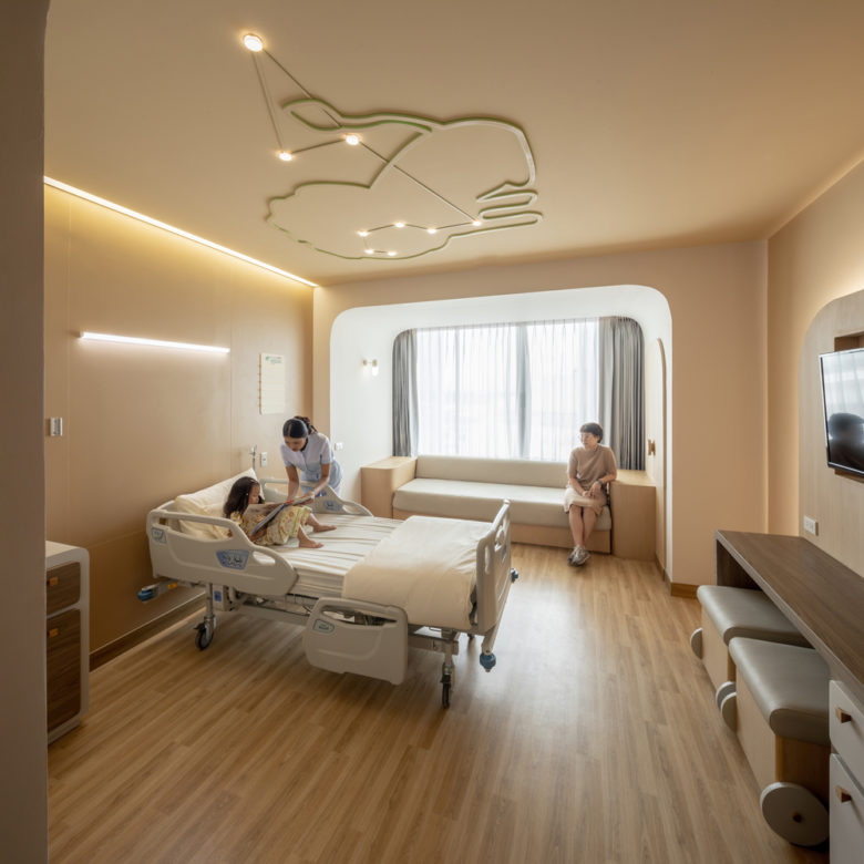
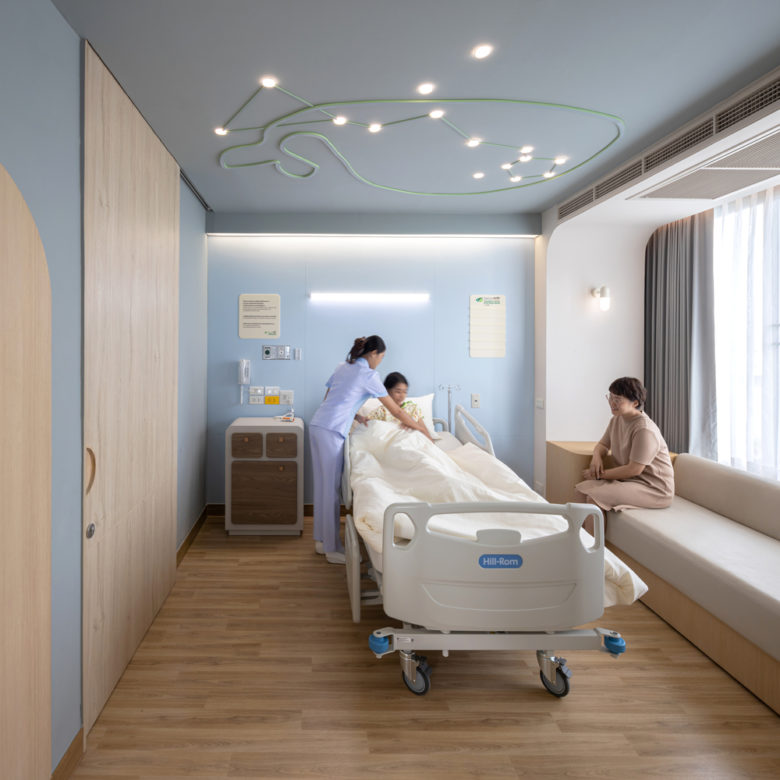
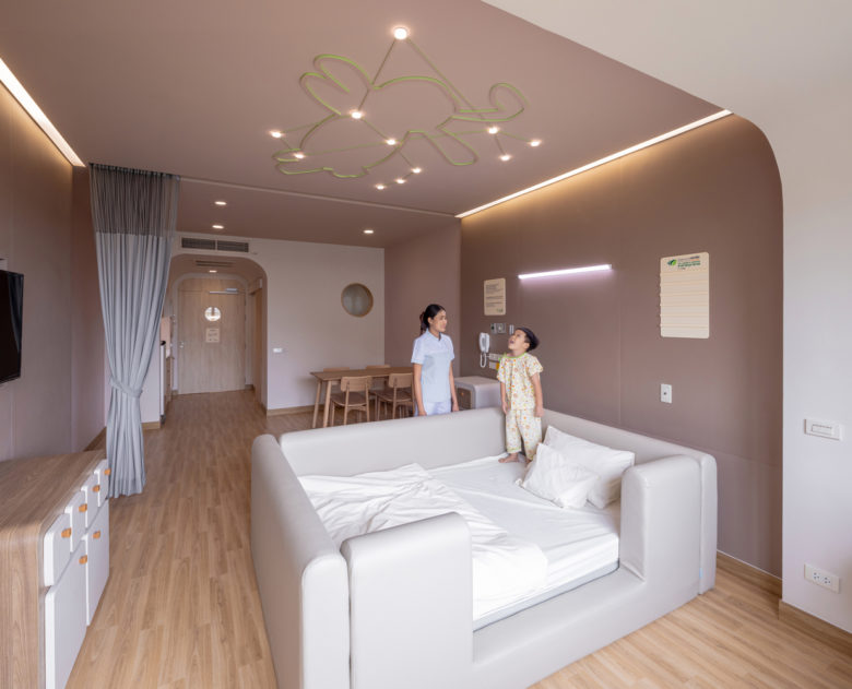
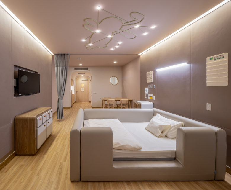
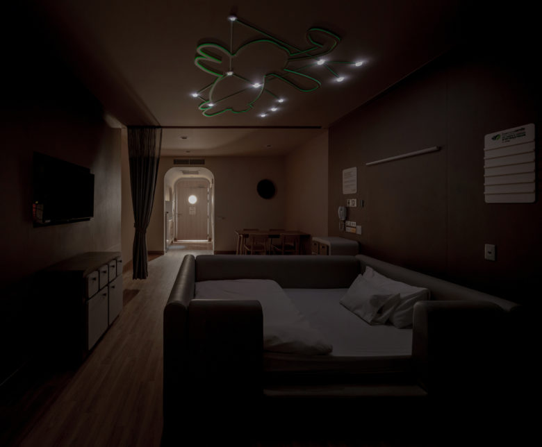
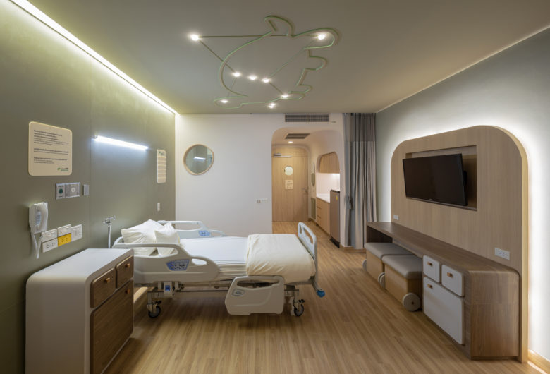
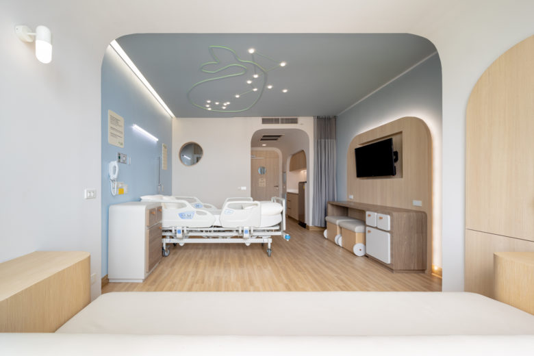
The hospital offers four room types, categorized not as a standard, special or suite room, but in the friendlier names of Whale, Turtle, Lion and Rabbit Constellation. Each room is decorated in a different color and installed above the bed is a glow-in-the-dark constellation with a customized lamp to provide both a standard lighting and the level of illumination that is suitable for a good night’s sleep. As we adults find ourselves amazed if not a bit jealous by the mesmerizing variety and development of children’s toys or even snacks these days, EKH Children Hospital will change everyone’s perception about what the space of a children’s hospital can be.
Architects: S:CSB
Architect In Charge: S:CSB Co.,Ltd
Interior Architect: IF (Integrated Field Co.,Ltd.)
Photographs: Ketsiree Wongwan
Add to collection
