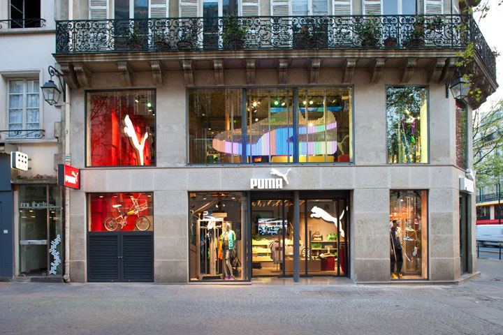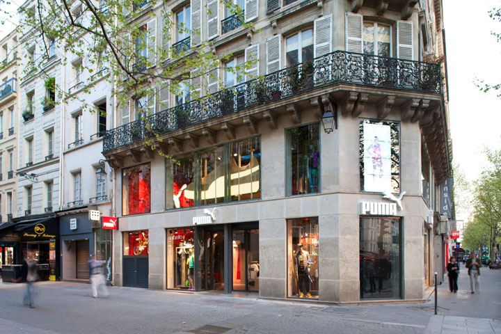

Located in the main walking direction between the famous forum des Halles and the Centre Pompidou, the Puma flagship store on Boulevard de Sébastopol reopened after a complete redesign in april 2011.

The idea of the new store concept developed by berlin based Plajer & Franz Studio together with Ales Kernjak (global store concept manager of the Puma Retail ag) was to bring back the joy into retail environments while aiming at a sustainable and innovative retail design. In line with the 4keys of Pumas’ vision – fair, honest, positive and creative – the new store displays a great mix of an ecological high tech concept, cutting-edge technology allowing for an interactive customer engagement as well as an creative input by parisian artists collective 9eme concept.

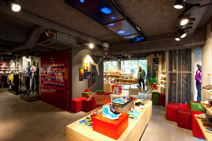
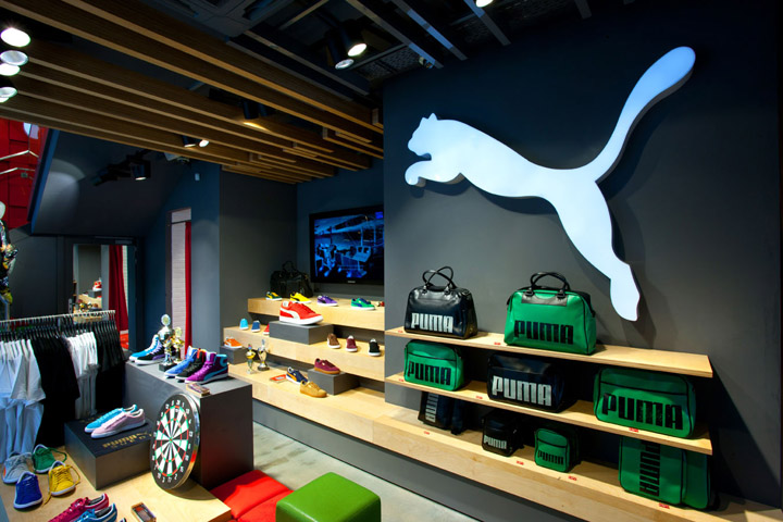
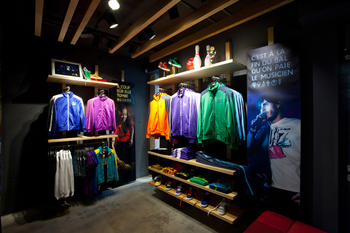
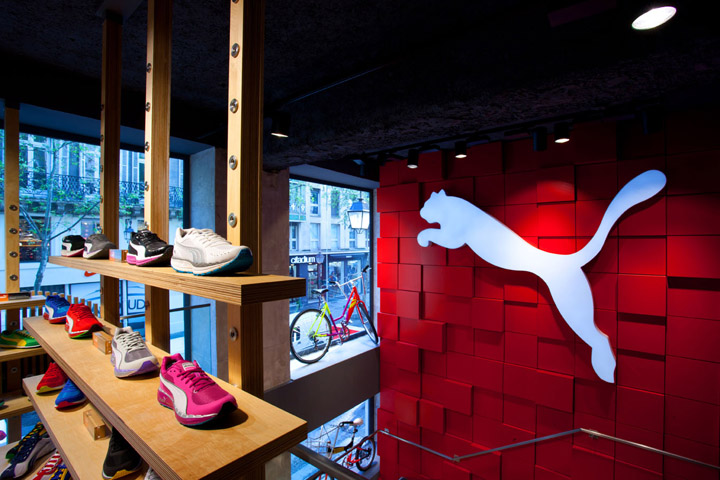
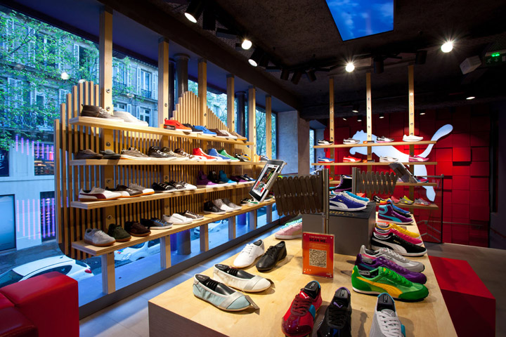
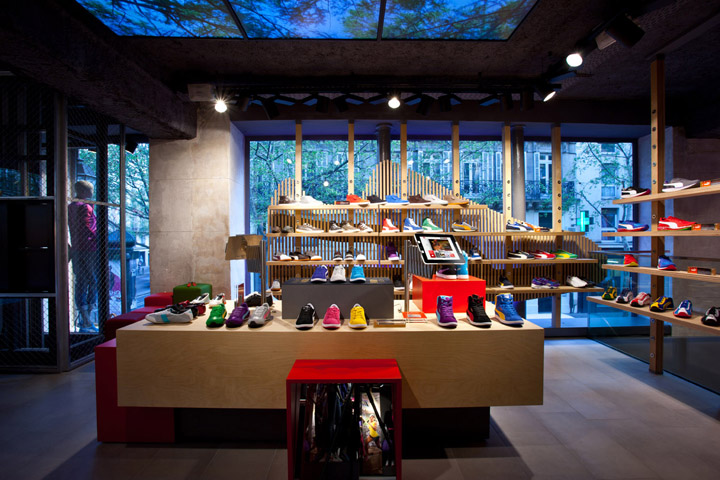
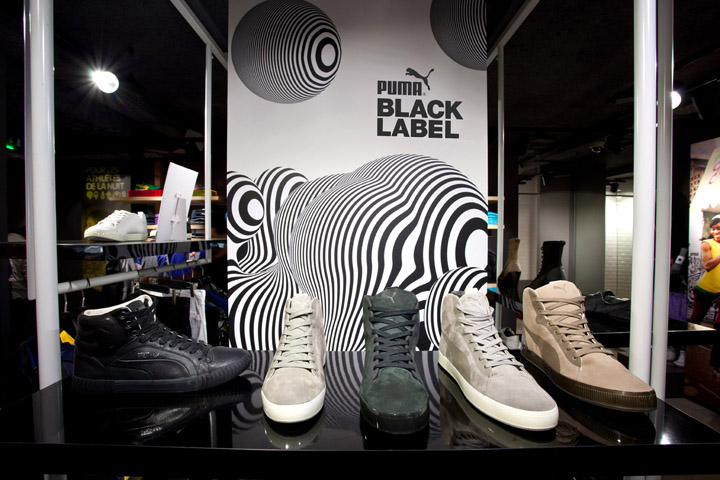
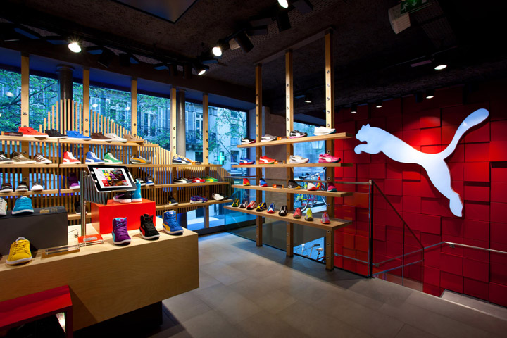
Two floors and more than 200 sqm of shopping space are filled with a broad range of footwear styles, apparel and accessories including Puma’s black label featuring the brand’s designer collaborations with Hussein Chalayan and Alexander Mcqueen. While treating the product as a hero the store design not only enhances the display of Pumas performance and lifestyle articles but intentionally works as a product category navigation. Hereby the footwear – still pumas core competence – is given the most attention and comes first in presentation and visibility. The footwear display in the shape of the iconic Puma suede with an illuminated multi-coloured form stripe functions as both a shop window drawing people’s attention from outside and as a big shoe display inside the store.

A six meters high brand wall in Puma’s iconic red is another eye catcher of the store. Built out of separate and removable cubes which can be changed randomnly the wall works as the connecting element between the two floors.

The idea of a colourful and joyful retail experience is further transported into the changing rooms where a special “Puma peepshow” – a red box that opens up exposing something unexpected being it video clips or product presentation – further allows customers to engage with the brand.

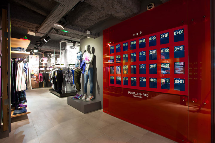
Generally customer interaction is written in big letters at Puma and therefore an important aspect of the store design including the integration of the latest communication channels: iPads are not only scattered around the shop attached to display tables but assembled at the “Puma joy pad” – a huge iPad wall framed by red transparent glass – that allows customers to interact with puma using specially
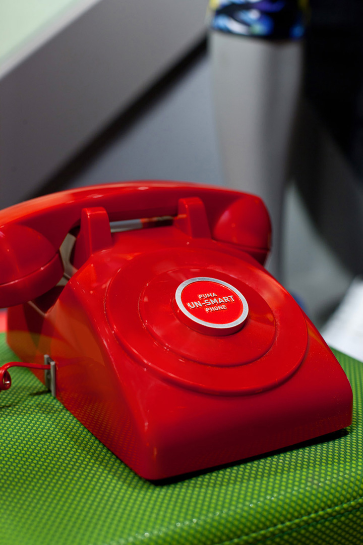
developed apps. In future this will be extended to life-streaming connections with other puma stores. the so called “un-smartphones” – old school telephones – playing random messages further support the idea of consumer engagement.


Despite numerous joyful elements the design concept sets a high value on sustainability. This is reflected in the use of ecological materials such as FSC certified wood and certified floor finishes, low-emitting paint and an efficient lighting concept mix to save energy consumption.

The store in paris is a first step towards a generally novel retail experience. A rollout of the new concept in other countries is envisaged.


Photography credits: Manuel Schlüter / copyright Puma ag
Companies involved in the concept and implementation of marketing activities and redworld elements such as the iPad wall and the un-smartphones:
GBH, London
Spies & Assassins, New York
