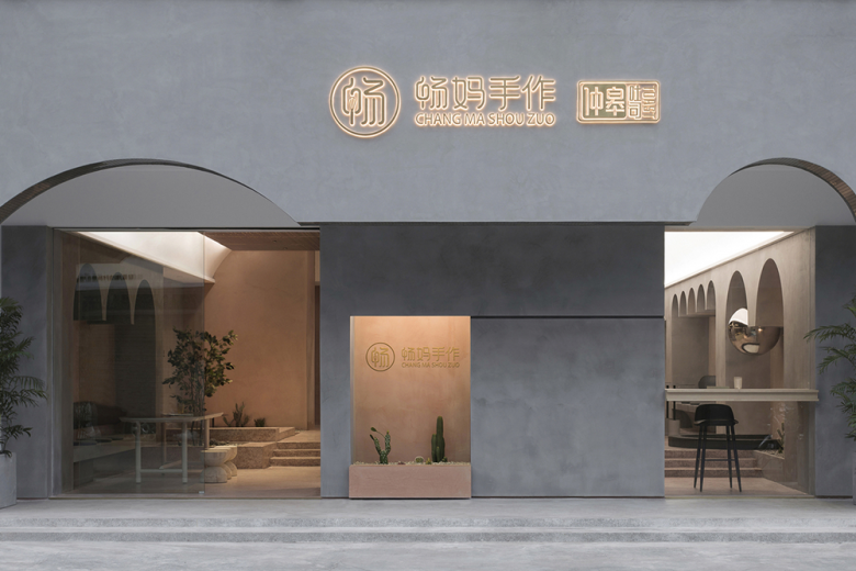
The Concept of Garden Tour
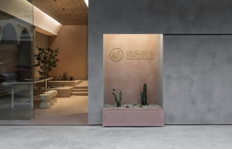
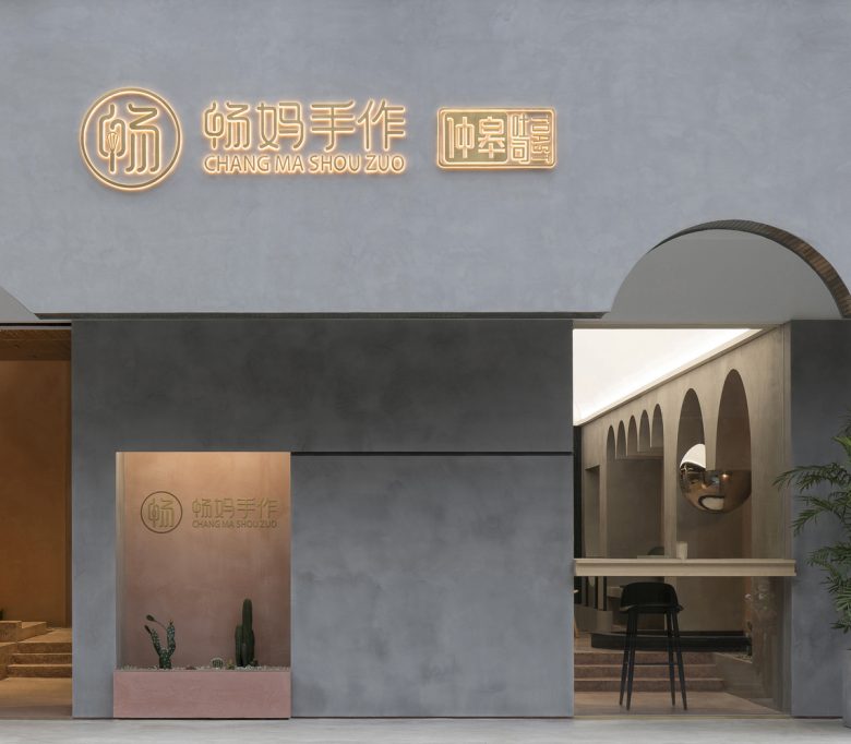
Mother Chang’s Handmade Bakery is a bakery and beverage store with unique local characteristics, that adheres to the concept of handmade bakery. Based on the proprietor’s business philosophy, we put forward the concept of “slow”. We expected it to not only provide food, but even more so a space where visitors can switch to another state right after passing through the front door from the noisy block. So we made an attempt to design this space into a dynamic “Garden Tour” layout, to unwind those who enter, enabling them to perceive and discover the beauty of the space on each footstep. Moreover, that kind of “slow” experience also resonates with the owner’s operation philosophy of purely handmade bakery.
The Dynamic Route Design
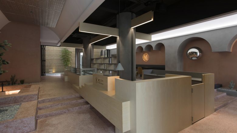
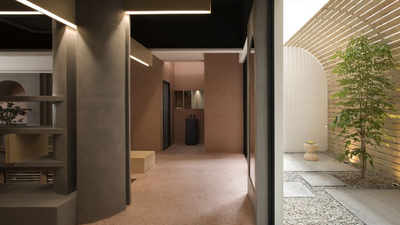
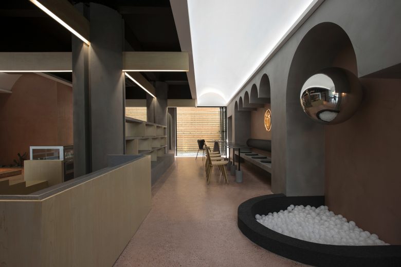
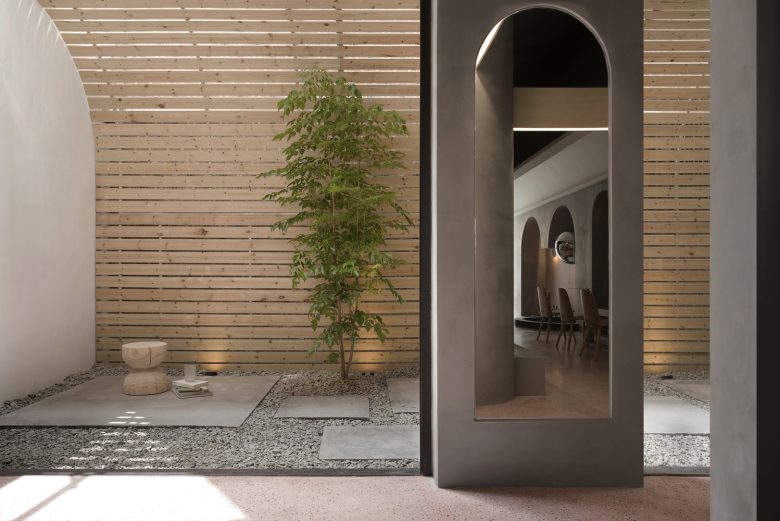
How to immerse customers in the “Garden Tour” experience using only 100 ㎡? We planned to set the reception and product display and other service functional areas in the center of the space, and distributed different dining spaces around this central area, forming a circular spatial layout, which invisibly lengthens the dynamic route of the space. Along the route, we set several different dining experience spaces and small sceneries interspersed in between, as well as an outdoor courtyard that feels like a micropark.
Space Creation
Height Differences
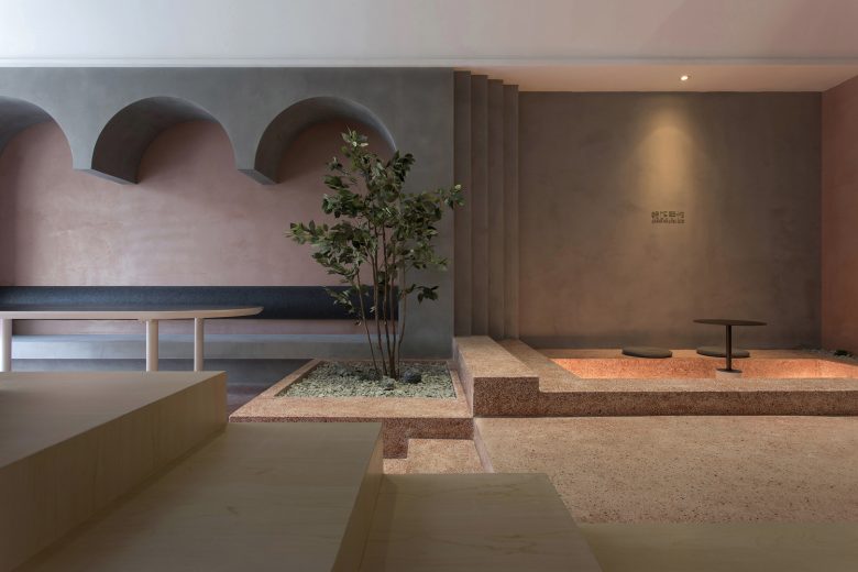
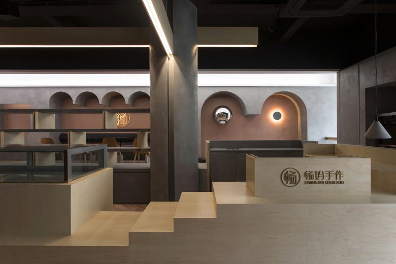
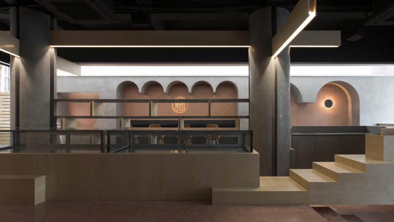
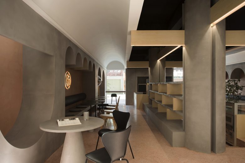
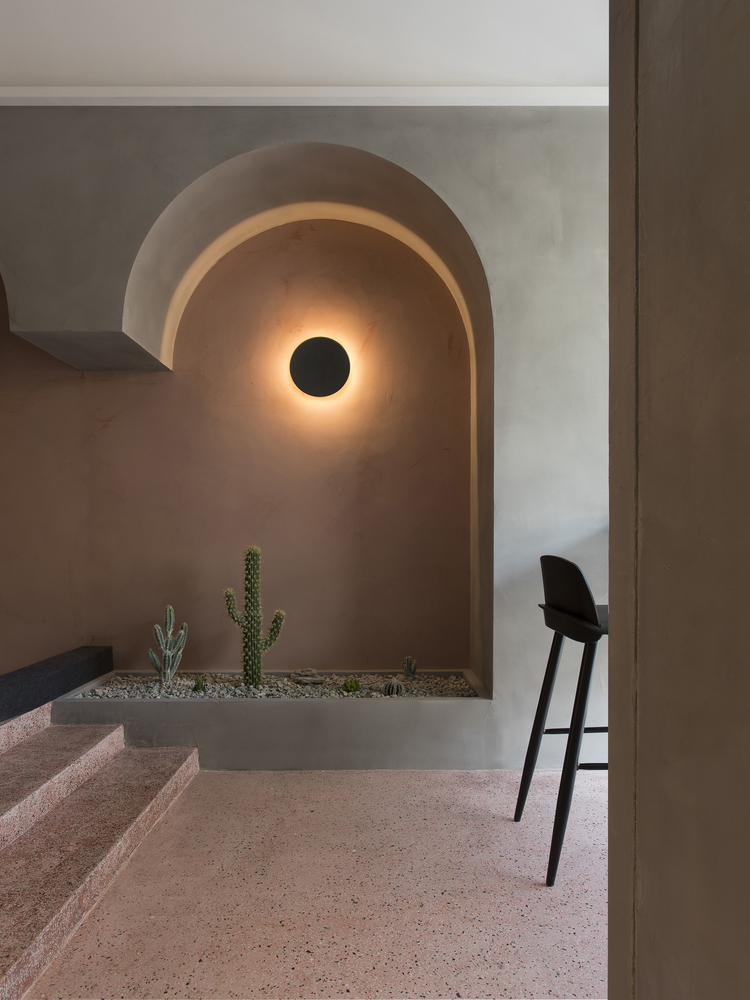
By covering the space with terrazzo tiles on site, we raised the rear half of the space by 30 cm, constructed a well-defined platform, and built flower ponds of different sizes as well as scattered stairs, creating the image of a “garden”. This altitude contrasts provides different dining experience and also forms interesting perspectives between customers and our staff.
Bracket System
The integrated four-part column replaces the previous two concrete square columns in the central area. The split column has a cross-shaped bidirectionality on the plane, increasing the visual weight of the structural design in the space. Three simplified wooden beams run through the split columns with overlap joint, and the orthogonal lying overlapping extends the vaults overlapped on both sides, forming a new spatial structure system. It can also be regarded as an evolution and new interpretation of the bucket arch structure of Chinese architecture.
Arch
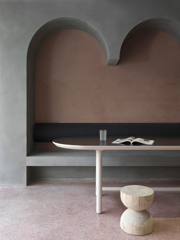
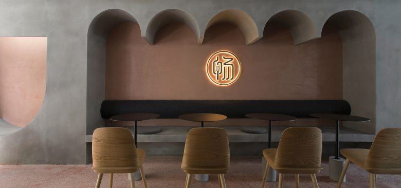
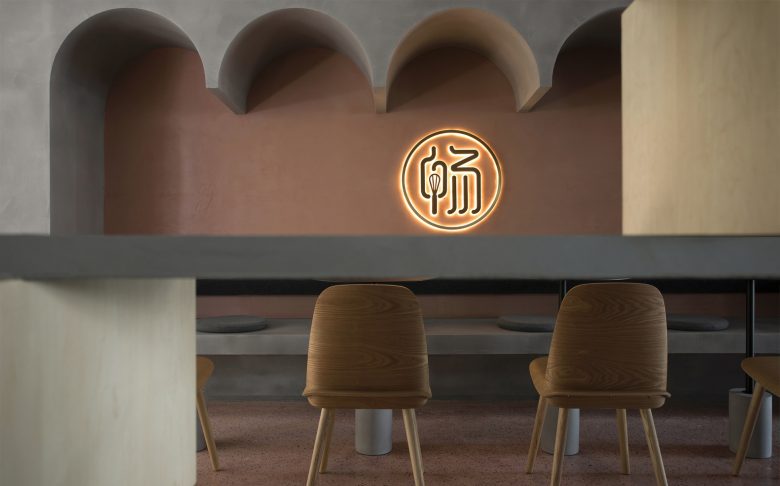
On both sides of the space, the continuous vaulted volume on the wall connects the vault of the ceiling, creating a spatial image of a circular vaulted corridor. It enhances the sense of hierarchy and visual extension of the space, thereby weakening the boundaries of the space.
Material
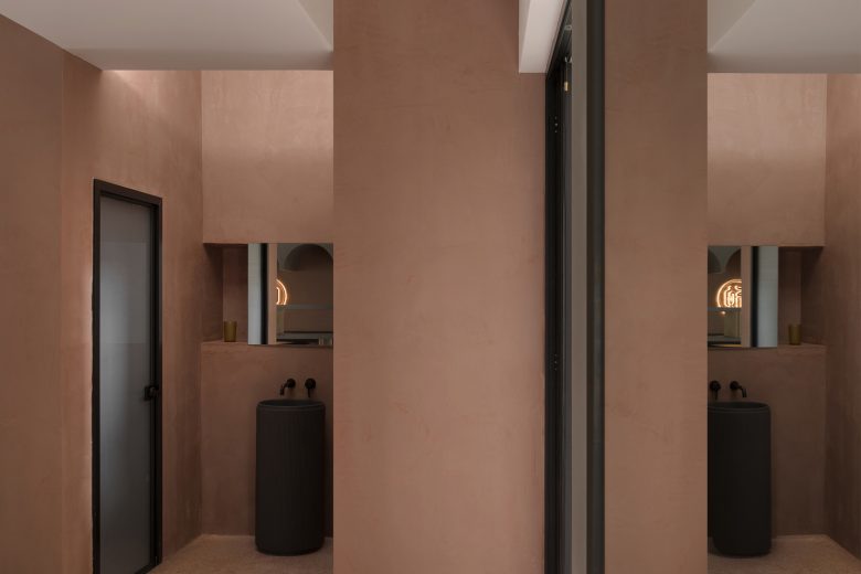
In order to create a “garden” atmosphere, we cover the floor on site with clay red terrazzo tiles, and painted the wall with hand-painted paint of cement gray and clay red. With the terrazzo flooring and hand-painted wall, it well shapes the sense of volume and block of the space, and the hand-made method is also in line with the proprietor’s business philosophy.
Our Philosophy
How to integrate natural elements into the architectural space and blur the boundaries of indoor and outdoor spaces has always been a proposition that our studio explores in architectural space design. This project is also a practice of our design philosophy. Through this practice, we look forward to creating more possibilities for commercial space, as well as expressing our insights on architectural space and vision for the appearance of urban blocks.
Architects: PADSTUDIO
Leader Designer & Team:Xuexin Ma, Hongfeng Ma, Jiatao Ma
Photographs: Rongkun Chen




Add to collection
