Baranowitz & Goldberg and Pitsou Kedem Architects delivered a fresh and open-plan office for PerimeterX to reflect the young high-tech company’s mission in Tel Aviv, Israel. PerimeterX has offices both in San Francisco and Israel. The new Israeli headquarters spans a full floor on the 22nd floor of one of Tel Aviv’s new high-rises in the center of the city. The offices enjoy a 360- degree view of the city including that of the sea.
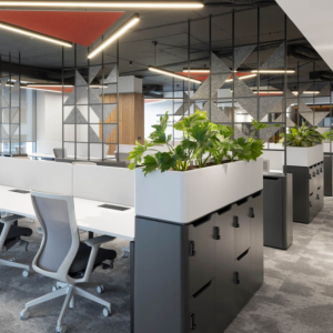
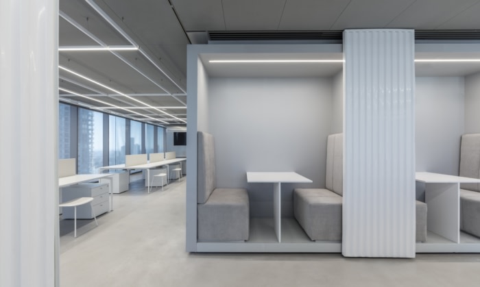
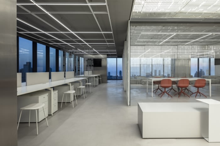
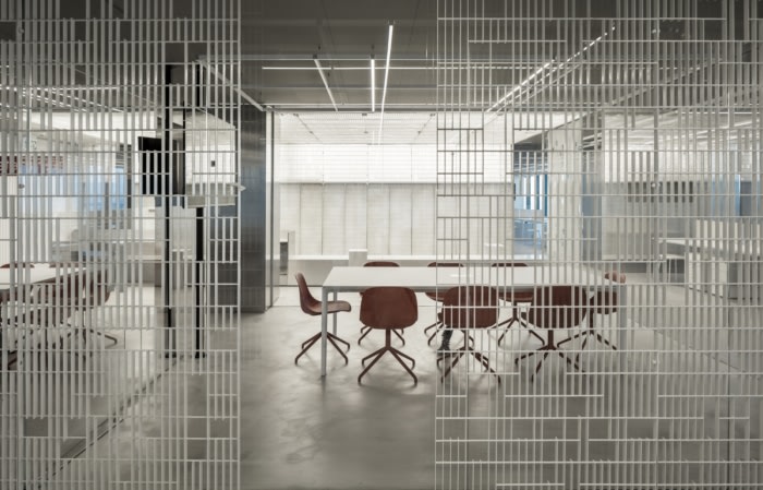
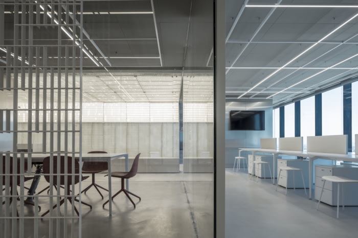
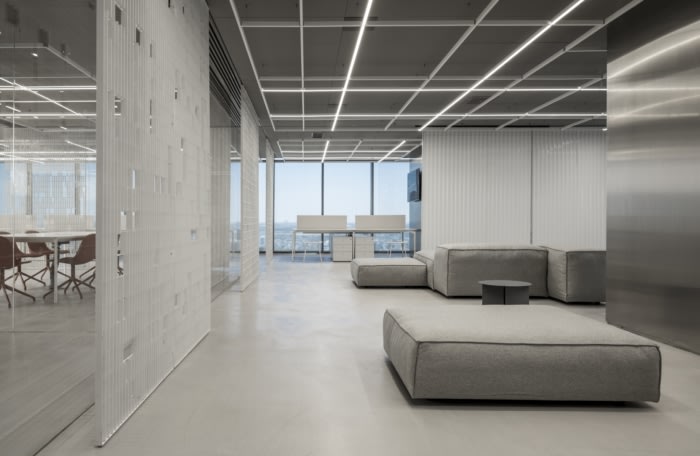
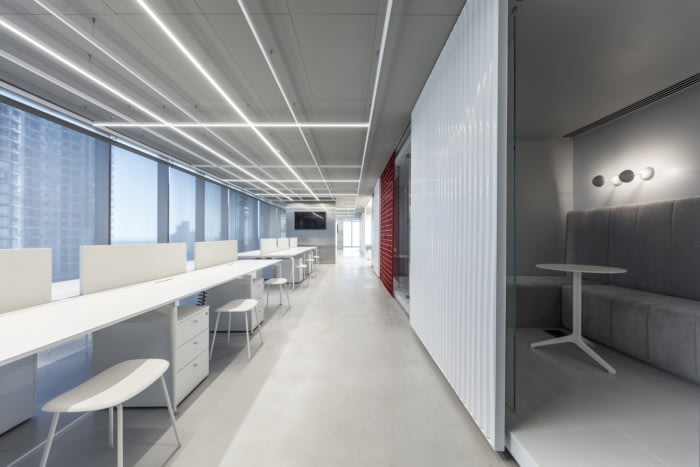
The design concept stemmed from a grid-based plan. The space was divided into volumes and circulation paths, between closed spaces and freestanding elements. The fact that almost all employees work in open space environments allowed for a layout where all closed rooms were situated around the core of the building and the open-space stations were placed as freestanding elements in the center of the space. Thus, the perimeter curtain wall remained un-obstructed, and the access to the view and light was open to all. The two large conference rooms were the only closed volumes to be placed as free-standing transparent boxes in the central public space. The two-dimensional grid was then extruded vertically with the introduction of a grid of tracks carrying movable partitions. These partitions subdivide the space and create new opportunities for grouping teams or having larger get-togethers. Two types of partitions were designed, one constructed of industrial, steel welded-grating and the other of corrugated polycarbonate sheets.
The main idea was to take industrial off-the-shelf products and manipulate them into fine, well-dressed elements.
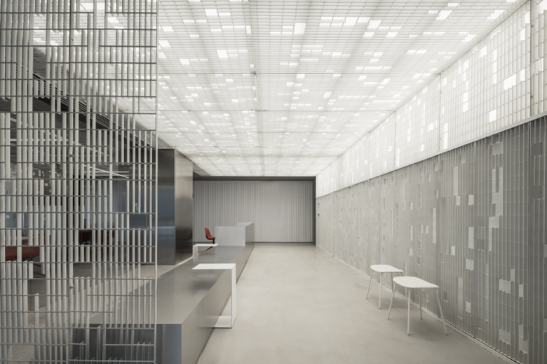
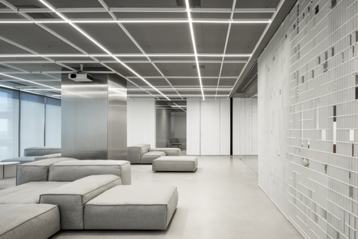
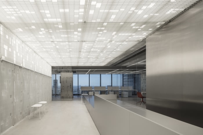
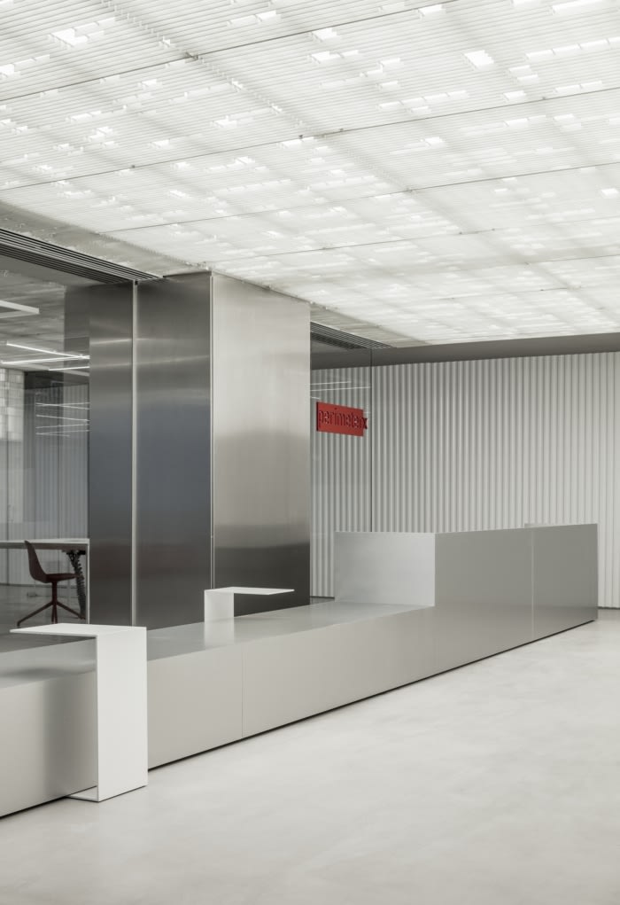
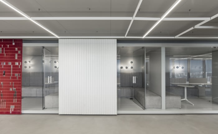
The steel grate was unraveled to create a new pattern and be transformed from a simple grid to an industrial lace. This woven-like partition created divisions without blocking the space. The openness of this so-called weave allowed for subtle, layered views of the cityscape around. The white corrugated polycarbonate sheets were designed as more assertive divisions that give more privacy.The color scheme of the space is all white and grey with red accents drawn from the company’s branding. The materials palette is a fusion of the sleek and industrial — aluminum cladding of columns and walls, juxtaposed with concrete floors and the partitions of unraveled welded grates in white paint finish and white corrugated polycarbonate sheets.
The concept of the grid and its deconstruction was also quoted in the lighting plan. A new grid was introduced, created of a combination of white aluminum profiles and led lights. The grid of light stretches above the entire space further asserting the free-flowing layout. The reception area was accentuated with light as well where the deconstructed welded grates’ ceiling in that area was backlit, creating a lucent canopy above the space.
Design: Baranowitz & Goldberg and Pitsou Kedem Architects
Photography: Amit Geron

Add to collection
