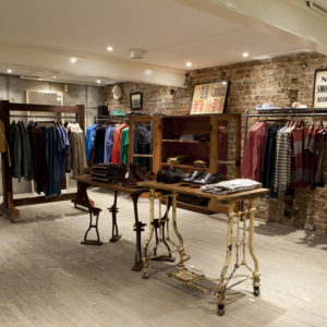


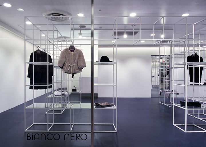
It is an Italian mode boutique in Osaka, Japan. ‘BIANCO NERO’ means ‘white and black’ in Italy, and we were required that the shop design suit the monotone clothes selected. We renovated the narrow space in underground shopping center as widely as possible, and the space still keeps the functionality as a shop.

The steel grid shelf in the shop has two functions that are to part the big space as if were divided into some small ones and to bring a moderate distance between salesclerks and customers. The layer-like shelf that overlaps several times creates a depth feel and a sense of unity to space, and has an effect that tightens the whole space.

In addition, the shelf consists of 6 units and it can respond to various shopping space by changing the combination of units. We considered this shop would be a sustainable and changeable design that can be used for long period as corresponding to prospective moving shop and renovation etc.
Designed by NI&Co.
Photo by Yuko Tada


http://www.dezeen.com/2012/10/15/bianco-nero-boutique-by-nico-architects/
http://www.nicoarchitects.com


Add to collection
